
Hi Friends of the Press, and a very Happy Feast-Day of St Brigid to you all! We are most glad to celebrate this day with the launch of our latest book ~
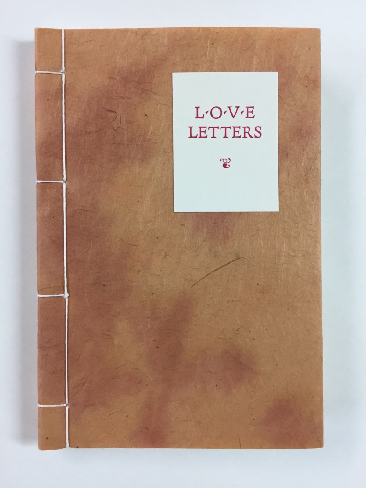
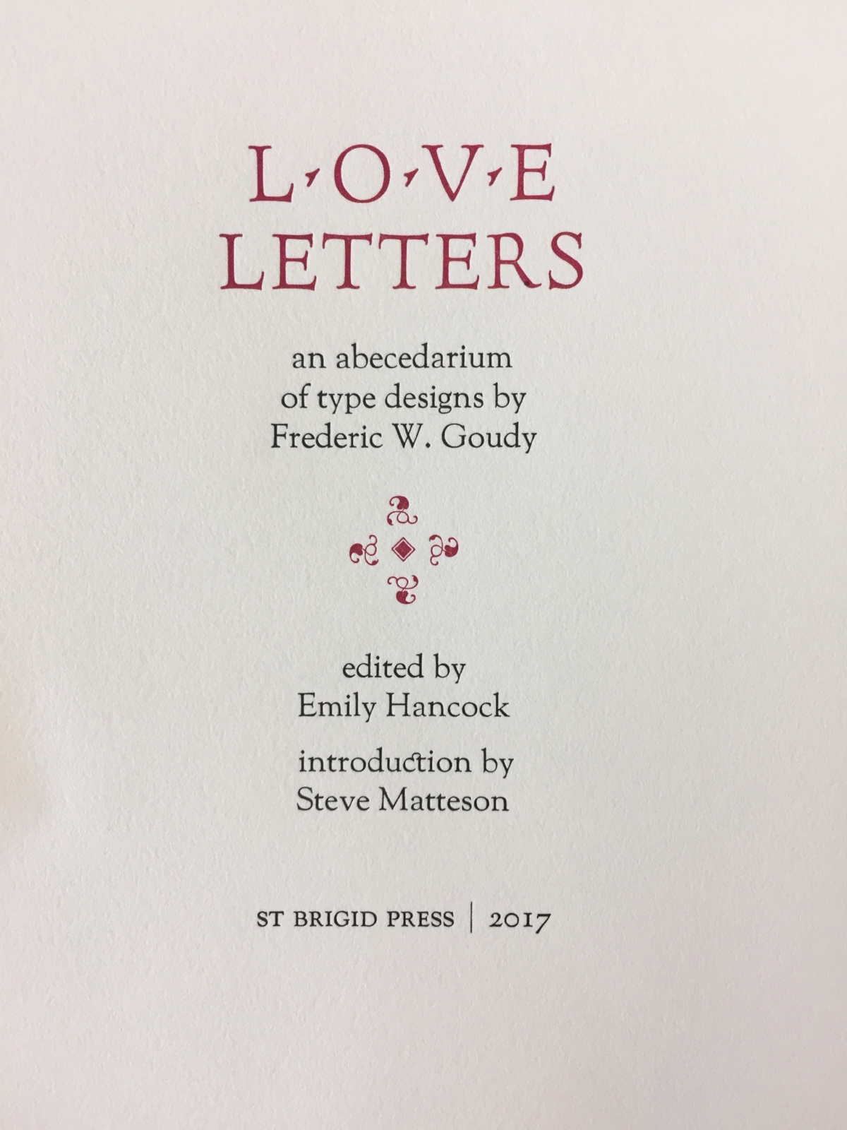
Love Letters: An Abecedarium of Type Designs by Frederic W. Goudy
This project all began with the simple love of letters ~ letters beautifully designed, cast, printed, and shared.
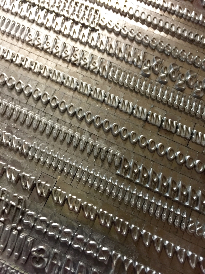
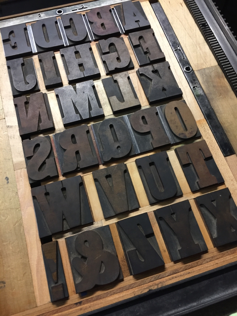
One of the most gifted and prolific type designers in American history, Frederic Goudy began his life’s work at his Village Press in Park Ridge, Illinois in 1903. Beginning in the 1890s and continuing until his death in 1947, he designed well over 100 typefaces, many of which are still in use today in both metal and digital formats.
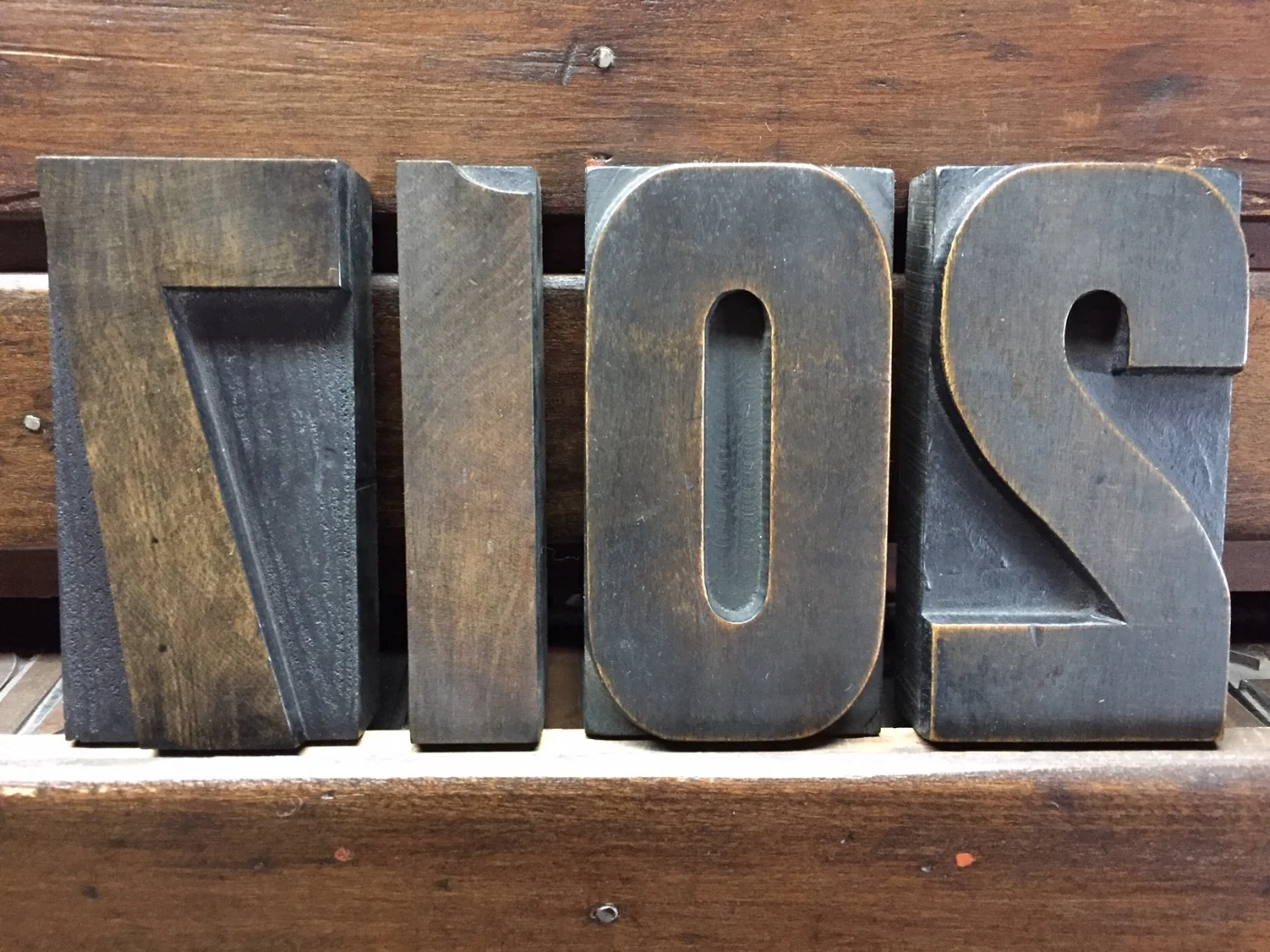
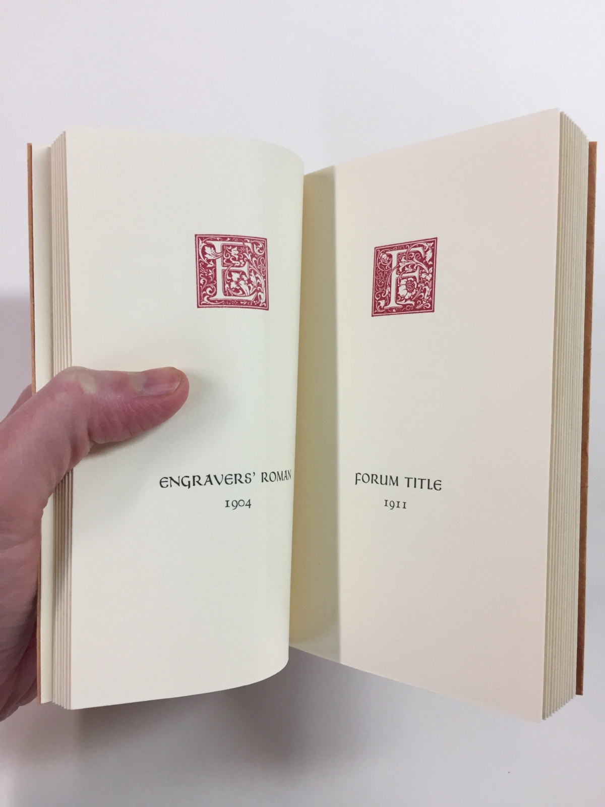
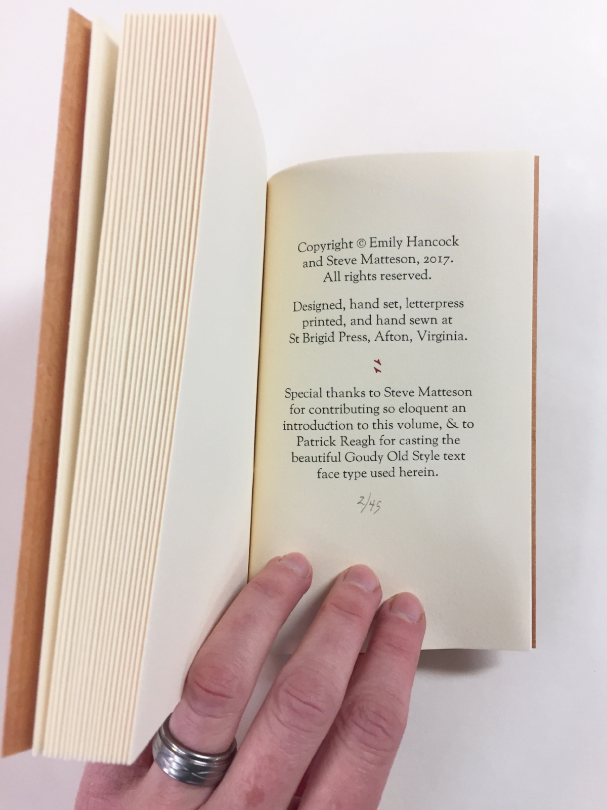
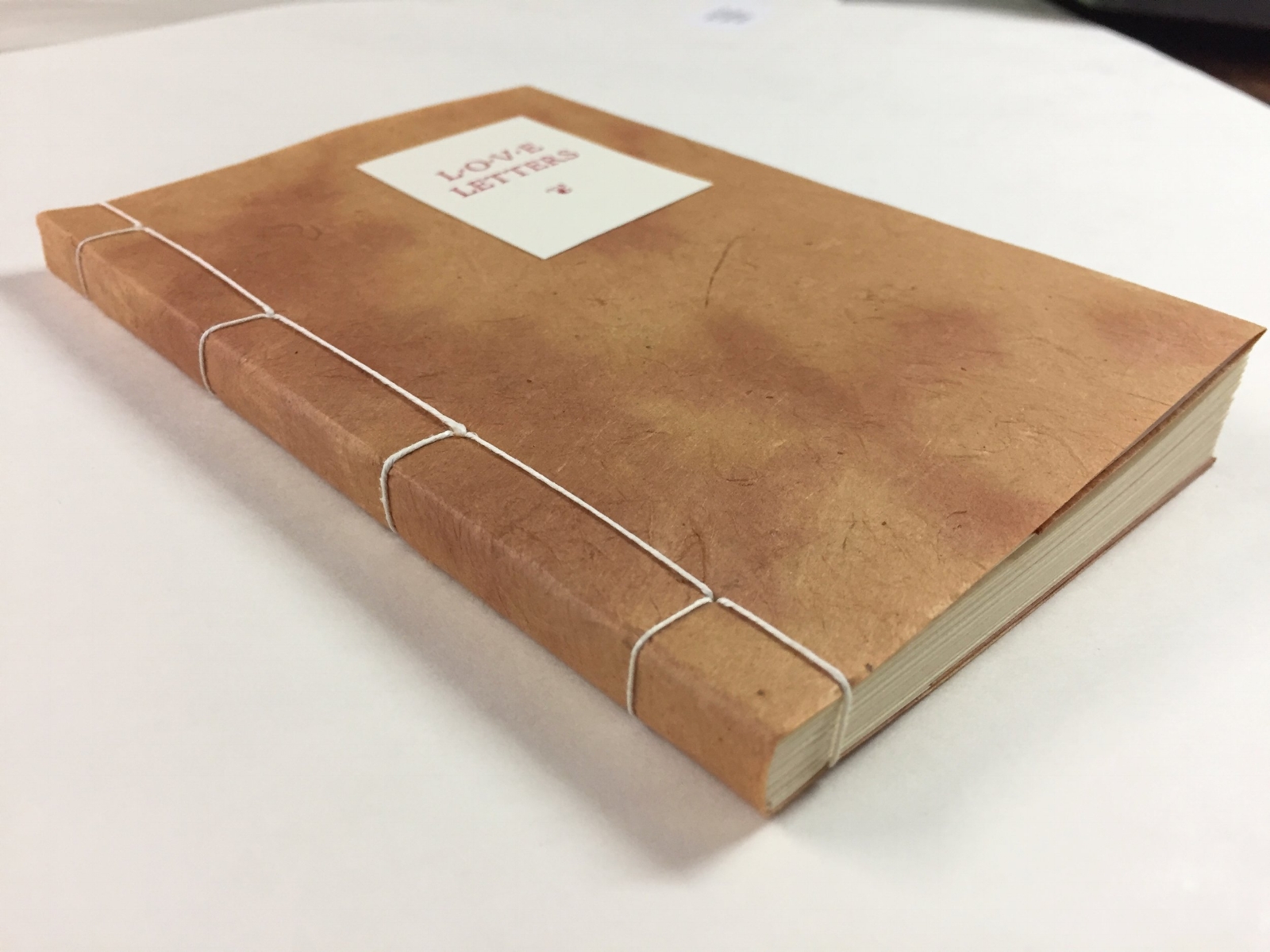
At St Brigid Press, we are honored to care for and print with a couple of rarer metal castings of Goudy’s designs. This book presents the gorgeous 60-point Cloister Initials and the elegant Friar in the form of an abecedarium, or “a-b-c book” ~ the large Initial letters are accompanied on each page by the name of another of Goudy’s typefaces, printed here in his Friar. The book was designed, handset in metal type, and printed on the circa-1915 iron handpress here at the Press by Emily Hancock.


If you want to see more of the process on printing a page of this book, please see our previous post, “Diary of a Printed Page.”

Steve Matteson, Creative Director at Monotype and historian of Frederic Goudy and his type designs.
Frederic Goudy energized a new generation of type designers with his beautiful, time-tested work. One of those designers who takes inspiration from Goudy is Steve Matteson. Steve is one of the finest digital type designers in the world, serving currently as Creative Type Director at the legendary Monotype Corporation. His roots are in metal and cast iron, though — he and I met in the Fall of 2015, at the American Printing History Association’s conference celebrating the iron handpress, held at the Rochester Institute of Technology where Steve first studied typography.
From the Droid font family to digital revivals of Goudy’s own types like Bertham Pro and Friar Pro, Matteson has a brilliant sense of lettering and typography. And history, too — we were thrilled when Steve agreed to write an introduction for Love Letters. In a few paragraphs, he manages to introduce us to Goudy the late-19th/early-20th century craftsman, and to bring the beauty of Goudy’s art and heart forward into our present age.
We love letters. And Frederic Goudy's are some of the most beautiful ever designed. May they spark joy in you as well!
- Edition of 45 numbered books.
- 6 x 4 inches (closed)
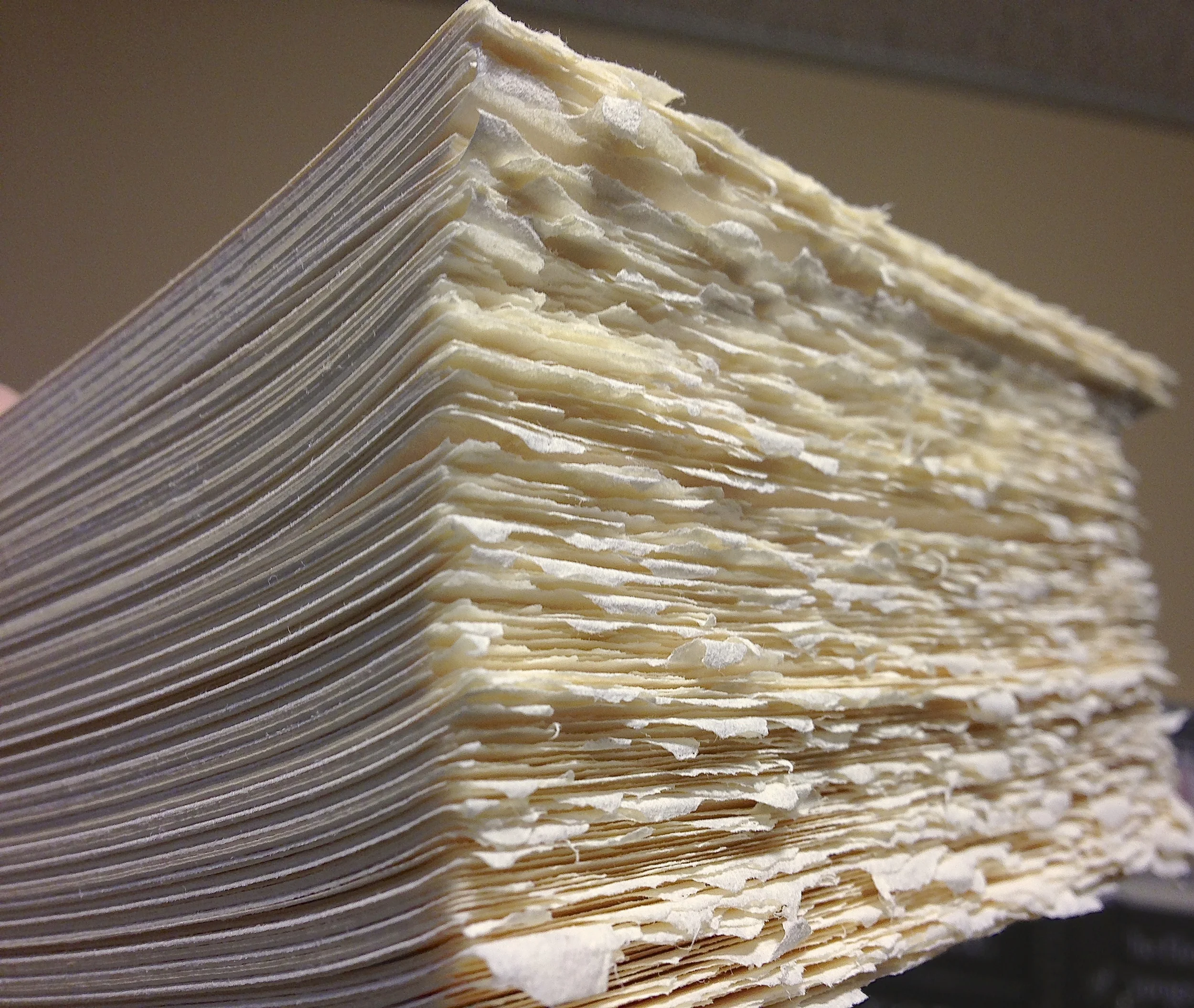
- Interior papers are Rives Lightweight mouldmade paper (cream), with accents of French Paper Company’s Parchtone Natural.
- Covers are Chestnut-Pinto Lokta, handmade in Nepal.
- Sewn side-bound with linen thread.
- Preface by Emily Hancock.
- Introduction by Steve Matteson.
- Goudy Old Style type for the text was specially cast for this printing by Patrick Reagh in Sebastopol, California.