Viewing entries tagged
letterpress

Book Looks: Selections from the Press Library, Part 4

1 Comment

Book Looks: Selections from the Press Library, Part 4

Hello Friends, and welcome back to Book Looks!

I began this blog series in 2021 to highlight some of the interesting volumes here in the St Brigid Press library — from the history of book-making to printing press maintenance, from typography and type design to the biographies of famous (or not) printers, and from paper-making to hand-sewing books. We’ll take a brief look at three volumes today, and spotlight more over time.

This edition of the series is inspired by my trip to Canada last October, where I participated in a marvelous gathering (a “Wayzgoose”) at Gaspereau Press in Nova Scotia. You can read about that adventure HERE.

Thanks for coming along as we browse the print shop shelves!

Emily Hancock

Previous Book Looks editions:

BOOK LOOKS, PART 4

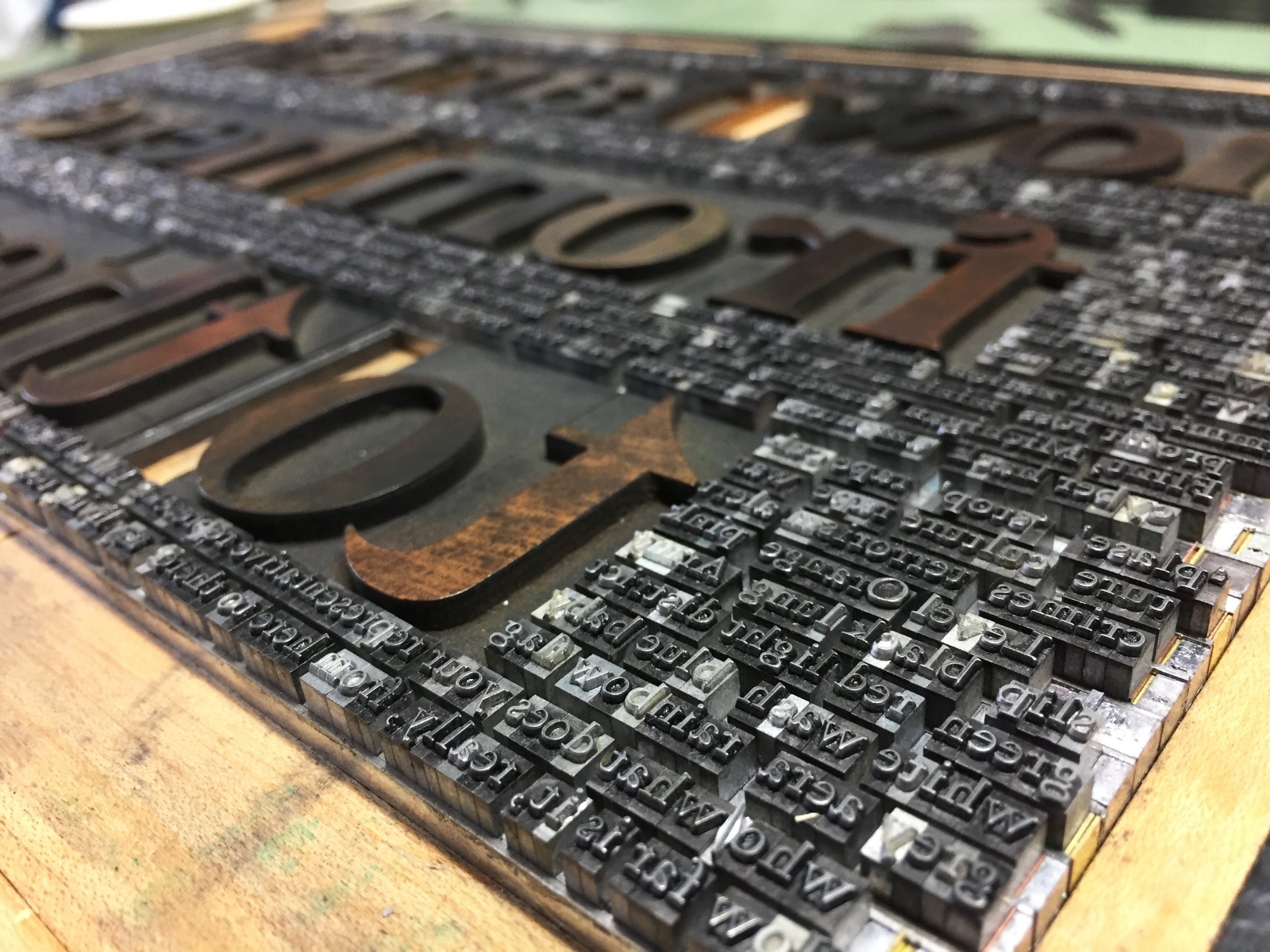
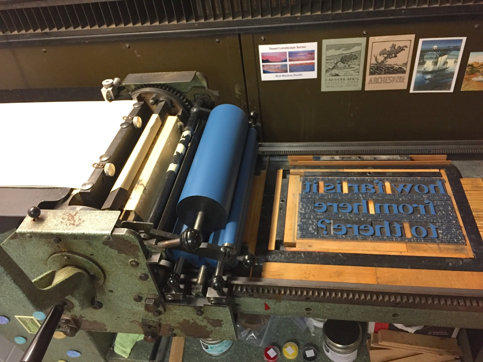
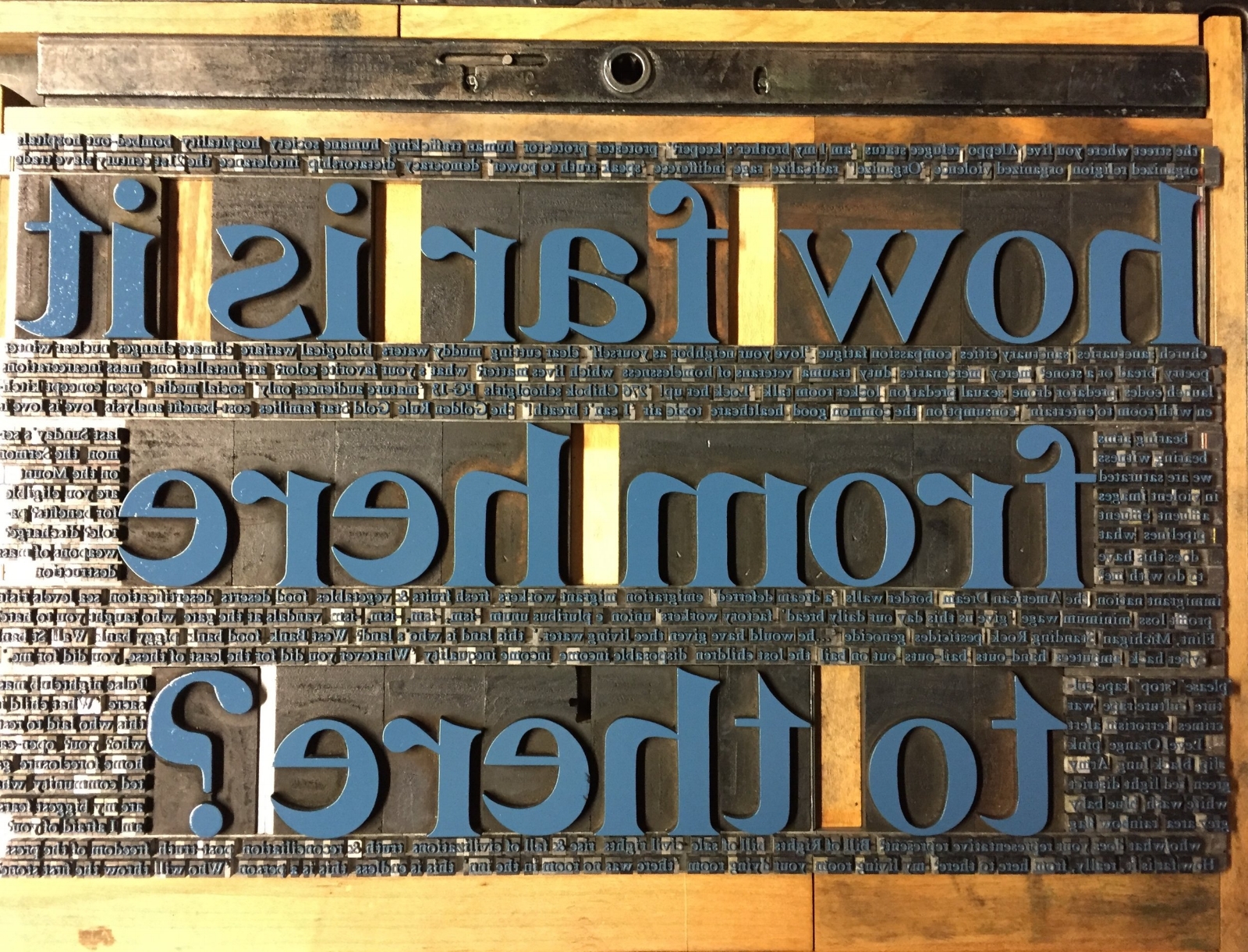
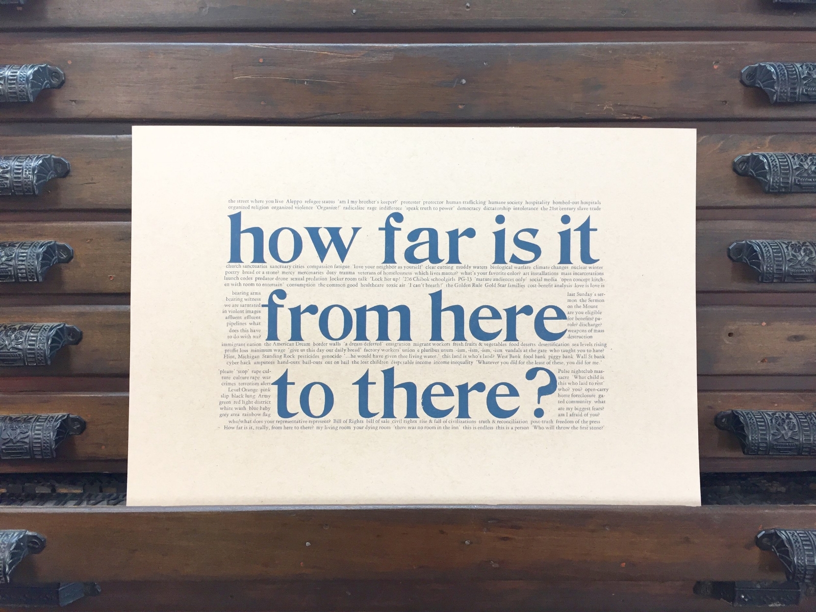
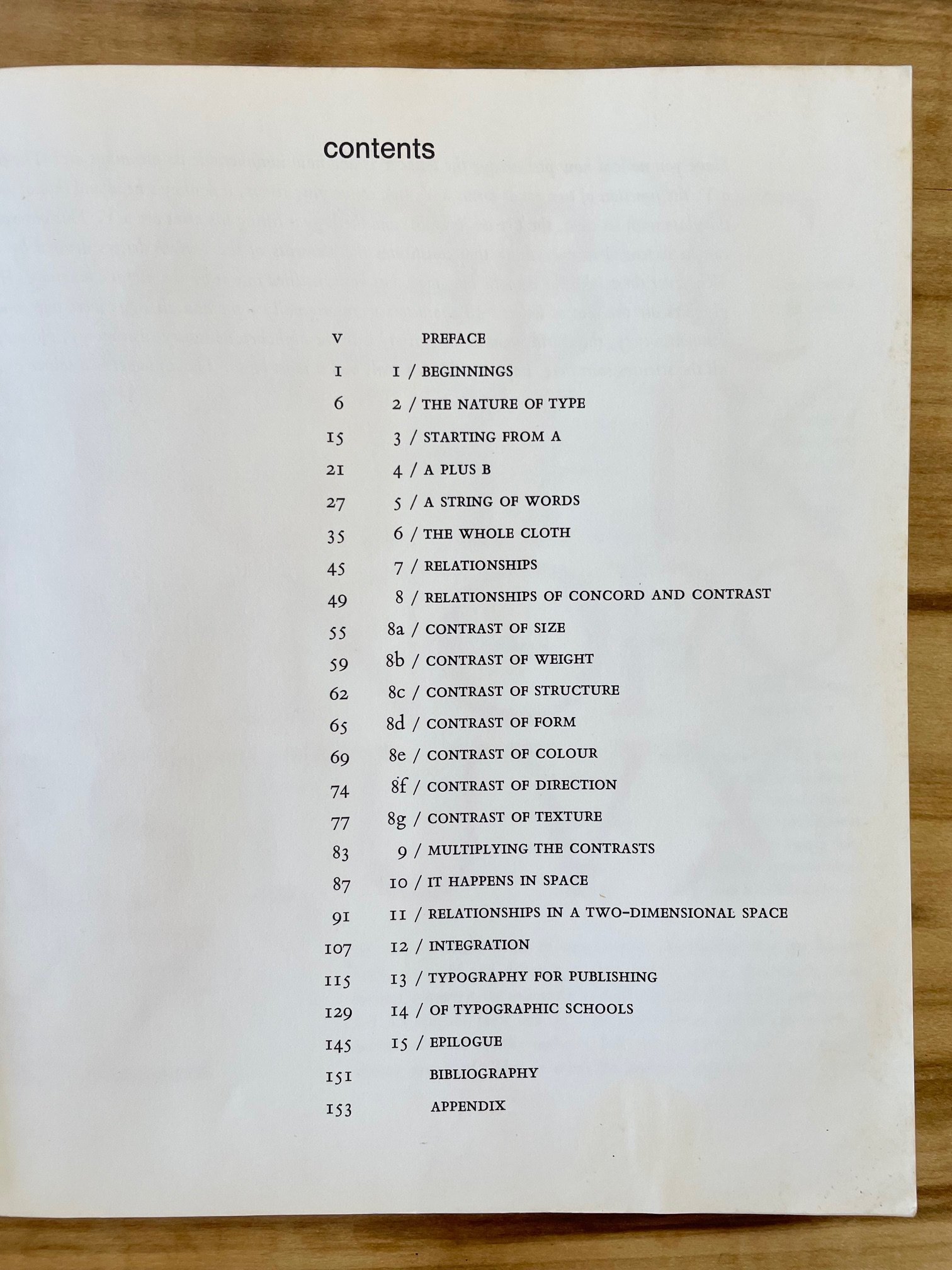
  1. Design With Type by Carl Dair

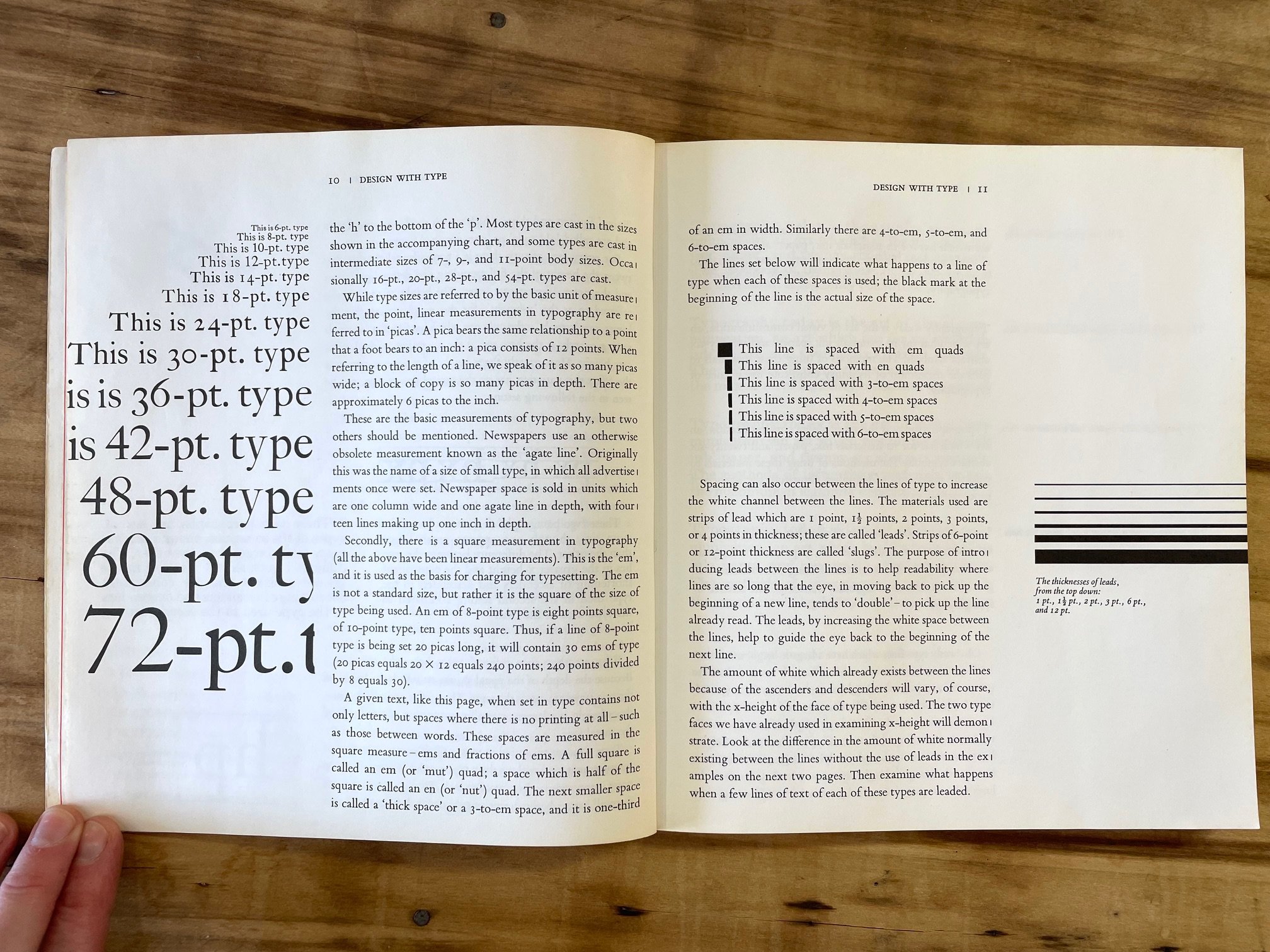
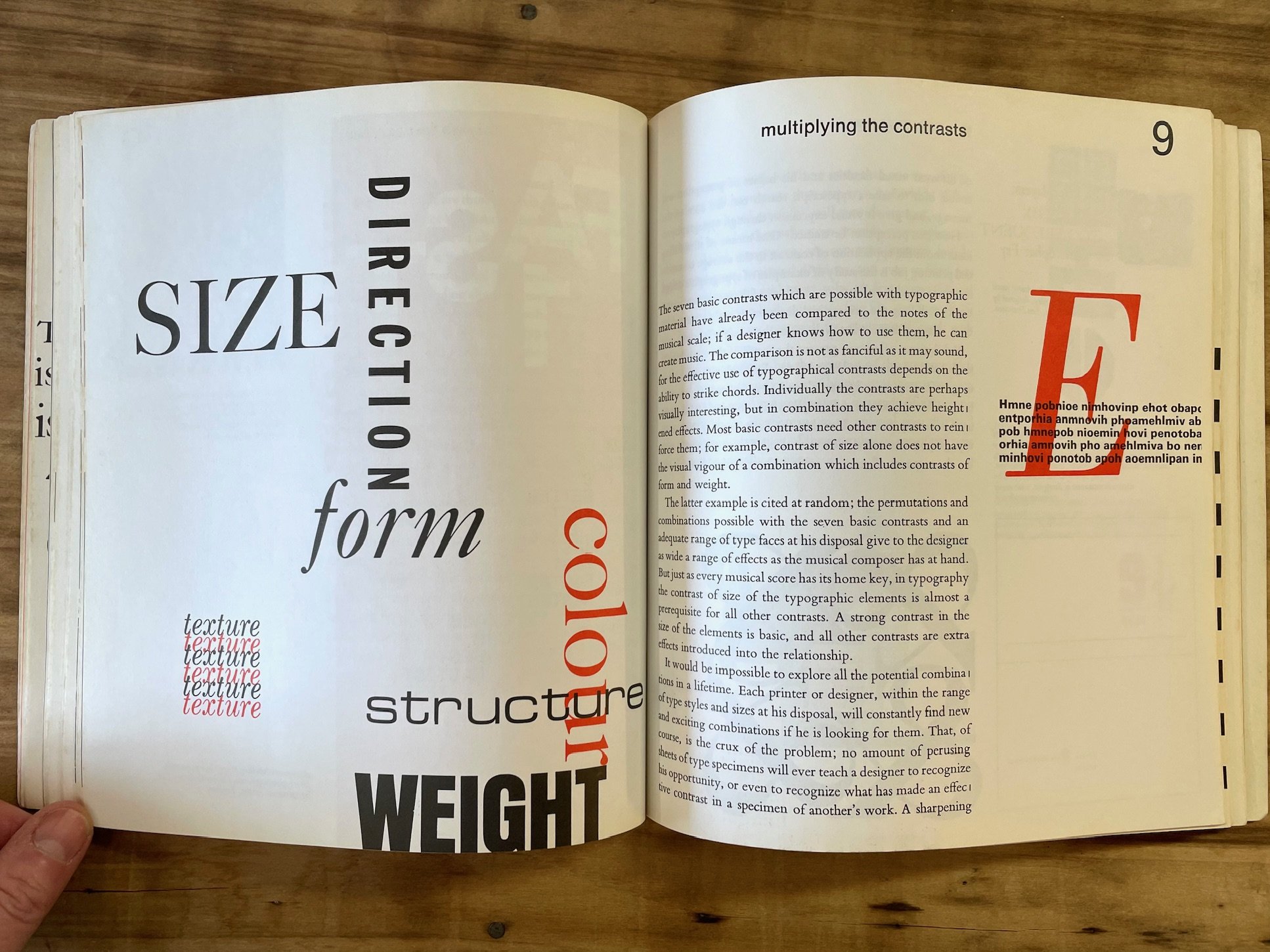
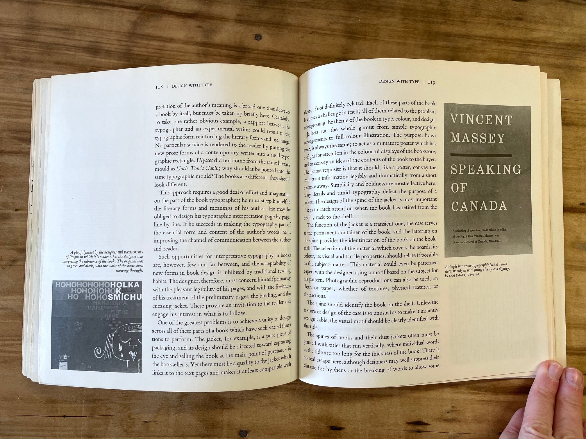
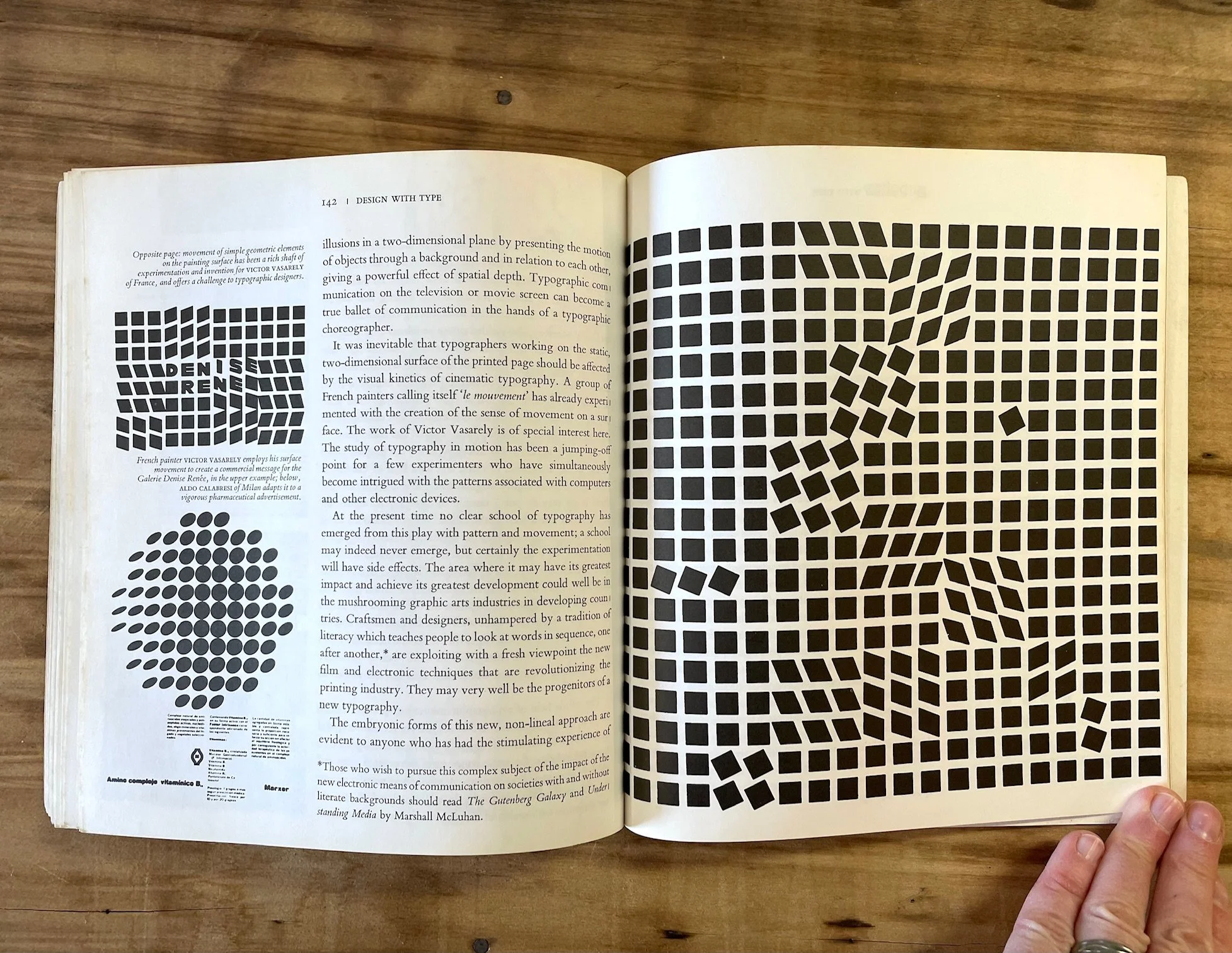
To learn about the 20th-century-history of typography and design in Canada is to encounter the extraordinary work of Carl Dair. Born in Ontario in 1912, Dair became an exceptional graphic designer, teacher, and type designer, and in 1952 published Design With Type. This relatively slim but comprehensive volume became a staple resource in the trade, and is still available new from the University of Toronto Press who published the revised version in 1967 (although there are many inexpensive used copies floating around for you to snag). “Good design in any field demands that the designer know the materials with which he is working”; this is, essentially, Dair’s purpose for writing this book and his hope for his readers. The well-illustrated, concise tour of the forms and functions of type on the page is all in service of Dair’s ultimate vision —that of encouraging excellence in visual communication, not mere “visual stimulation.” [University of Toronto Press; I recommend the revised version published after 1967.]


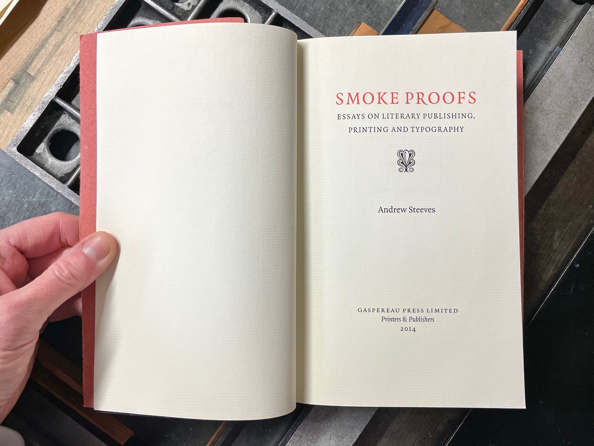
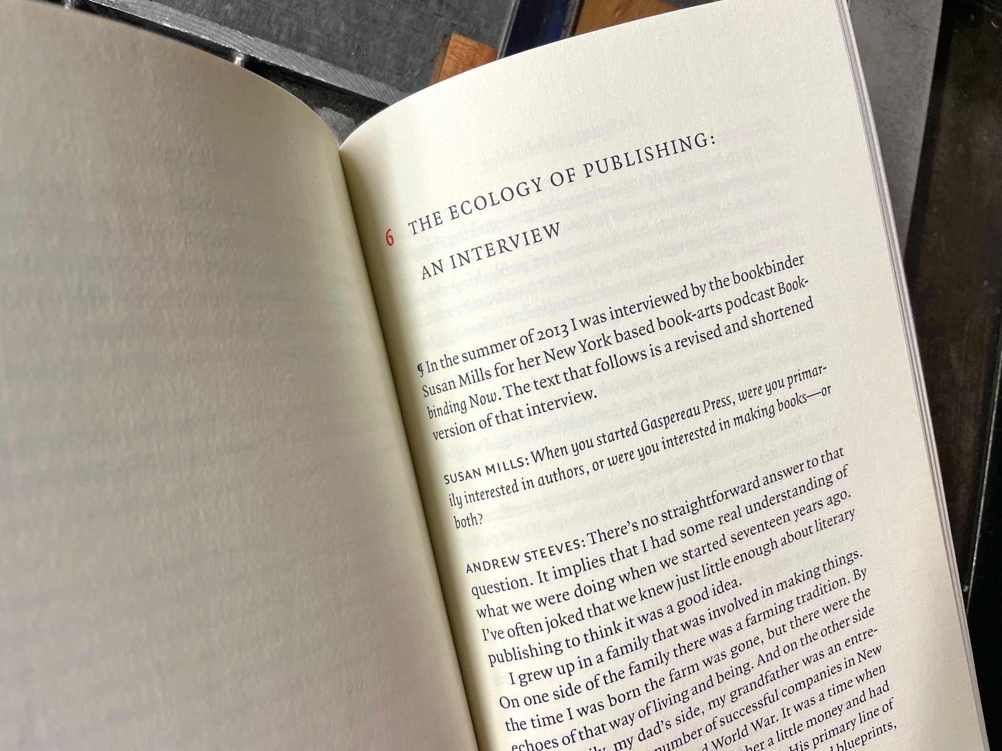
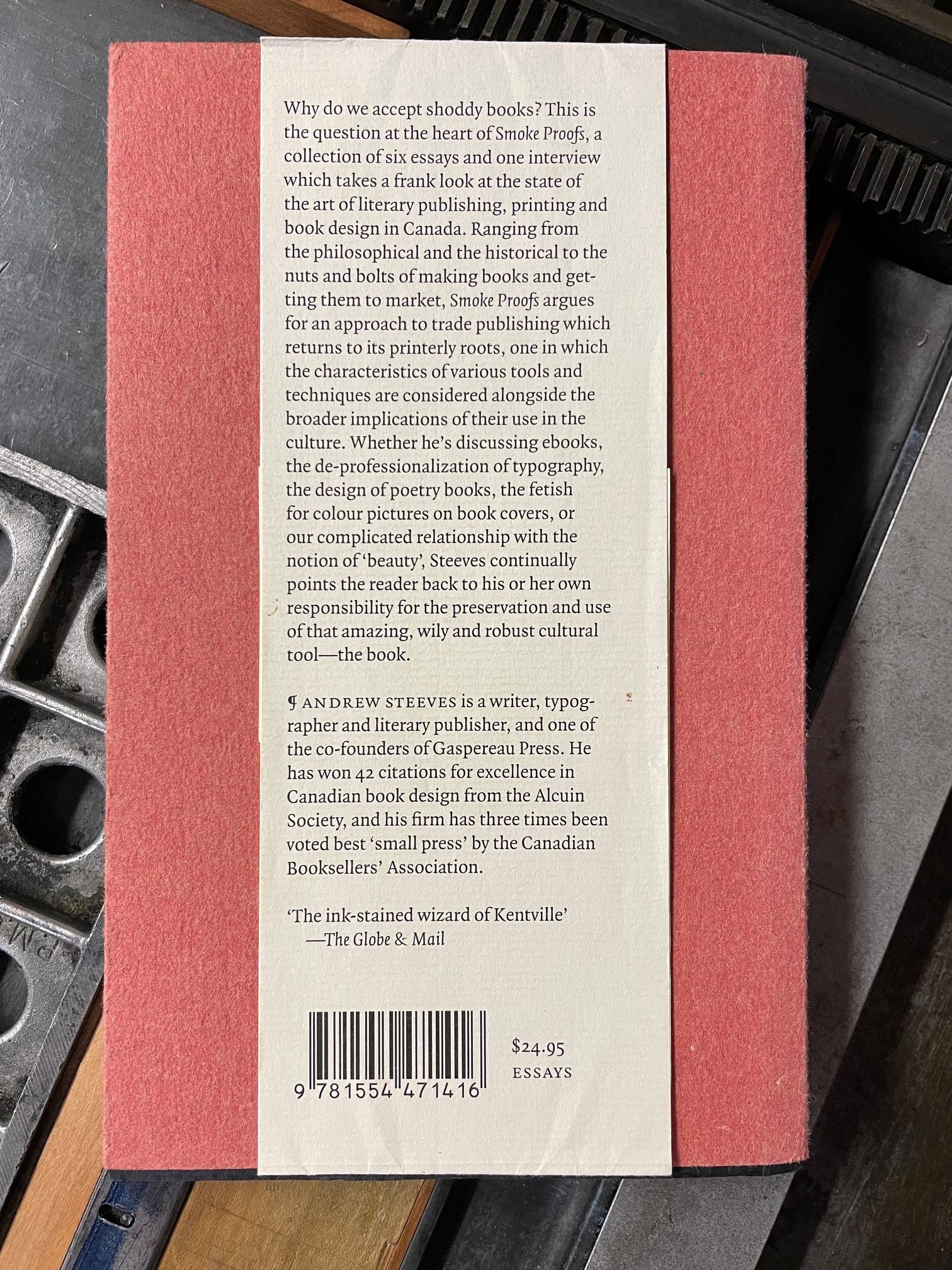
2. Smoke Proofs: Essays on Literary Publishing, Printing & Typography by Andrew Steeves

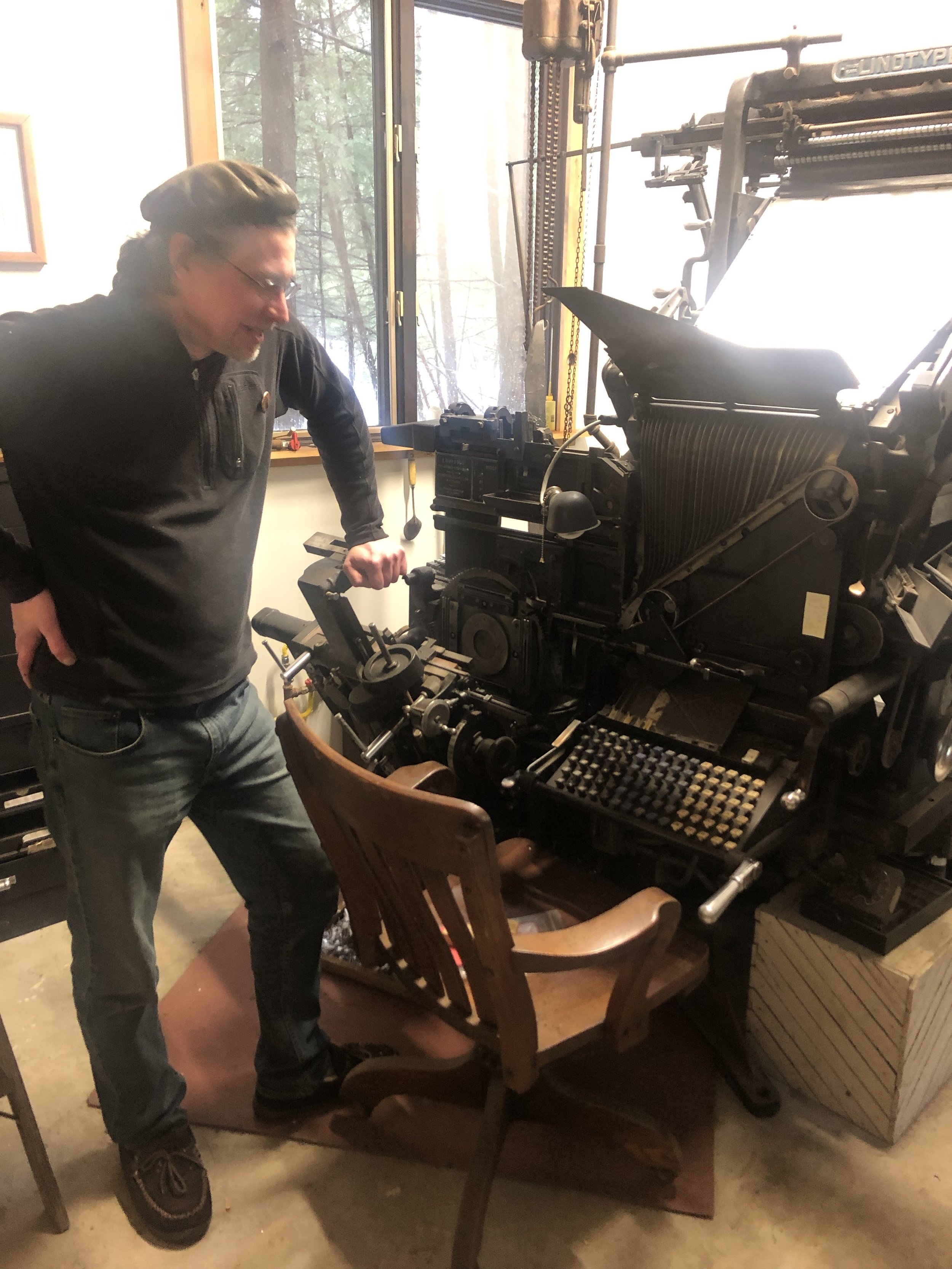
My Canadian trip destination last autumn was Gaspereau Press in Kentville, Nova Scotia. Established in 1997 by Andrew Steeves and Gary Dunfield, Gaspereau is a relatively small offset- and letterpress-print shop that has had an outsized impact on the literary culture of its home province and beyond. From the digitally designed, offset-printed with letterpress jacket trade editions of poetry and prose, to Steeves’ completely letterpress printed fine press volumes, each book is an impeccably made home for excellent literature. In 2014, Steeves published a book of his own writing called Smoke Proofs: Essays on Literary Publishing, Printing & Typography. Rather than a “how-to” primer on typesetting or page layout, this collection from a true citizen-publisher is more of a what and why, “identifying issues, challenging dogma and agitating for our full and creative engagement with the many challenges we encounter when we set literary works into type and publish the results.” Steeves and his work have always called on me to be my best creative self for the good of the community I serve, and this book is a superlative guide and goad, inspiration and invitation, that I return to regularly. Smoke Proofs is a trustworthy, hand-held compass for anyone adventuring into the wilds of literary publishing and printing.


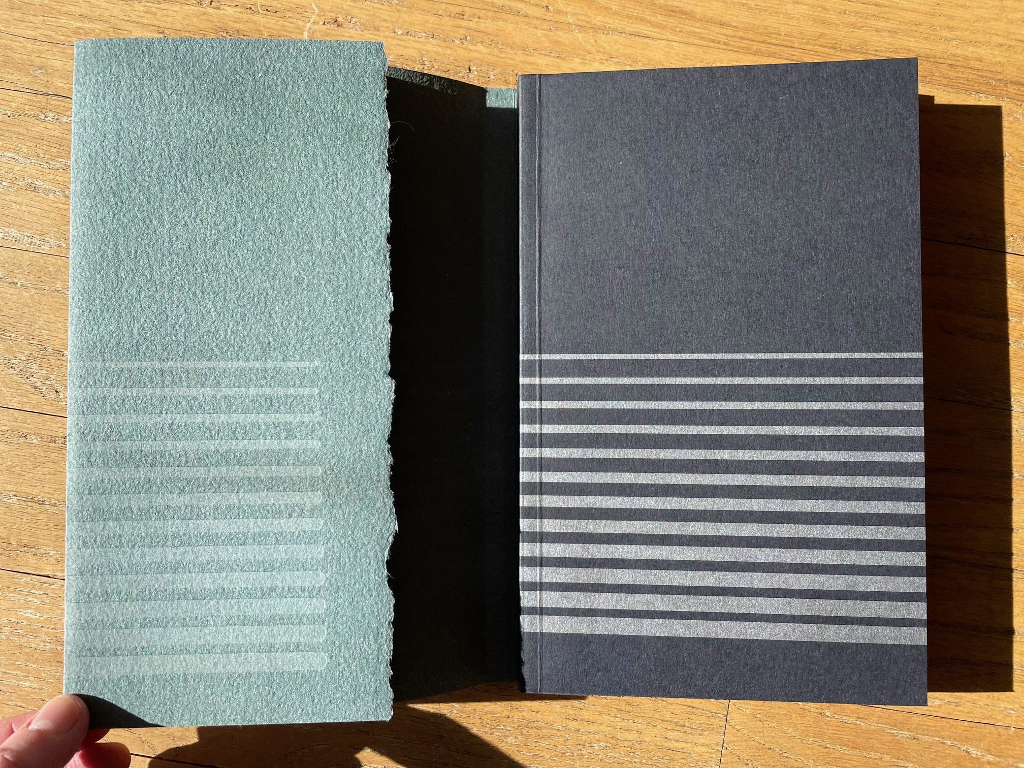
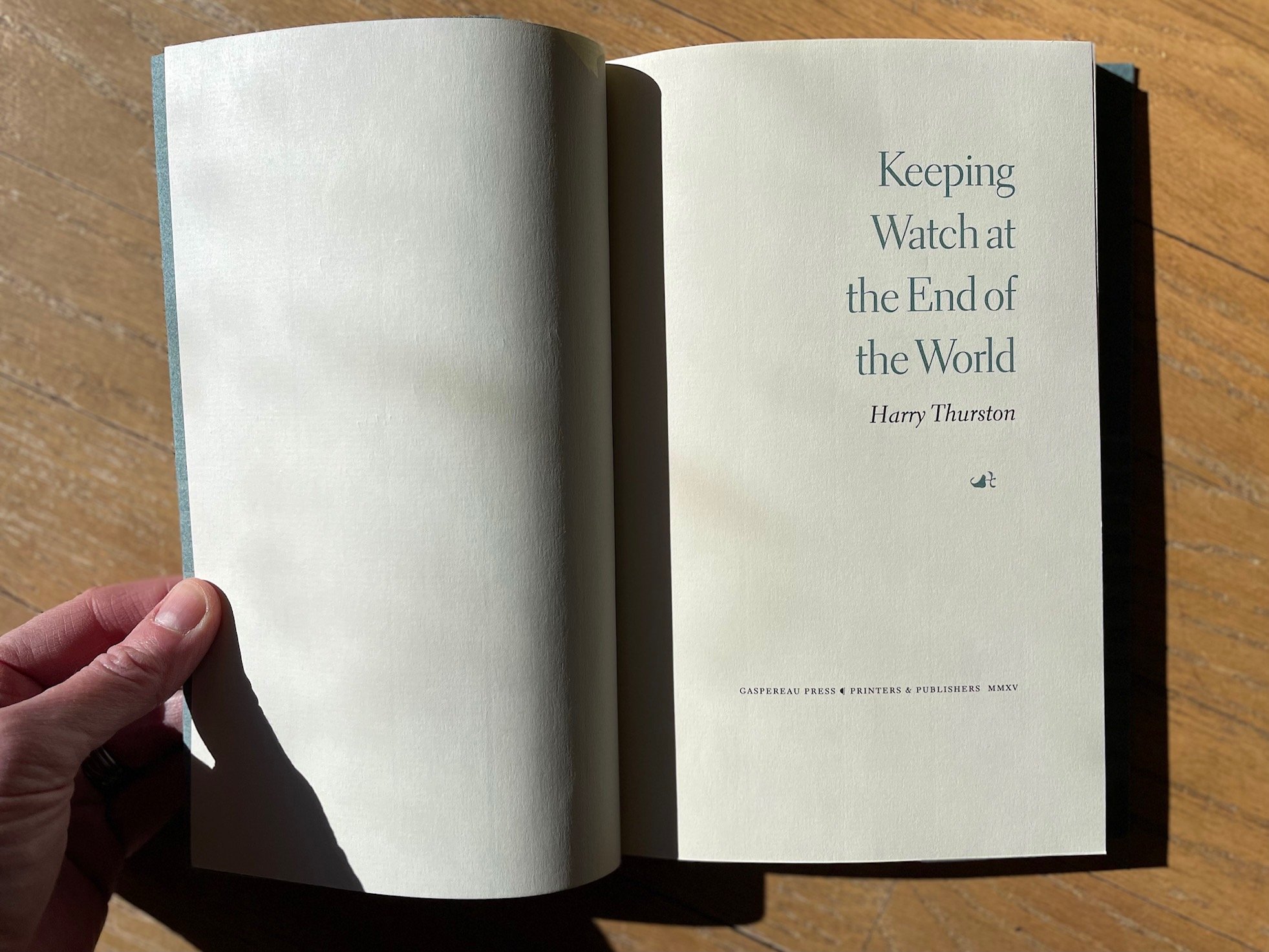
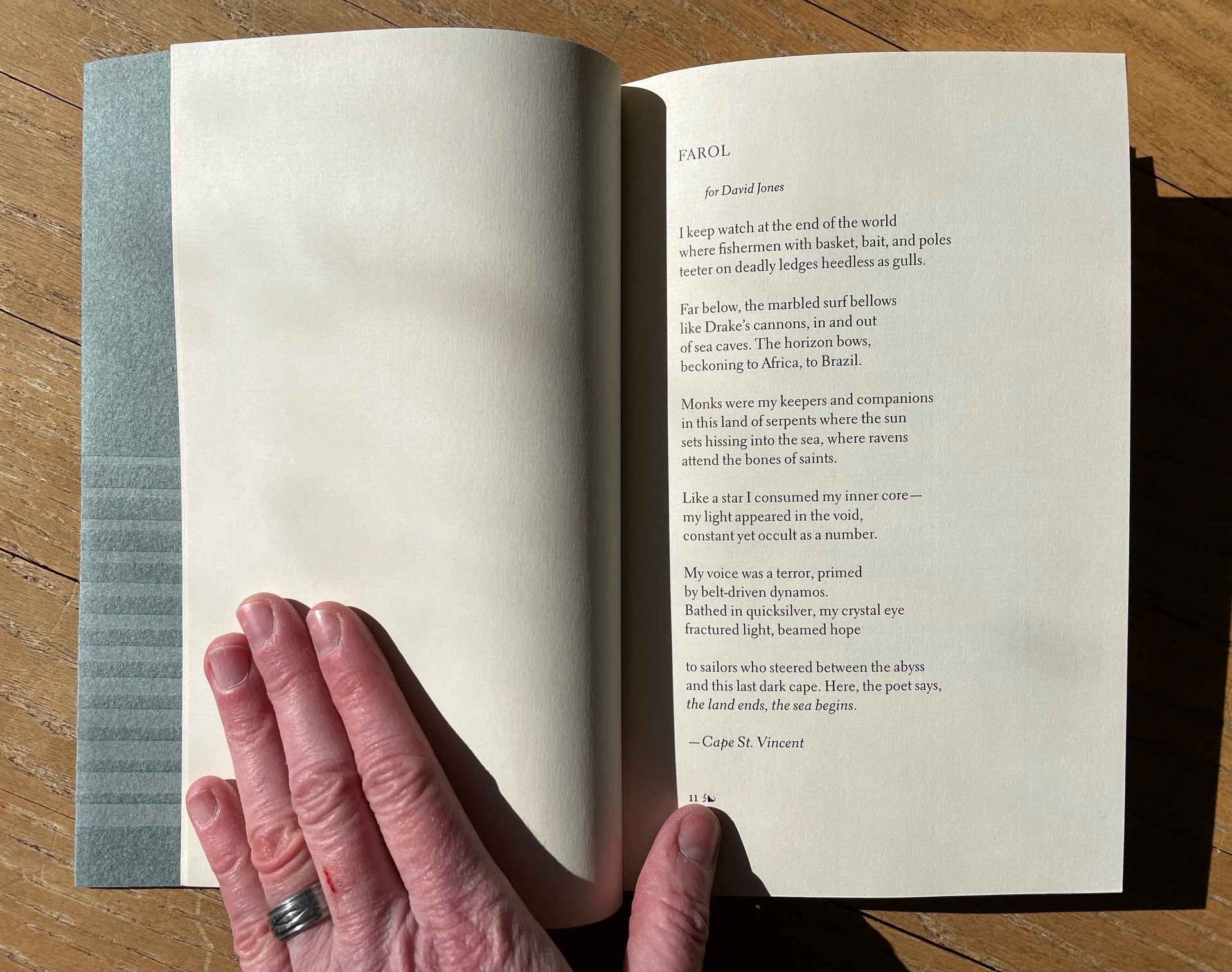
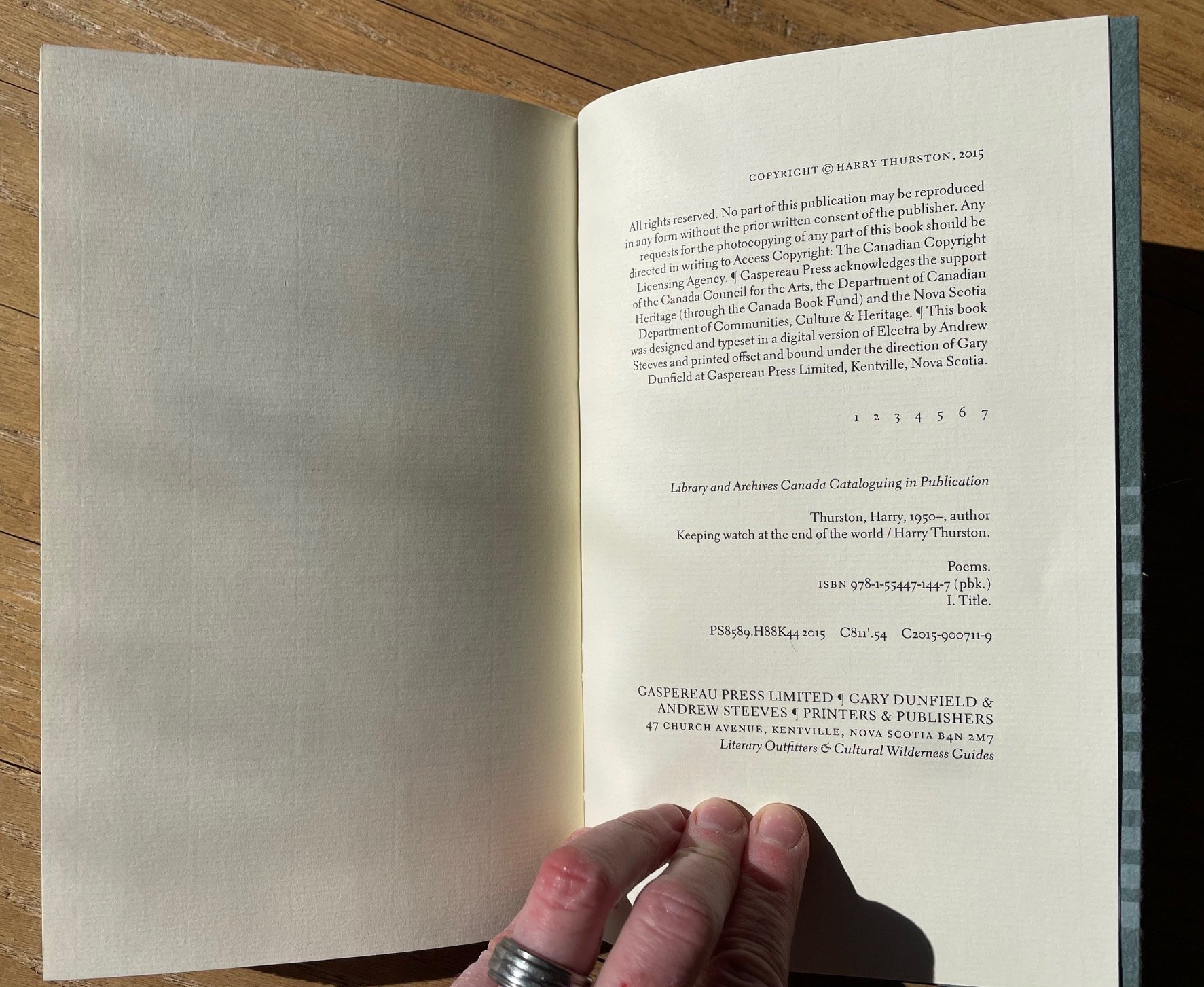
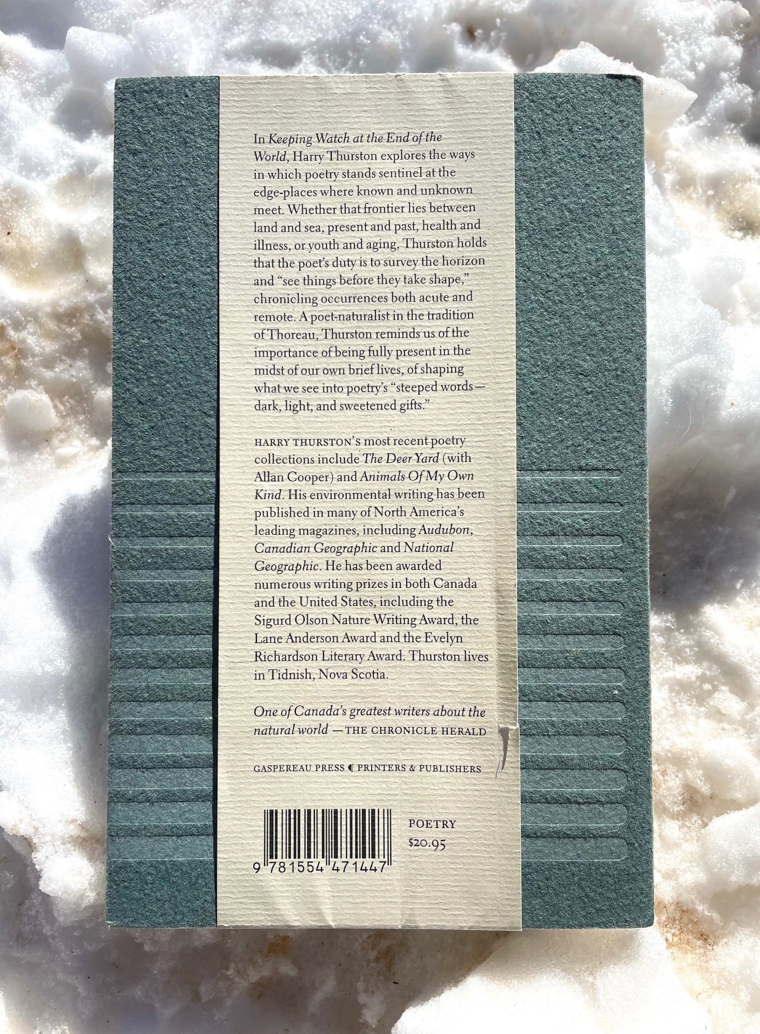
3. Keeping Watch at the End of the World by Harry Thurston

“All of us belong, as much as the black ducks / at rest in the harbour…”

Harry Thurston grew up in Nova Scotia and became a prize-winning poet and environmental journalist, as well as mentor to many students at the University of King’s College. His word-and-image collaborations with the renowned New Brunswick photographer Thaddeus Holownia (several volumes of which have been designed by Andrew Steeves) are exquisite. I was lucky to meet Thurston last autumn and to pick up copies of several of his books published by Gaspereau Press, including the outstanding Keeping Watch at the End of the World. The sea is a central presence in this beautiful collection. Whether writing about his native, booming Bay of Fundy or the Mediterranean’s millennia of layered stories, Thurston’s heart and eye take in and give back to us the intricate, flowing world. His ear, like his pulse, are tuned to the tides — whether oceanic, emotional, or historical. And he is always walking that wrack line, where the sea — whether the sea of time or of memory or of water itself— gives up its mysteries (and takes them back again). Grab a copy of Thurston’s work and enjoy his keen company in “This brief time we have to share / while the tide fills and empties the bay.”

(Apologies for the shadow-dappling on some of these photos below. My photographic error, not on the pages themselves.)


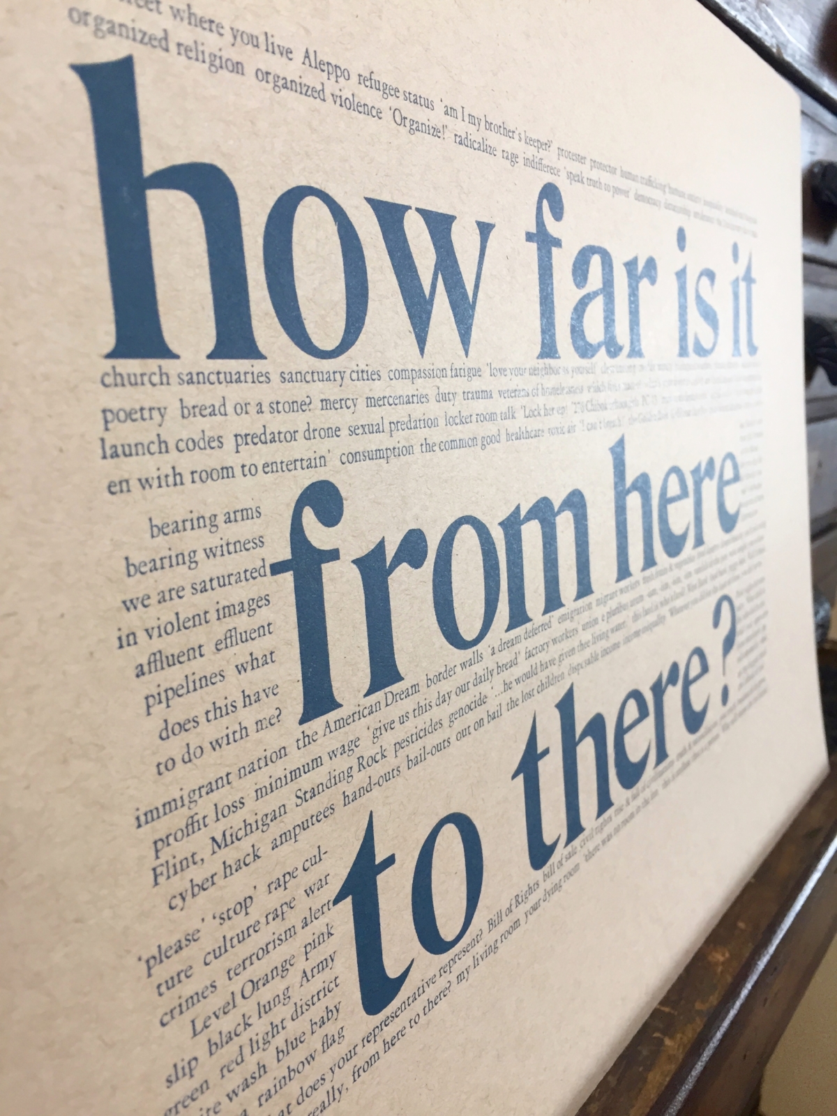
To close out our little trip to Canada, here’s a final word from Carl Dair — this poster hangs in a prominent position at St Brigid Press:

Well, that’s all for now, friends, as I gotta get back to setting some type ;-) Stay tuned for future installments of Book Looks, and in the meantime, be well and read on!

Emily

1 Comment

Book Looks: Selections from the Press Library, Part 3

5 Comments

Book Looks: Selections from the Press Library, Part 3

Hello, Friends! Book Looks is BACK!

We began this series a couple of years ago, highlighting some of the interesting volumes here in the St Brigid Press library — from the history of book-making to printing press maintenance, from typography and type design to the biographies of famous (or not) printers, and from paper-making to hand-sewing books. We’ll take a brief look at three volumes today, and spotlight more over time. (If you missed the first Book Looks post, read it HERE, and the second Book Looks post HERE.)

Thanks for coming along as we browse the print shop shelves!

Emily Hancock

BOOK LOOKS, PART 3

Research for a new small letterpress project sent me to the library stacks this very week. I needed to brush back up on the history of type design and printing in northern Italy during the Renaissance period. A niche subject? Yeah. And fascinating! I pulled down a few volumes, books I hadn’t looked at in a while — it felt like catching up with old friends. If you’re into type and printing history, here are some books that just might interest you, too.

  1. Historical Types: From Gutenberg to Ashendene by Stan Knight

As calligrapher and type designer Paul Shaw writes, “Historical Types is a modest book in scale and appearance that deceptively hides a wealth of information…” In under 100 pages, Knight provides an illustrated survey of the high points of type design from the 1450s to the first years of the 1900s — from Nicolas Jenson and Aldus Manutius working in Venice during the period I was studying, through the French Renaissance and Baroque, Neoclassical and Rational, 19th century and Private Press types that followed. Not one to to be wordy, Knight’s descriptions of each type, designer, and accompanying printed examples are short and tight, packing a good bit of info in just over half a page. The real treasure, especially for comparative study, are the large photo reproductions, taking up three-fourths of each two-page spread — we get up close and personal with each typeface, at its original size as well as  enlarged, doing its job on a period manuscript page. Whenever you can get to a special collections and see such early printed books in front of your very eyes, then go. When you can’t, pull Historical Types off the shelf and spend some enjoyable time pouring over this handy home reference of foundational styles of type. (Oak Knoll Press, 2012)


2. Five Hundred Years of Printing by S.H. Steinberg (revised by John Trevitt)

If you want a broader education in the history of Western printing, from Gutenberg to post-WWII, then settle in with this volume’s 250 pages of densely packed information. Originally published in 1955, the revised edition has been expanded and updated, including dozens of illustrations of manuscript pages through the ages. In addition to deft histories of printing and publishing technologies, Steinberg and Trevitt are interested in the economic and sociological aspects of the industry as well. They highlight and explore some of the cultural dimensions of book making, from the phenomena of bestsellers and censorship to the role of patrons and libraries. The authors also consider who “the reading public” is at any given time, noting the state of education, literacy, and book- and periodical-selling through the centuries. (Oak Knoll Press, 1996)


3. Twentieth Century Type Designers by Sebastian Carter

Ok, out of the dusty distant past and into the (relatively recent) present. In this volume, the book designer and printer Sebastian Carter profiles some of the best European and American type designers working from the early 20th century until this book was published in 1987. Frederic Goudy and William Addison Dwiggins are here, as well as Rudolf Koch, Victor Hammer, Jan van Krimpen, Joseph Blumenthal and many more — all of them men, of course, though there is one page devoted to Gudrun Zapf-von Hesse. (You can begin exploring women type designers here and here.) At a few well-illustrated pages per entry, Carter gives us a relatively brief but informative survey of each designer, their history and influences, and a feel for what makes their design(s) unique. I find myself pulling this book off the shelf at regular intervals, while taking a break in the print shop, to dip into the interesting personalities and creativities highlighted herein. (Taplinger Publishing, 1987)


Well, that’s all for now, friends, as I gotta get back to setting some type ;-) Stay tuned for future installments of Book Looks, and in the meantime, be well and read on!

Emily

5 Comments

Book Looks: Selections from the Press Library, Part 2

4 Comments

Book Looks: Selections from the Press Library, Part 2

Books. It all begins and ends with books here at St Brigid Press. 

Personally and professionally, my life has been significantly shaped by the encounters I’ve had with literature ~ I bet many of you have similar stories. Early in my continuing apprenticeship to traditional printing and book-making, kind friends and mentors in the craft directed me to essential volumes about letterpress, typography, printing history, and more. Those folks and the books they recommended got me started on the right foot, and I return again and again to their wisdom. 

Over the years, through the generosity of others and through my own acquisitions, the library at St Brigid Press has grown into a rich repository of texts. I thought it might be fun for us all to take a brief look at some of these volumes ~ from type design to press maintenance, printer’s biographies to sewing books.

Here’s the second installment of “Book Looks” ~ short spotlights on some of my favorite volumes from the Press library. Enjoy! (If you missed the first Book Looks post, read it HERE.)


BOOK LOOKS, PART 2

  1. A Short History of the Printed Word, by Warren Chappell & Robert Bringhurst

This is a good, concise introduction to the history of the origins and development of printing in the West. Warren Chappell’s original text from the early 1970s was revised and updated by Robert Bringhurst in the late 1990s to extend and expand the book’s scope. Beginning with the development of alphabets and cast type, Chappell and Bringhurst then give us a brisk, well-illustrated tour of the 15th-20th centuries: the innovations of type designers and typographers like Aldus Manutius, Simon de Colines, and Bruce Rogers; new techniques in printing illustrations from woodcuts to intaglio methods to electrotyping; and the rise and revolution of newspapers, periodicals, and, in the last chapter, digital production. This book helped me begin to get my head around the complex history of printing in the West, and introduced me to some of the brilliant people who forged new innovations in letterforms, book design, and production processes. Original edition of A Short History of the Printed Word was published in 1970; second edition published by Hartley & Marks, 1999.


2. Mary Ann Shadd Cary: The Black Press & Protest in the 19th Century, by Jane Rhodes

One of the many delights of delving into traditional printing and bookmaking has been the discovery of the individuals and communities who built the presses, designed the type, made the books, and passed along the printed word. One of those individuals was Mary Ann Shadd Cary — the first Black female publisher in North America. Cary (1823-1893) grew up well-educated, in a family of free African-Americans in Delaware. Her family was very active in the antislavery movement and in the movement to relocate Blacks to places where slavery had been abolished. One of those relocation areas was what is now Ontario, Canada, and Mary Ann moved there with her brother, first establishing a school and then becoming a journalist and publisher. In 1853, Cary founded The Provincial Freeman, a newspaper “Devoted to anti-slavery, temperance, and general literature.” It also supported women’s suffrage, and it served the region’s African-Canadian community for 4 years. She traveled widely, wrote essays about racial and gender equality, and, after the Civil War and the death of her husband, she moved back to the United States and got a law degree from Howard University. Cary was an amazing woman blazing trails in publishing and civil rights in the 19th century. Mary Ann Shadd Cary: The Black Press and Protest in the Nineteenth Century by Jane Rhodes is published by Indiana University Press, 1998. If Rhodes’ full biography is not for you, then here’s a newspaper article that hits some of the highlights.


3. Against the Grain: Interviews with Maverick American Publishers, edited by Robert Dana

City Lights. Godine. Copper Canyon. New Directions. These now-legendary independent poetry publishing houses were started by likewise legendary personalities: Lawrence Ferlinghetti, David Godine, Sam Hamill & Tree Swenson, and James Laughlin. In the mid-1980s, the poet Robert Dana interviewed these and a few others who worked on the leading edge of small press publishing in 20th century America. It’s a fascinating read, ranging from the inky details of typesetting to the state of the then avant-garde. I particularly enjoyed “listening” to one of my letterpress heroes, the fine press typographer and designer Harry Duncan: “I print books for somebody who is going to discover the text of the book—poems, stories, and so on—with the same delight that I discover it as I am working on the book.” Against the Grain was published by the University of Iowa Press, 1986.

There are only two ways to publish. One is to try to figure out what everyone else will like, which I’ve generally found to be totally unsuccessful, because nobody knows. And the other is to know what YOU like... So what I like is what I publish.
— David Godine

Stay tuned for future installments of “Book Looks,” friends. In the meantime, be well and read on!

Emily

4 Comments

Shelf Life: an interview with Emily Hancock

1 Comment

Shelf Life: an interview with Emily Hancock

Hello, Friends,

What a fine time we had talking about printing and poetry with Kristin Adolfson! Thanks to all of you who tuned in to the live event this week. And a big bow of gratitude to our hosts ~ the Virginia Festival of the Book and the Virginia Center for the Book.

Did you miss it?? It's now freely available to watch!
https://www.facebook.com/vabookfest/videos/297255041699409/ 

Kristin and I chat about how I got started with traditional printing, the making of the latest book, and take a walking tour of the print shop.

Enjoy!

1 Comment

Pressing on together for change

Comment

Pressing on together for change

Hello, Friends of the Press,

The long, costly fight for justice and equality for all Americans is not over. The recent welling of protests against racism and police brutality, and in support of Black and Brown lives and livelihoods, has been unprecedented in the US and around this globe we all call home. Now is the time to press on further, to lift our voices higher, and lean in to the momentum for change across this land.

As Rev. Dr. William Barber and The Poor People's Campaign say, "We Rise Together!"

In support and in aid of the movement for justice and equality for all and the dismantling of racist policies at every level, I'm pumping out a new series of The People's Postcards. Lending the power of the printing press to empower you ~ to tell your elected officials what you think, how you feel, what you want to see accomplished in the next chapter of this experiment called America.

From small-town mayors to big-city senators, chiefs of police to environmental advisory boards ~ take ten minutes to send a note of thanks or challenge, question or urgent appeal. It matters. This is, you are, democracy in action ~ alive and embodied and an agent for meaningful change in the world.

Building on previous editions of The People's Postcards featuring Hamilton, Adams, and Douglass, ready now is this edition for Black Lives Matter:

  • Letterpress printed with antique wood type.

  • USPS postcard size 6" x 4.25"

  • Pre-stamped / postage-paid.

  • Packs of 10 ($10) and 25 ($25).

  • Proceeds donated to The Poor People's Campaign.

A social movement that only moves people is merely a revolt. A movement that changes both people and institutions is a revolution.
— Martin Luther King Jr., in "Why We Can't Wait"

Let's be the change, friends.

In solidarity,
Emily

Emily Hancock
St Brigid Press
Afton, Virginia

Comment

In Conversation With Emily

Comment

In Conversation With Emily

This Spring I was delighted to be interviewed by the amazing Nicole Arnett Phillips of Typograph.her. Nicole is a designer, typographer, printer, and publisher based in New Zealand, and curates an indispensable monthly newsletter of “typographic musings.” Read our conversation about craft, creativity, and printing history: https://www.typographher.com/blog/2020/4/24/in-conversation-with-emily-hancock

It is a uniquely intimate, valuable thing to hand-set poetry in metal type, letter-by-letter and space-by-space, to touch every textured page as my foot treadles the 125-year-old press, to sew every stitch tight, and then hand that book to someone who may be enlivened by it.
— Emily Hancock
4F75CF29-BF6D-4703-82B7-4695F1FC45B8.jpeg

Comment

A Michigan Journey

2 Comments

A Michigan Journey

Last week I had the great pleasure of visiting poets and printers in Michigan, teaching a class on book making and traditional printing at Interlochen Arts Academy, and being present at the official launch of the newest chapbook from St Brigid Press—Seven River Prayers by Michael Delp. (There are only 5 chapbooks left, so if you’re interested, please see the webpage: www.stbrigidpress.net/books/seven-river-prayers )

Pencil points to Interlochen, Michigan.

The seed for the journey was planted months ago, when Mike Delp and I were conversing about the chapbook’s final stages. “Long-shot thought,” I wrote to him. “It would be pretty special to have some kind of book launch event. Or at least to try. What do you think the chances are that Interlochen Arts Academy or some other place you think is good would allow us to hold such an event?” From that wondering-out-loud, a whole wonderful week’s worth of traveling, connecting, and sharing evolved.

I left my Blue Ridge Virginia home on Sunday, March 31st, with a car-full of books, winter clothes, a tiny 1930s-era printing press, and an emergency tin chocked with my spouse’s homemade chocolate-chip cookies. I drove north-west through hours of snow showers. Eager to take a break from the highway, I got off the interstate in Ohio after seeing a sign for a natural area along the shores of Lake Erie east of Toledo. Around sunset, I pulled into Magee Marsh Wildlife Area (contiguous with Ottawa National Wildlife Refuge), and slowly drove the 1.5 mile park road. 

The wetlands were teeming with birds. Red-winged blackbirds were chatting in the brush along the edges of the road, and I rolled the windows down to take in their husky whistles (the air temperature was around freezing, but I didn’t care—this was the soundtrack to Spring!). As I rounded a woodlot into an expanse of wetland, two Sandhill Cranes banked over my car and settled down somewhere out in the marsh. Hundreds of waterfowl paddled, dabbled, and preened along the waterways—Pied-billed Grebes, Buffleheads, Ring-necked Ducks, gorgeous Northern Shovelers, and so many more. I stopped to listen and watch. Looking down at the darkening water at the road’s edge, I saw bubbles break the surface, a stream of them popping up for a dozen yards. Soon, the large chocolate-brown head of an adult beaver emerged. It swam past me, not twenty feet away, intent on its evening rounds. After the quick shadow of a Harrier strafed my car, I looked up—away to the west two Bald Eagles were flying toward their enormous nest, high in a tree along the lake shore. Stunned to grateful silence by it all, I resumed the highway just as last light was flaring neon yellow and pink through a distant snow squall.

The next day, already low on cookies, I drove in blessedly bright sunshine across Michigan to Hudsonville, just to the west of Grand Rapids and not far from the shores of Lake Michigan. There, I finally met-in-person the poet whose chapbook I had the honor of publishing in 2018— J. L. Davis. We had first connected through, of all things, Twitter. A couple of years ago, my admiration for her crystalline short-form poetry led to a conversation about the possibility of creating letterpress edition of some of her work. Wildflowers Ending debuted last November (and there are only 12 copies left; if you’re interested, see the webpage here— stbrigidpress.net/books/wildflowers-ending ). 

The poet Jessica Davis (L) and me.

The poet Jessica Davis (L) and me.

Jessica and her family generously put me up for the night last Monday, and we spent hours talking all things poetry-and-more over cups of ginger tea and, later, glasses of red wine. Like the beautiful oaks in her backyard, Jessica is an old soul; we traversed time and space, experience and emotion and creative expression, in our rich, wandering conversations. She’s as tuned to language and the heart as white pines are to wind and birdsong. Tuesday morning, I left their home filled with deep friendship, gratitude, and a baggie of delicious chocolate-chip muffins.

The road north lead into more snow. Due in Interlochen by late afternoon, I wanted to make a pilgrimage first to one of my early mentors in traditional fine press printing—Chad Pastotnik of Deep Wood Press. The ground began to whiten the further I went, until snow-plow piles of the dirty white stuff were banked higher than my head. I wound west and north of the small town of Mancelona until I found Chad’s place, tucked back in a grove of conifers along the swift Cedar River. Walking up to his shop across shoveled but icy walks, I inhaled the heady scent of the trees, the cold. A merganser floated past; a few chickadees announced me to the woods. 

Opening the studio door at my knock, Chad ushered me into his world—ink and iron, lush papers and sharp tools, eagle eyes and exactitude. One of the most accomplished fine press printers on the planet, he has operated Deep Wood Press since 1991. I came across images of Chad’s work early on in my learning about traditional printing and bookmaking, and it was truly an honor to experience DWP first-hand. He has an excellent collection of hand-set type and Linotype matrices for book work, and prints mostly on a venerable old Vandercook 219. In the time he generously shared with me, we talked over equipment, inks, his stunning library of fine press books, the business of book arts, and some of the finer points of colophon construction. I left filled with new knowledge, inspiration, and more gratitude.

Winding my way southwest in the late afternoon cold drizzle, I glimpsed frozen Lake Michigan from Traverse City before dropping down to the world-renowned Interlochen Center for the Arts. I checked into the Stone Hotel on campus, where my second-story window looked out on frozen Green Lake. The sky and the ice were nearly the same pearl-grey color, with a green-black scar of coastline between. A few crows careened from the top of a pine and out across the expanse. 

Green Lake, Interlochen, Michigan.

At 6pm that evening, I went downstairs to the hotel lobby, where Michael Delp was waiting for me. The connection and rapport I’d felt with him through social media and email was immediately incarnated with a hearty hug and a deep dive into conversation. He took us a few miles down the road to Bud’s Coffee Shop, a local hangout. Over burgers and coffee, we rambled all over the woods—poetry and the poets we’ve known, families and dogs, his 30 years of teaching and administrating at Interlochen, his passion for words and rivers. As with Jessica Davis, after so long in electronic communication it was fantastic to actually sit across a table from each other and talk. It felt like we’d just got started when it was time to head back to campus and try to get my brain unwound enough for sleep.

The next morning dawned bright and cold. Mike drove us a short ways east of campus to the spectacular little retreat he and his wife have on the banks of the Boardman River. We crunched down the slick slope of old snow to the fast-moving water—sunlight and eddies whorled across the surface. “It’s pretty high right now,” Mike said of the water level. “Usually I can walk across here to the other bank.” The small old cottage, renovated and enlarged over the years, held comfy furniture, fly rods, a wood stove, and a view of heaven. Before we left, I followed Mike up the steep grade through open stands of hemlock, poplar, and ash (the latter mostly decimated by the green ash borer beetle), stepping in his boot-prints for purchase in the crusted snow layer. Just a handful of miles as the crow flies from Interlochen, this place was a world away. And the beating heart of Mike and his family.

We headed back to campus in time for lunch with the Creative Writing Department Faculty. Mika Perrine, a friend and former student of Mike’s, is the Interim Director of the department, and the one who made it possible for me to come visit. She and Joe Sacksteder (the incoming Director, as of June 1st) and Bri Cavallaro and her husband Chase all welcomed me generously amid a cafeteria bustling with high-school boarding students carrying instrument cases and be-stickered laptops. The energy, intensity, and vigor of students and teachers alike was palpable. After an hour, this middle-aged introvert was excited and exhausted at the same time!

Photo courtesy of The Writing House Instagram account.

The master class on book arts that the department had invited me to do started at 3:30pm. By 3, the splendid Great Room of The Writing House was filling with students. After a bit of fiddling with the projector, Mika and Joe got my computer slideshow running, and I launched into a brief presentation on the history, immediacy, and vitality of traditional printing and publishing: “The Body of the Book: Toward an Embodied Ecology of Literature.” The students and faculty listened as I prattled on for a bit, until the talk drew to a close and it was time to get busy and actually make something. 

I passed around baggies of paper, punching awl, needle, and thread. In a short while, these dedicated, accomplished authors (students and teachers alike) had made a couple of blank books to hold their new ideas and creations. As they finished, I invited each one up to the table where I’d set up the only printing press I can lift—a sweet old 1930s-era hobby press—and everyone pulled a keepsake print. Huzzah! What a delight to meet and work with these young folks and their teachers. What an honor to spread the gospel of handmade books and letterpress printing to the likes of these brilliant human beings! 

Directly on the heels of the class was the official launch of Michael Delp’s Seven River Prayers. The students moved en masse from the tables where we made the booklets to front row seats near the lectern. Faculty, friends and family of Mike’s, and community members filled the other seats. Mika called us all to attention and shared Mike’s bio, then turned the proceedings over to him. An old hand with a gathering of literature-lovers, Mike held us rapt with his particular rhythm of reading—sharing a poem; sharing part of his process as a writer; a quote by Jim Harrison; sharing another poem; a quote by Thoreau; sharing about the making of the book; one more poem. Five minutes in, we were all converts to this force-of-nature poetic experience. Including, apparently, Mike’s own grandson—four month old Wilder, bouncing in his parents’ arms at the back of the room, gurgled and burbled at his Grandad reading poetry. The expression of love and joy on Mike’s face was transcendent. 

After the reading, folks hung out for a bit and talked, got their copies of the chapbook signed, and came up to the St Brigid Press table to peruse the show-and-tell display of type and tools. I had left one of Mike’s poems composed in metal type, so that folks could see some of the process of traditional printing, and also took along 125-year-old wood type letters to heft in hand. There’s nothing like picking up and holding language in its three-dimensional forms.

Mike and his wonderful wife Claudia, Joe Sacksteder, and a couple of their dear friends and I went out for a delicious supper that evening. (My first taste of Lake Superior whitefish was terrific.) More engaging and inspiring conversation flowed, first over food and later over a celebratory glass of wine at Mike’s and Claudia’s sweet, dog- and book-filled home on the shore of Green Lake. When Mike dropped me back off at the hotel, I stood outside my car for a while, cleaning ink off the press under cold starry skies. As with each experience on this trip, when night fell and I crawled back into the hotel bed, I felt at the same time exhausted, elated, and full of profound gratitude. 

The 1930s-era traveling printing press.

Next morning, there was only one thing left to do—head home. And I was ready! By 7:52am I pulled out of the campus parking lot and headed southeast, into a bitter cold but blessedly bright day. Around mid afternoon I reached the outskirts of Toledo, and decided to stop back by the wildlife refuge. Tree swallows were swooping and swirling over a pond near the entrance to the visitors center, and a Great Blue Heron and several Egrets stalked the edges. I drove the marsh road again, past clusters of waterfowl, to where it ended by the shoreline of Lake Erie. The fierce wind nearly blew me over as I approached the pounding, latte-colored lake edge on foot, crunching over low berms of empty shells . Seagulls winged by, west to east, unfazed by the gale. Turning back from the razor wind to the thin line of woods separating shore from marsh, I spied two Bald Eagle nests high in still-bare trees. Both were occupied, and I regarded with awe those parents hunkered against snow and cold, sheltering new life.

As I left the wildlife area and worked my way towards the interstate past fields of stubble, I must have seen a dozen more eagles. The day, and my energies, diminished as I left Ohio and pressed east into the ridges and valleys of western Pennsylvania, and I stopped for the night on the outskirts of Pittsburgh. The next morning broke with a cold rain, and I finished the long road-trip in soggy fog. It was all worth it, though, when I finally rolled up our driveway and was welcomed home into my spouse’s open arms and the pup’s ecstatic leaps. 

What an amazing, 1757-mile journey—new places, new people, new experiences, and enduring friendships, memories, and deep gratitude. 

Home very-sweet home.

2 Comments

How Far Is It From Here To There?

4 Comments

How Far Is It From Here To There?

This is a Printing Office
...armory of fearless truth...
— Beatrice Warde (1932)

"This is a Printing Office," by American journalist and typographer Beatrice Warde (1932). Here printed by the Hamilton Wood Type and Printing Museum (Two Rivers, Wisconsin).

I see this poster, "This is a Printing Office," each time I walk into my print shop, where it hangs in a prominent place. The text was written by American journalist and typographer Beatrice Warde in 1932, and printed by the Hamilton Wood Type and Printing Museum a few years ago. Each time I see it, the manifesto grounds me and focuses my intention for the day’s work — this work of offering the daily bread of language.

The events of 2016, from global heartaches to national and personal ones, have challenged me; they’ve challenged my perception of the world, of my place in the world, of what is real, of what is trustworthy, and of what is possible (both for ill and for good). In the chaos of events and emotions, one question emerged to guide my inner reflections: How far is it from here to there?

How far from where I stand — the bit of earth, the people and places, my experiences and my feelings — to where others stand, what they experience, what they feel. That inquiry was the key in my heart’s lock, and, when turned, out tumbled a year’s worth of words and wonderment about my relationship to others, to the world, to suffering, and to action.

"How far is it from here to there?"  12x18 letterpress poster by Emily Hancock, $12 post-paid. For ordering, email us at stbrigidpress@gmail.com .

The only thing I knew to do with all of this was to set my reflections in wood and metal type and print them. So, I offer these thoughts and questions now to those of you who may be interested, as a small act of communion — a trust that we’re in this together, in all the dark chaos as much as any dawn.

As the calendar year turns to 2017, I have no answers. But at St Brigid Press we do have a mission — to be a Printing Office. To engage truth and beauty and experience as honestly and wholeheartedly as we can; to converse with care and courage with our community. With you.

Thank you for your presence in my life and in the conversation. All the best to you all,

Emily Hancock

If you would like a copy of my print, "How Far Is It From Here To There?", please email us ~ stbrigidpress@gmail.com . ($12 post-paid to US addresses; inquire for oversees postage.)

4 Comments

A Letterpress Lexicon, Part 3

7 Comments

A Letterpress Lexicon, Part 3

Hi, Friends of St Brigid Press!

Here is the third installment in our occasional blog series about the words and phrases that identify printing's particular tools and processes ~ A Letterpress Lexicon. Enjoy!

(If you missed Part 1, you can find it HERE. And Part 2 is HERE.)


Today's Words Are:

PIED  ~  Pronounced with a long “i”, as in "cherry pie." The term for metal type that has become all jumbled up, disarranged, mixed up.

HELL BOX  ~  The box or bucket into which is thrown metal type that is too worn or damaged to print well.

PRINTER'S DEVIL  ~  An old term for the young assistant in a printing shop who was given menial tasks or errands, such as sweeping floors or sorting type.


I had a completely different set of interesting words from the printing trade ready to share with you all. And then this happened:

Pied type on the floor at St Brigid Press.

I allowed myself to get in a hurry recently, while looking for a particular dash in the back of a typecase. I pulled the case out too far, without pulling the case below it out slightly (a safety measure, to prevent what happened from happening), and CRASH — a small tsunami of metal letters fell to the floor. The concrete floor. ARGH. There they stayed for a few days, until I could face the mess again and gently scoop up the pied type.

A 12pt letter "m" from the pile of pied type. It is, unfortunately, damaged and bound for the hell box.

Much of the type is salvageable, thank goodness. But there are still many letters, numbers, and punctuation pieces that were damaged. Type metal is soft enough to scratch or dent easily if dropped. Those pieces that are too damaged to print correctly will be weeded out and relegated to the hell box. When the box is full, a type foundry can melt down the metal and cast new letters with it.

The St Brigid Press hell box, into which we pitch metal letters that are broken, scratched, dented, or otherwise rendered unprintable. Grateful acknowledgement goes to the Shop Dog, Mira, for generously donating an empty biscuit tub for the task.

Obviously, sorting pied type is a time-consuming job. One that is at once drudgery and exacting — each letter must be inspected to see if its face is dented or scratched, or if it survived the ordeal unscathed. Since we are in the full swing of book production here at the Press, we decided to call upon our own printer’s devil, Julia Grammer, to help out. Julia is a student of typography and graphic design at an area college. Not only is she knowledgable about type, but she brings the kind of care, curiosity, and intelligent attention that are guiding principles at the Press. Here’s a case of type after Julia was let loose on it:

Ahhhh.... Order, wrought from chaos, thanks to the Press printer's devil, Julia Grammer.

Thanks, as always, for joining us on this journey, Friends! 

All best to all,

The Pied Typer of Afton

7 Comments

How Type is Made, Part 2

4 Comments

How Type is Made, Part 2

Traditional letterpress printing requires physical letters, cast from metal or carved from wood, which get inked and pressed into paper to make a print. In the last post, we took a look at the process of making type from metal (if you missed it, click here). In this installment, we’ll see how it’s created from wood.

Civil War recruitment poster.
From the International Printing Museum website.
http://www.printmuseum.org/museum/wood-type-2/

Wood came to be used as a material for making letters for printing primarily in the 1800s, when the printing and advertising industry became more widespread. Imagine trying to lift a big “Wanted”-poster-sized chase of metal type — pretty darn heavy! (See the photo of a Civil War recruitment poster.) Letters carved and routed from holly or maple were MUCH lighter, and could be made MUCH larger than their metal counterparts. 

Here at the Press, we’re fortunate to care for and print with a nice selection of wood type, most of which was made between 1875 and 1910. If used with plenty of TLC, it’ll outlast us (just like our presses)!

Here's a slide-show of some of the materials and tools used to create wood type, along with some of the type in our collection here at the Press:

A lot of vintage type, however, either went to the scrap heap decades ago, is just too damaged to print well anymore, or is too scarce and expensive for most printers to purchase. Thankfully, there are a few excellent folks who are making brand new type from wood today!

Here is a great interview (4 mins) of Geri McCormick of Virgin Wood Type (Rochester, NY), by Frank Romano.

And another great short (1 min) video of Scott Moore, of Moore Wood Type (in Ohio), making new wood type:

Want to know more about the wonderful world of wood type?

Here are some great resources ~


Thanks for joining us on this journey into type! Please sign up below for more occasional dispatches from letterpress land!

St Brigid Press

4 Comments