Viewing entries tagged
letterpress printing

Print Shop Life: quick clips of recent work

1 Comment

Print Shop Life: quick clips of recent work

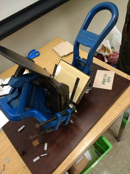
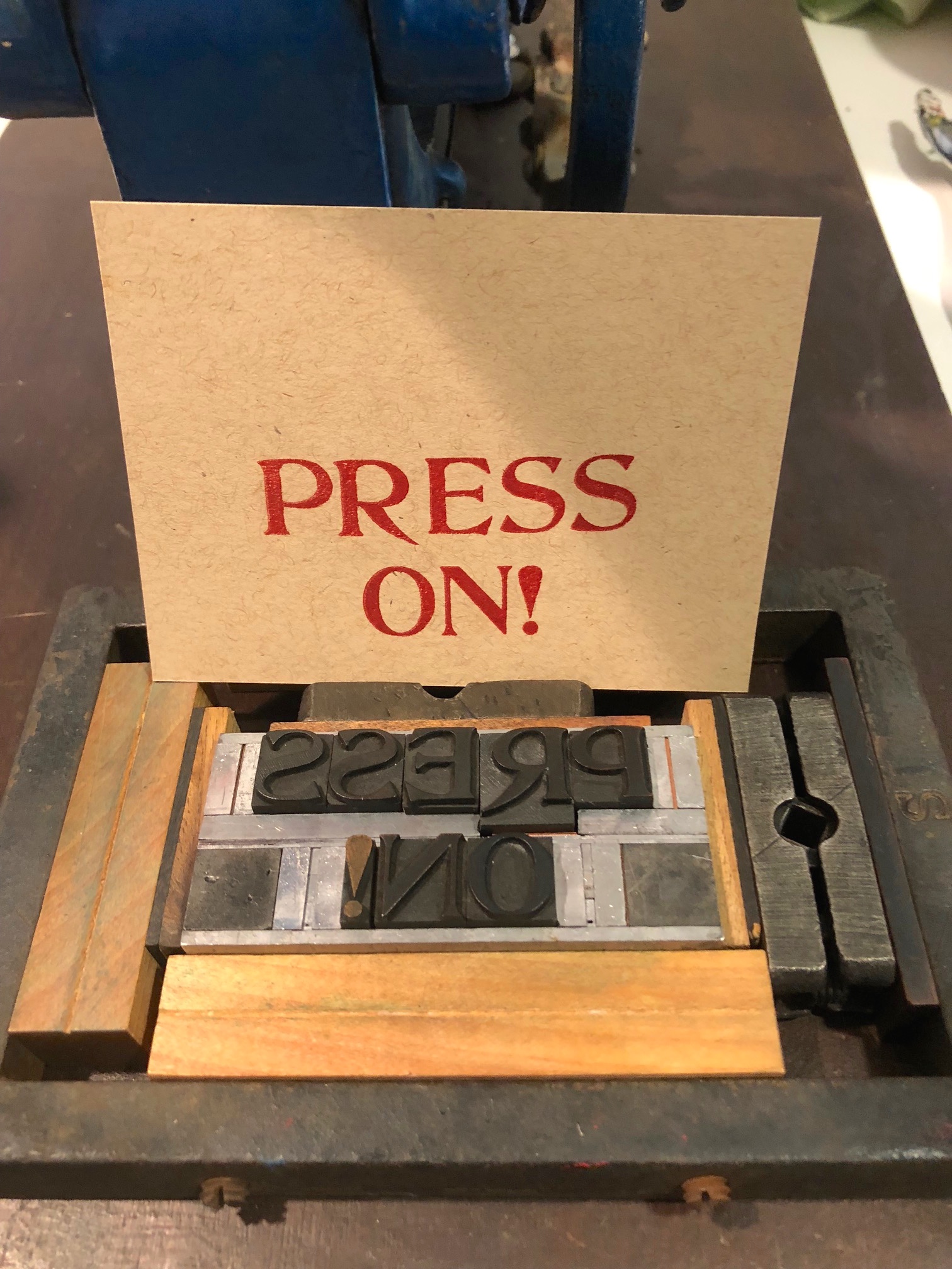
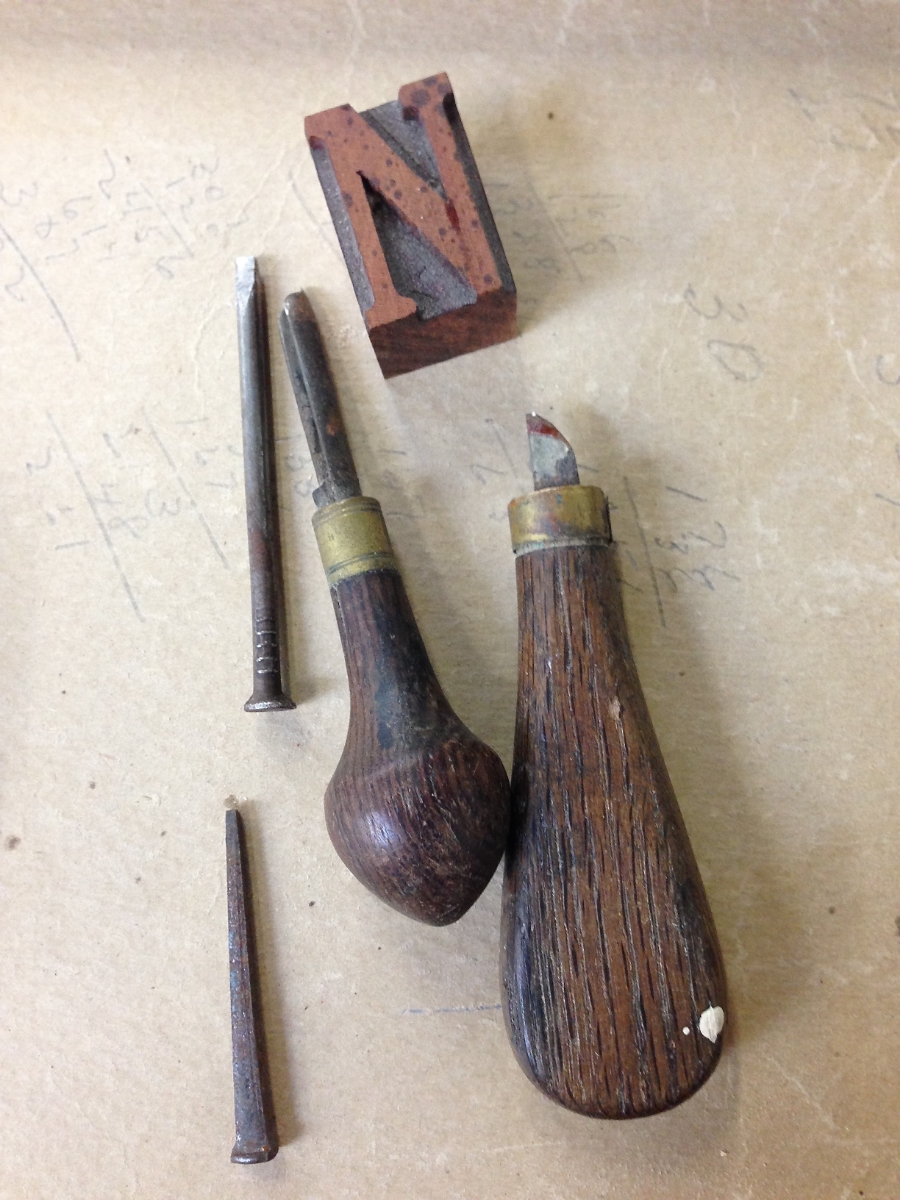
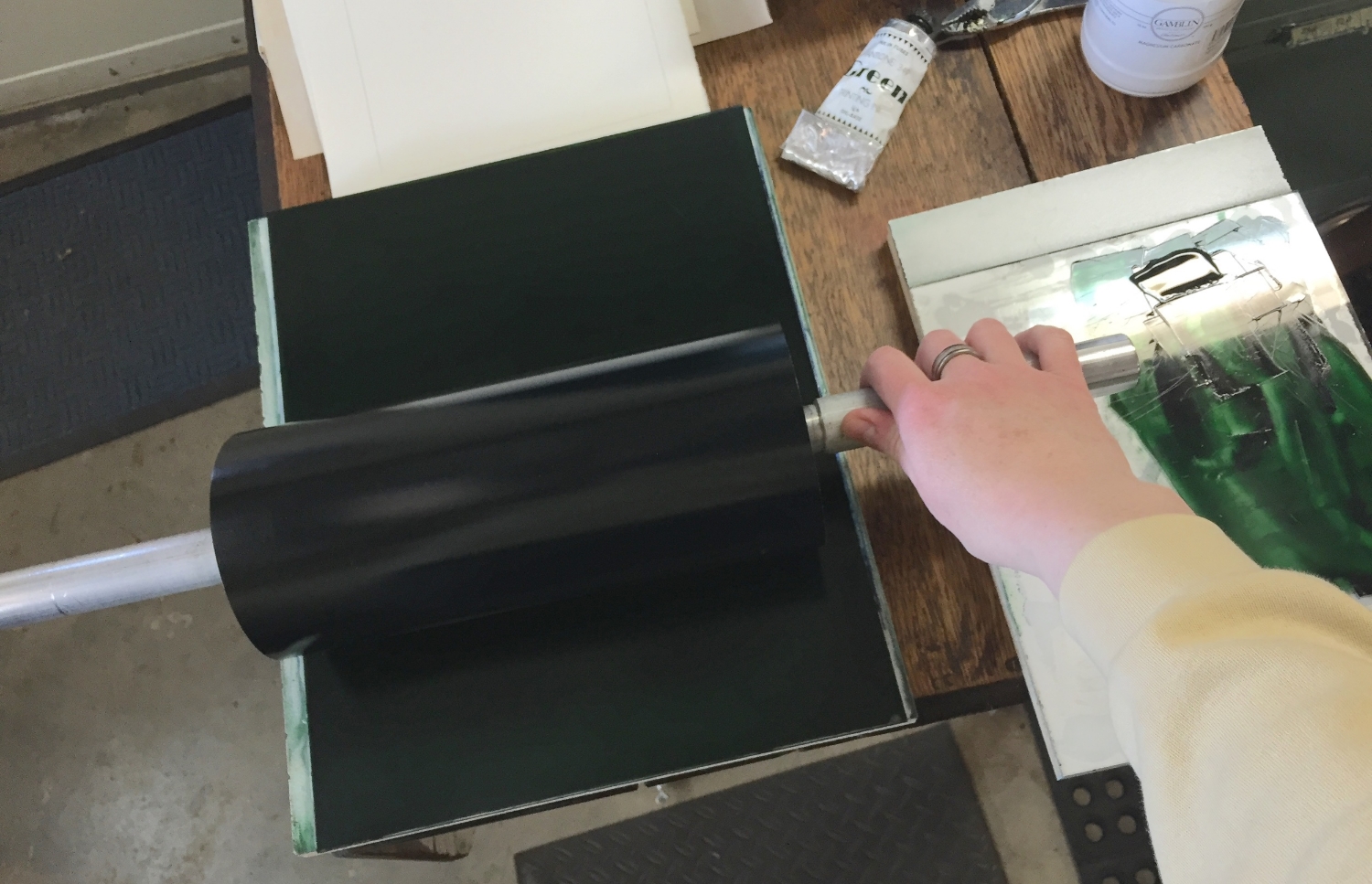
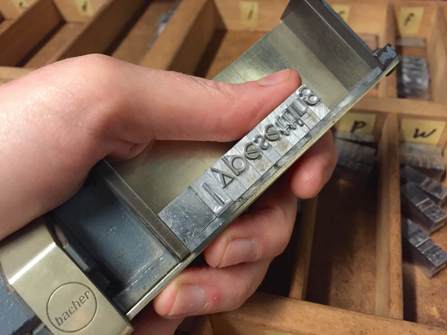
Here are a handful of videos and photos showing various parts of the process of making a letterpress printed book. This particular project, for a private client, involved making one hundred 60-page books and took many months to complete.


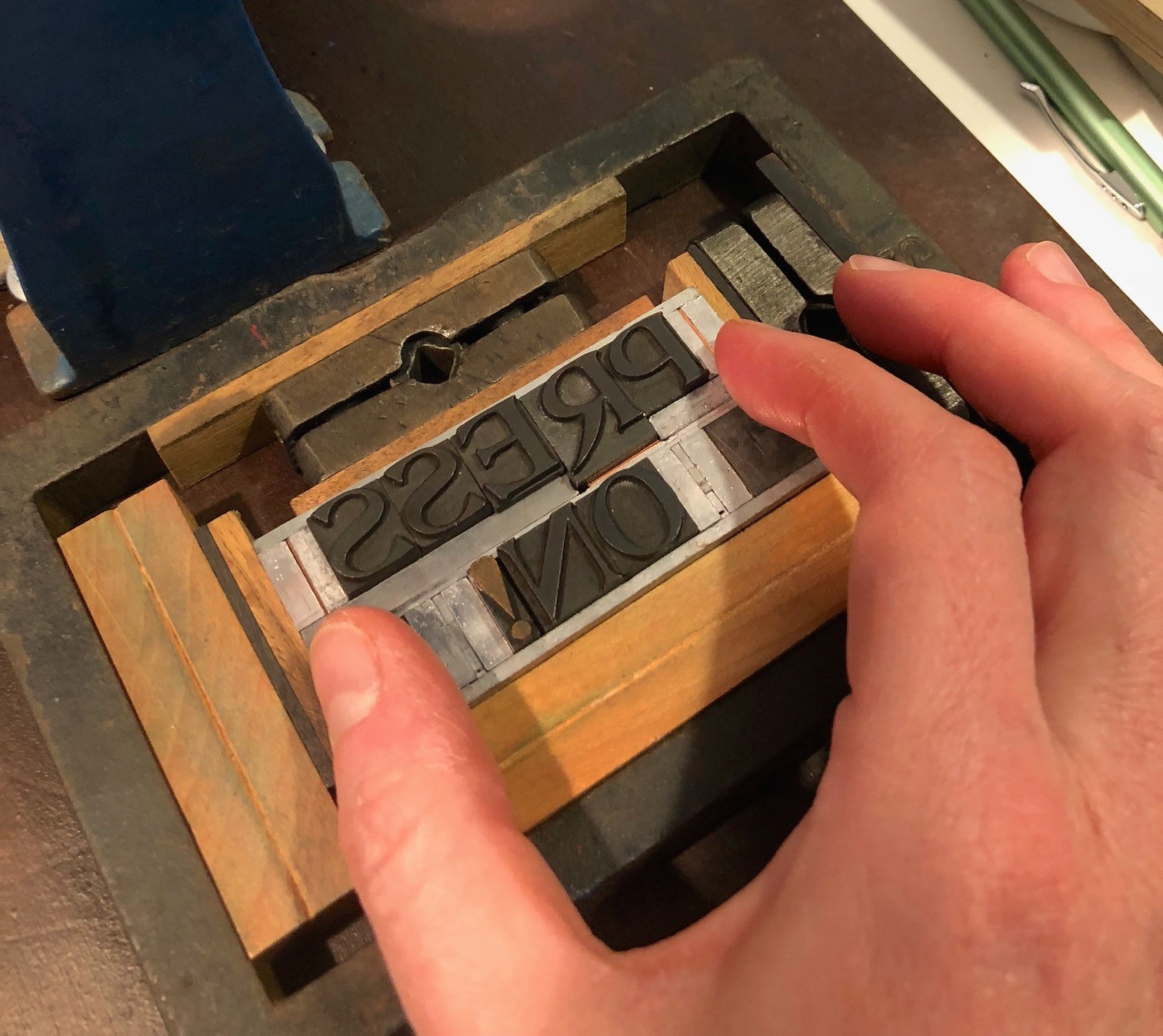
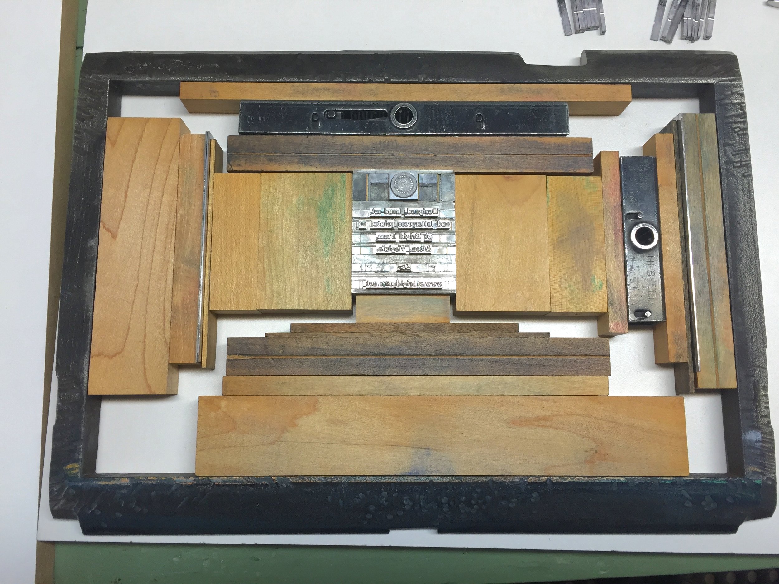
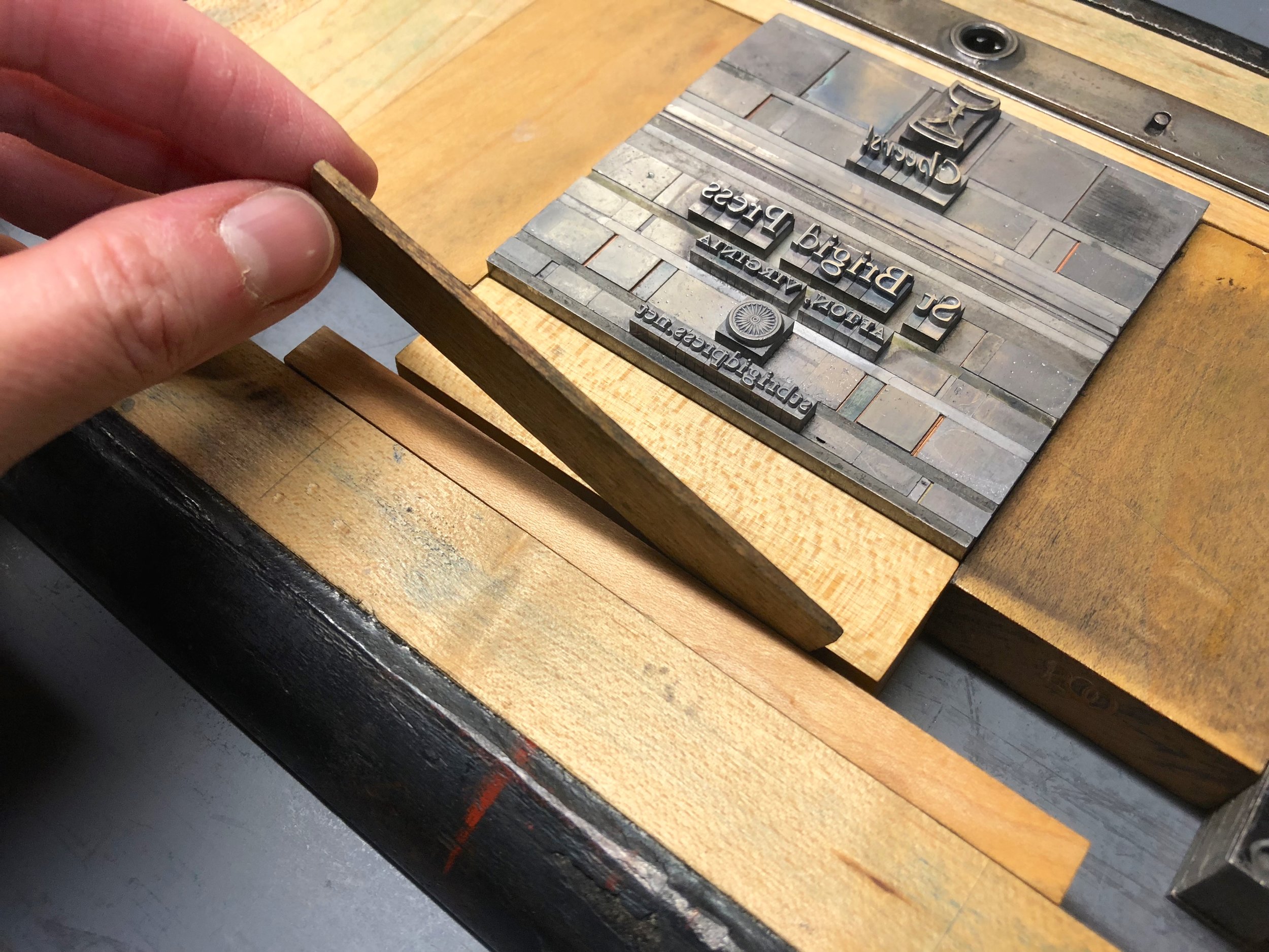
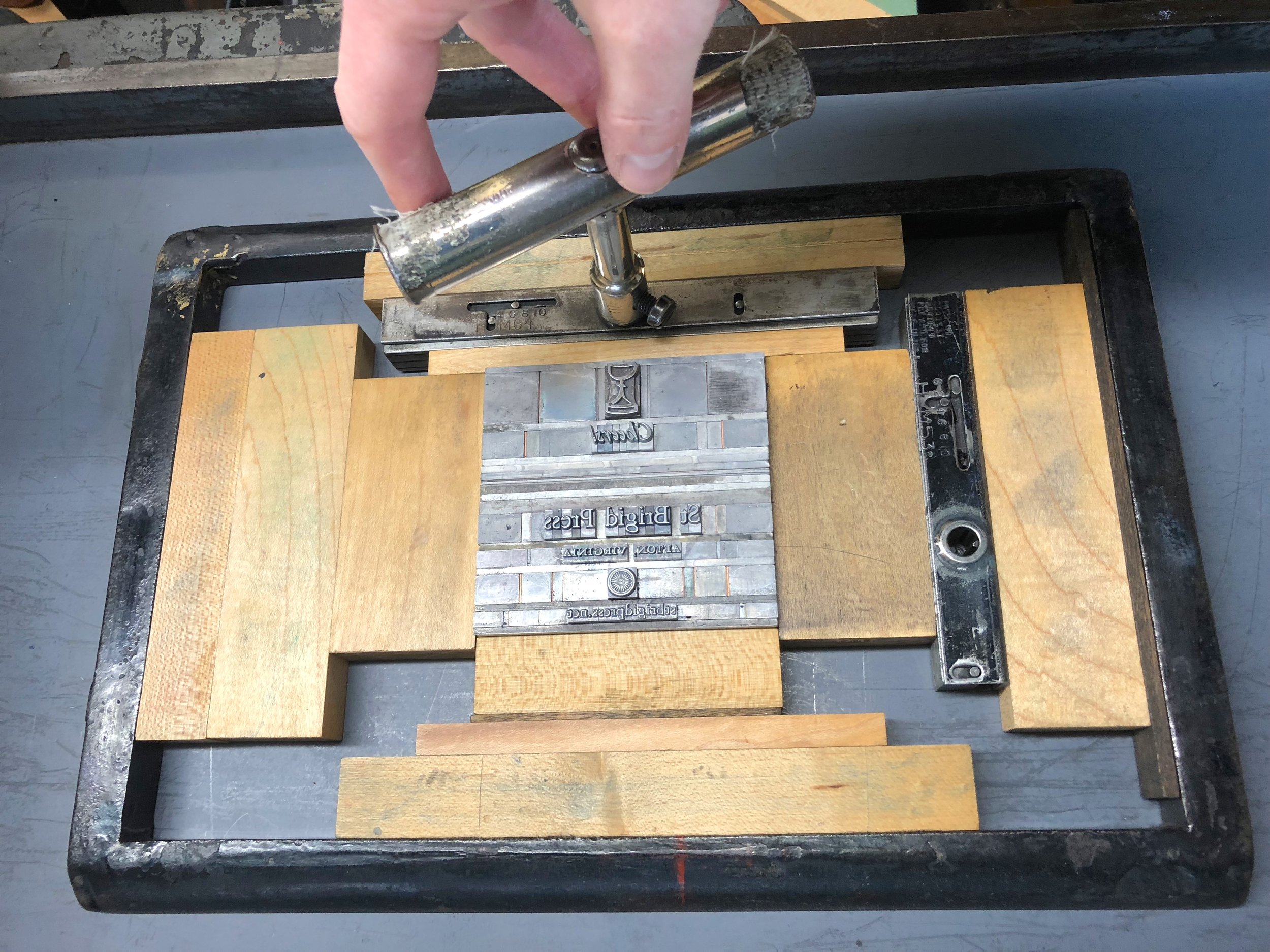
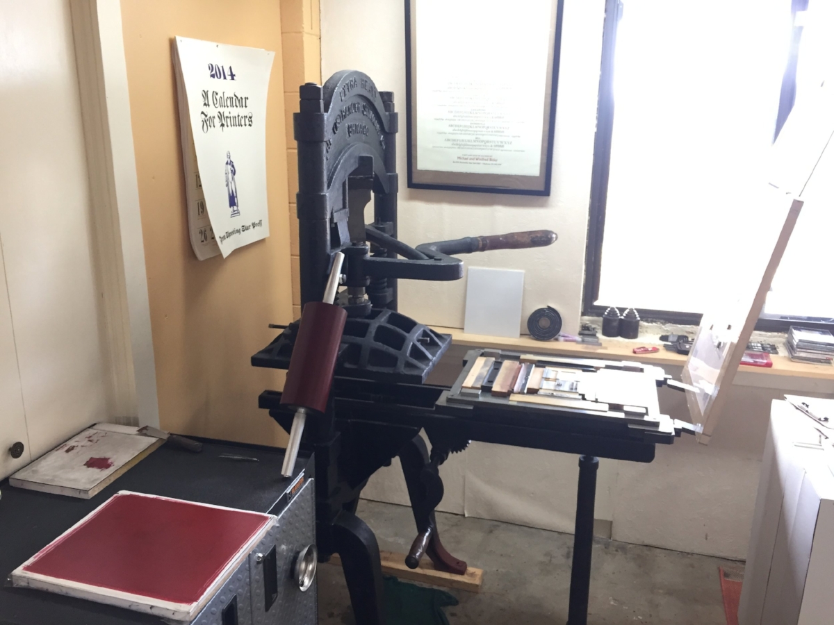
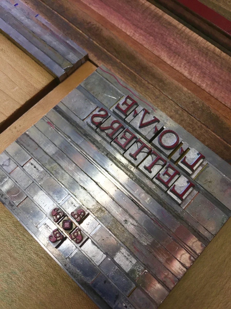
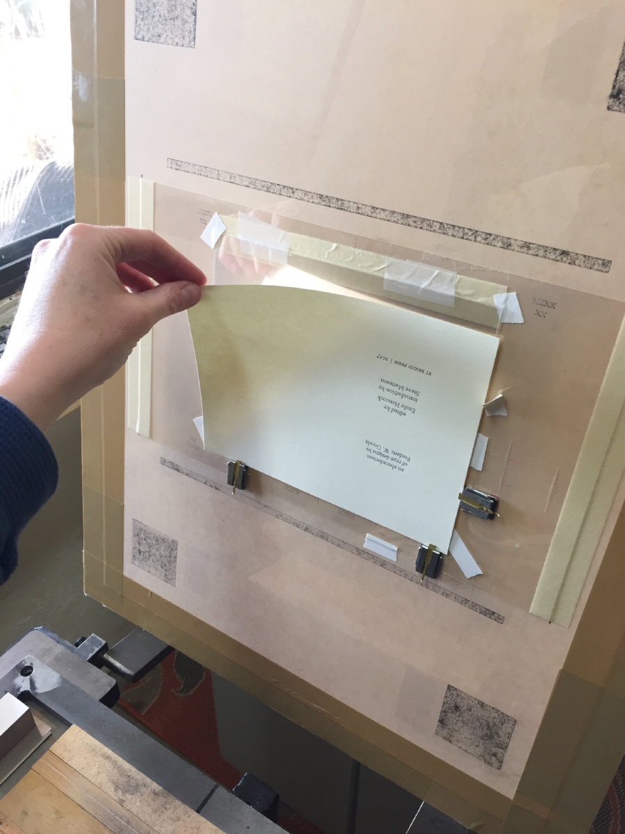
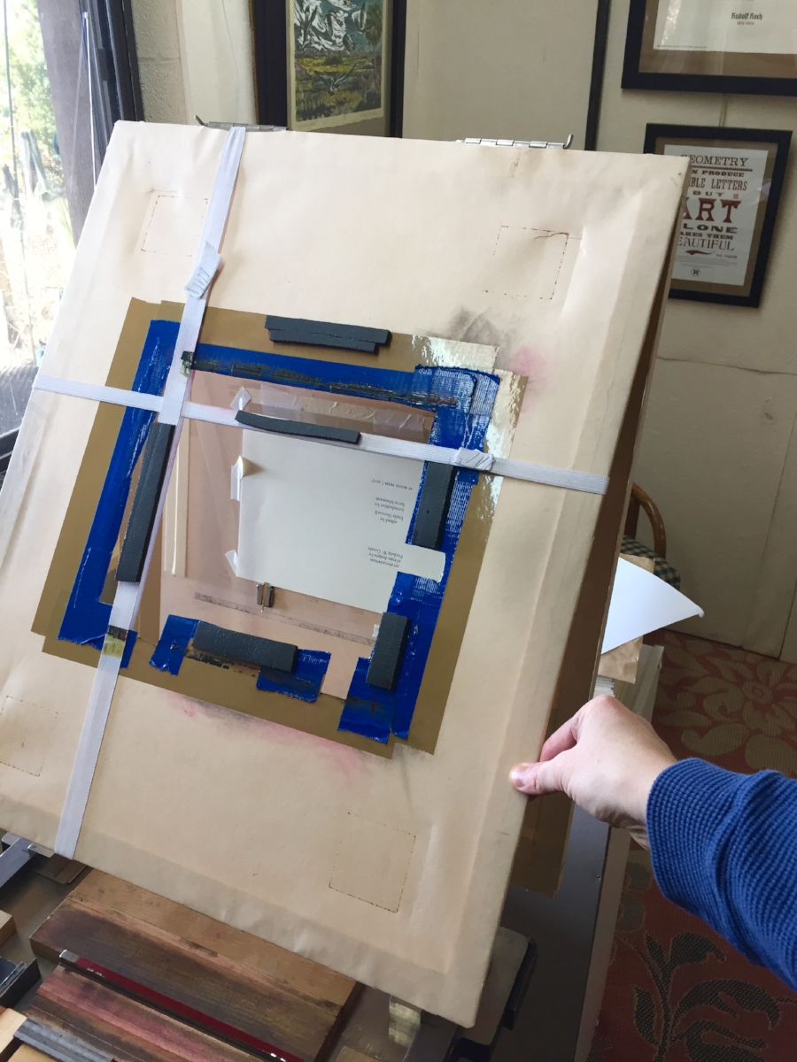
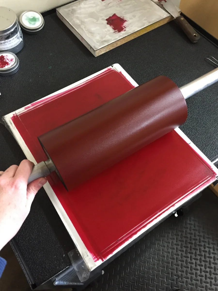
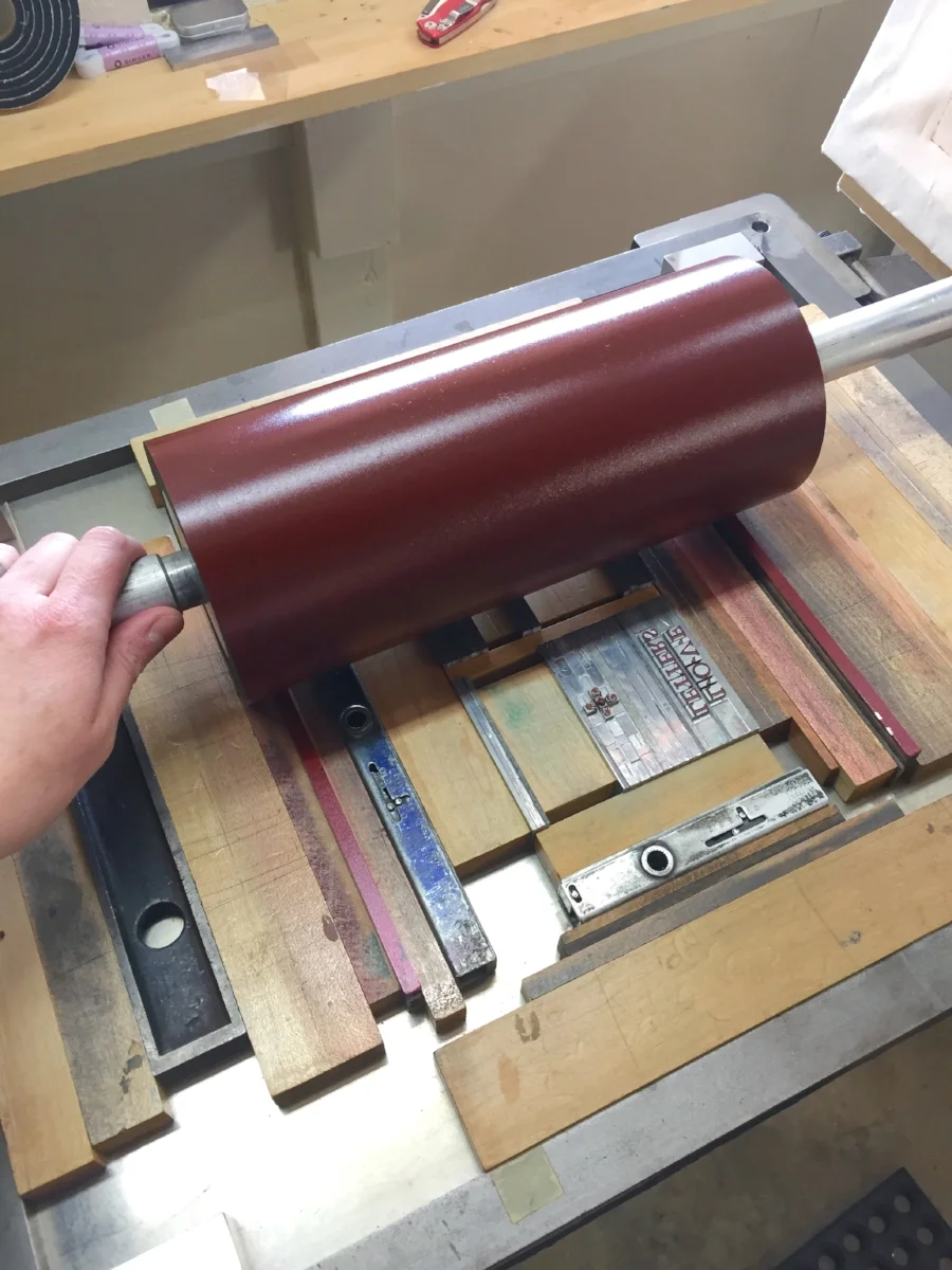
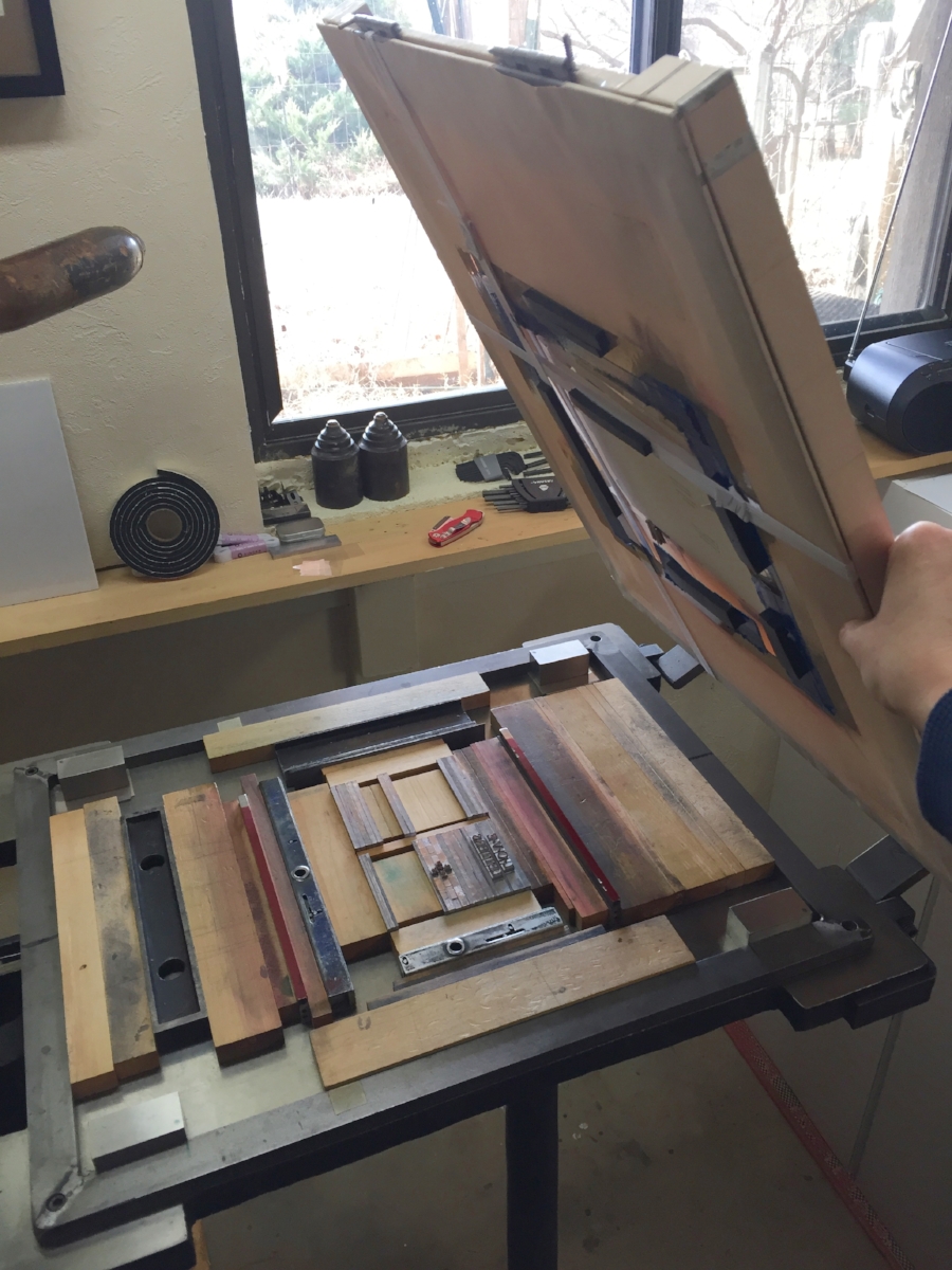
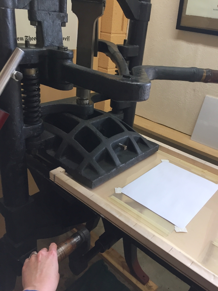
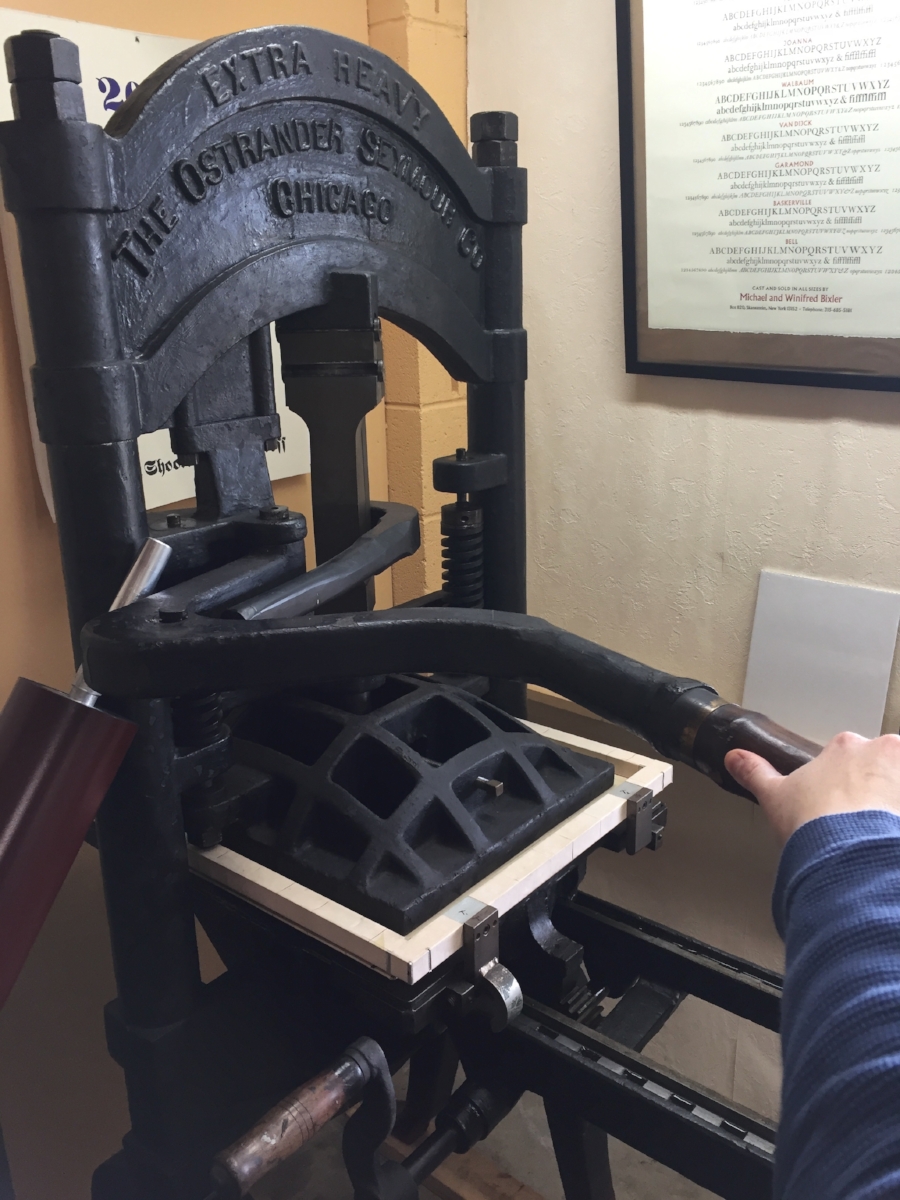
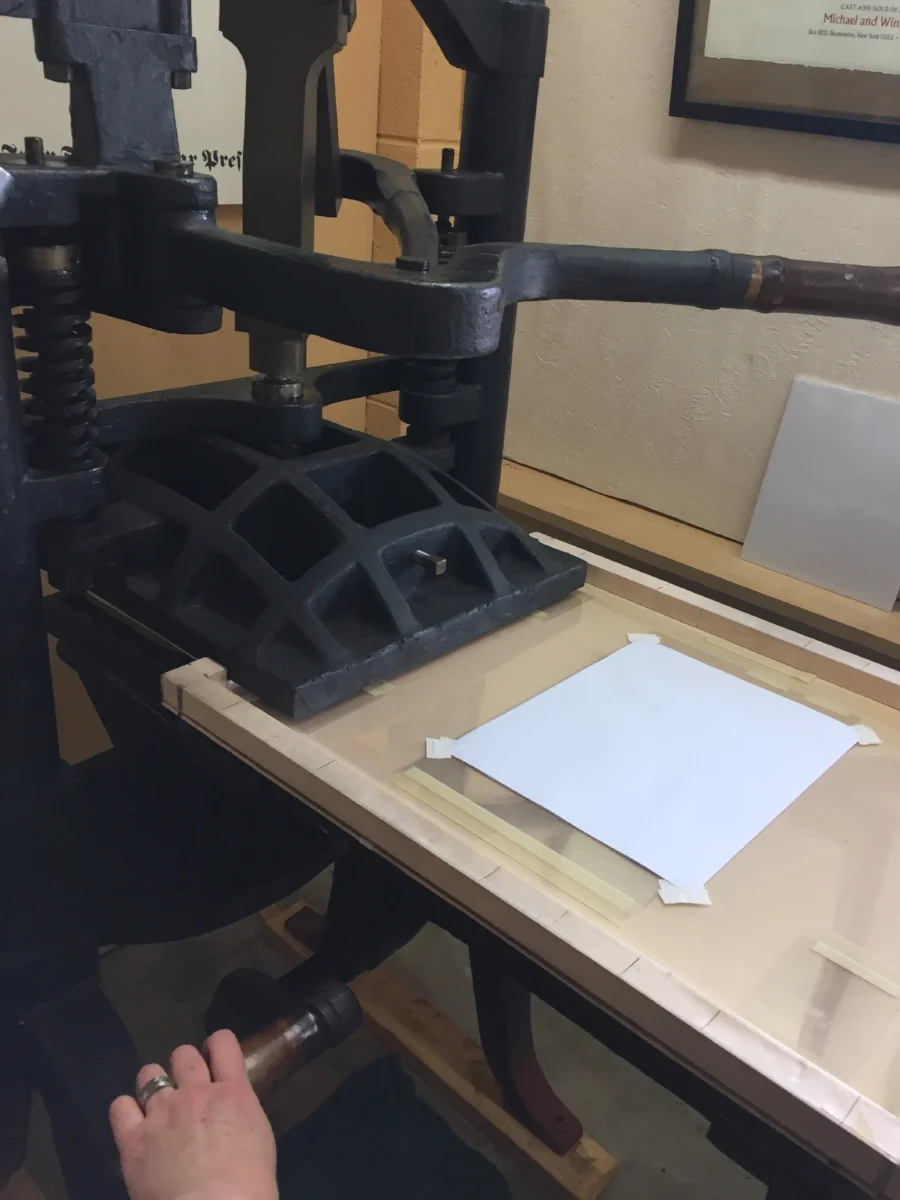
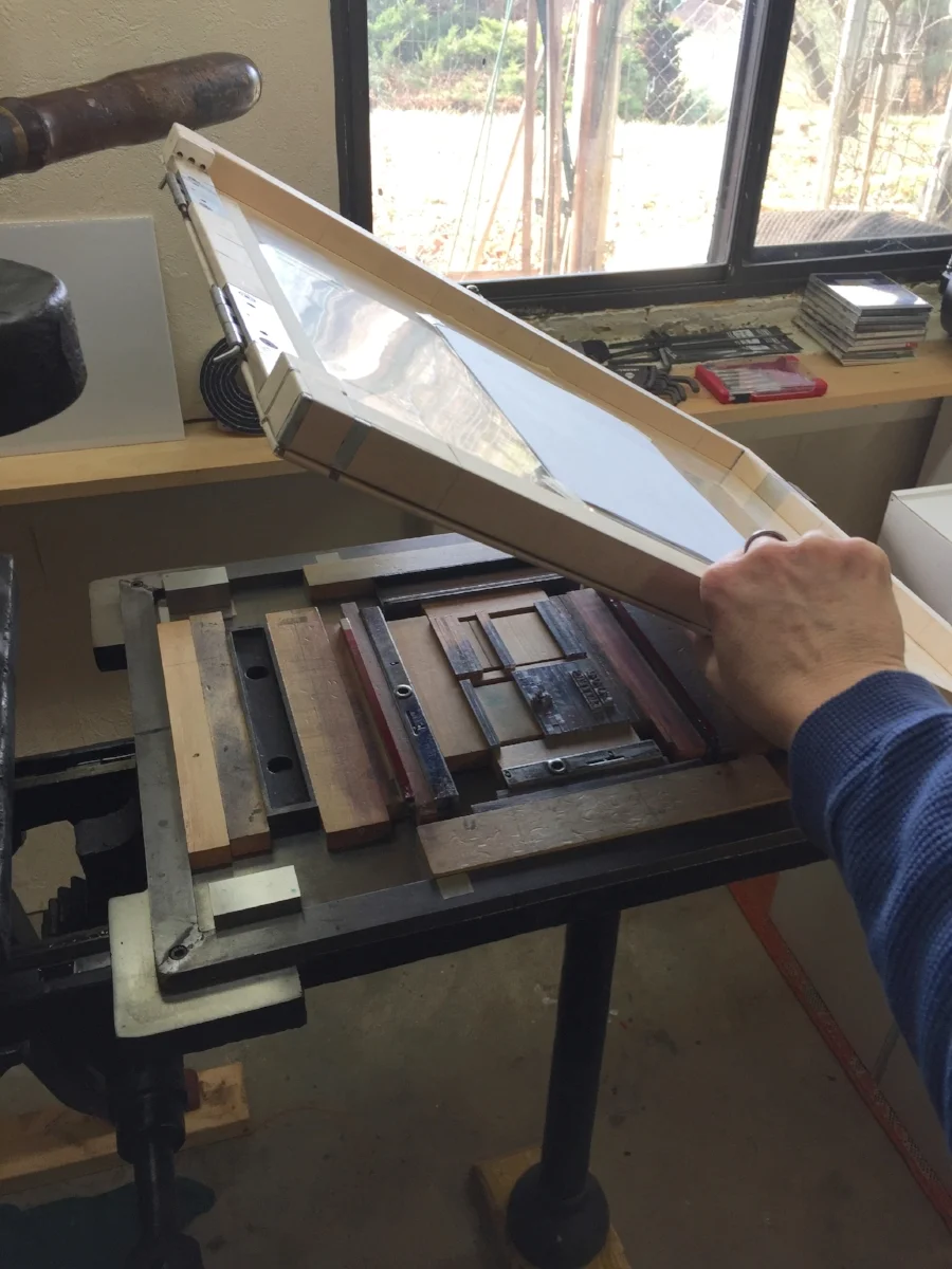
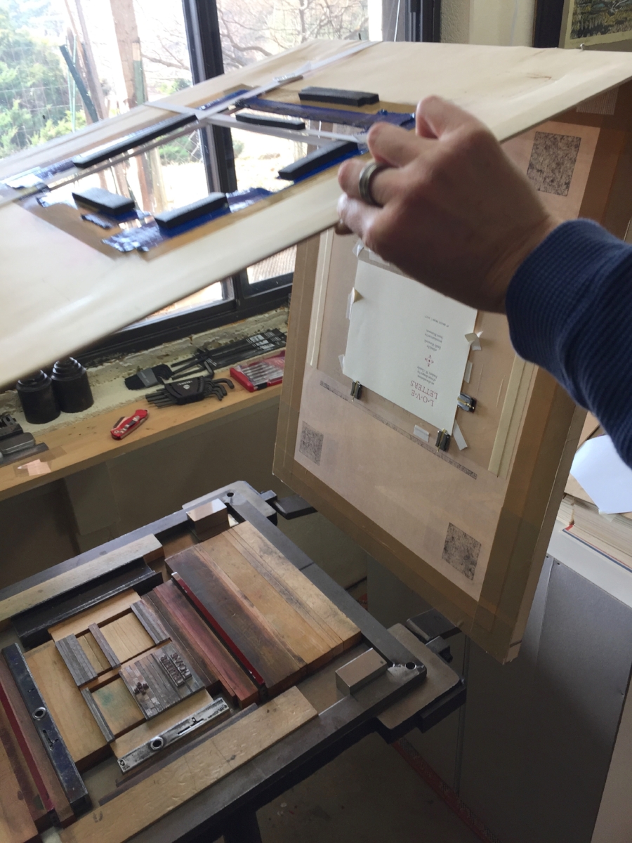
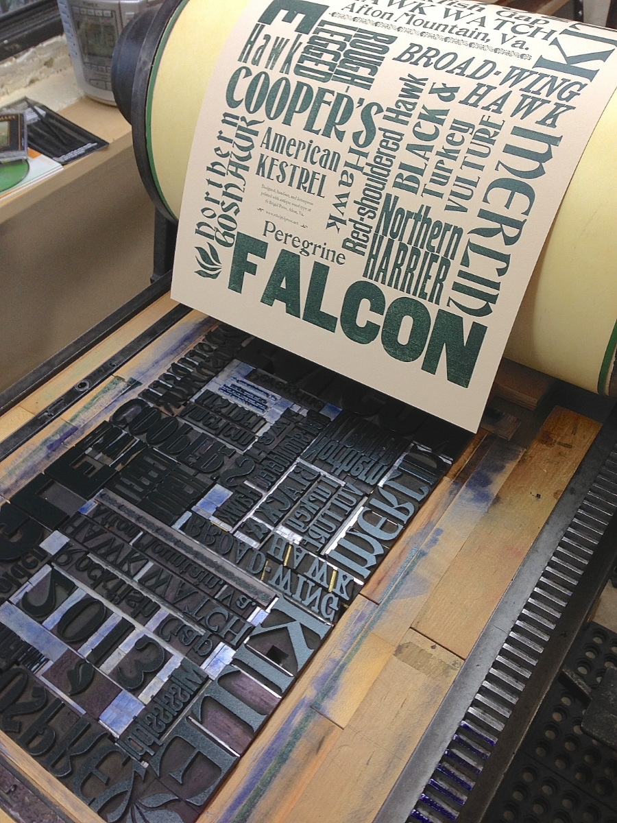
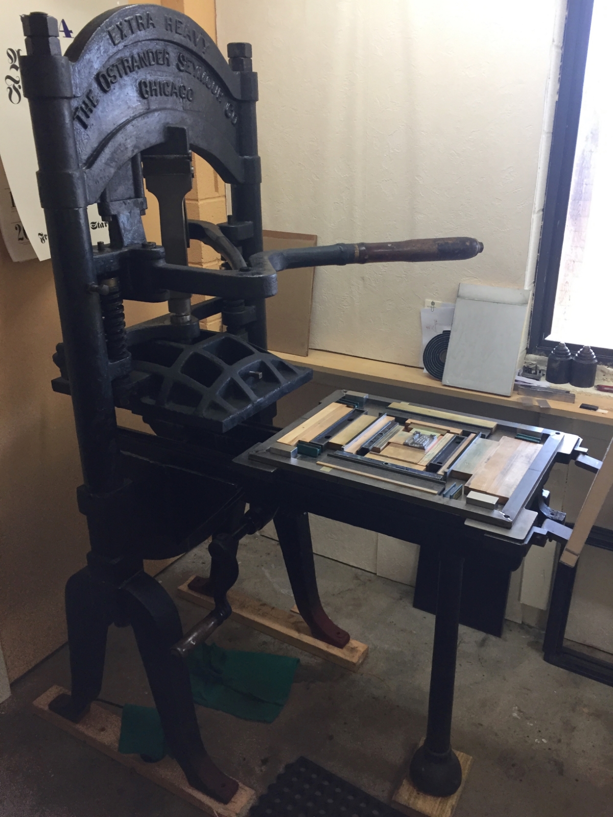
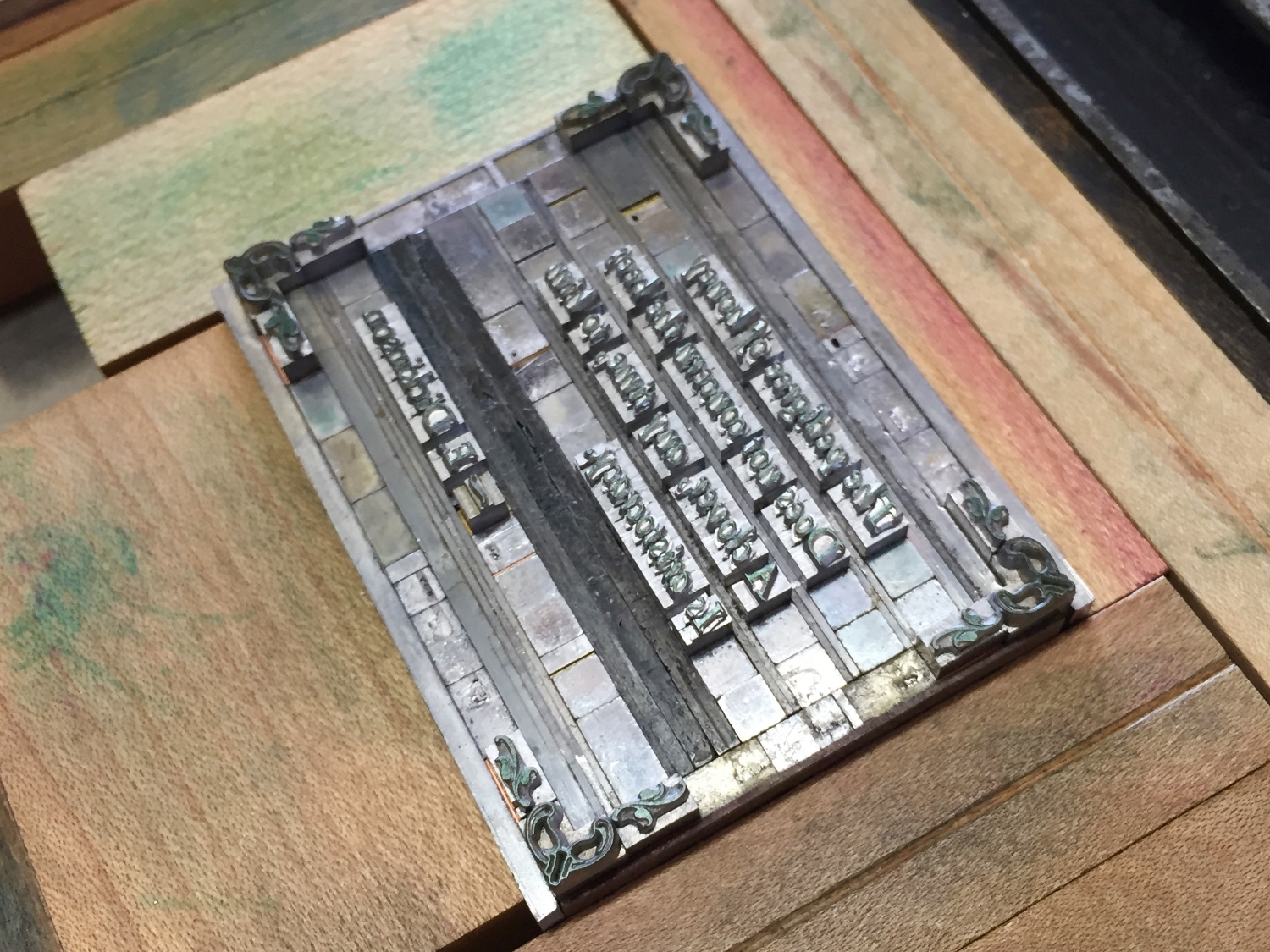
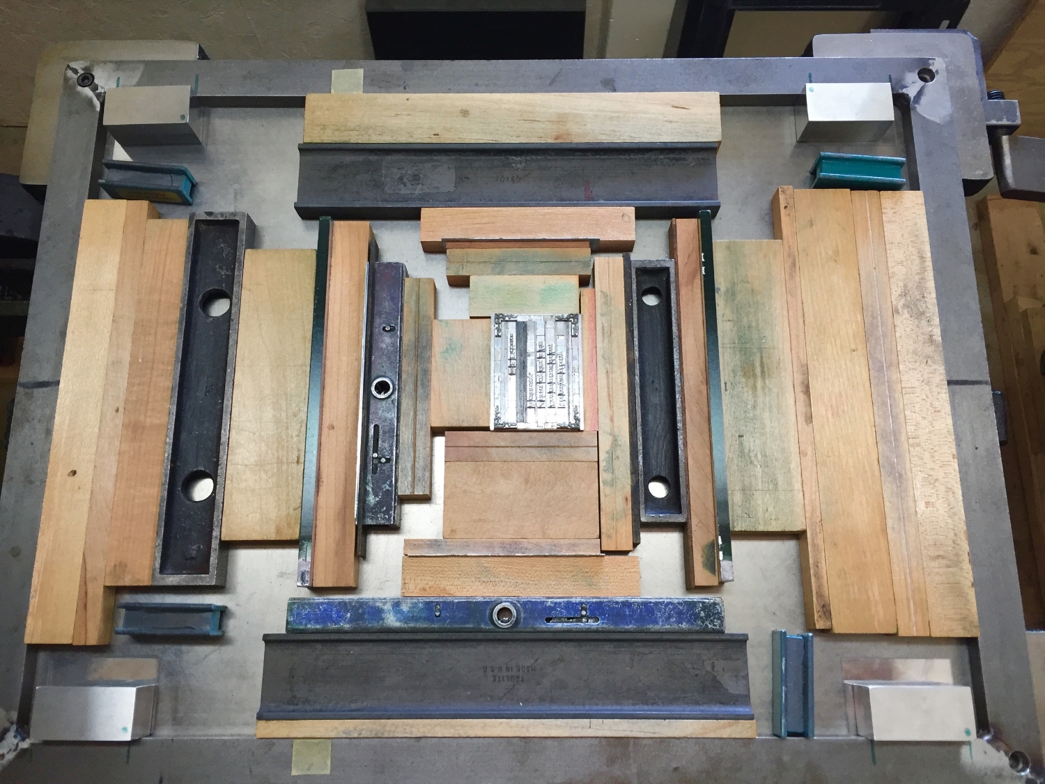
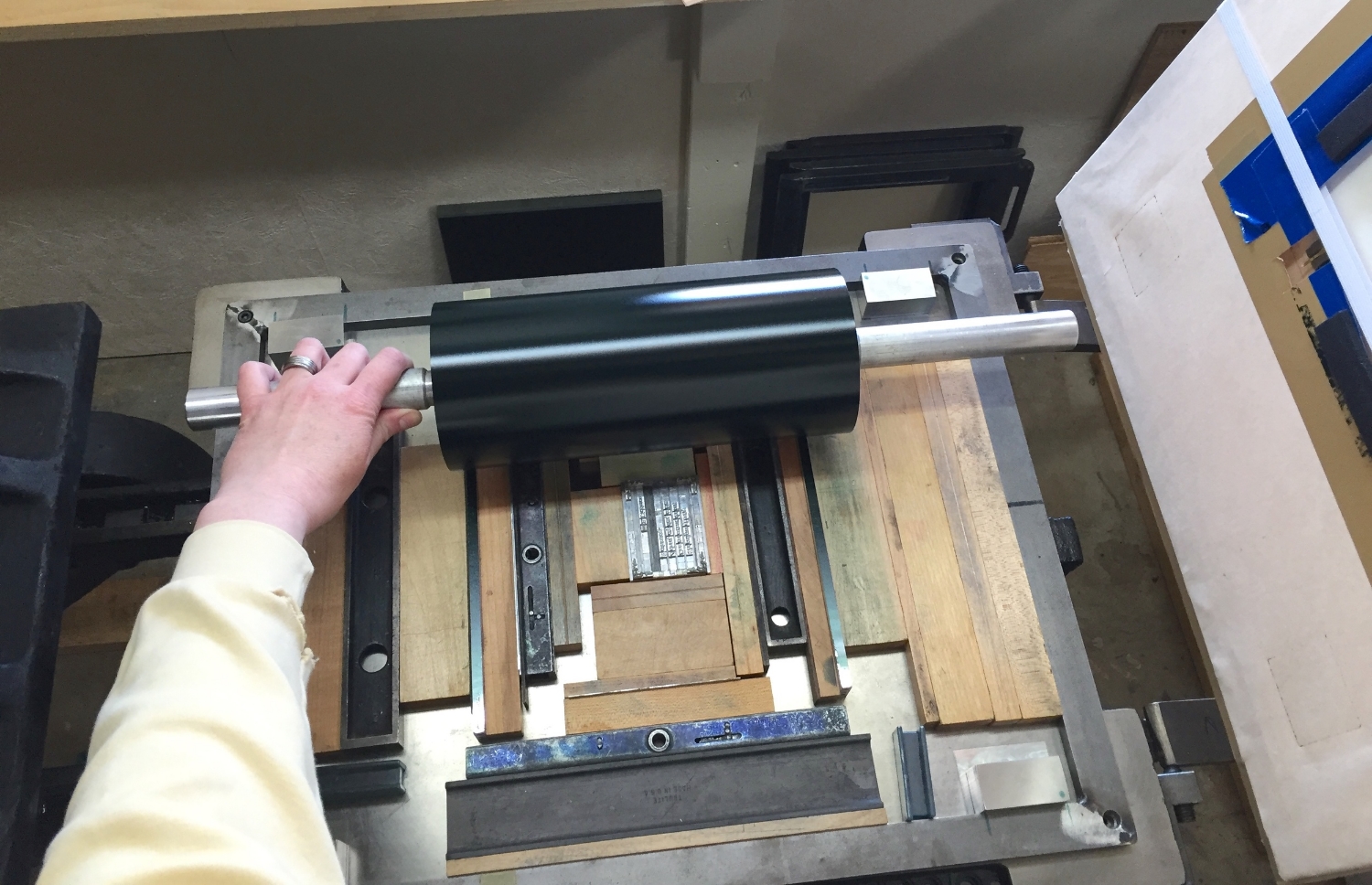
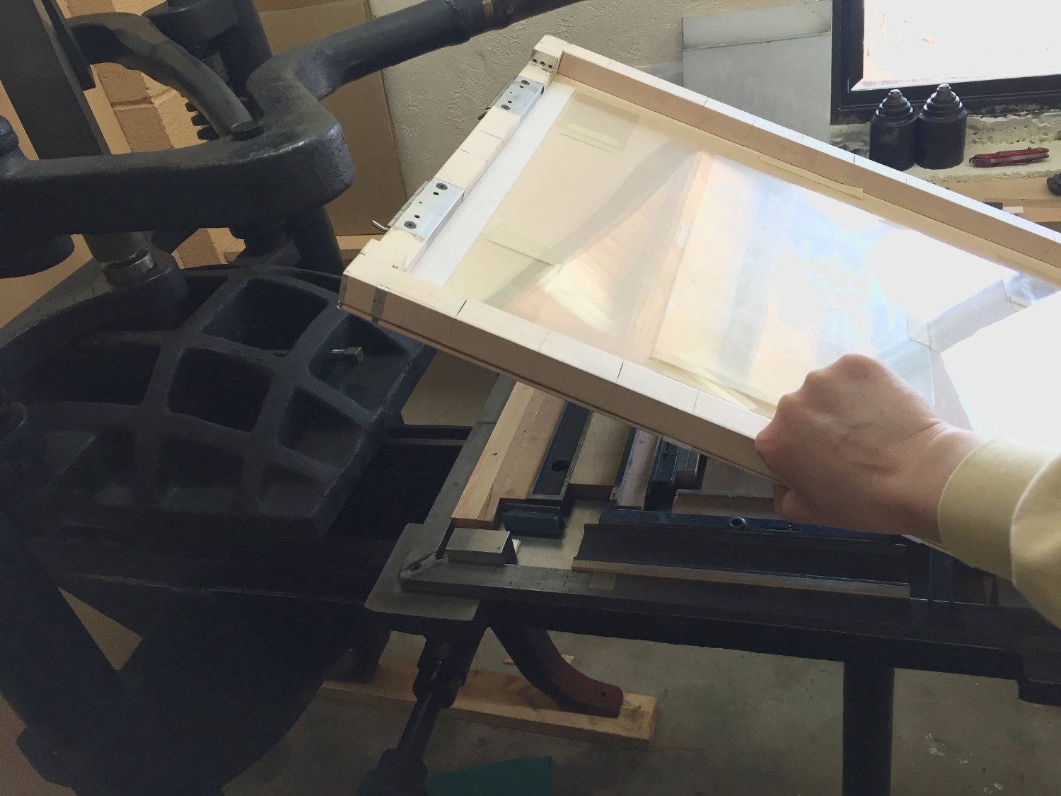
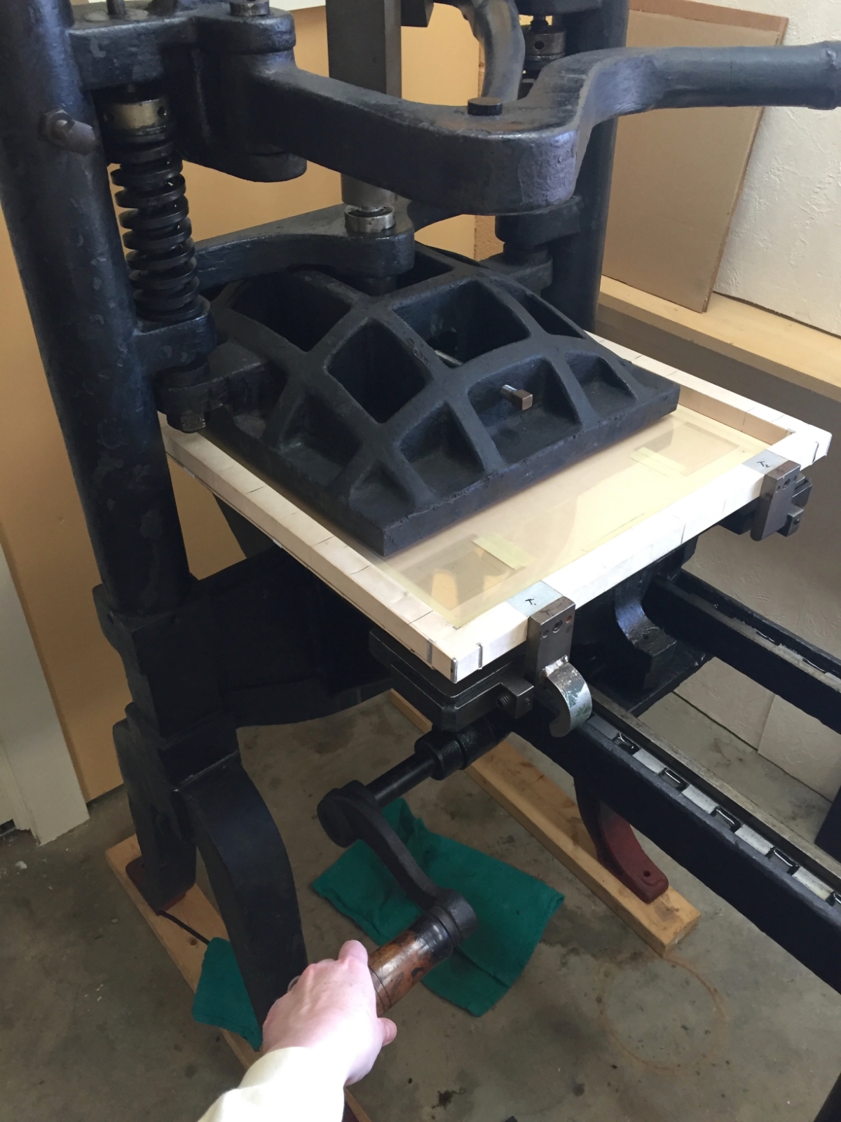
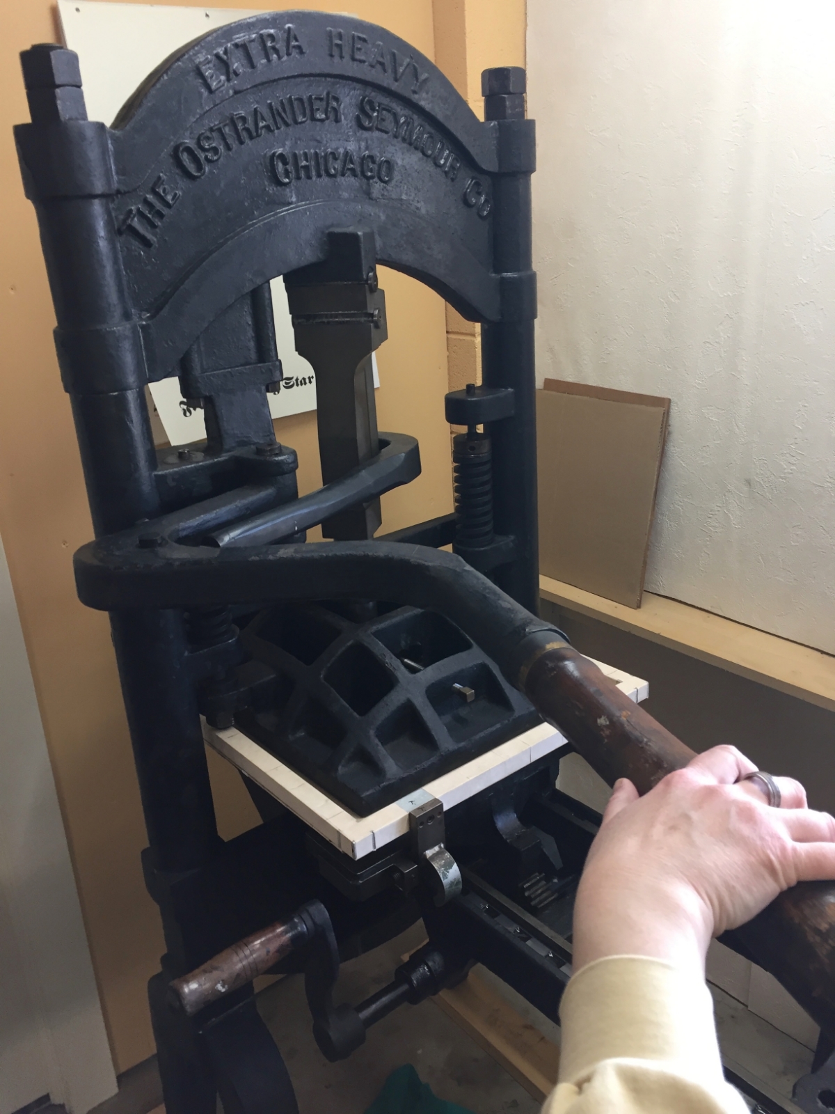
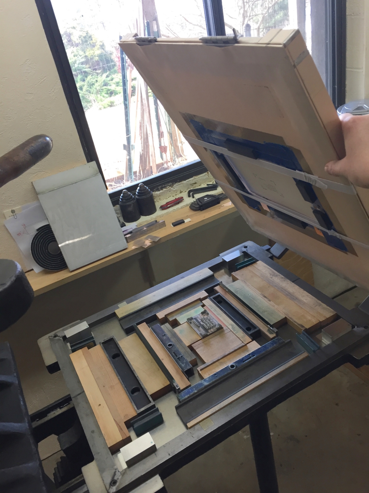
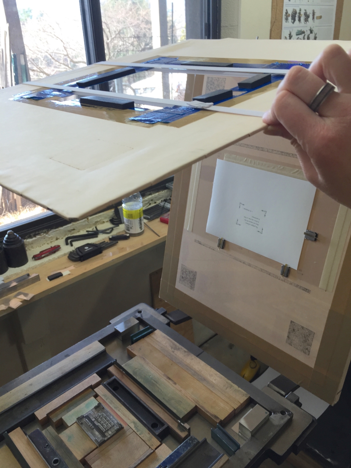
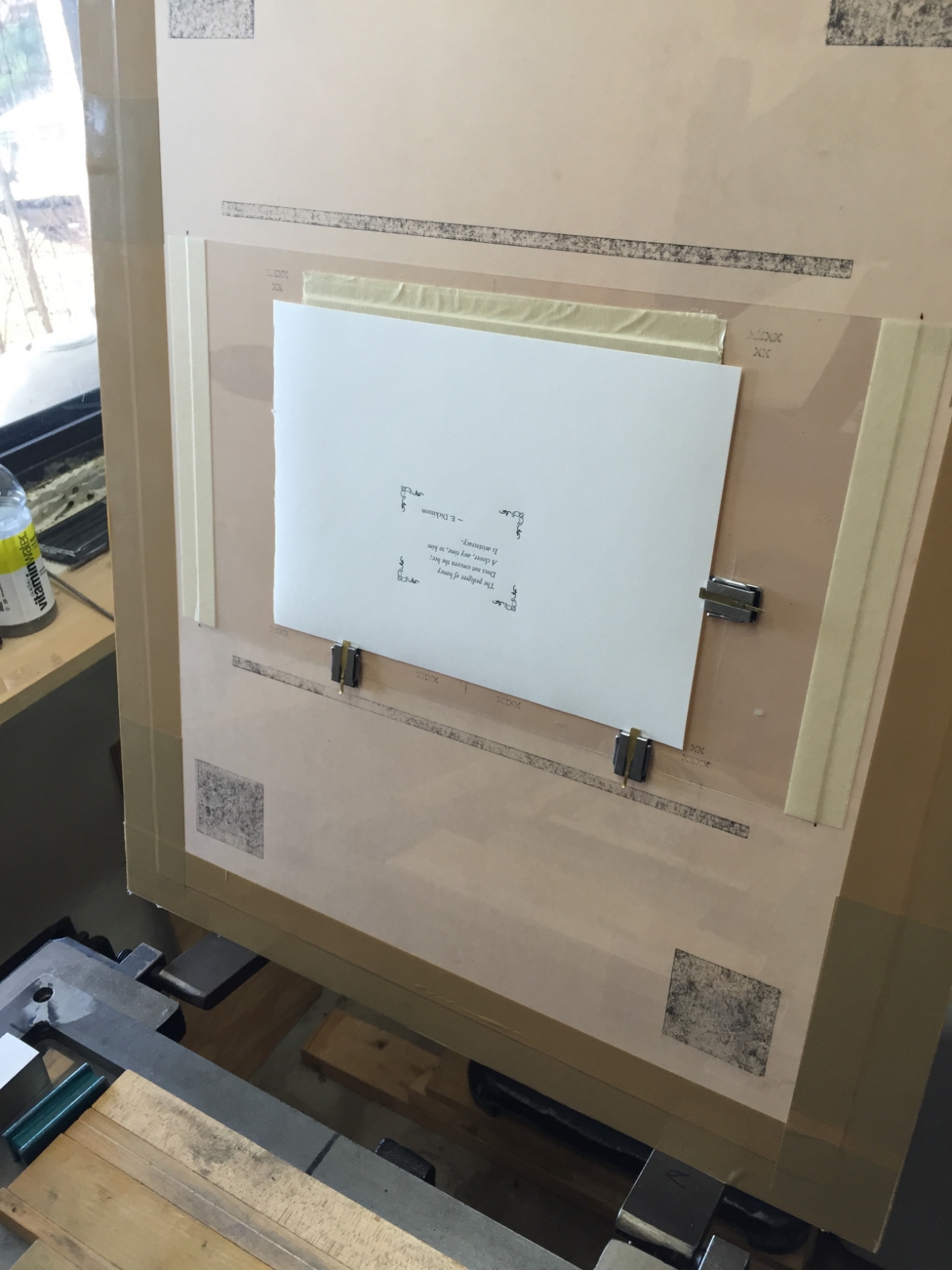
This first video is of me printing some of the book’s pages. Having already hand-set the text with metal type and locked that type up on the bed of the printing press (a Challenge model 15MP), I am cranking the sheets of paper through the cylinder press, one by one, to letterpress print that type.

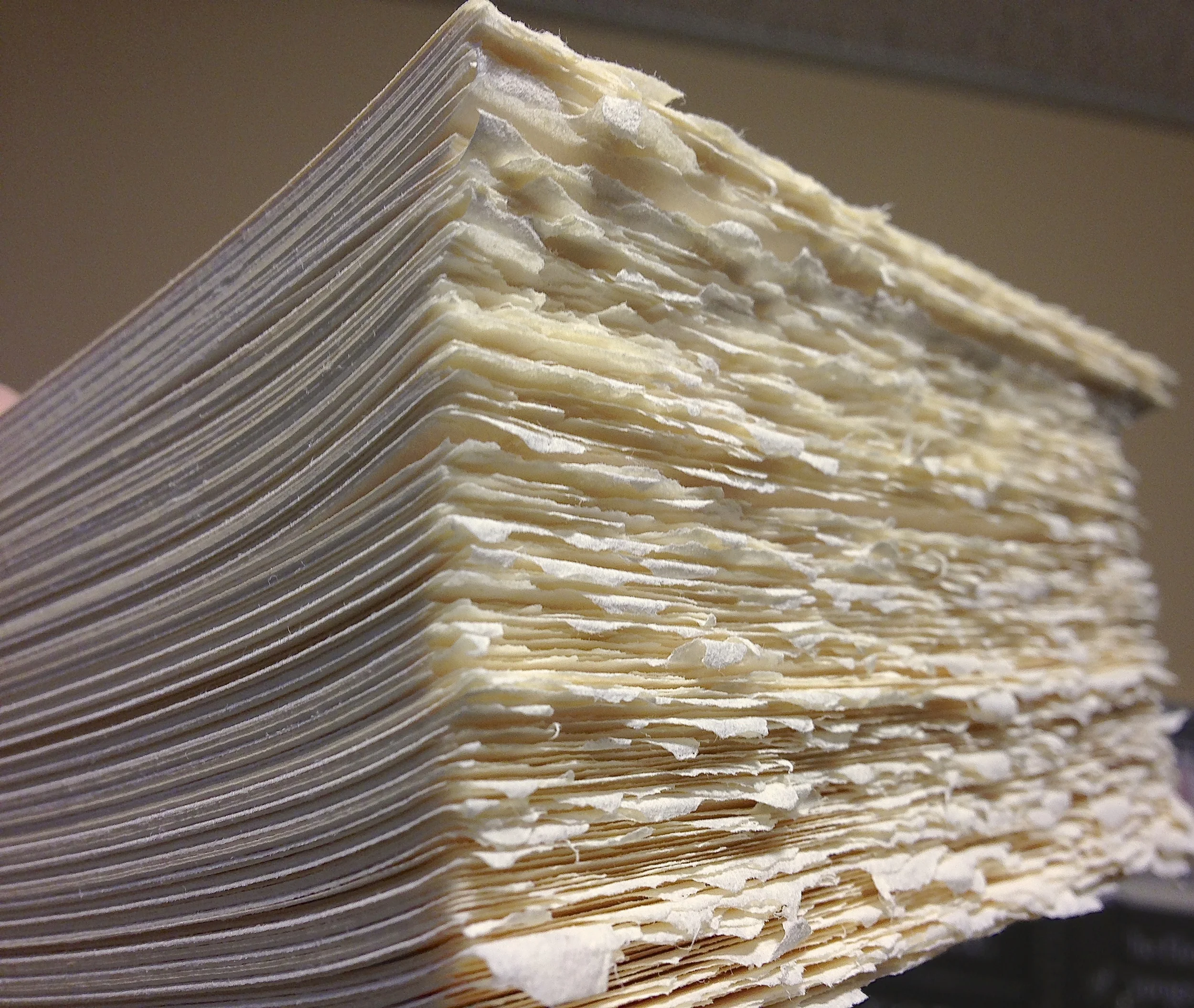
The next photo and video shows “The Boss”, a guillotine paper cutter with a 23-inch blade, made in St Louis, Missouri, around 1895. It makes short work of trimming the printed book pages.

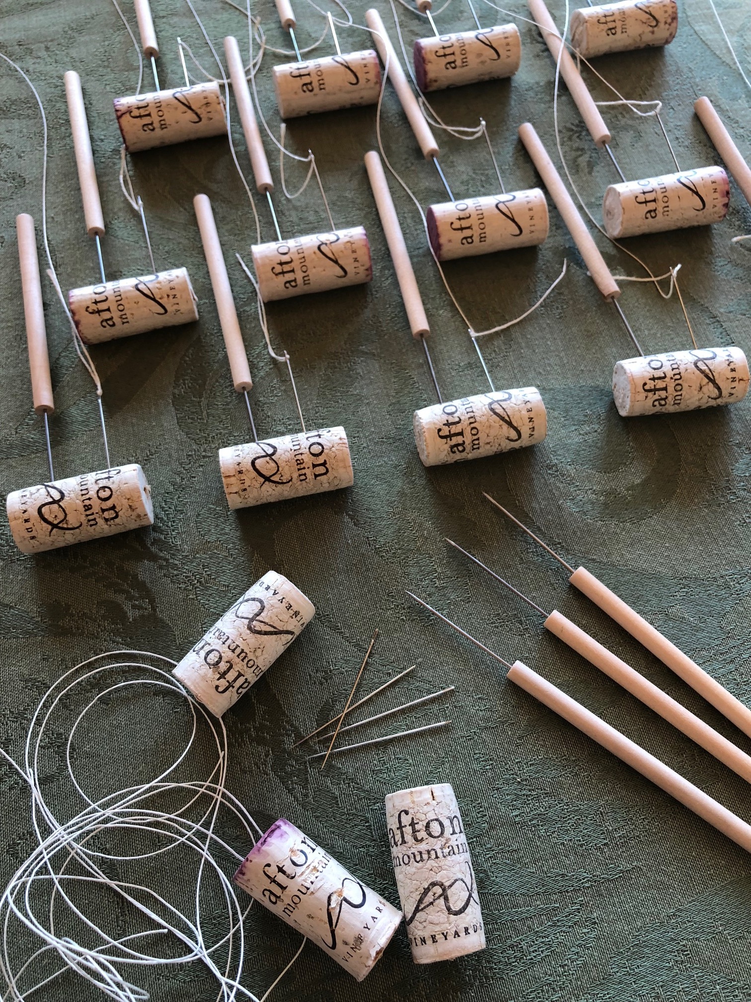
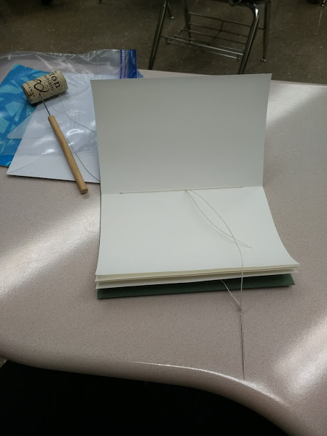
For those who like to watch paint dry, here’s a nearly-nine-minute video of me hand-sewing the printed pages together to make one (out of a hundred) sturdy book. Actually, this is one of the most enjoyable parts of the process to me!

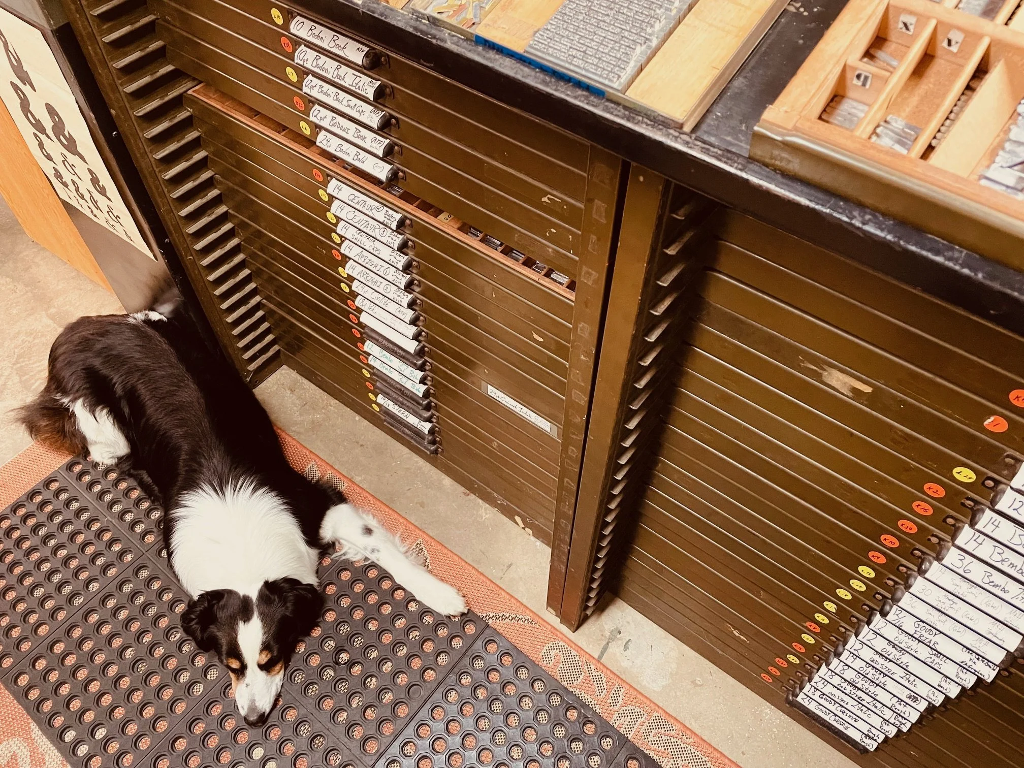
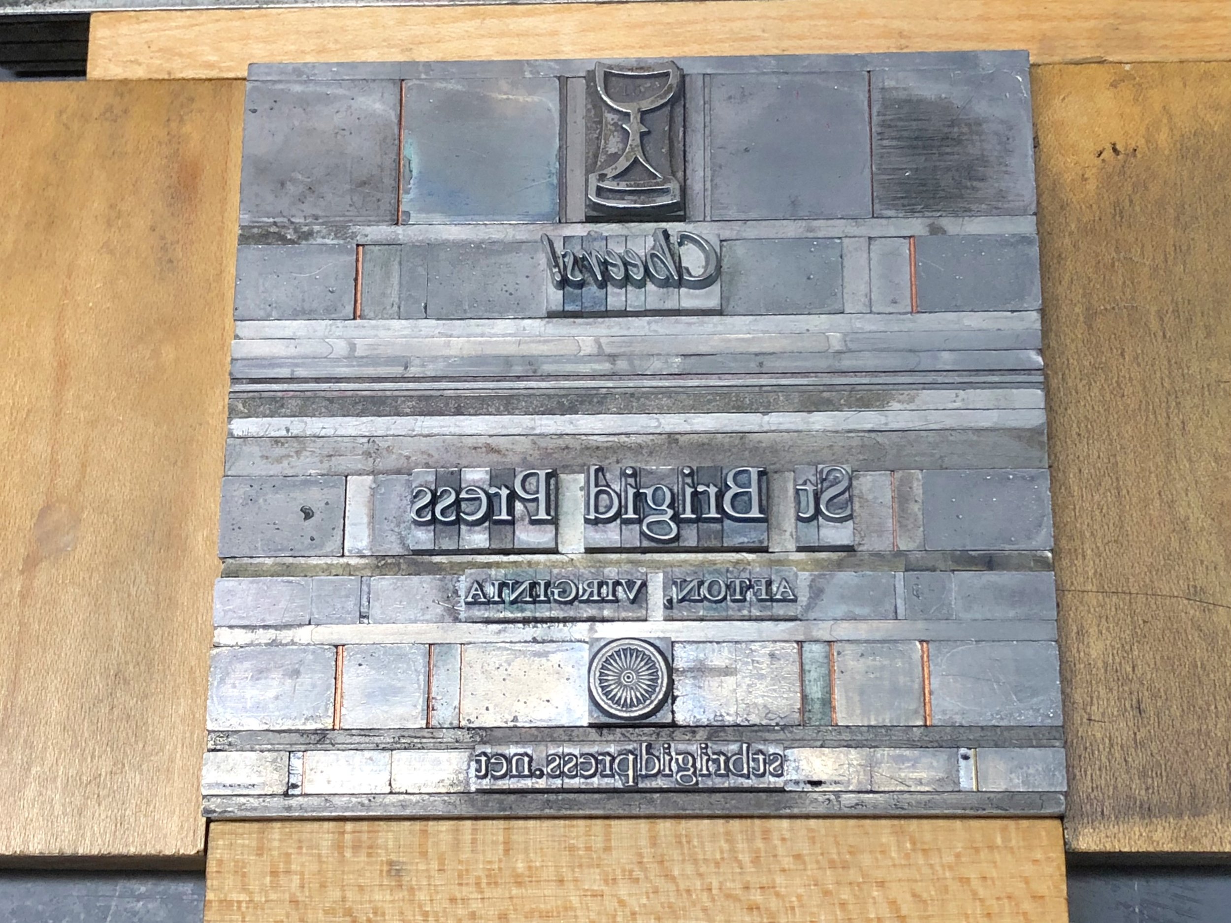
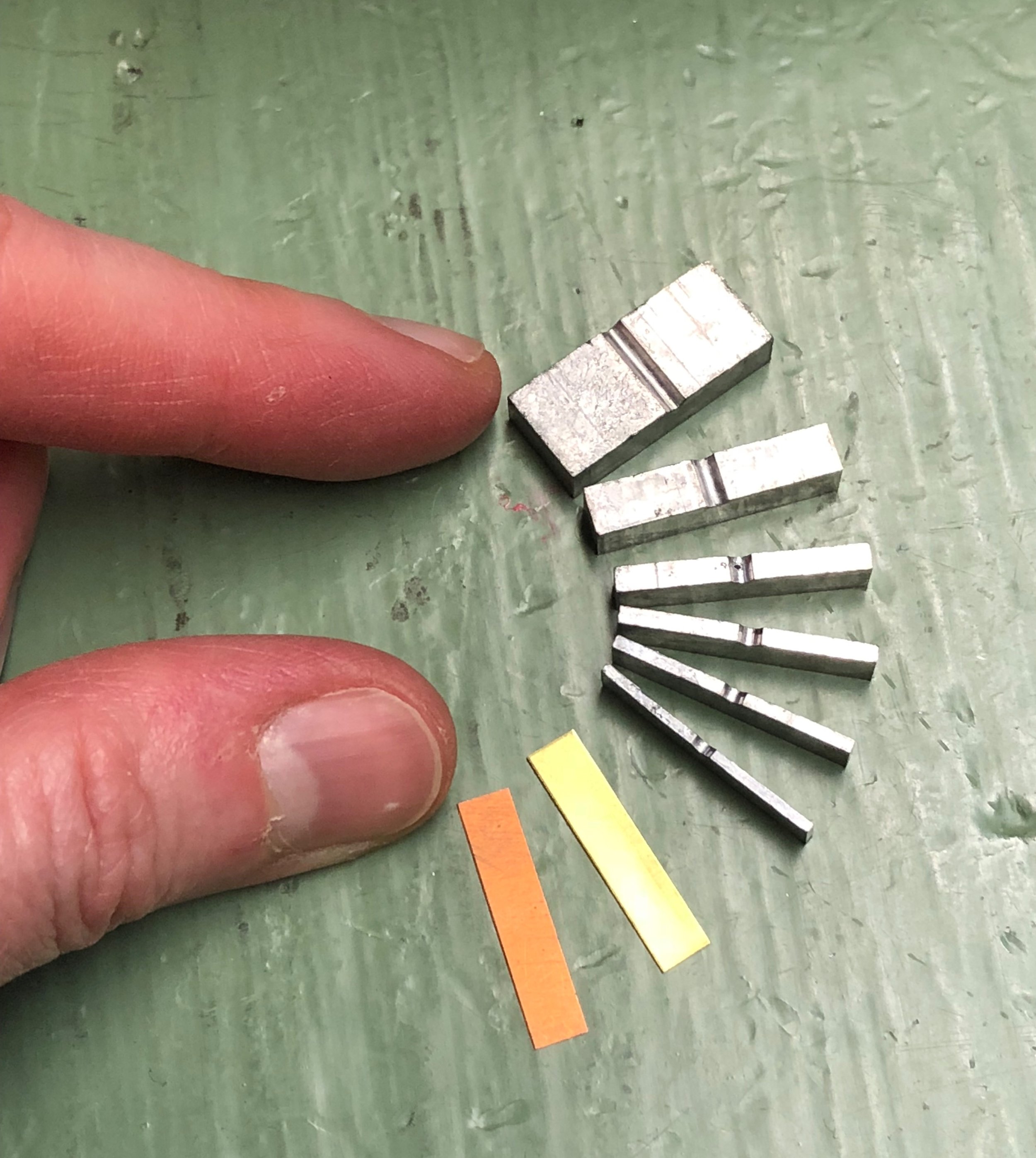
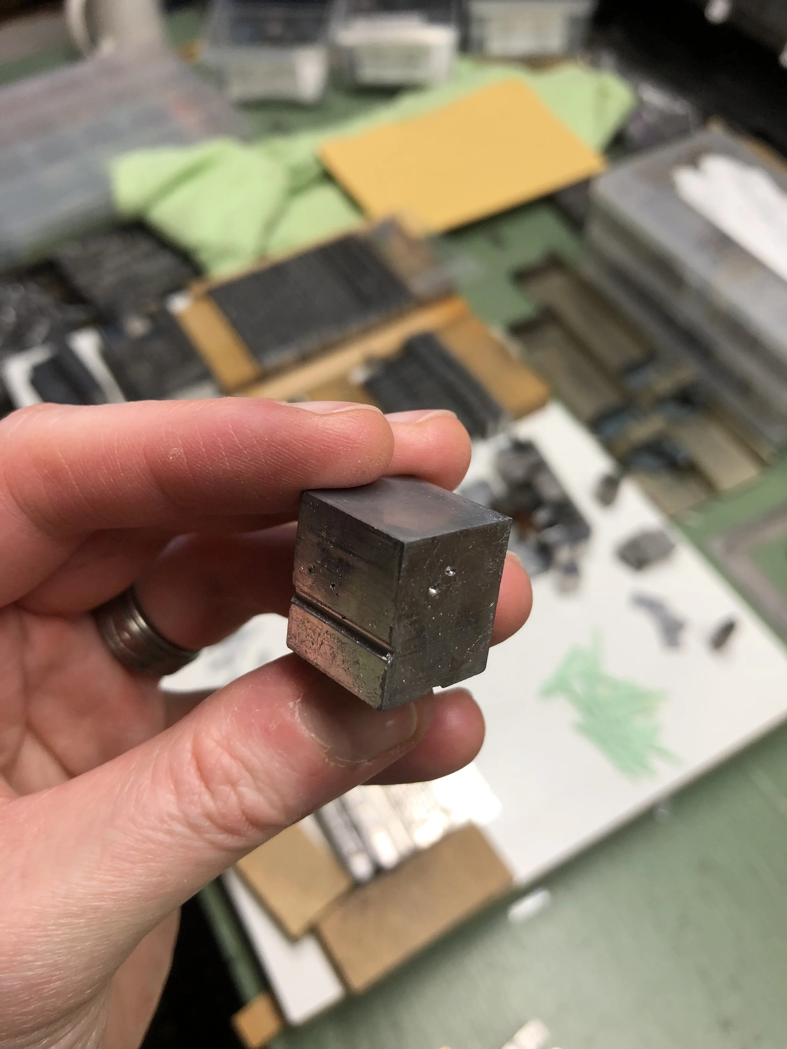
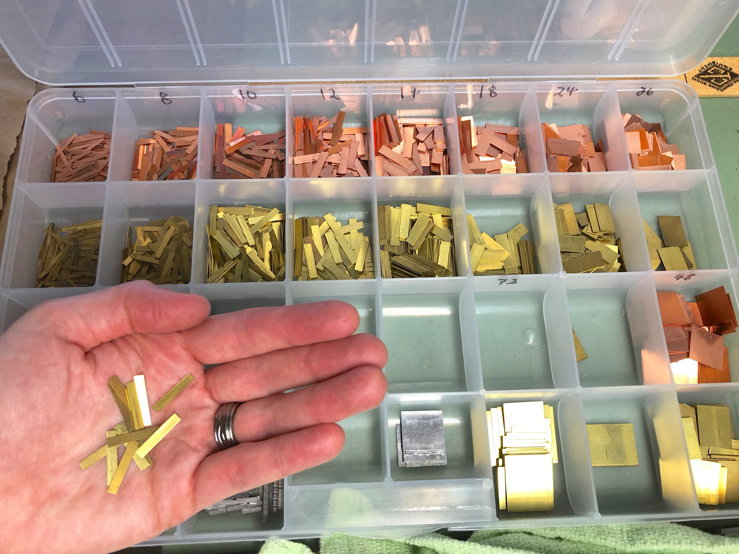
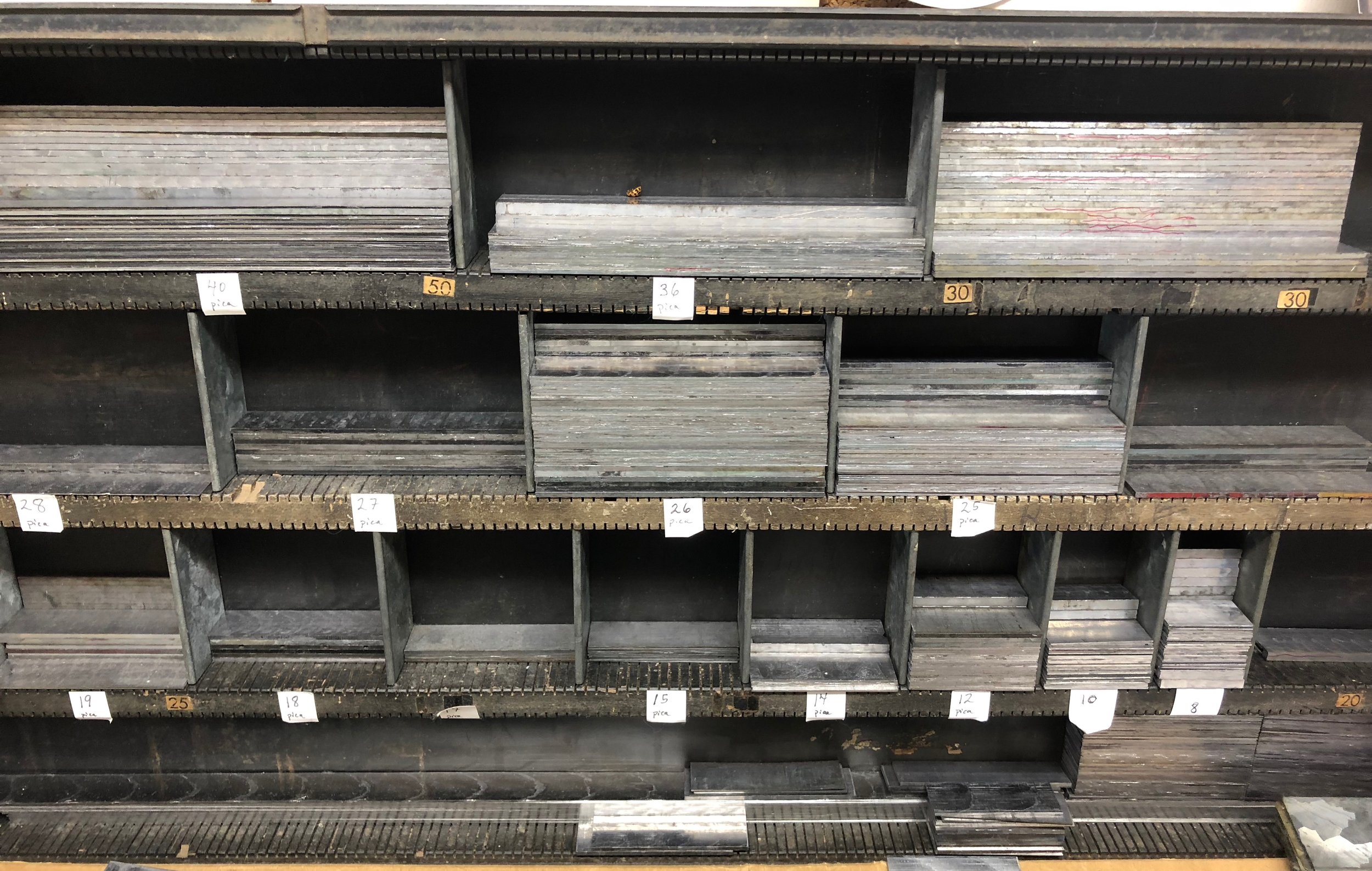
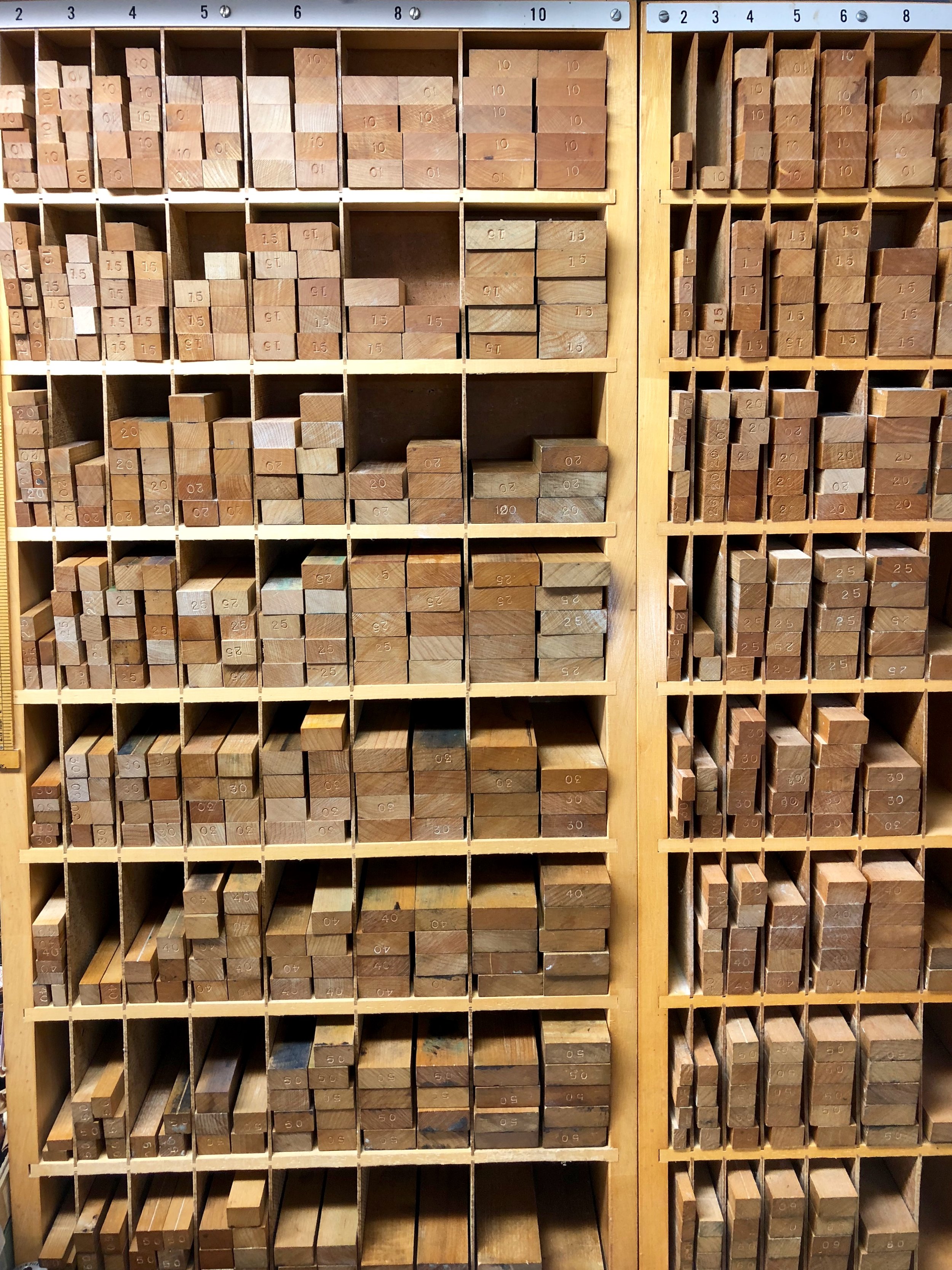
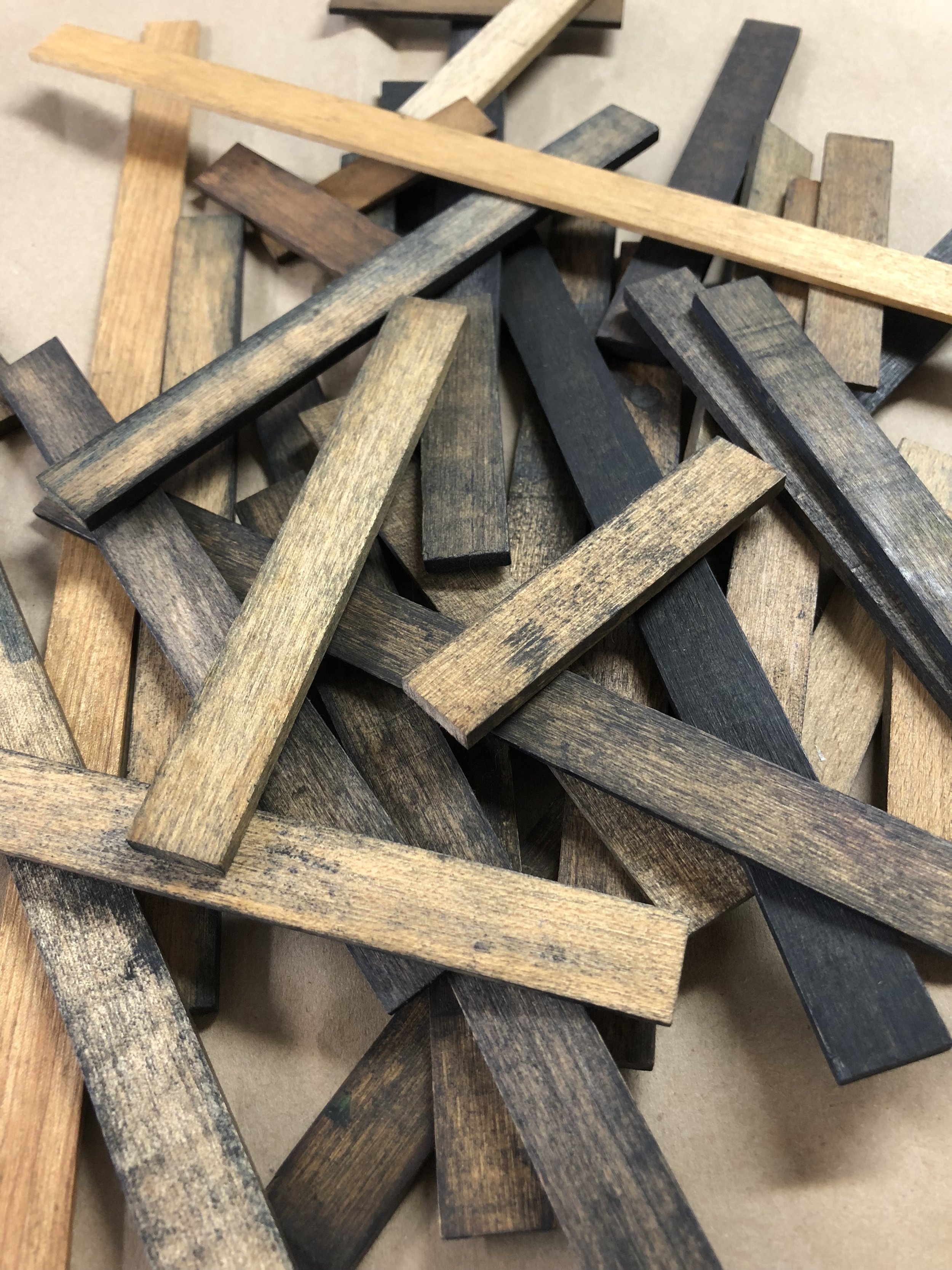
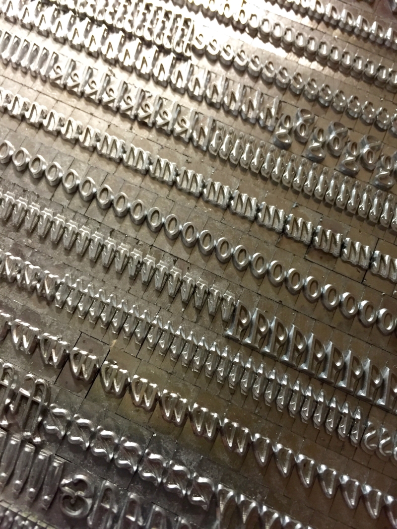
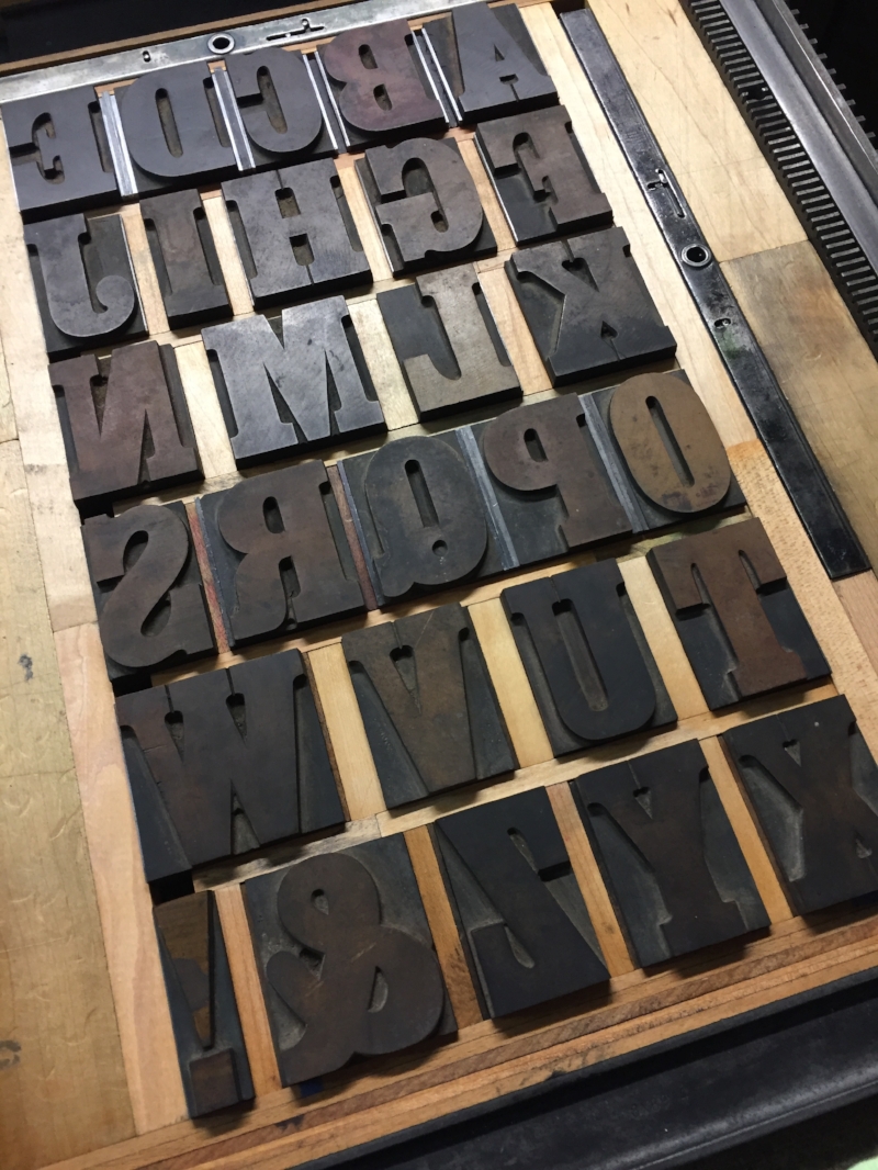
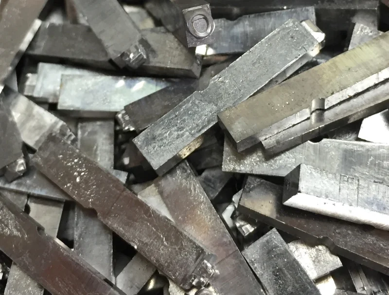
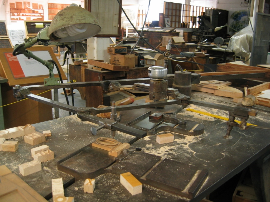
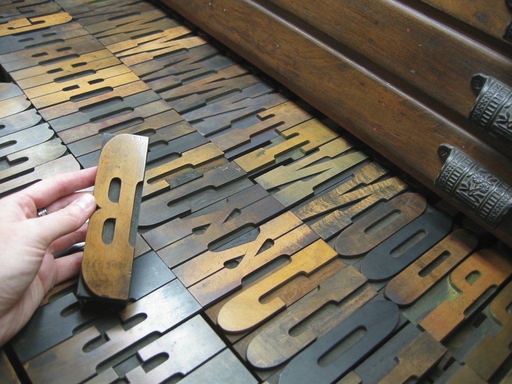
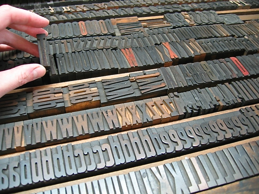
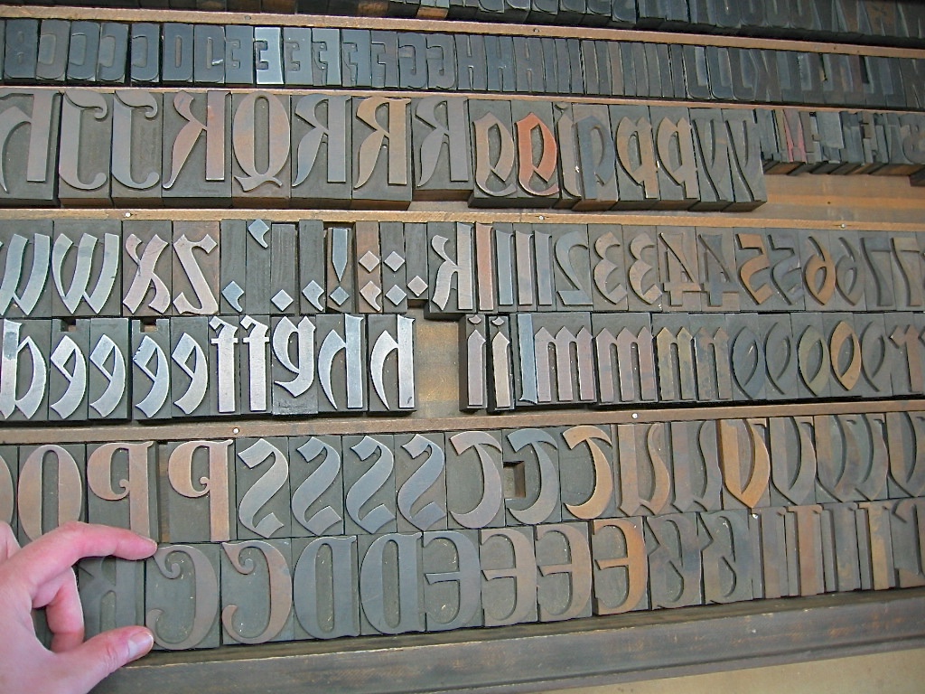
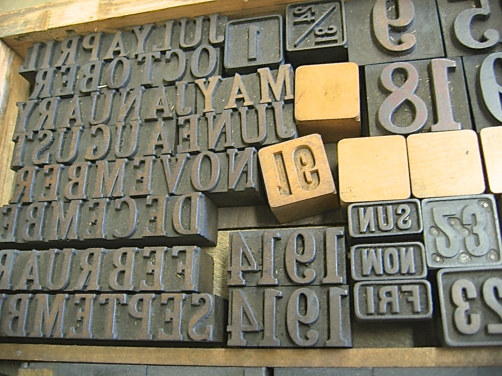
Last but not least, here is a brief look at putting all that metal type away after printing the book. Each letter and space goes back into its designated little slot in the wooden case that holds all the type. There it will await the next project!

Linji, the Australian Shepherd Shop Dog, finds all of this incredibly boring…

1 Comment

Women in Literature: Past, Present, & Future

3 Comments

Women in Literature: Past, Present, & Future

Last week, I had the great pleasure of being a guest in a Women in Literature class at Northern Virginia Community College (Woodbridge). Professor Indigo Eriksen, a fabulous poet and teacher whom I had met some years ago at a poetry festival, invited me to show her students a simple sewn binding technique that they could use for their end-of-term chapbook projects.

"Women in Literature" students hand-sewing their first notebooks.

"Women in Literature" students hand-sewing their first notebooks.

That initial intent blossomed into spending an hour and a half with her wonderful class, sharing about the history of women in printing and publishing, sewing a couple of notebooks together, and letterpress printing a keepsake on an old traveling press. Later that afternoon, I gathered with about twenty other students in the campus auditorium to talk about poetry, writing, language, and to read a bit from my own work in The Open Gate: New & Selected Poems

IMG_20180416_131335609.jpg
IMG_20180416_131253020.jpg

I was incredibly moved and invigorated by the engagement of these young women in the class, and the women & men at the reading. They were so present, interested and interesting, bright, and energized. They asked thoughtful, insightful questions, and deepened my own curiosity and understanding about language and literature. The students in the class took to sewing like ducks to water, and they are now part of the great lineage of women who have made a book! I am honored to have crossed paths with them all, and look forward to seeing their creative lives unfold. 

Here's a video of a happy printer ~ Janae printing her first letterpress piece on the 1930 Kelsey 3x5 press!

Here are a few photos from our conversation later that afternoon about poetry, writing, and publishing:

Here are a few slides from what I shared with the students about the history of women in printing and publishing. It's a long and vibrant history, one that they are now a part of!

Many, many thanks to Professor Indigo Eriksen, the fantastic students at Northern Virginia Community College Woodbridge, and Deans David Epstein & Michael Turner for inviting me to spend a wonderful afternoon with them!

All best wishes to all, 

Emily Hancock

3 Comments

 A Letterpress Lexicon, Part 4: Spacing Out

6 Comments

A Letterpress Lexicon, Part 4: Spacing Out

Hi, Friends of St Brigid Press!

Here is the long-awaited fourth installment in our occasional blog series ~ A Letterpress Lexicon ~ about the words and phrases that identify printing's particular tools and processes. Enjoy!

If you missed the first posts in this series, you can find them here:


A Letterpress Lexicon Part 4 ~ Spacing Out

We space out daily here at the Press ~ all for a good cause. ;-) 

You might already know that every single letter of the alphabet that we set and print here is a physical piece of metal or wood ~ a piece .918-inches tall, with the reverse image of the letter on the top, in relief. 

IMG_0864.jpg

Hand-set type:

Moveable type, which makes everything possible here at the Press. Here, the letters of the word "haiku" in metal.

Well, every single SPACE between every word and every line is also a physical piece of metal or wood. These pieces are made a little lower than the top of the letters, so that they do not pick up ink.

IMG_7132.jpg

The forme:

In this photo, you can see all of the metal spacing material surrounding the metal letters. The spacing material is a bit lower in height, so it does not get ink on it, and comes in various sizes according to the size of the type (12-point, 24-point, etc.). The spacing between the lines of type is also metal, cut to length.

The spacing material is cast to a point-size matching the size of the type body being set ~ from tiny 6-point to giant (and heavy!) 72-point in our shop. Spacing is also cast in various standard widths, so the typesetter can put larger or smaller spaces between words, as desired. These widths range from multiples of an "em" (the square of the type body; for example, a 12-point-by-12-point square) to "thins" (brass and copper slivers to fill in the smallest gaps in a line).

In addition to letter spacing, strips of metal also need to be correctly sized and set between lines of type ("leading" or "linespacing"). This strip material comes in various widths and can be cut to various lengths (also called "slugs") ~ all tailored to ordering the printed page. 

The whole point of spacing is to surround the letters and lines as snug as possible. A loose letter can print unevenly, and even become damaged. 

The final step before printing is to surround the whole forme (the letters and spaces) with "furniture" ~ blocks of wood (sometimes metal) in various standard sizes that fill out the chase. Two quoins (a kind of lock) are placed in as well, and when turned with a key the quoins tighten everything together. 

When the forme to be printed is locked up tight, I can lift it off the table and into the press without fear of everything collapsing onto the floor.

IMG_7134.jpg

The printer:

Emily, holding a tightly locked forme in mid-air. If the spacing material has been set correctly, the whole thing can be transferred easily to the printing press. If it has NOT been set correctly... well.. catastrophe can ensue. 

IMG_4595.JPG

The printed page:

Now, when you see a printed page, you'll think of the actual mass and work of all that "white space"! Shown here, a leaf from Jeff Schwaner's Wind Intervals.

So, that's the story of SPACE at St Brigid Press! 

Thanks for spacing out with us for a few minutes ;-)

6 Comments

Diary of a Printed Page

16 Comments

Diary of a Printed Page

I must confess ~ each time a piece of paper goes into the printing press blank and emerges again filled with words, I am astonished. 

What still feels like the sudden epiphany of language out-of-nothing is not, in fact, miraculous. It is careful, collaborative craftsmanship by author and papermaker and metal-caster and printer, among others. It’s a strangely fluid movement of human and machine ~ an always-changing choreography of eye and iron, hand and fiber, thought and ink and breath. 

Joyous!

Here’s a little photo diary from today’s print run. I was printing the second color (in red) on the title page of St Brigid Press’s newest book, forthcoming in early February.

Thanks so much for joining us on this journey. All best to you all,

St Brigid Press

16 Comments

New Year's Greetings from the Press

10 Comments

New Year's Greetings from the Press

Dear Friends,

Gratitude is something that we aim to practice and cultivate here at the Press. With the turn of the calendar year, we are especially mindful of this today and want to share some of what's at the top of our Thankful list:

YOU ~

Without your friendship and support, St Brigid Press would not be able to continue. We are so deeply grateful for your active presence with us on this creative journey, and for your enthusiasm for and patronage of the work we do.

MAKING BOOKS ~

2016 saw the publication of our first book printed on the iron handpress, Reverie. (If you missed that exciting process, check out these previous posts: "Printing a Poem on the Handpress" and "Printing With Plants".)

2017 begins with two books in process: Love Letters (an abecedarium honoring the beautiful work of American type designer Frederic Goudy, with an introduction by contemporary type designer Steve Matteson), and Wind Intervals (a new chapbook of poems by Jeff Schwaner, illustrated with nature prints). More on these projects soon!

TYPE ~

We are grateful to care for and print with an excellent collection of metal and wood type, and we give great thanks for folks who are still casting new metal type for us letterpress printers to use. Pat Reagh, of Patrick Reagh Printers in California, cast a gleaming font of Goudy Old Style for us this summer. And Michael and Winifred Bixler of The Bixler Press and Letterfoundry in New York created a gorgeous set of Bembo letters for us earlier in the year. These two castings will feature in the new books-in-progress.

In addition to metal type, we are honored to house the St Brigid Press Collection of Historic Wood Type. This collection received some wonderful TLC by graphic designer and 2016 Press intern, Julia Grammer. Julia identified, catalogued, and cleaned the type, and then produced some stunning letterpress printed type specimens of selected faces. We are very thankful for her excellent work of curating this collection.

THE FUTURE ~

In addition to the books-in-progress mentioned above, we have several new and extremely exciting irons in the Press fire. Over the next few months, stay tuned as we unveil these creative adventures, from a new wood type poster series to new vistas in poetry publishing! As always, we are grounded and guided by our mission to continually offer the daily bread of language, especially poetry, while practicing the traditional arts and crafts of printing and book making. Thank you, once again, for journeying with us!

With gratitude, and all best wishes,

Emily Hancock of St Brigid Press

10 Comments

A Letterpress Lexicon, Part 3

7 Comments

A Letterpress Lexicon, Part 3

Hi, Friends of St Brigid Press!

Here is the third installment in our occasional blog series about the words and phrases that identify printing's particular tools and processes ~ A Letterpress Lexicon. Enjoy!

(If you missed Part 1, you can find it HERE. And Part 2 is HERE.)


Today's Words Are:

PIED  ~  Pronounced with a long “i”, as in "cherry pie." The term for metal type that has become all jumbled up, disarranged, mixed up.

HELL BOX  ~  The box or bucket into which is thrown metal type that is too worn or damaged to print well.

PRINTER'S DEVIL  ~  An old term for the young assistant in a printing shop who was given menial tasks or errands, such as sweeping floors or sorting type.


I had a completely different set of interesting words from the printing trade ready to share with you all. And then this happened:

Pied type on the floor at St Brigid Press.

I allowed myself to get in a hurry recently, while looking for a particular dash in the back of a typecase. I pulled the case out too far, without pulling the case below it out slightly (a safety measure, to prevent what happened from happening), and CRASH — a small tsunami of metal letters fell to the floor. The concrete floor. ARGH. There they stayed for a few days, until I could face the mess again and gently scoop up the pied type.

A 12pt letter "m" from the pile of pied type. It is, unfortunately, damaged and bound for the hell box.

Much of the type is salvageable, thank goodness. But there are still many letters, numbers, and punctuation pieces that were damaged. Type metal is soft enough to scratch or dent easily if dropped. Those pieces that are too damaged to print correctly will be weeded out and relegated to the hell box. When the box is full, a type foundry can melt down the metal and cast new letters with it.

The St Brigid Press hell box, into which we pitch metal letters that are broken, scratched, dented, or otherwise rendered unprintable. Grateful acknowledgement goes to the Shop Dog, Mira, for generously donating an empty biscuit tub for the task.

Obviously, sorting pied type is a time-consuming job. One that is at once drudgery and exacting — each letter must be inspected to see if its face is dented or scratched, or if it survived the ordeal unscathed. Since we are in the full swing of book production here at the Press, we decided to call upon our own printer’s devil, Julia Grammer, to help out. Julia is a student of typography and graphic design at an area college. Not only is she knowledgable about type, but she brings the kind of care, curiosity, and intelligent attention that are guiding principles at the Press. Here’s a case of type after Julia was let loose on it:

Ahhhh.... Order, wrought from chaos, thanks to the Press printer's devil, Julia Grammer.

Thanks, as always, for joining us on this journey, Friends! 

All best to all,

The Pied Typer of Afton

7 Comments

How Type is Made, Part 2

4 Comments

How Type is Made, Part 2

Traditional letterpress printing requires physical letters, cast from metal or carved from wood, which get inked and pressed into paper to make a print. In the last post, we took a look at the process of making type from metal (if you missed it, click here). In this installment, we’ll see how it’s created from wood.

Civil War recruitment poster.
From the International Printing Museum website.
http://www.printmuseum.org/museum/wood-type-2/

Wood came to be used as a material for making letters for printing primarily in the 1800s, when the printing and advertising industry became more widespread. Imagine trying to lift a big “Wanted”-poster-sized chase of metal type — pretty darn heavy! (See the photo of a Civil War recruitment poster.) Letters carved and routed from holly or maple were MUCH lighter, and could be made MUCH larger than their metal counterparts. 

Here at the Press, we’re fortunate to care for and print with a nice selection of wood type, most of which was made between 1875 and 1910. If used with plenty of TLC, it’ll outlast us (just like our presses)!

Here's a slide-show of some of the materials and tools used to create wood type, along with some of the type in our collection here at the Press:

A lot of vintage type, however, either went to the scrap heap decades ago, is just too damaged to print well anymore, or is too scarce and expensive for most printers to purchase. Thankfully, there are a few excellent folks who are making brand new type from wood today!

Here is a great interview (4 mins) of Geri McCormick of Virgin Wood Type (Rochester, NY), by Frank Romano.

And another great short (1 min) video of Scott Moore, of Moore Wood Type (in Ohio), making new wood type:

Want to know more about the wonderful world of wood type?

Here are some great resources ~


Thanks for joining us on this journey into type! Please sign up below for more occasional dispatches from letterpress land!

St Brigid Press

4 Comments

Printing With Plants

3 Comments

Printing With Plants

Hi Friends of St Brigid Press!

We're rolling along in our production of our new chapbook, Reverie, which launches next Sunday the 20th at Black Swan Books (3pm to 5pm, if you're in the neighborhood!). At the moment, we are enjoying illustrating the pages with original nature prints from the grasses that grow in the meadow at the Press.

Here's a sneak peek at today's print process, working with the lovely little meadow flower, Pennsylvania Bittercress.

Just last week, our field began to bloom with the tiny white petals of Cardamine pensylvanica, Pennsylvania Bittercress. 

We decided the Bittercress would make a delightful accompaniment to the first poem in the book.

Next we hand-mixed a sweet spring green color, gently pressed the Bittercress into the ink, and carefully transferred the inked cutting to the page of poetry.

Lifting off the Bittercress, reveals its subtle image. Next up: clover and wild onion!


Thanks for joining us!

If you can't make it to the look launch on March 20th, but are interested in purchasing this limited edition book, please see HERE.

3 Comments

Printing a Poem on the Handpress

1 Comment

Printing a Poem on the Handpress

One of our chief passions here at the Press is traditional letterpress printing — using some of the techniques, equipment, and materials that have been used since Johannes Gutenberg and his team first developed moveable type and printing presses in Europe around 1450. 

We enjoy being a part of that long historical lineage, learning the skills and passing along the wonder of the printed word. Our latest project, a little chapbook of poems called “Reverie,” has given us the opportunity to produce a book entirely on the circa-1915 iron handpress, affectionally named “Ben” (for Ben Franklin, of course). 

Here is a series of photos that will walk you through the printing of one sheet of one poem for this one book. By the time we finish the edition, we will have enacted this same process about 1,260 times. Good thing we love what we do!

All best to all, 

St Brigid Press

1 Comment

A Letterpress Lexicon, Part 2

1 Comment

A Letterpress Lexicon, Part 2

Hi, Friends of St Brigid Press!

Here is the second installment in our occasional blog series about the words and phrases that identify printing's particular tools and processes ~ A Letterpress Lexicon. Enjoy!

(If you missed Part 1, you can find it HERE.)


Today's 3 words are

TYPECASE, TYPESETTING, and COMPOSING STICK


TYPECASE:  A typecase is a wooden tray, divided up into numerous small compartments, in which the letters, numbers, and punctuation of a font of type are organized and stored. 

TYPESETTING:  This refers to the action of composing words from the individual pieces of type. A printer reaches into their typecase, picks up the desired letter, and literally "sets" it in place beside the last letter placed. 

COMPOSING STICK:  This is the tool that holds the pieces of type that are being set (or, "composed"). Usually made of brass or steel, the composing stick is held in the non-dominant hand while the typesetter lines up each desired letter. The stick is adjustable, according to how long the line of type needs to be. 

And here's a little video to put these three words together!

Thanks so much for joining us on this journey into the World of Letterpress!

If you haven't already, take a second to sign up below for our occasional newsletter, which features posts like this one, as well as updates on our printing projects here at St Brigid Press.


1 Comment