Viewing entries tagged
printing books

Book Looks: Selections from the Press Library, Part 4

1 Comment

Book Looks: Selections from the Press Library, Part 4

Hello Friends, and welcome back to Book Looks!

I began this blog series in 2021 to highlight some of the interesting volumes here in the St Brigid Press library — from the history of book-making to printing press maintenance, from typography and type design to the biographies of famous (or not) printers, and from paper-making to hand-sewing books. We’ll take a brief look at three volumes today, and spotlight more over time.

This edition of the series is inspired by my trip to Canada last October, where I participated in a marvelous gathering (a “Wayzgoose”) at Gaspereau Press in Nova Scotia. You can read about that adventure HERE.

Thanks for coming along as we browse the print shop shelves!

Emily Hancock

Previous Book Looks editions:

BOOK LOOKS, PART 4

  1. Design With Type by Carl Dair

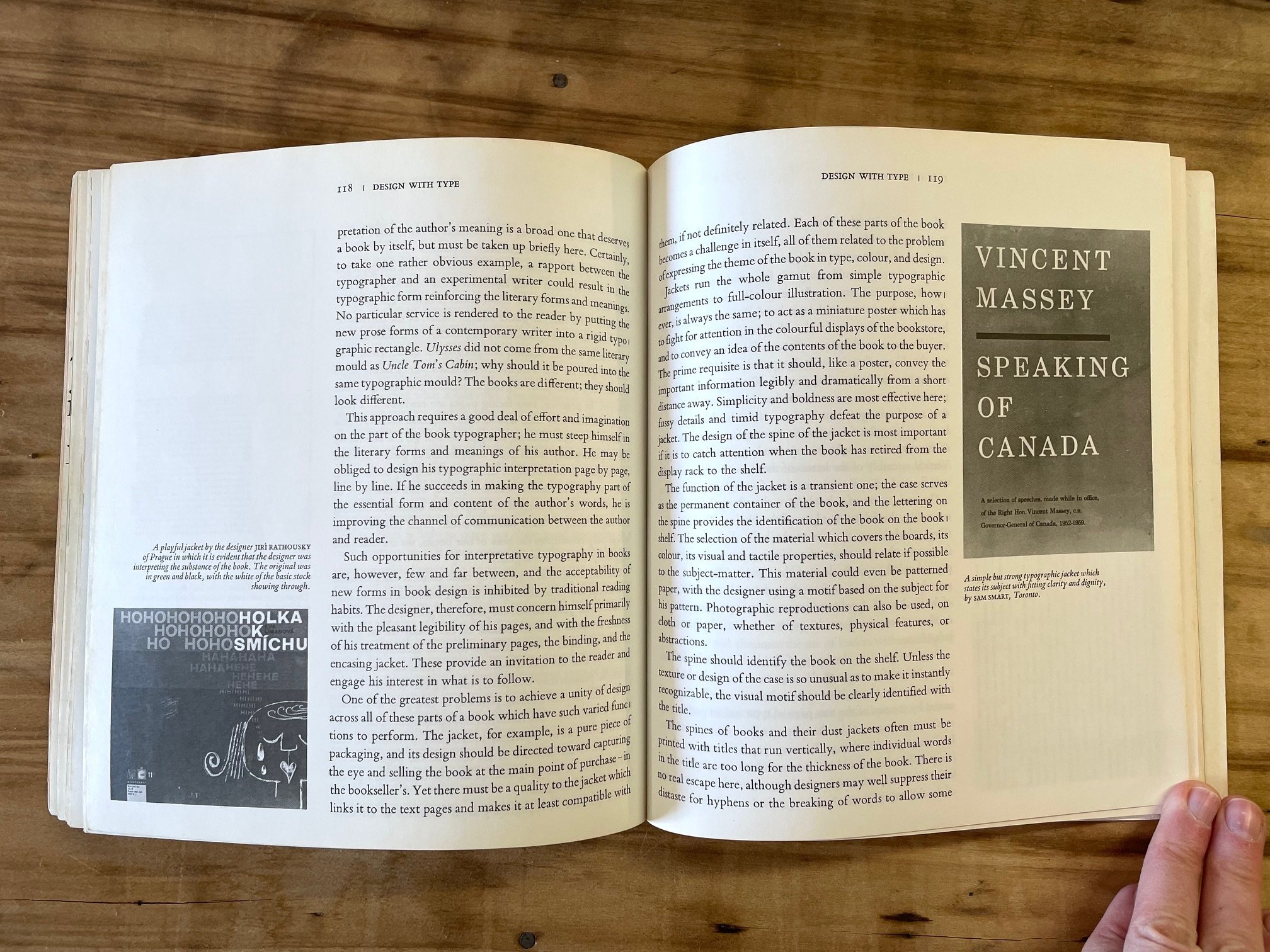
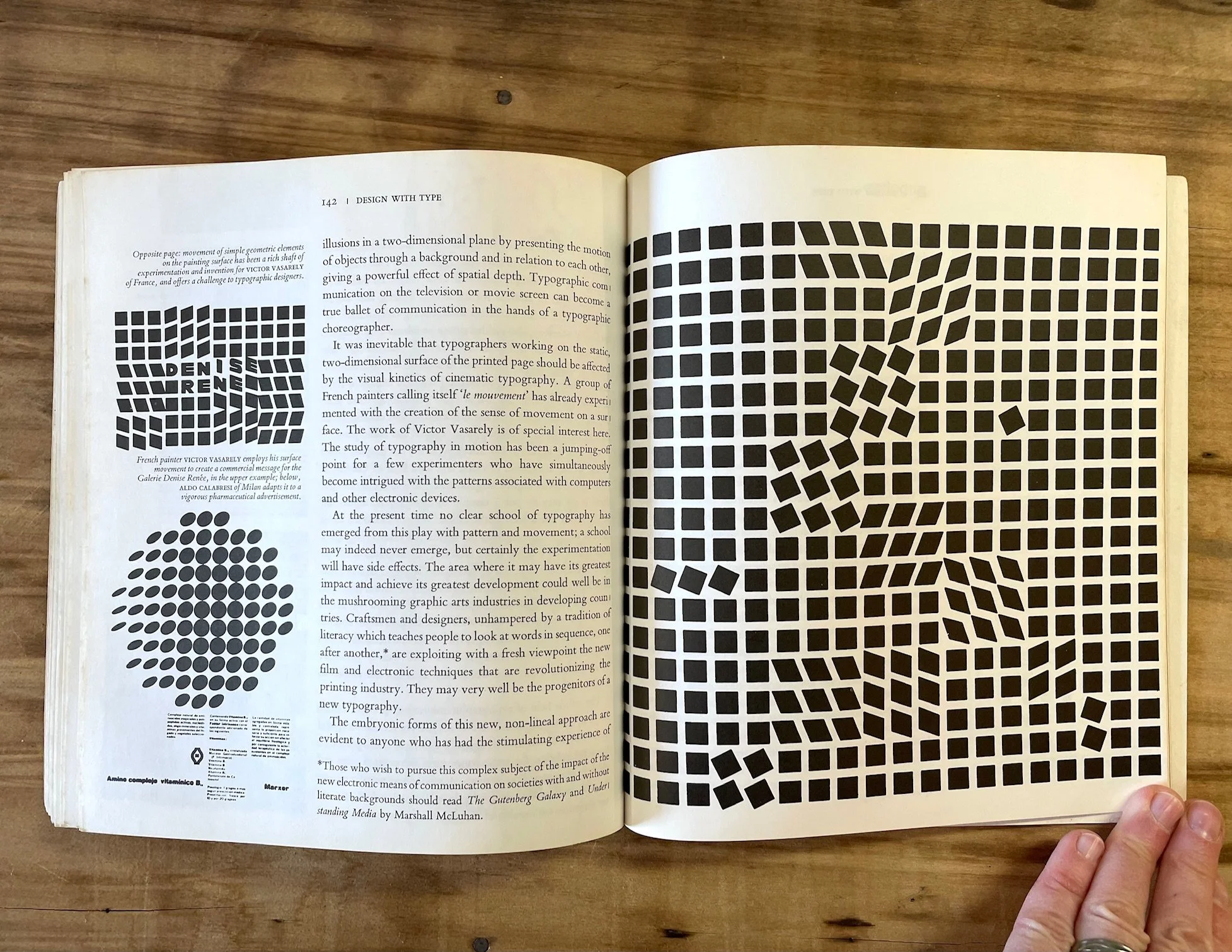
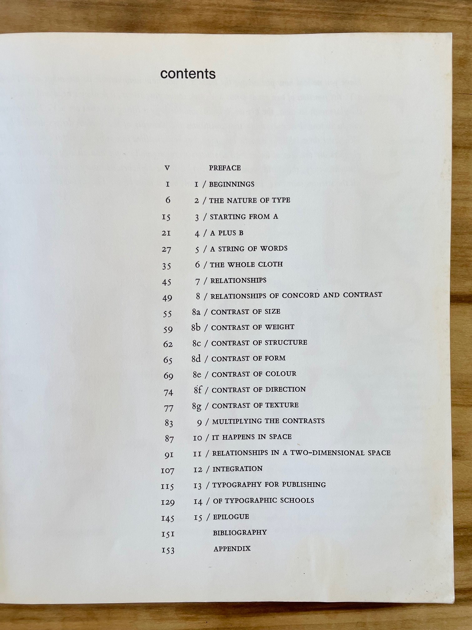
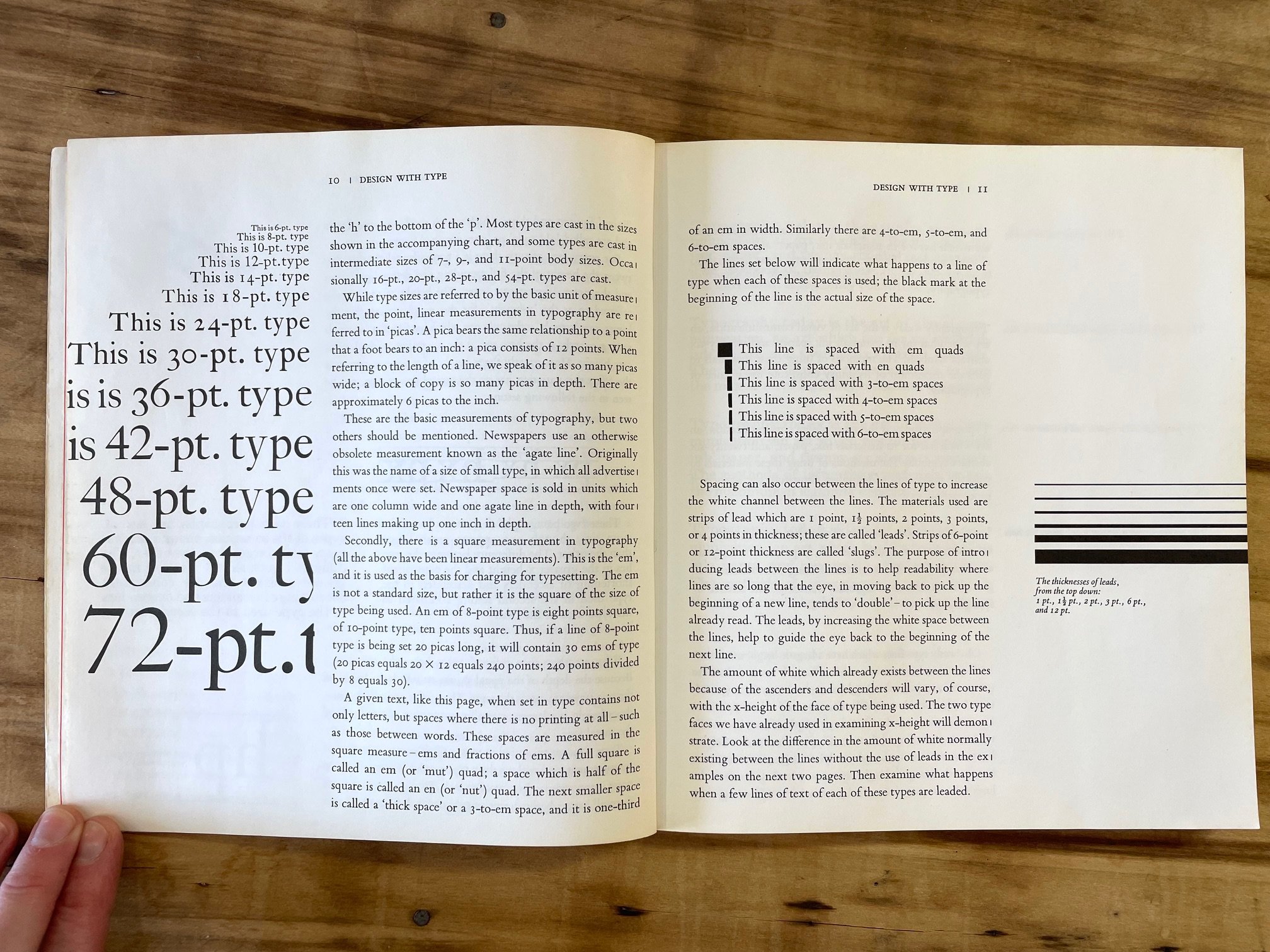
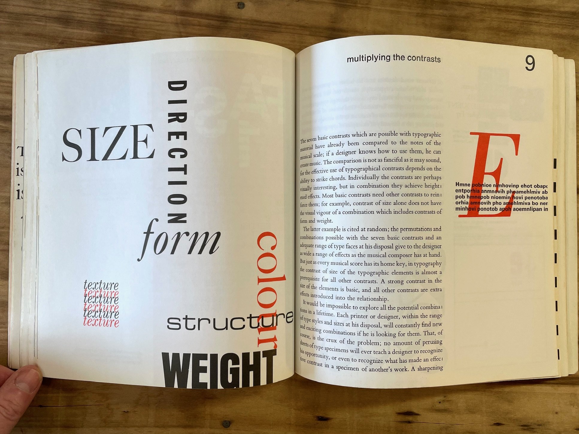
To learn about the 20th-century-history of typography and design in Canada is to encounter the extraordinary work of Carl Dair. Born in Ontario in 1912, Dair became an exceptional graphic designer, teacher, and type designer, and in 1952 published Design With Type. This relatively slim but comprehensive volume became a staple resource in the trade, and is still available new from the University of Toronto Press who published the revised version in 1967 (although there are many inexpensive used copies floating around for you to snag). “Good design in any field demands that the designer know the materials with which he is working”; this is, essentially, Dair’s purpose for writing this book and his hope for his readers. The well-illustrated, concise tour of the forms and functions of type on the page is all in service of Dair’s ultimate vision —that of encouraging excellence in visual communication, not mere “visual stimulation.” [University of Toronto Press; I recommend the revised version published after 1967.]

2. Smoke Proofs: Essays on Literary Publishing, Printing & Typography by Andrew Steeves

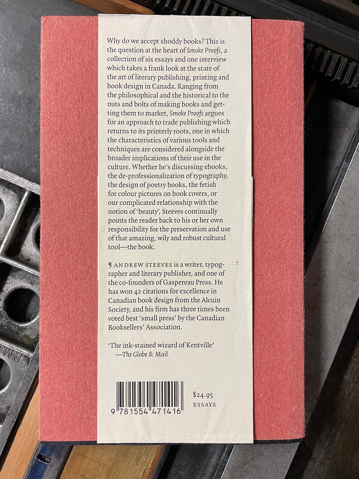
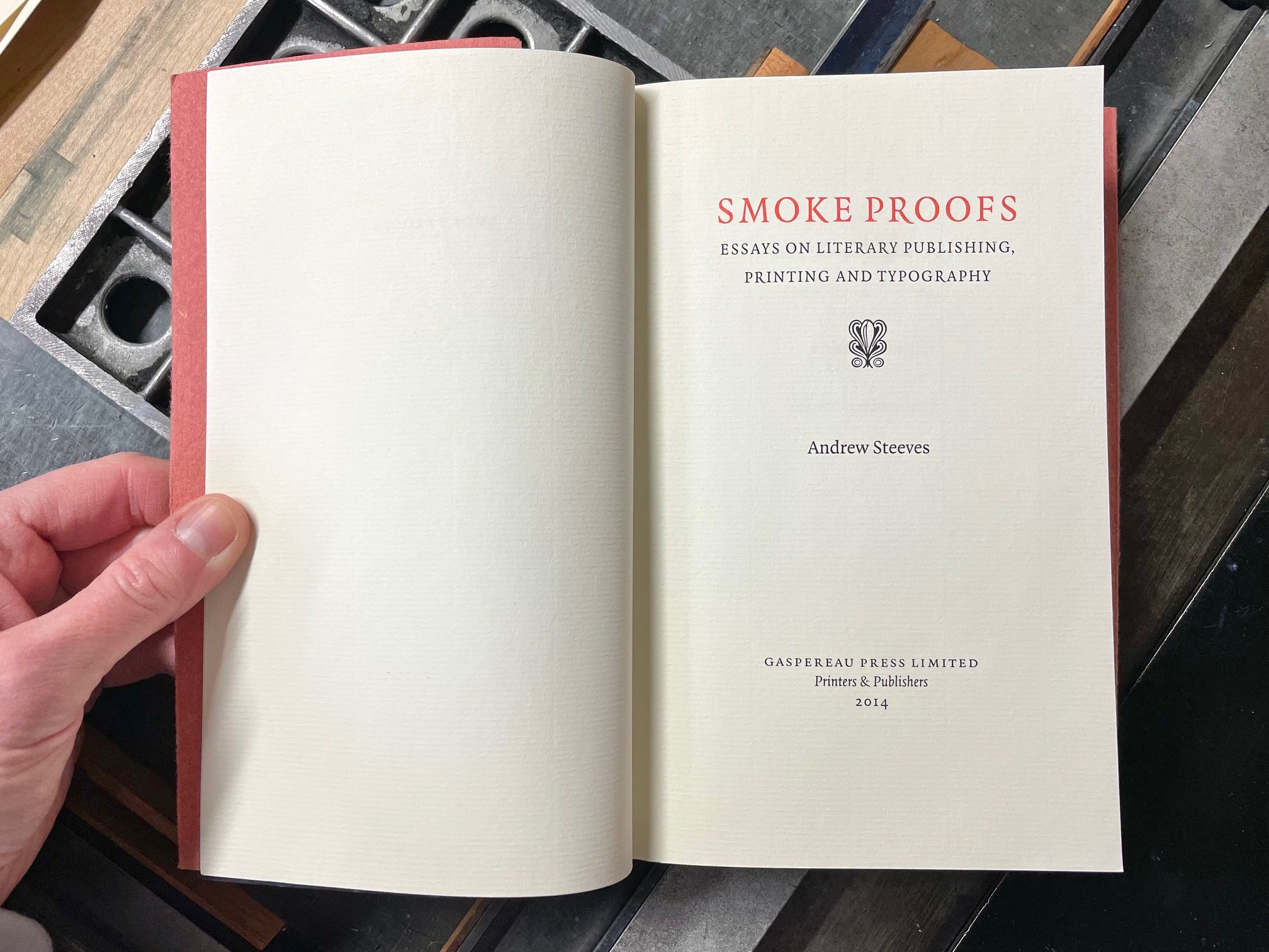
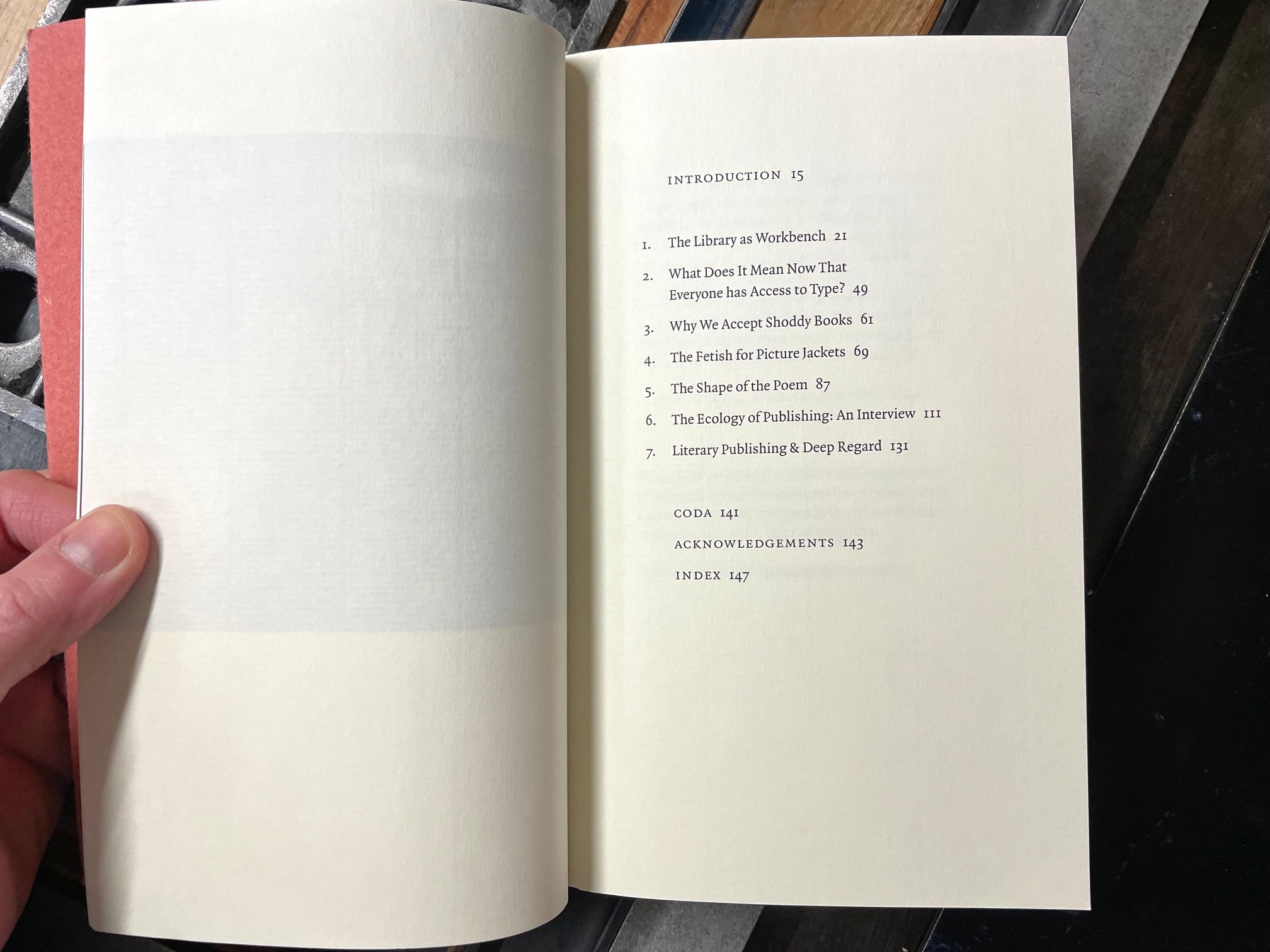
My Canadian trip destination last autumn was Gaspereau Press in Kentville, Nova Scotia. Established in 1997 by Andrew Steeves and Gary Dunfield, Gaspereau is a relatively small offset- and letterpress-print shop that has had an outsized impact on the literary culture of its home province and beyond. From the digitally designed, offset-printed with letterpress jacket trade editions of poetry and prose, to Steeves’ completely letterpress printed fine press volumes, each book is an impeccably made home for excellent literature. In 2014, Steeves published a book of his own writing called Smoke Proofs: Essays on Literary Publishing, Printing & Typography. Rather than a “how-to” primer on typesetting or page layout, this collection from a true citizen-publisher is more of a what and why, “identifying issues, challenging dogma and agitating for our full and creative engagement with the many challenges we encounter when we set literary works into type and publish the results.” Steeves and his work have always called on me to be my best creative self for the good of the community I serve, and this book is a superlative guide and goad, inspiration and invitation, that I return to regularly. Smoke Proofs is a trustworthy, hand-held compass for anyone adventuring into the wilds of literary publishing and printing.
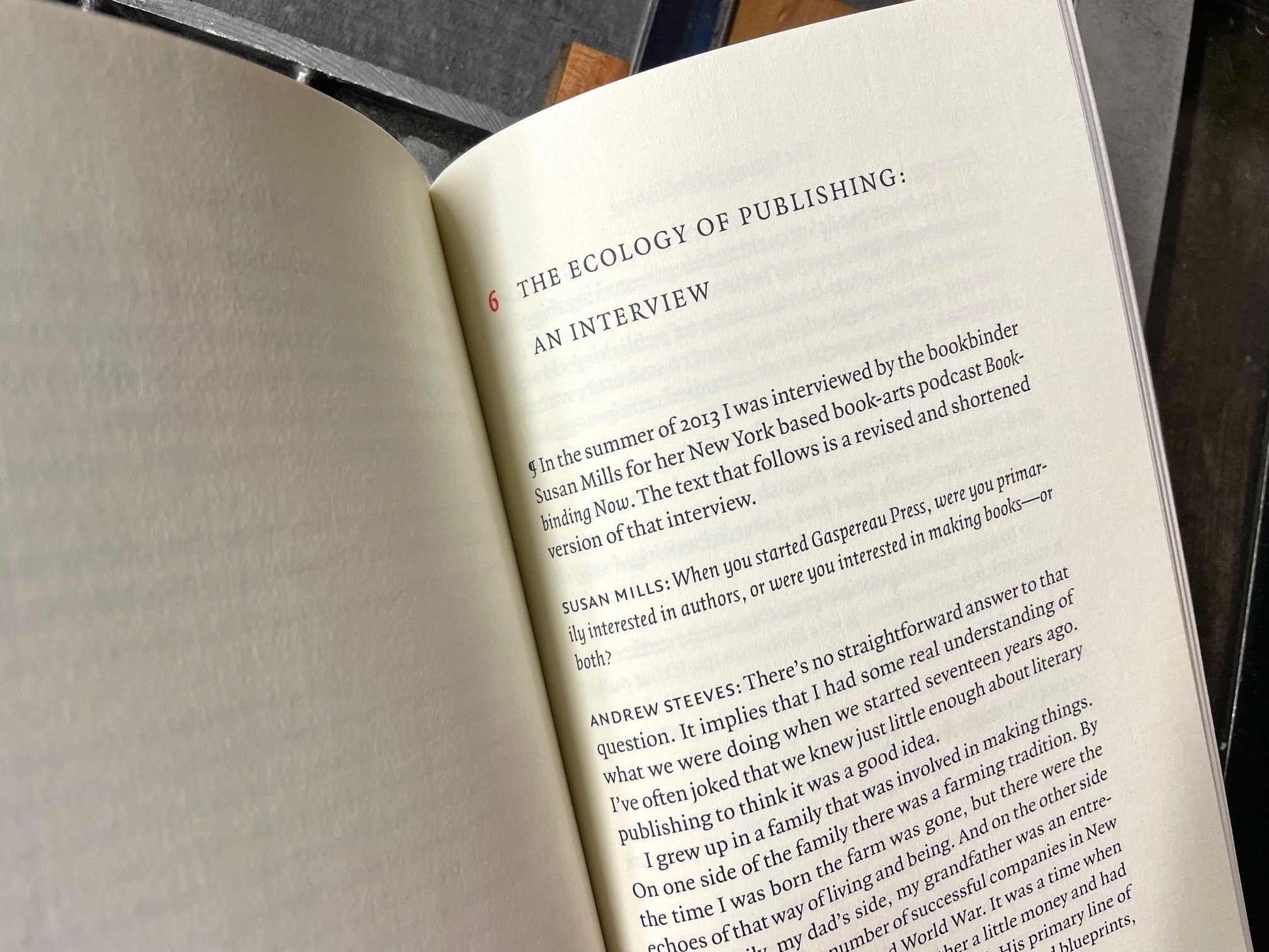
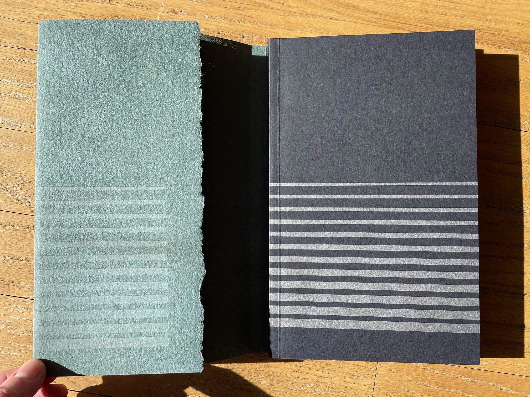
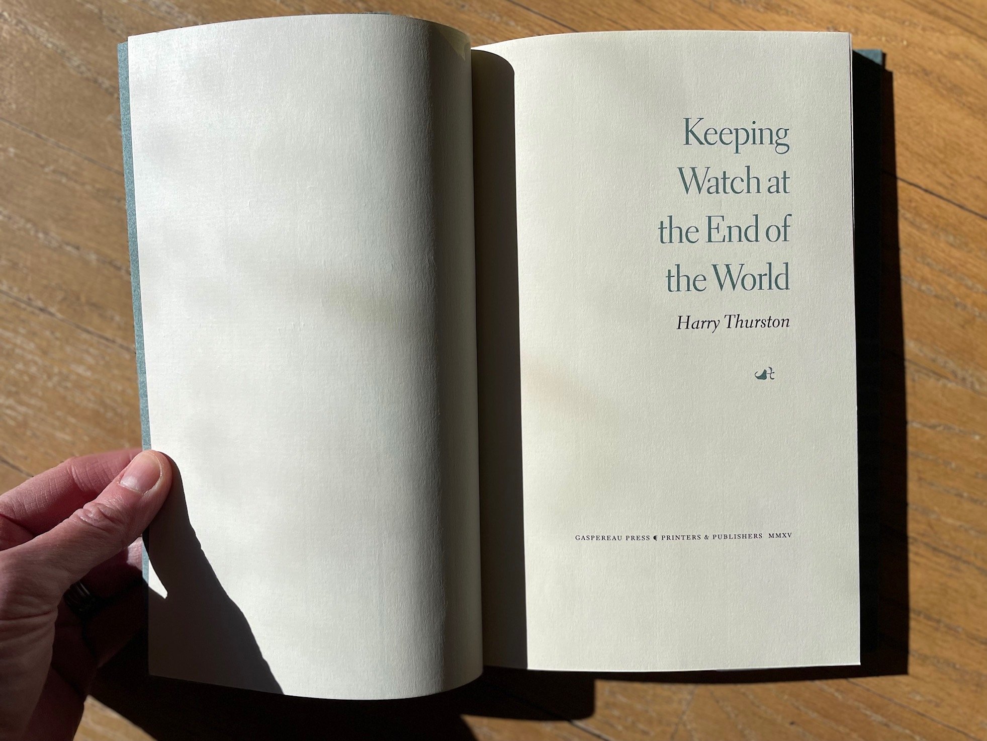
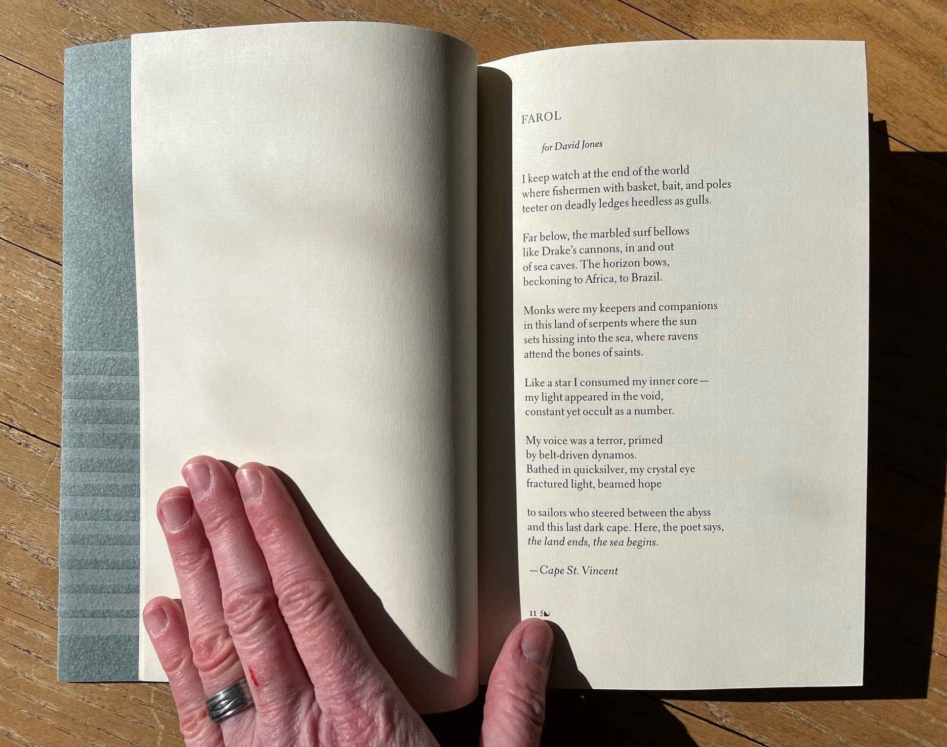
3. Keeping Watch at the End of the World by Harry Thurston

“All of us belong, as much as the black ducks / at rest in the harbour…”

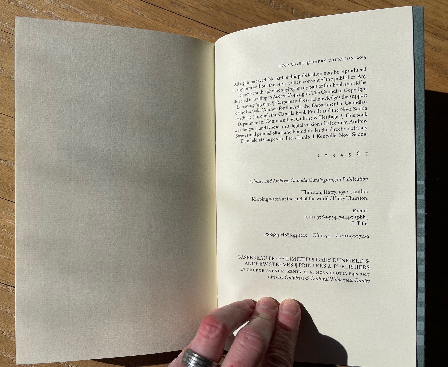
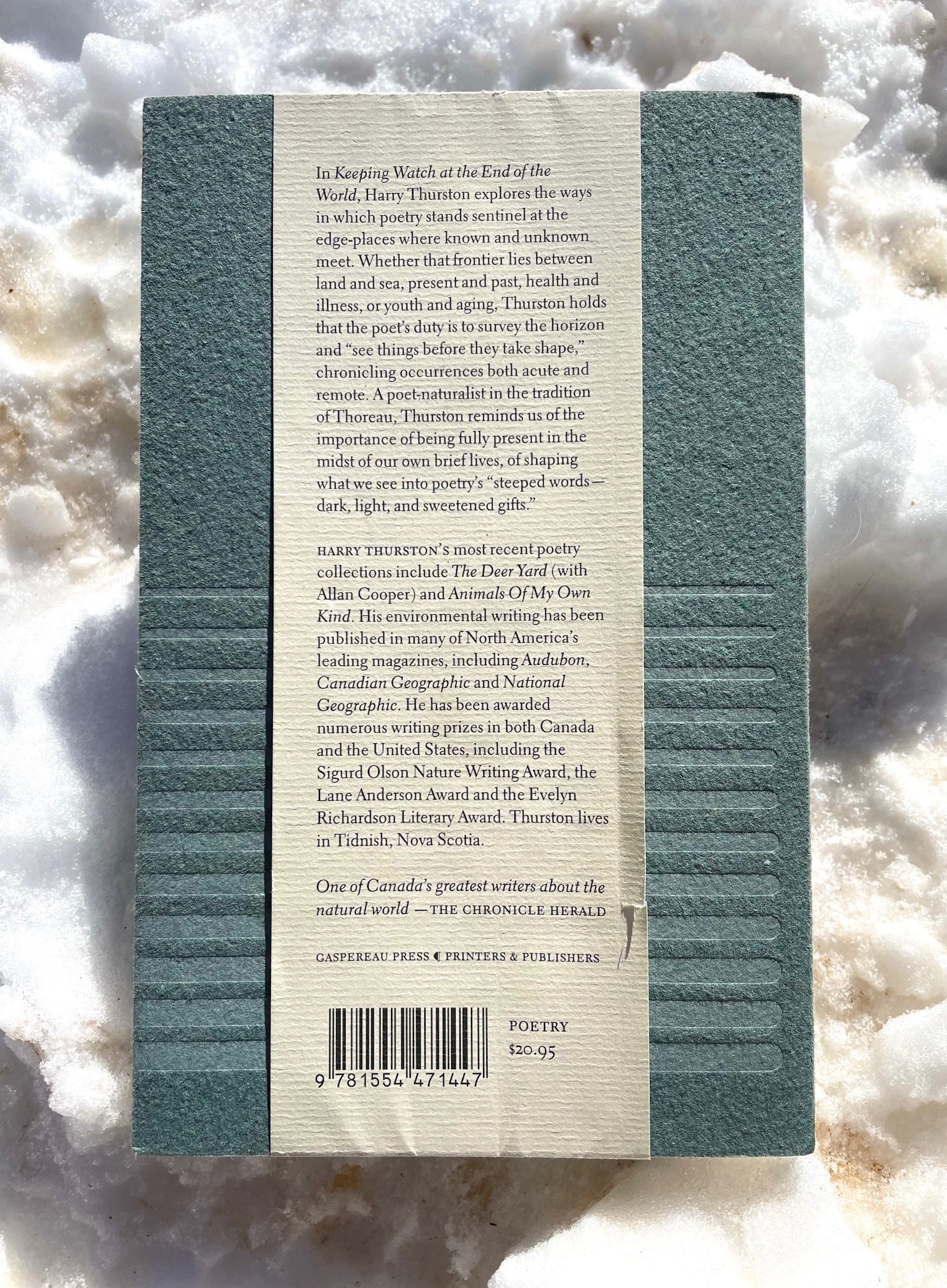
Harry Thurston grew up in Nova Scotia and became a prize-winning poet and environmental journalist, as well as mentor to many students at the University of King’s College. His word-and-image collaborations with the renowned New Brunswick photographer Thaddeus Holownia (several volumes of which have been designed by Andrew Steeves) are exquisite. I was lucky to meet Thurston last autumn and to pick up copies of several of his books published by Gaspereau Press, including the outstanding Keeping Watch at the End of the World. The sea is a central presence in this beautiful collection. Whether writing about his native, booming Bay of Fundy or the Mediterranean’s millennia of layered stories, Thurston’s heart and eye take in and give back to us the intricate, flowing world. His ear, like his pulse, are tuned to the tides — whether oceanic, emotional, or historical. And he is always walking that wrack line, where the sea — whether the sea of time or of memory or of water itself— gives up its mysteries (and takes them back again). Grab a copy of Thurston’s work and enjoy his keen company in “This brief time we have to share / while the tide fills and empties the bay.”

(Apologies for the shadow-dappling on some of these photos below. My photographic error, not on the pages themselves.)
To close out our little trip to Canada, here’s a final word from Carl Dair — this poster hangs in a prominent position at St Brigid Press:

Well, that’s all for now, friends, as I gotta get back to setting some type ;-) Stay tuned for future installments of Book Looks, and in the meantime, be well and read on!

Emily
1 Comment

Book Looks: Selections from the Press Library, Part 3

5 Comments

Book Looks: Selections from the Press Library, Part 3

Hello, Friends! Book Looks is BACK!

We began this series a couple of years ago, highlighting some of the interesting volumes here in the St Brigid Press library — from the history of book-making to printing press maintenance, from typography and type design to the biographies of famous (or not) printers, and from paper-making to hand-sewing books. We’ll take a brief look at three volumes today, and spotlight more over time. (If you missed the first Book Looks post, read it HERE, and the second Book Looks post HERE.)

Thanks for coming along as we browse the print shop shelves!

Emily Hancock

BOOK LOOKS, PART 3

Research for a new small letterpress project sent me to the library stacks this very week. I needed to brush back up on the history of type design and printing in northern Italy during the Renaissance period. A niche subject? Yeah. And fascinating! I pulled down a few volumes, books I hadn’t looked at in a while — it felt like catching up with old friends. If you’re into type and printing history, here are some books that just might interest you, too.

  1. Historical Types: From Gutenberg to Ashendene by Stan Knight

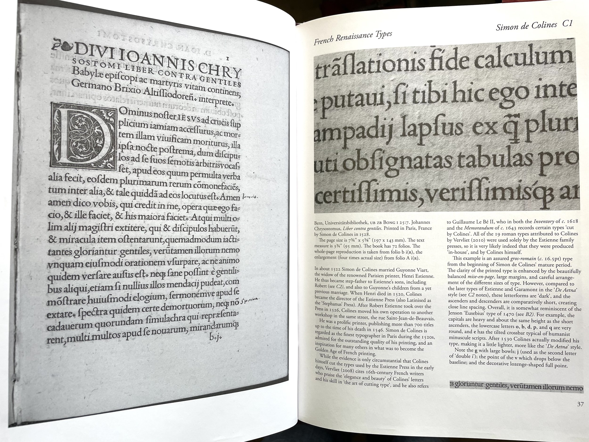
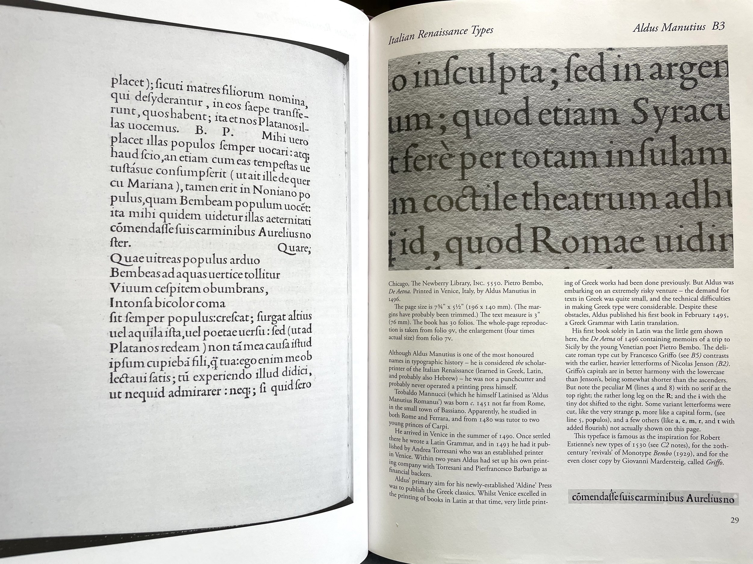
As calligrapher and type designer Paul Shaw writes, “Historical Types is a modest book in scale and appearance that deceptively hides a wealth of information…” In under 100 pages, Knight provides an illustrated survey of the high points of type design from the 1450s to the first years of the 1900s — from Nicolas Jenson and Aldus Manutius working in Venice during the period I was studying, through the French Renaissance and Baroque, Neoclassical and Rational, 19th century and Private Press types that followed. Not one to to be wordy, Knight’s descriptions of each type, designer, and accompanying printed examples are short and tight, packing a good bit of info in just over half a page. The real treasure, especially for comparative study, are the large photo reproductions, taking up three-fourths of each two-page spread — we get up close and personal with each typeface, at its original size as well as  enlarged, doing its job on a period manuscript page. Whenever you can get to a special collections and see such early printed books in front of your very eyes, then go. When you can’t, pull Historical Types off the shelf and spend some enjoyable time pouring over this handy home reference of foundational styles of type. (Oak Knoll Press, 2012)


2. Five Hundred Years of Printing by S.H. Steinberg (revised by John Trevitt)

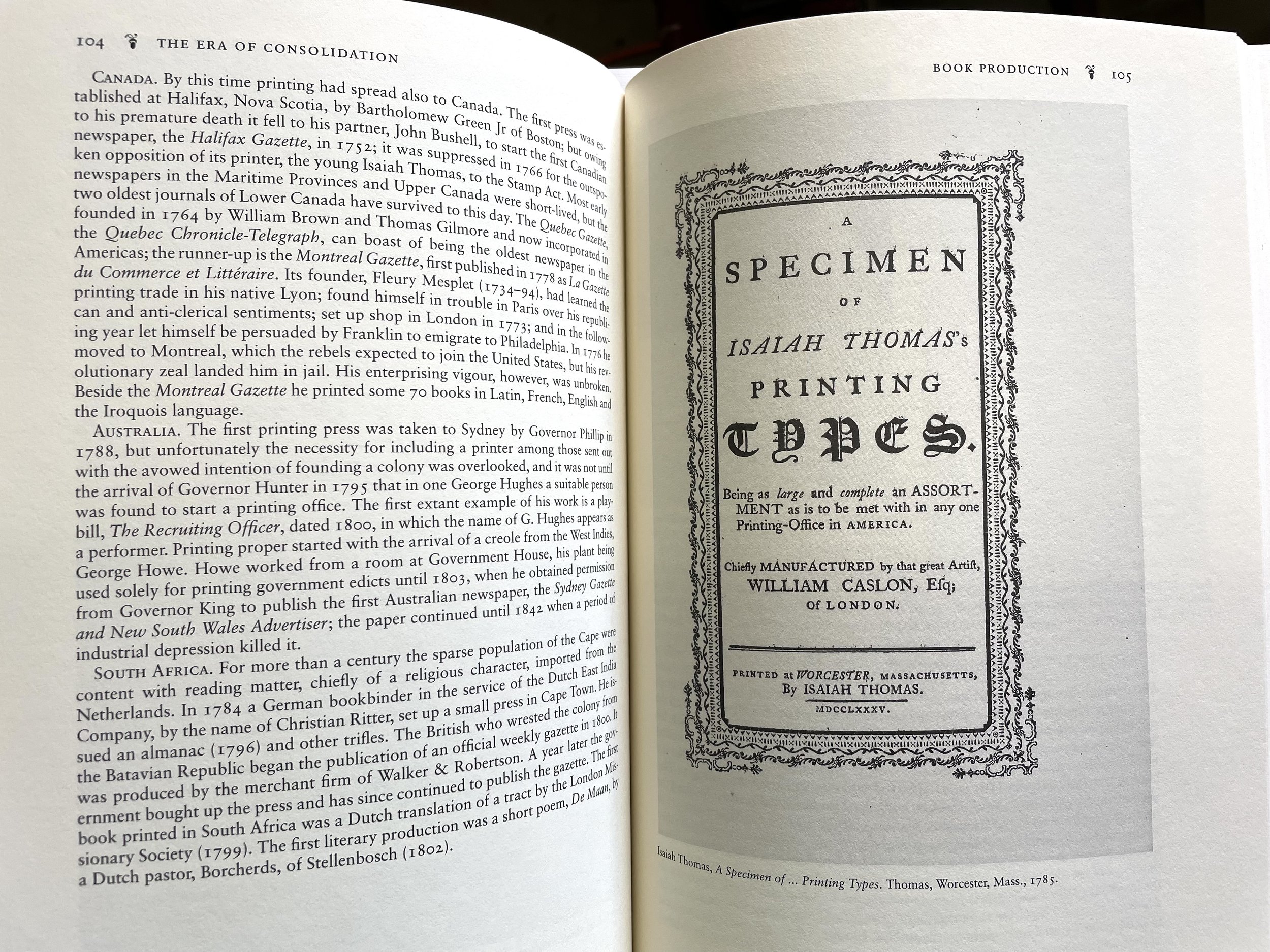
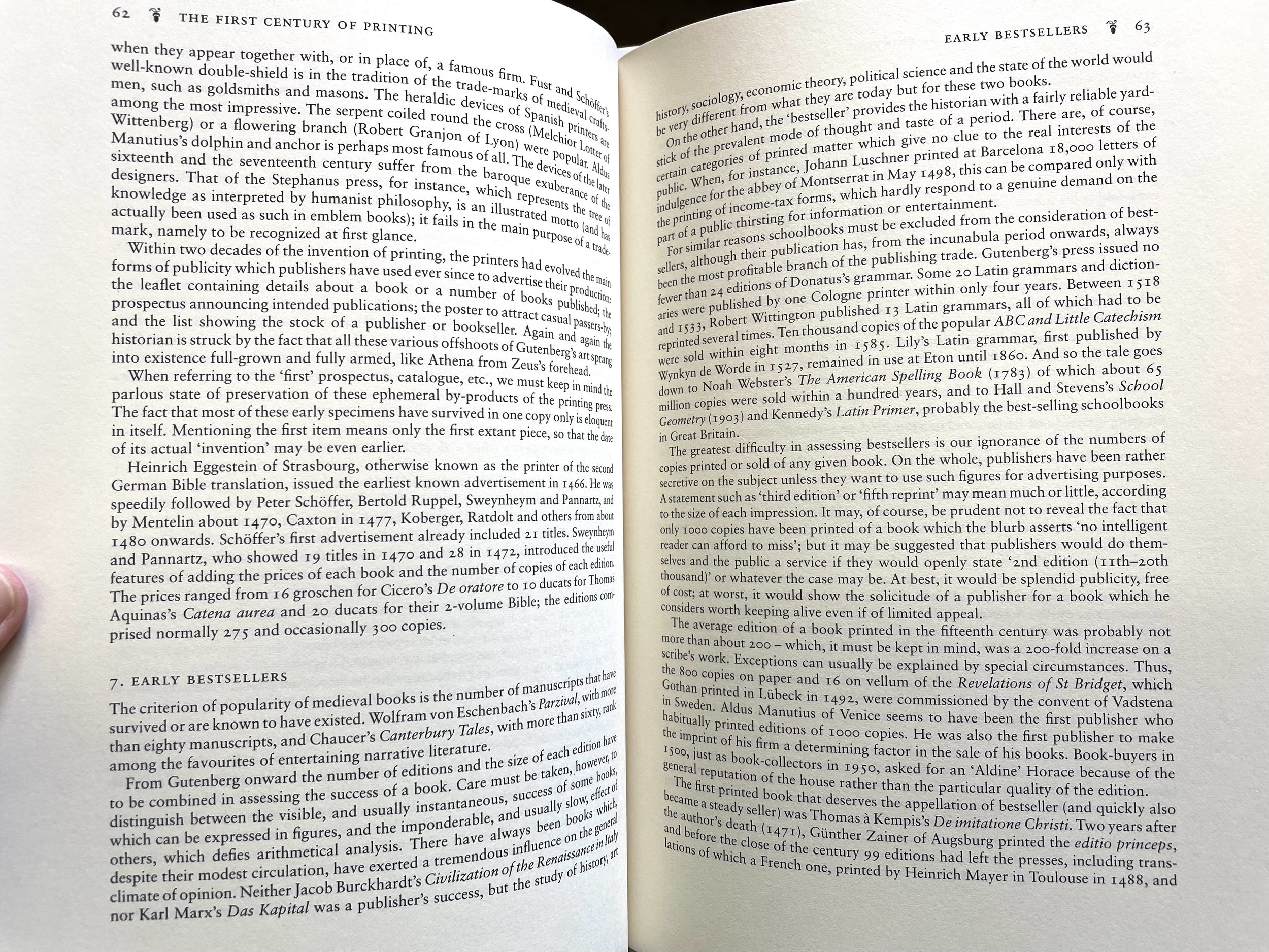
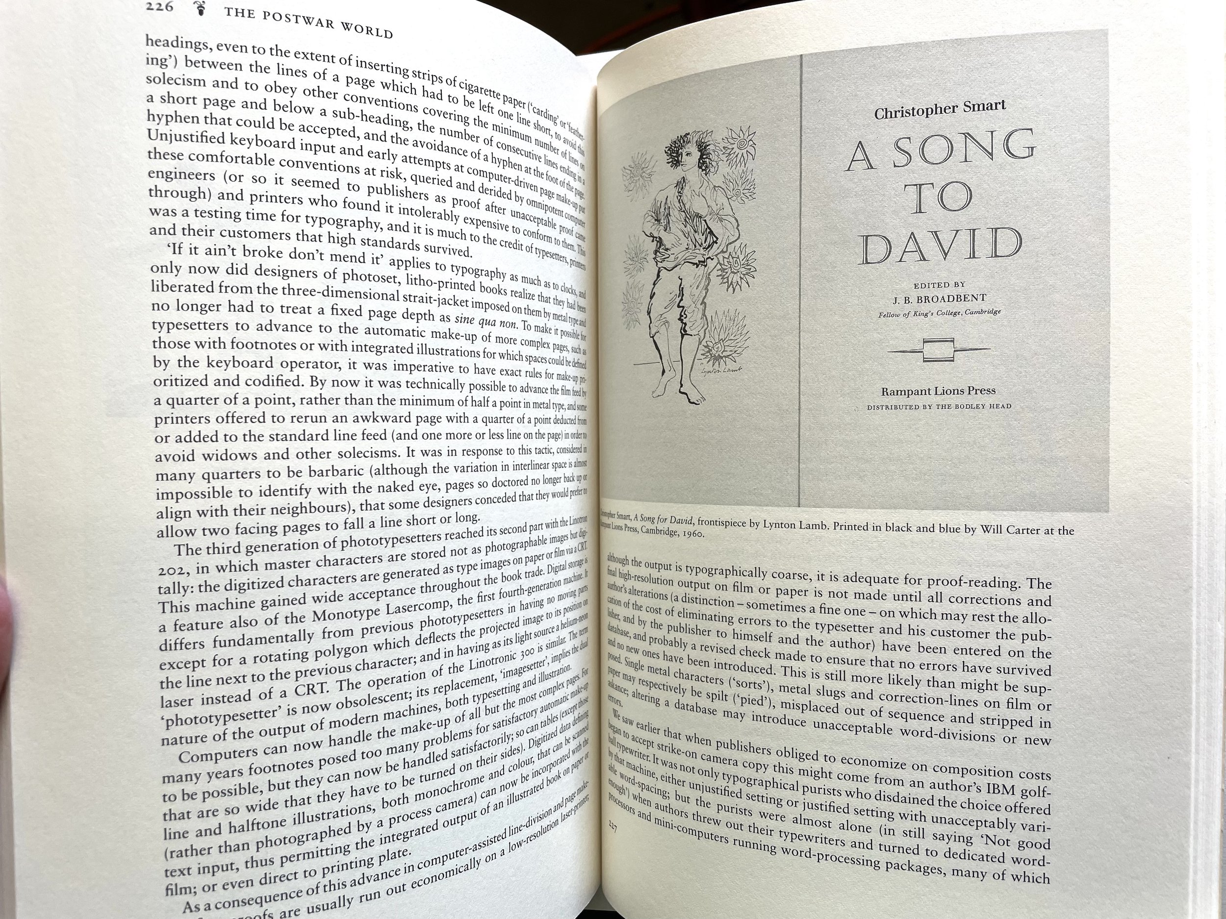
If you want a broader education in the history of Western printing, from Gutenberg to post-WWII, then settle in with this volume’s 250 pages of densely packed information. Originally published in 1955, the revised edition has been expanded and updated, including dozens of illustrations of manuscript pages through the ages. In addition to deft histories of printing and publishing technologies, Steinberg and Trevitt are interested in the economic and sociological aspects of the industry as well. They highlight and explore some of the cultural dimensions of book making, from the phenomena of bestsellers and censorship to the role of patrons and libraries. The authors also consider who “the reading public” is at any given time, noting the state of education, literacy, and book- and periodical-selling through the centuries. (Oak Knoll Press, 1996)


3. Twentieth Century Type Designers by Sebastian Carter

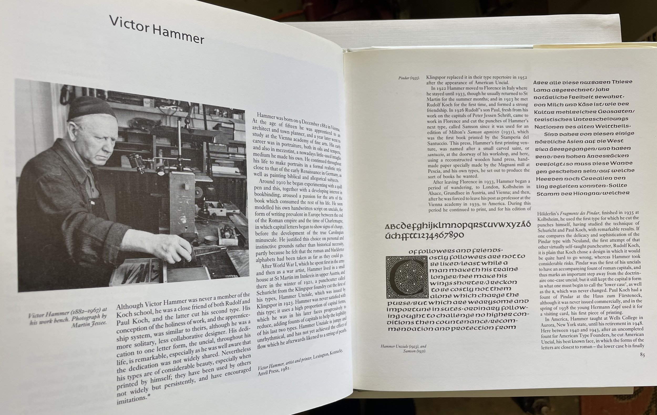
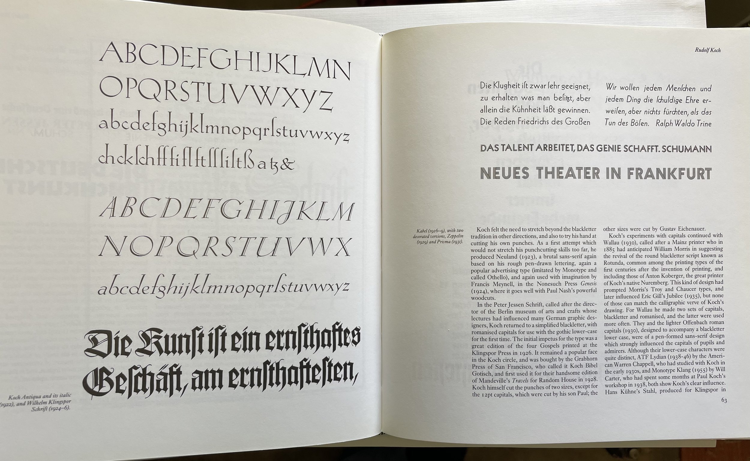
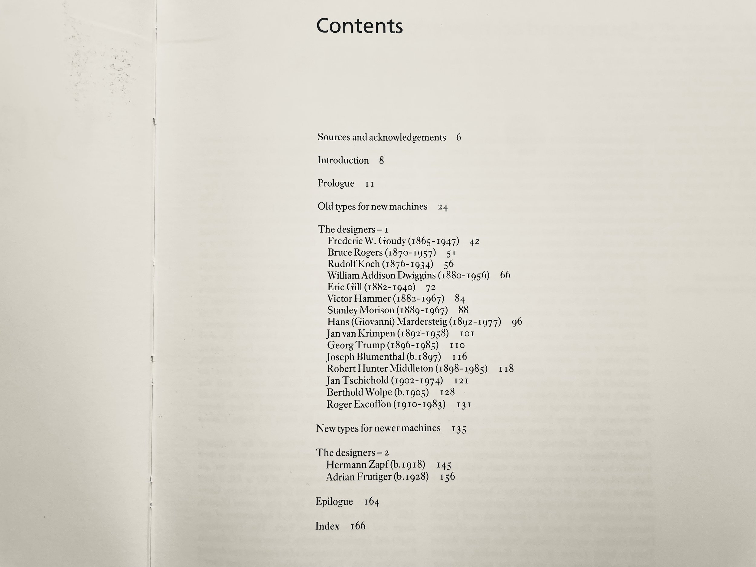
Ok, out of the dusty distant past and into the (relatively recent) present. In this volume, the book designer and printer Sebastian Carter profiles some of the best European and American type designers working from the early 20th century until this book was published in 1987. Frederic Goudy and William Addison Dwiggins are here, as well as Rudolf Koch, Victor Hammer, Jan van Krimpen, Joseph Blumenthal and many more — all of them men, of course, though there is one page devoted to Gudrun Zapf-von Hesse. (You can begin exploring women type designers here and here.) At a few well-illustrated pages per entry, Carter gives us a relatively brief but informative survey of each designer, their history and influences, and a feel for what makes their design(s) unique. I find myself pulling this book off the shelf at regular intervals, while taking a break in the print shop, to dip into the interesting personalities and creativities highlighted herein. (Taplinger Publishing, 1987)


Well, that’s all for now, friends, as I gotta get back to setting some type ;-) Stay tuned for future installments of Book Looks, and in the meantime, be well and read on!

Emily

5 Comments

Book Looks: Selections from the Press Library, Part 2

4 Comments

Book Looks: Selections from the Press Library, Part 2

Books. It all begins and ends with books here at St Brigid Press. 

Personally and professionally, my life has been significantly shaped by the encounters I’ve had with literature ~ I bet many of you have similar stories. Early in my continuing apprenticeship to traditional printing and book-making, kind friends and mentors in the craft directed me to essential volumes about letterpress, typography, printing history, and more. Those folks and the books they recommended got me started on the right foot, and I return again and again to their wisdom. 

Over the years, through the generosity of others and through my own acquisitions, the library at St Brigid Press has grown into a rich repository of texts. I thought it might be fun for us all to take a brief look at some of these volumes ~ from type design to press maintenance, printer’s biographies to sewing books.

Here’s the second installment of “Book Looks” ~ short spotlights on some of my favorite volumes from the Press library. Enjoy! (If you missed the first Book Looks post, read it HERE.)


BOOK LOOKS, PART 2

  1. A Short History of the Printed Word, by Warren Chappell & Robert Bringhurst

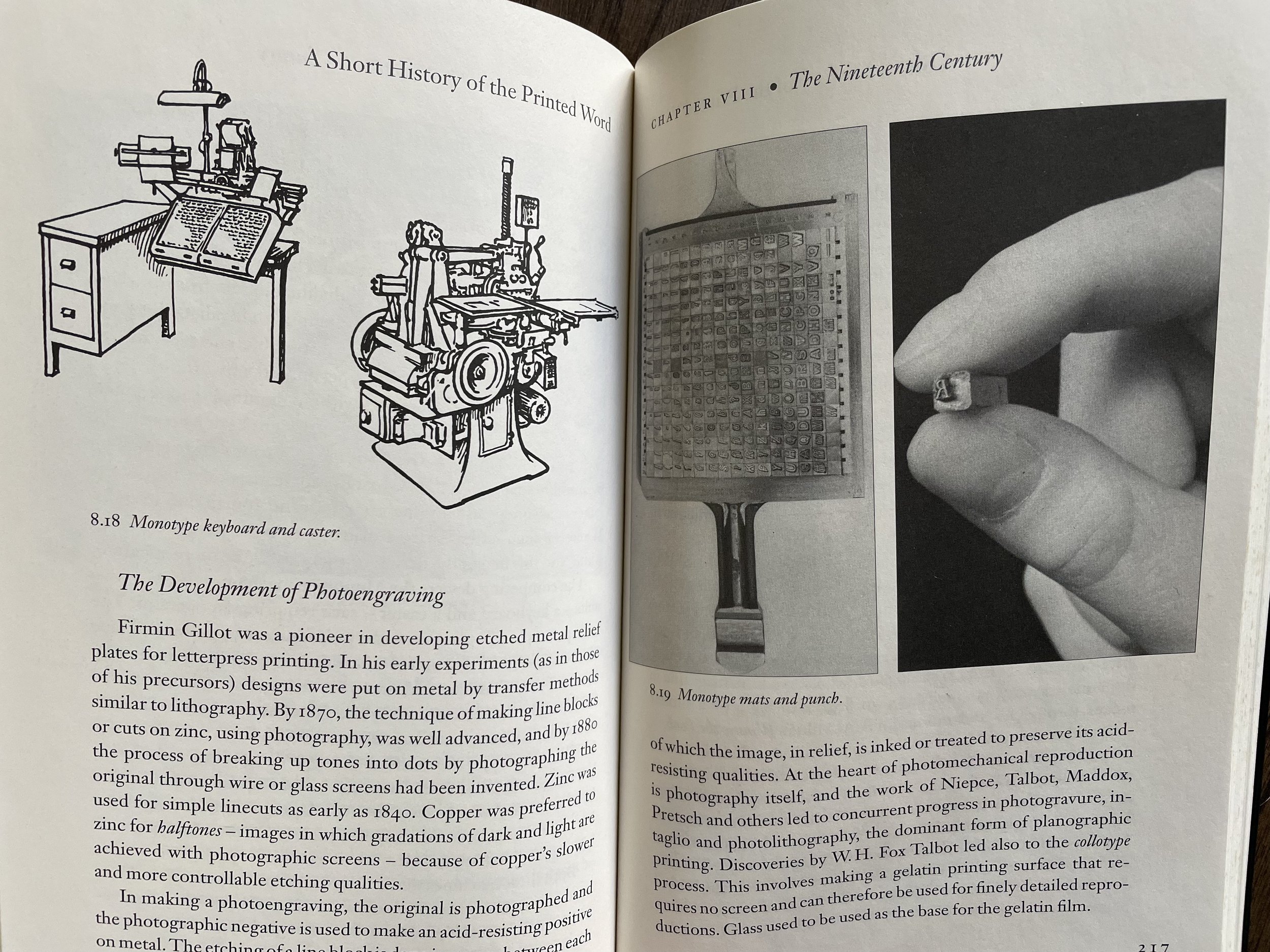
This is a good, concise introduction to the history of the origins and development of printing in the West. Warren Chappell’s original text from the early 1970s was revised and updated by Robert Bringhurst in the late 1990s to extend and expand the book’s scope. Beginning with the development of alphabets and cast type, Chappell and Bringhurst then give us a brisk, well-illustrated tour of the 15th-20th centuries: the innovations of type designers and typographers like Aldus Manutius, Simon de Colines, and Bruce Rogers; new techniques in printing illustrations from woodcuts to intaglio methods to electrotyping; and the rise and revolution of newspapers, periodicals, and, in the last chapter, digital production. This book helped me begin to get my head around the complex history of printing in the West, and introduced me to some of the brilliant people who forged new innovations in letterforms, book design, and production processes. Original edition of A Short History of the Printed Word was published in 1970; second edition published by Hartley & Marks, 1999.


2. Mary Ann Shadd Cary: The Black Press & Protest in the 19th Century, by Jane Rhodes

One of the many delights of delving into traditional printing and bookmaking has been the discovery of the individuals and communities who built the presses, designed the type, made the books, and passed along the printed word. One of those individuals was Mary Ann Shadd Cary — the first Black female publisher in North America. Cary (1823-1893) grew up well-educated, in a family of free African-Americans in Delaware. Her family was very active in the antislavery movement and in the movement to relocate Blacks to places where slavery had been abolished. One of those relocation areas was what is now Ontario, Canada, and Mary Ann moved there with her brother, first establishing a school and then becoming a journalist and publisher. In 1853, Cary founded The Provincial Freeman, a newspaper “Devoted to anti-slavery, temperance, and general literature.” It also supported women’s suffrage, and it served the region’s African-Canadian community for 4 years. She traveled widely, wrote essays about racial and gender equality, and, after the Civil War and the death of her husband, she moved back to the United States and got a law degree from Howard University. Cary was an amazing woman blazing trails in publishing and civil rights in the 19th century. Mary Ann Shadd Cary: The Black Press and Protest in the Nineteenth Century by Jane Rhodes is published by Indiana University Press, 1998. If Rhodes’ full biography is not for you, then here’s a newspaper article that hits some of the highlights.


3. Against the Grain: Interviews with Maverick American Publishers, edited by Robert Dana

City Lights. Godine. Copper Canyon. New Directions. These now-legendary independent poetry publishing houses were started by likewise legendary personalities: Lawrence Ferlinghetti, David Godine, Sam Hamill & Tree Swenson, and James Laughlin. In the mid-1980s, the poet Robert Dana interviewed these and a few others who worked on the leading edge of small press publishing in 20th century America. It’s a fascinating read, ranging from the inky details of typesetting to the state of the then avant-garde. I particularly enjoyed “listening” to one of my letterpress heroes, the fine press typographer and designer Harry Duncan: “I print books for somebody who is going to discover the text of the book—poems, stories, and so on—with the same delight that I discover it as I am working on the book.” Against the Grain was published by the University of Iowa Press, 1986.

There are only two ways to publish. One is to try to figure out what everyone else will like, which I’ve generally found to be totally unsuccessful, because nobody knows. And the other is to know what YOU like... So what I like is what I publish.
— David Godine

Stay tuned for future installments of “Book Looks,” friends. In the meantime, be well and read on!

Emily

4 Comments