
Hello, Friends of the Press!
This is the first of a new blog series profiling the backstories of some of the equipment here. From presses to paper cutters, we’ll take a brief look at each tool, highlighting its history and how it came to St Brigid. Hope you enjoy meeting some of these venerable members of our print shop!
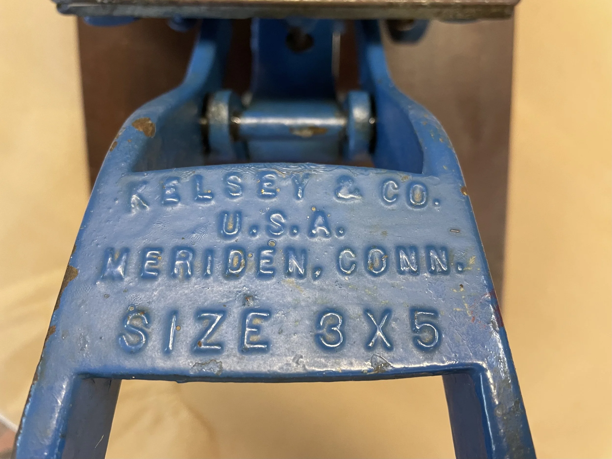
The Kelsey Excelsior 3x5 ~
A Tiny Mighty Press!
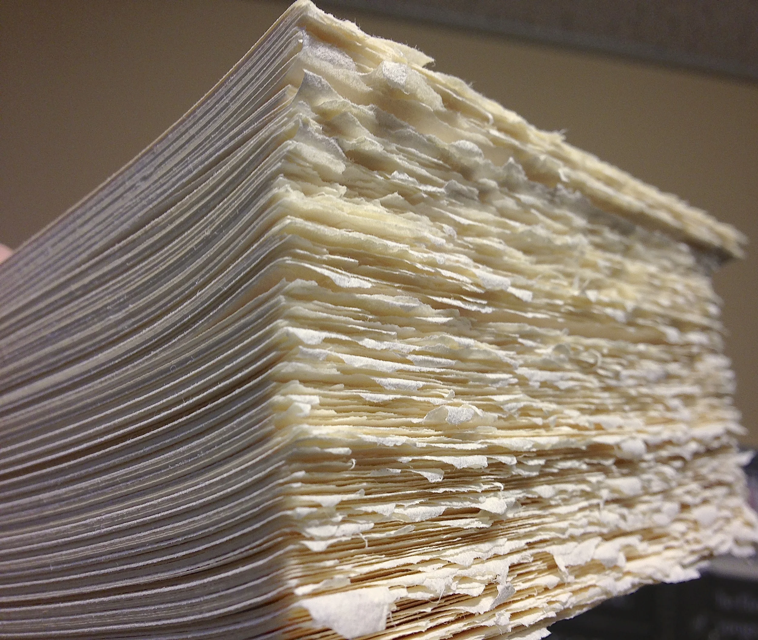
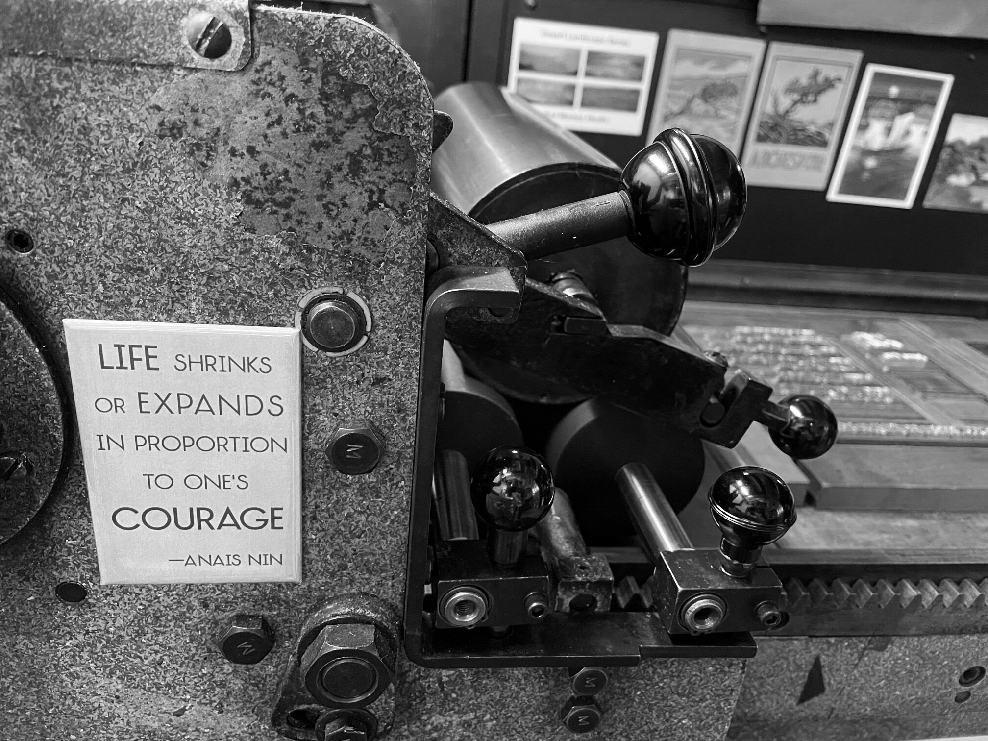
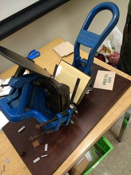
The largest press in the shop at St Brigid weighs over 1500 pounds. At just a bit more than 20 pounds, the Kelsey Excelsior 3x5 is the smallest. But this century-old wee wonder punches far above its weight in its role as an ambassador for letterpress printing.
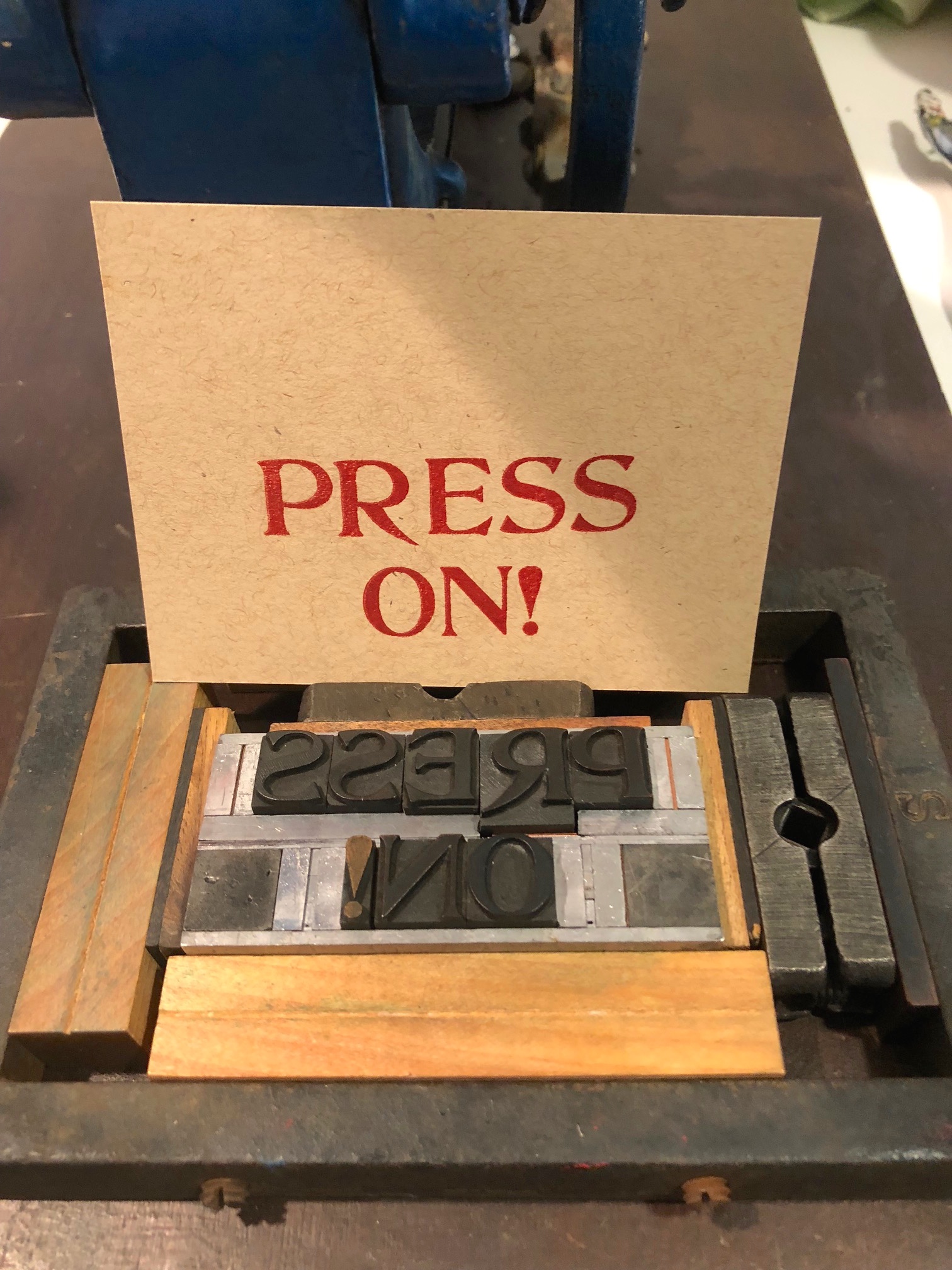
The circa-1930 Kelsey Excelsior 3×5 printing press here at St Brigid.
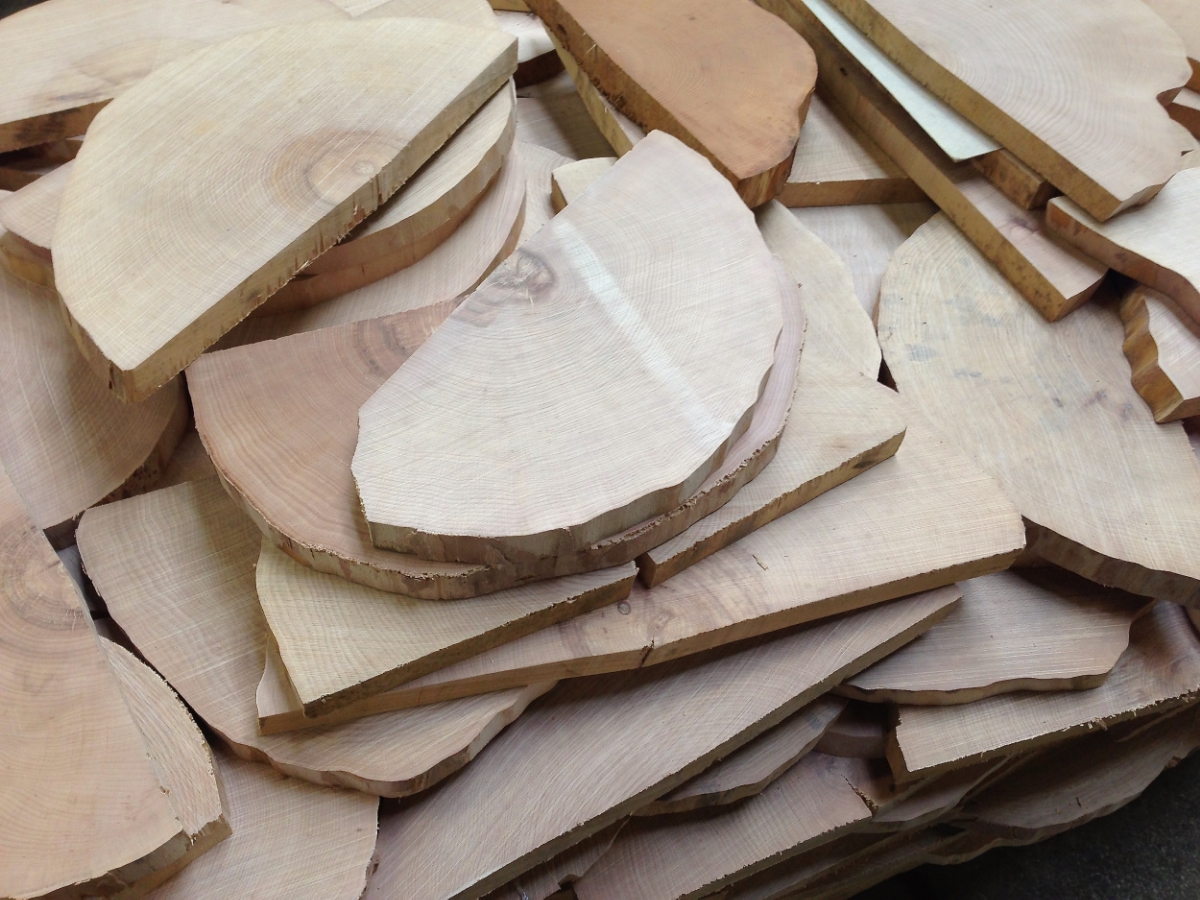
The Kelsey Company in Connecticut manufactured a long line of “Excelsior” table-top printing presses for the hobby trade, beginning in 1873 and continuing until 1994. They marketed their presses (and their kits of ink, type, and stationery) to the kids who aimed to make their own name tags or Christmas greetings, as well as the businessmen who wanted to print their own business cards. These portable presses delighted generations of inky enthusiasts — and still do.
How did this particular bright blue Kelsey press find its way to the St Brigid shop? Read on to find out the amazing backstory.


In the 1920s and ‘30s, a boy named Stephen lived with his family in Erie, Pennsylvania. When his grandfather passed away, Stephen was given his grandfather’s gold-tipped cane. Though a stylish accoutrement of a well-to-do gentleman, the cane held little interest for the young lad — except as a means to a different, much more enticing treasure. In 1930, Stephen pawned that fancy walking stick for ten dollars and bought himself a Kelsey printing press. This Kelsey press.
Stephen went on to enjoy letterpress printing so much that he kept the hobby up throughout his life. When he had a son of his own, he taught him to love printing, too. In 2015, when retirement and downsizing bid the son to consider passing the Kelsey on to new inky hands, he put up an ad on a printers’ forum. Luckily, happily, magically, I was the one to see that notice and was able to welcome the press to the print shop here.
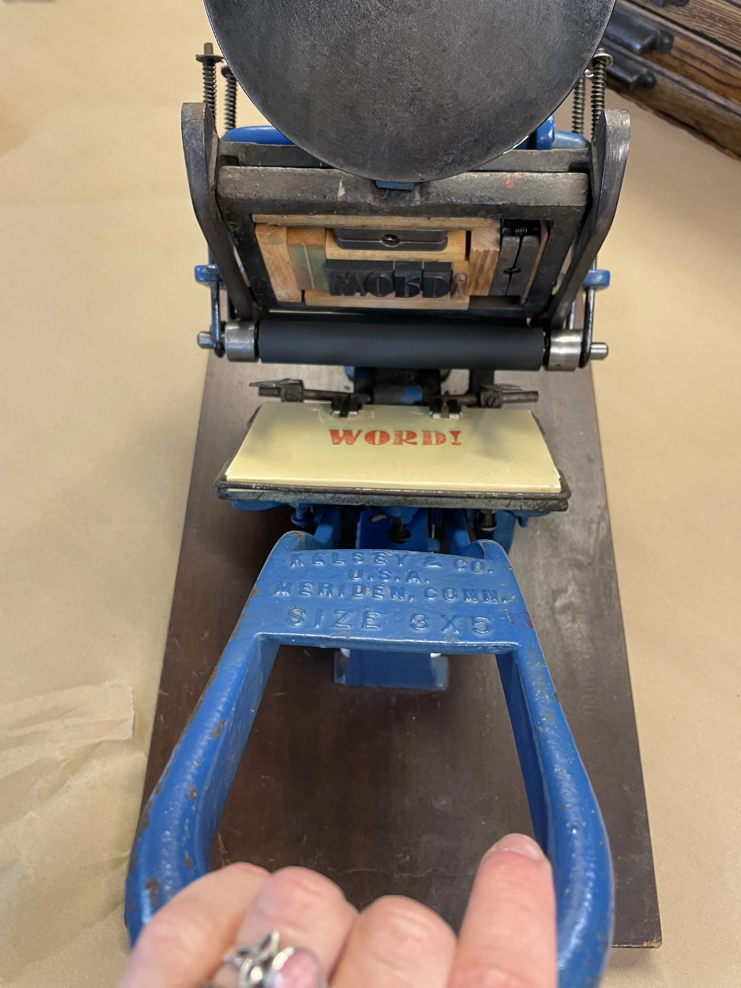
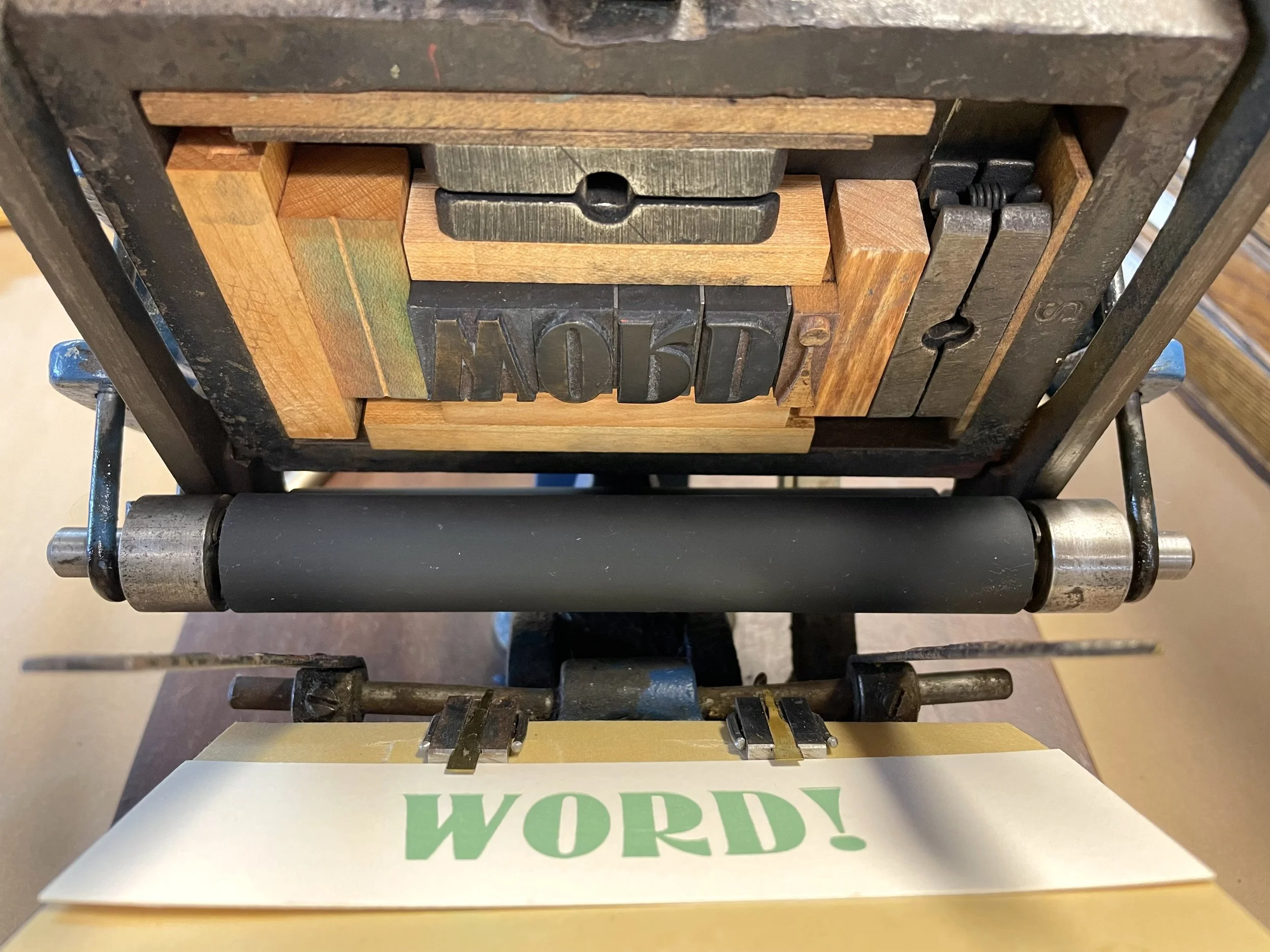
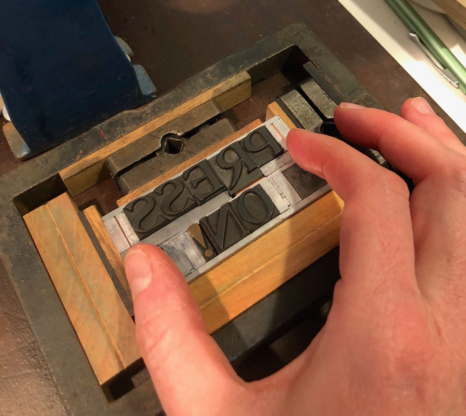
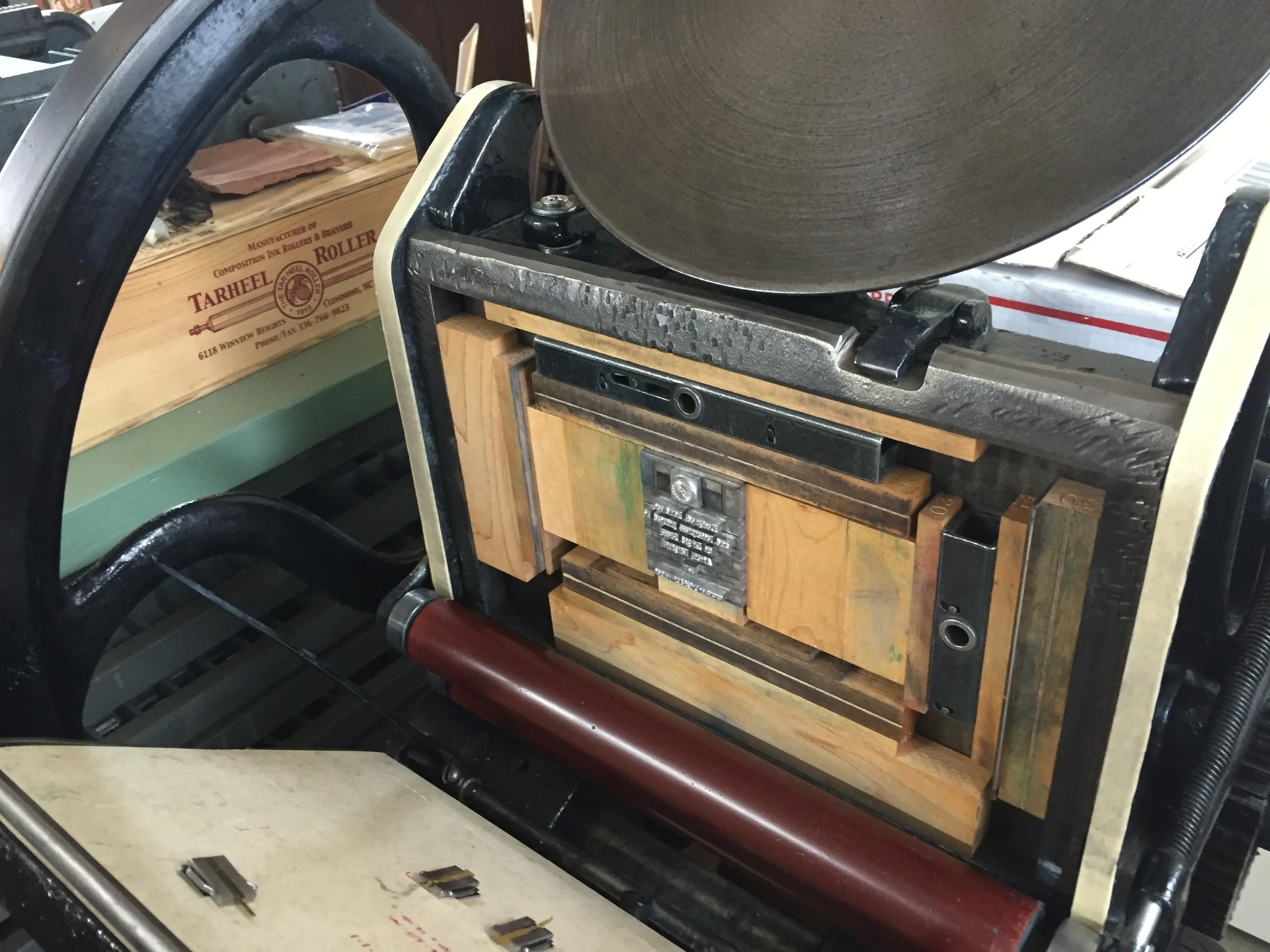
The Kelsey press operates by pressing down on the U-shaped handle, which causes the inked rollers to move across the type (not shown in this video) and the press to close, transferring the ink to paper. Before returning to the open position, the rollers take up more ink from the rotating disc.
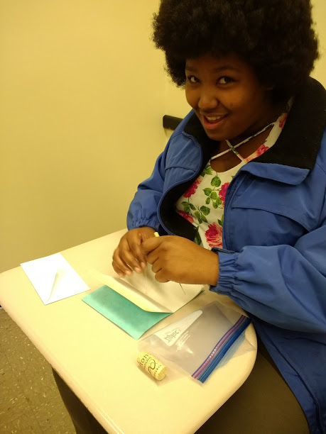
Janae, a student at a college in northern Virginia, delights in printing her first piece on the Kelsey.
In the past ten years, the Kelsey 3x5 has been a wonderful ambassador for the trade, accompanying me to numerous events to demonstrate the basics of traditional printing. The small press always makes a big impact, and each time I see the sparkling eyes and smiling faces of new printers, I say thank you to that boy in Pennsylvania who, almost 100 years ago, dreamed big with this Tiny Mighty Press.

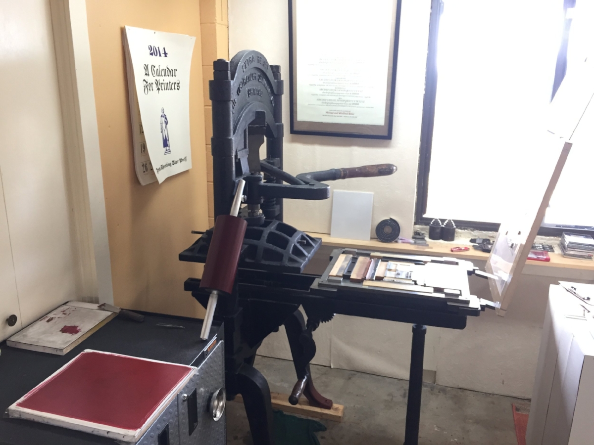
The Kelsey 3×5 printing press perched atop its (very) big sibling, the 1500lb Chandler-&-Price press.


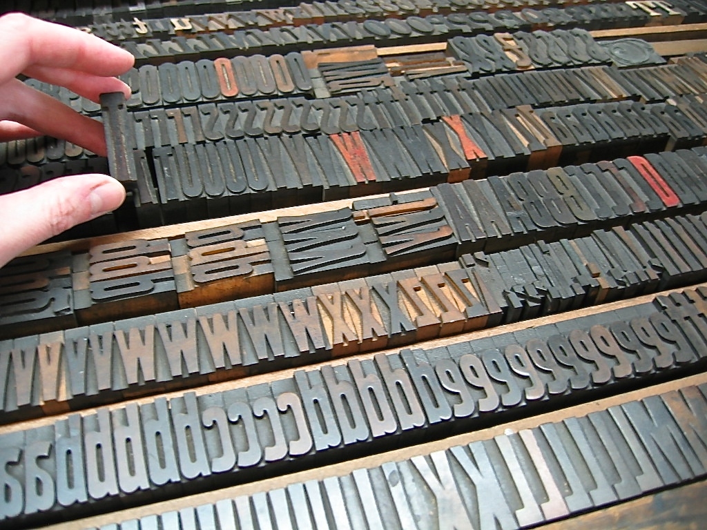
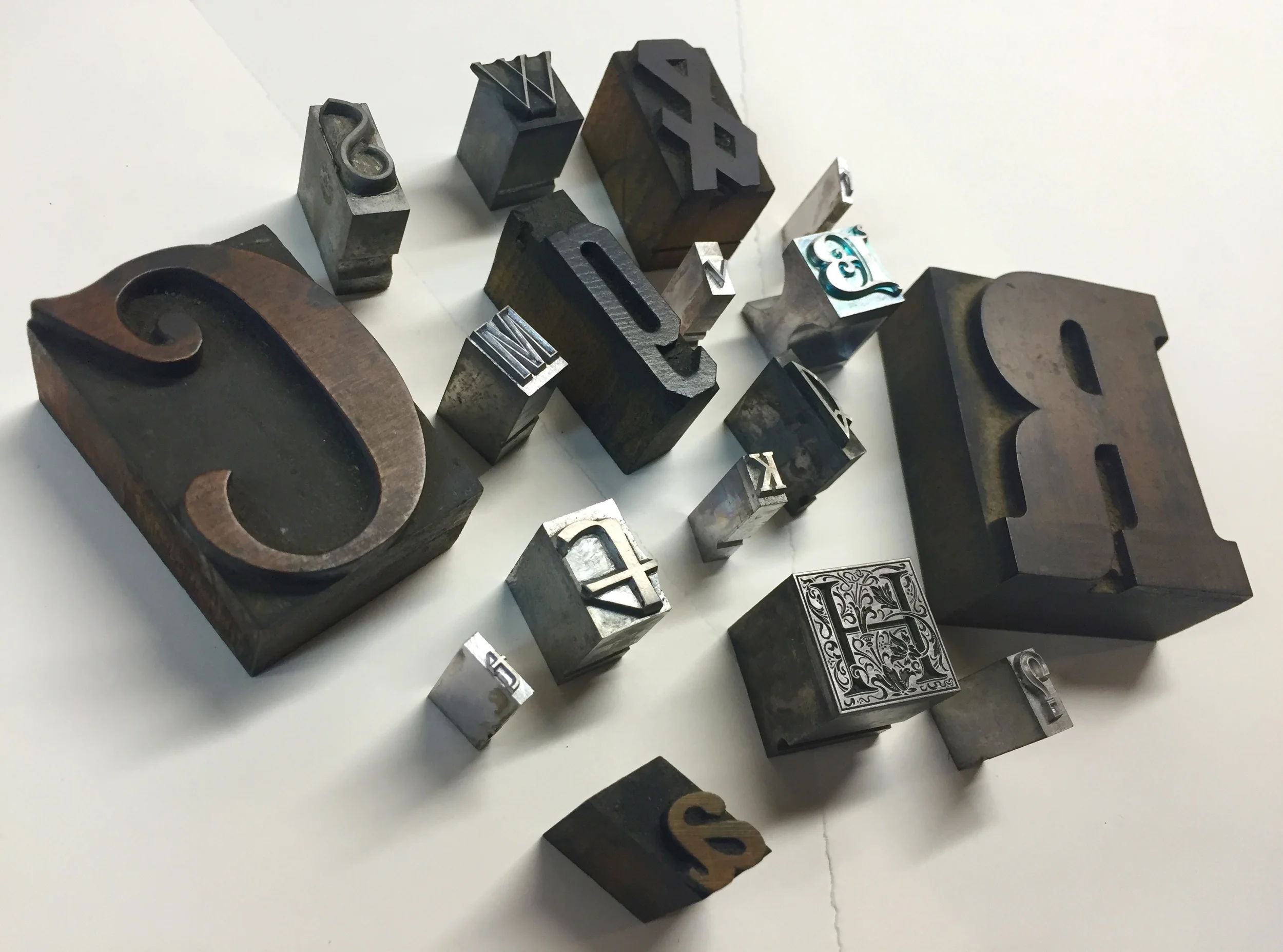


 Not to mention our "b"s and "d"s!

