
Hi, Friends of St Brigid Press!
Here is the long-awaited fourth installment in our occasional blog series ~ A Letterpress Lexicon ~ about the words and phrases that identify printing's particular tools and processes. Enjoy!
If you missed the first posts in this series, you can find them here:
A Letterpress Lexicon Part 4 ~ Spacing Out
We space out daily here at the Press ~ all for a good cause. ;-)
You might already know that every single letter of the alphabet that we set and print here is a physical piece of metal or wood ~ a piece .918-inches tall, with the reverse image of the letter on the top, in relief.

Hand-set type:
Moveable type, which makes everything possible here at the Press. Here, the letters of the word "haiku" in metal.
Well, every single SPACE between every word and every line is also a physical piece of metal or wood. These pieces are made a little lower than the top of the letters, so that they do not pick up ink.
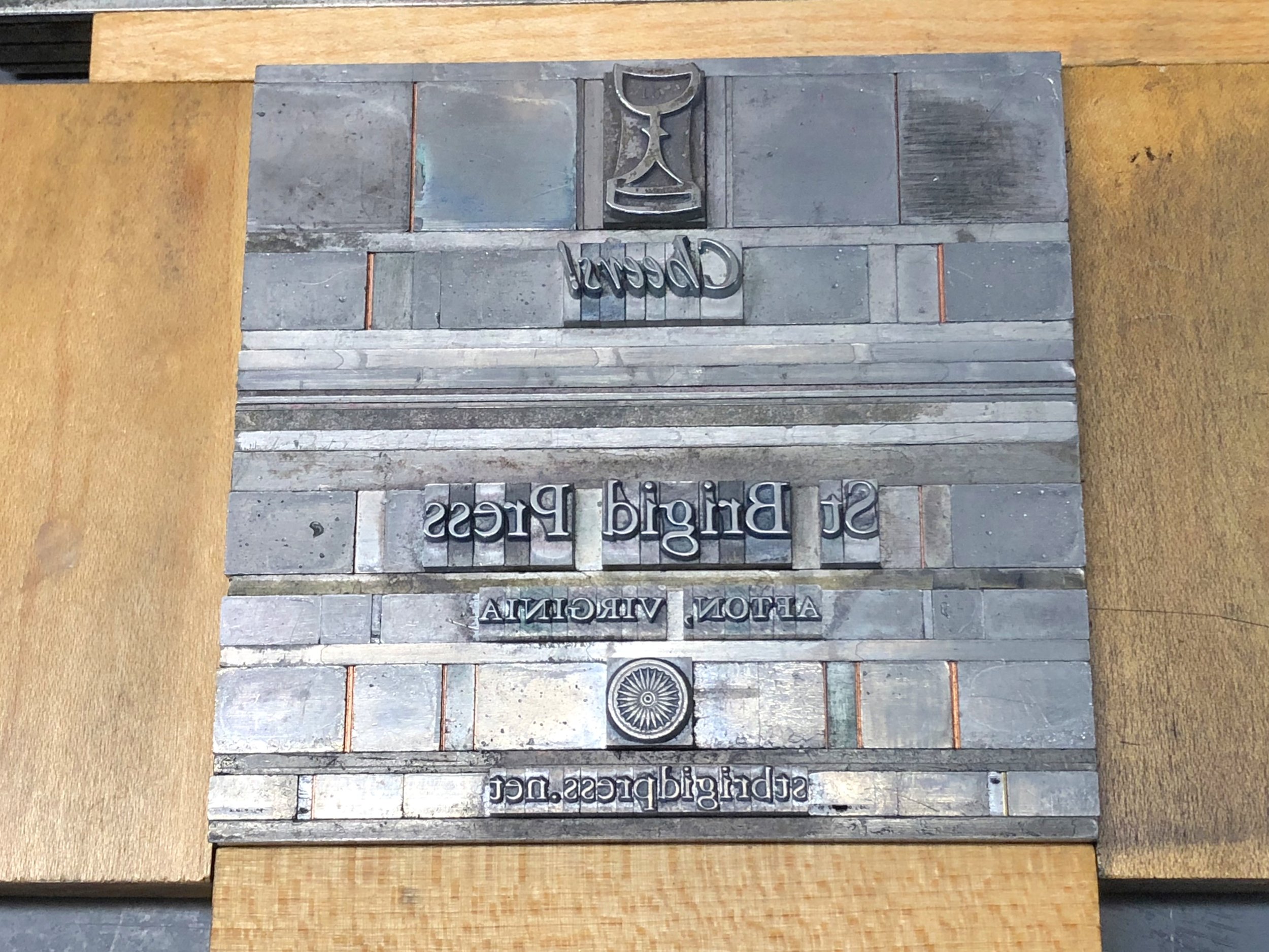
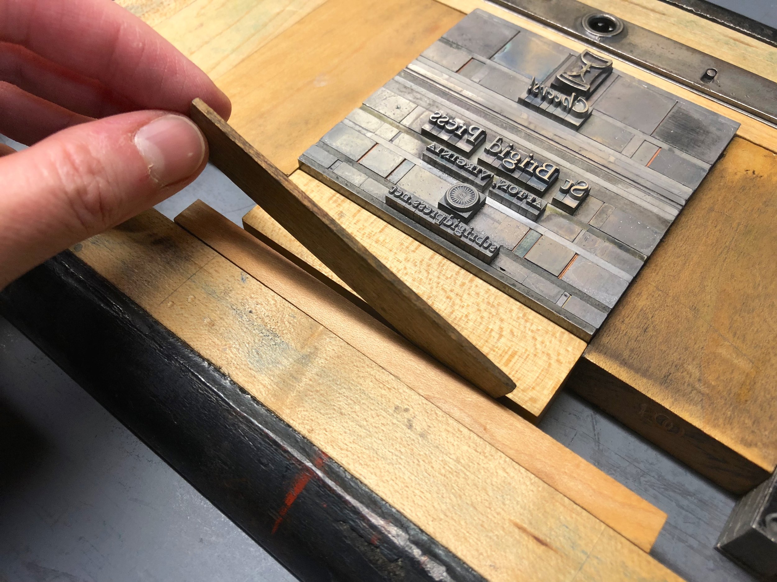
The forme:
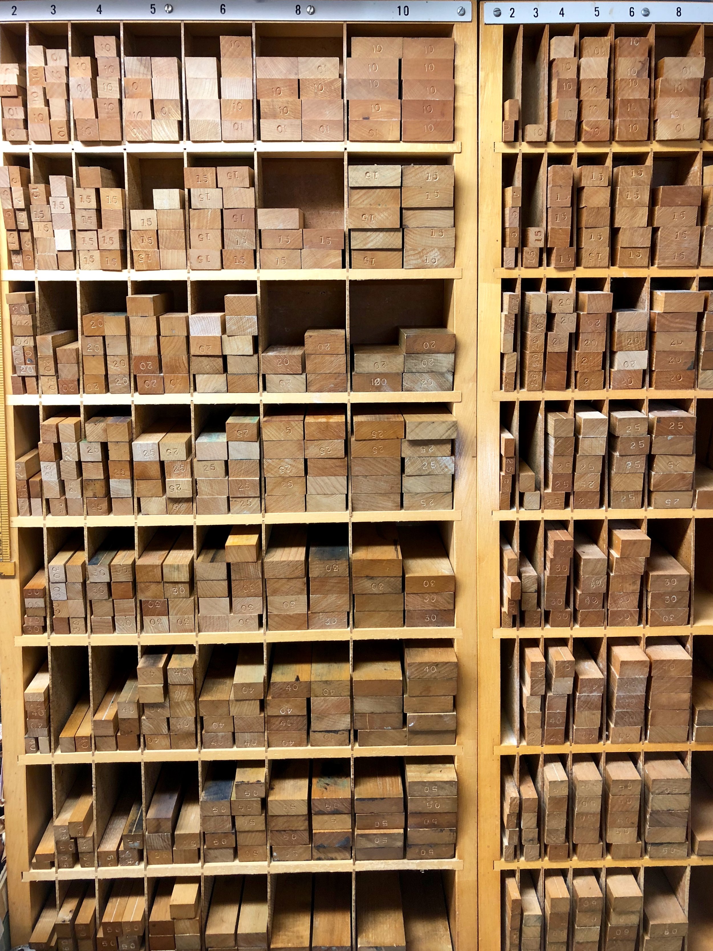
In this photo, you can see all of the metal spacing material surrounding the metal letters. The spacing material is a bit lower in height, so it does not get ink on it, and comes in various sizes according to the size of the type (12-point, 24-point, etc.). The spacing between the lines of type is also metal, cut to length.
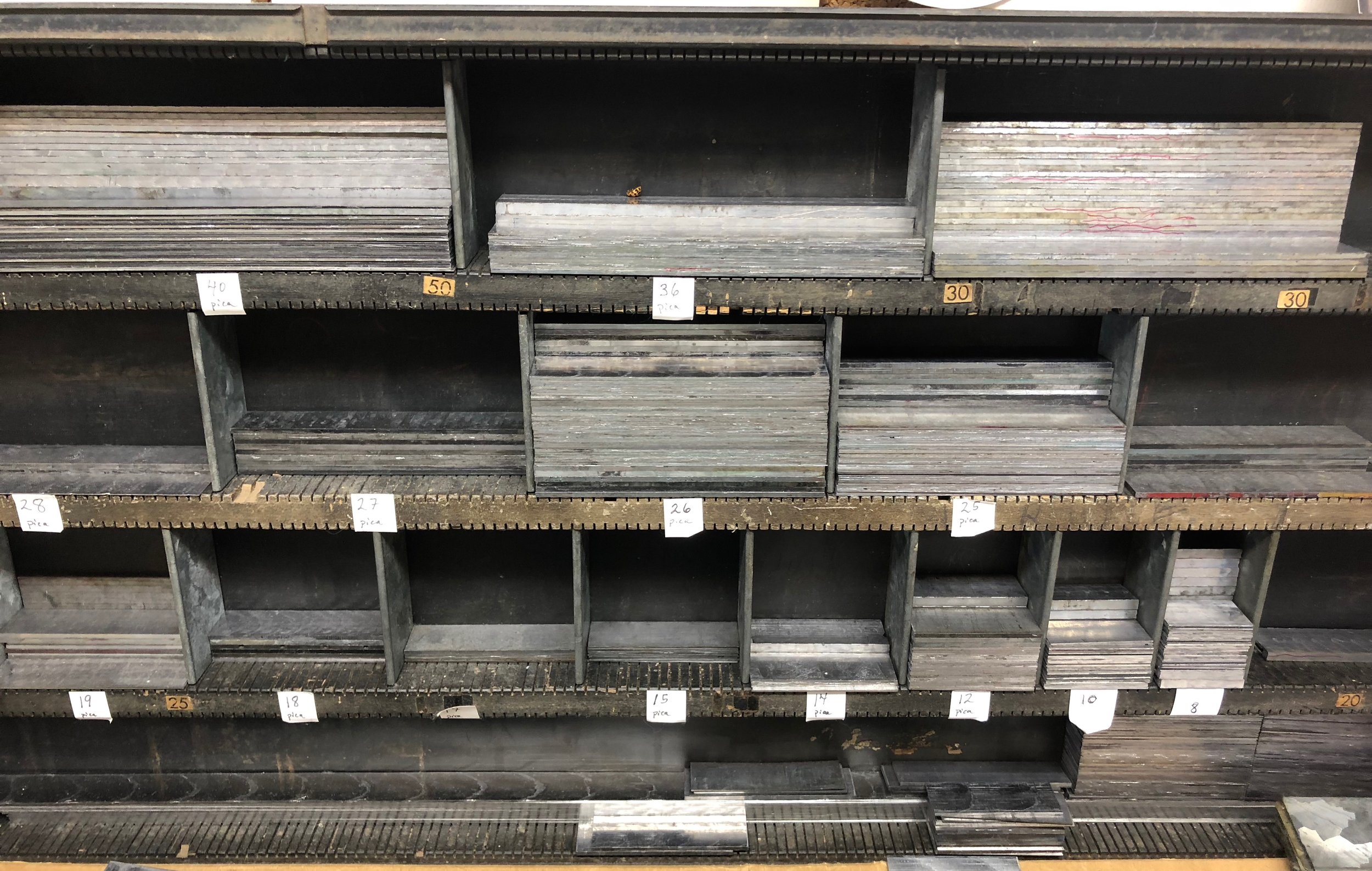
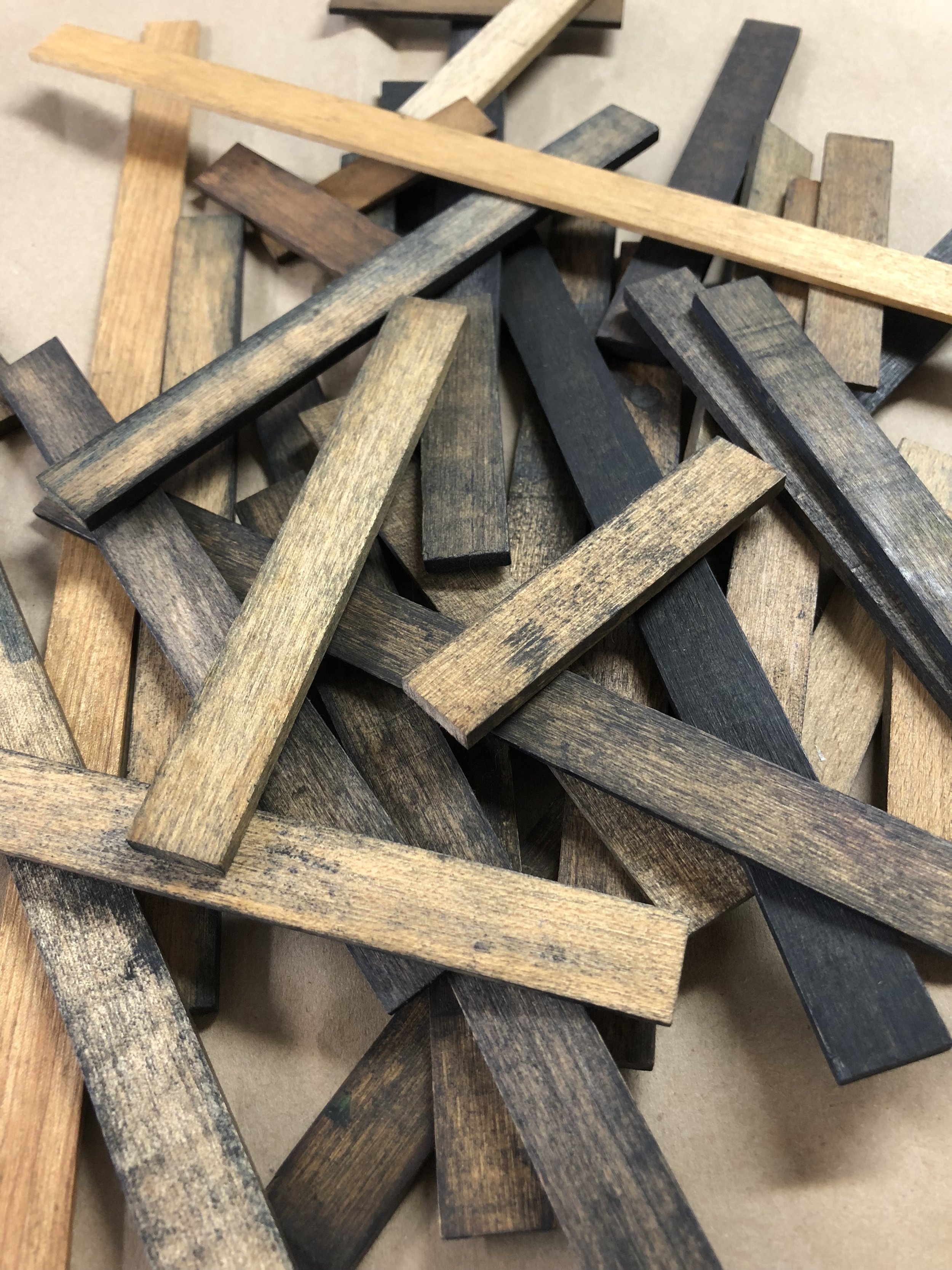
The spacing material is cast to a point-size matching the size of the type body being set ~ from tiny 6-point to giant (and heavy!) 72-point in our shop. Spacing is also cast in various standard widths, so the typesetter can put larger or smaller spaces between words, as desired. These widths range from multiples of an "em" (the square of the type body; for example, a 12-point-by-12-point square) to "thins" (brass and copper slivers to fill in the smallest gaps in a line).


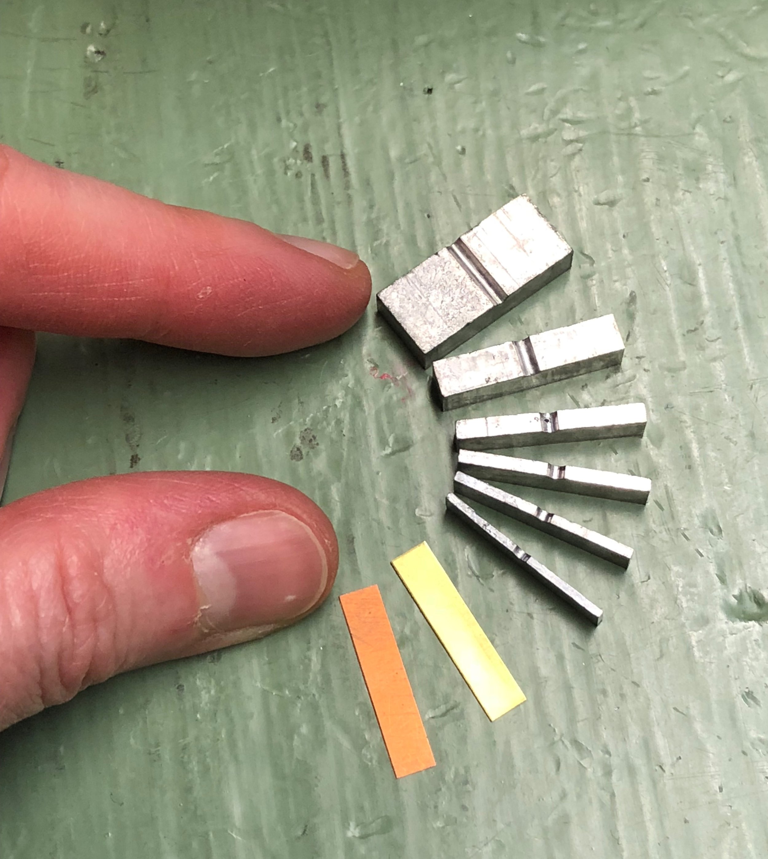
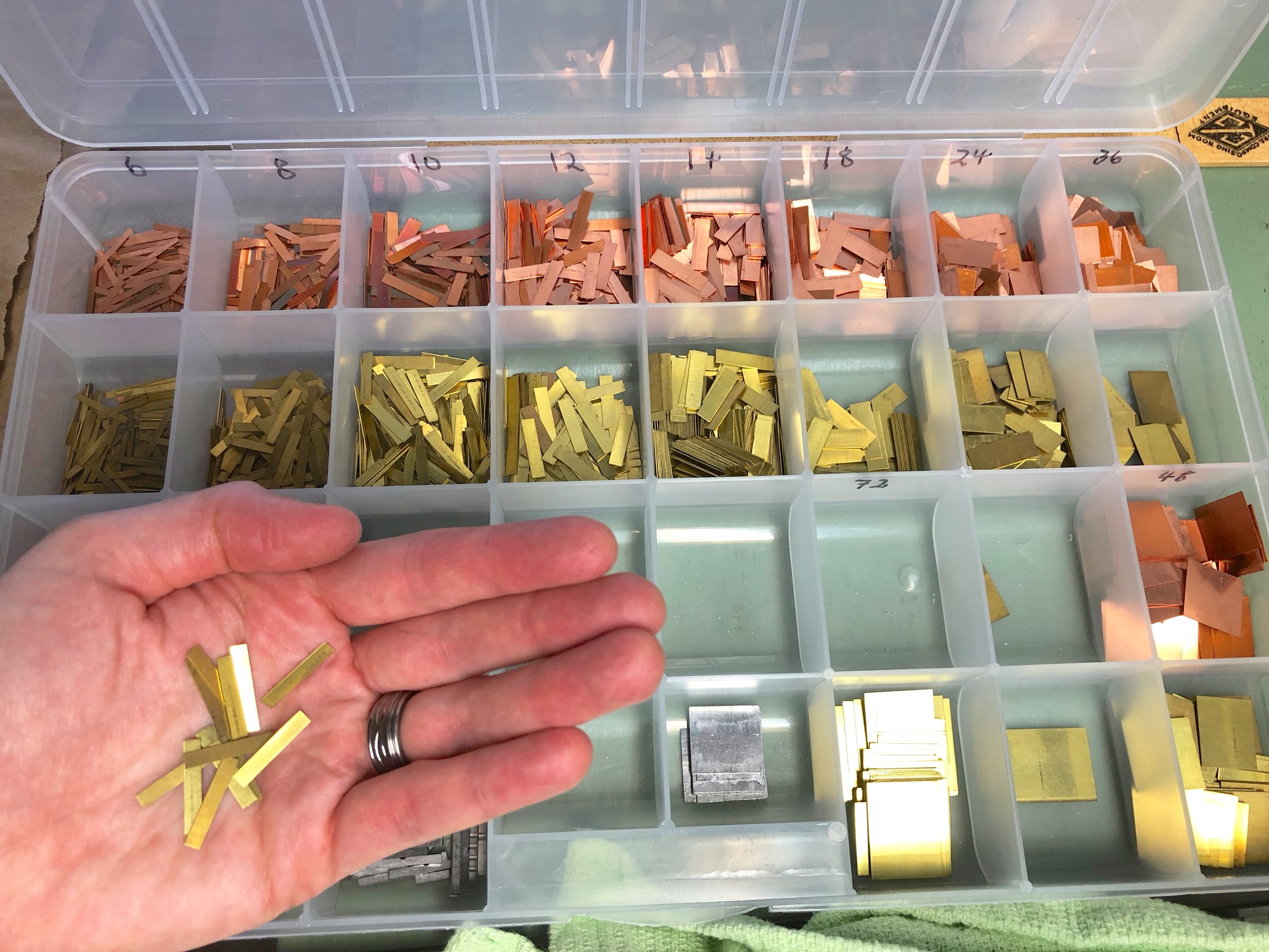
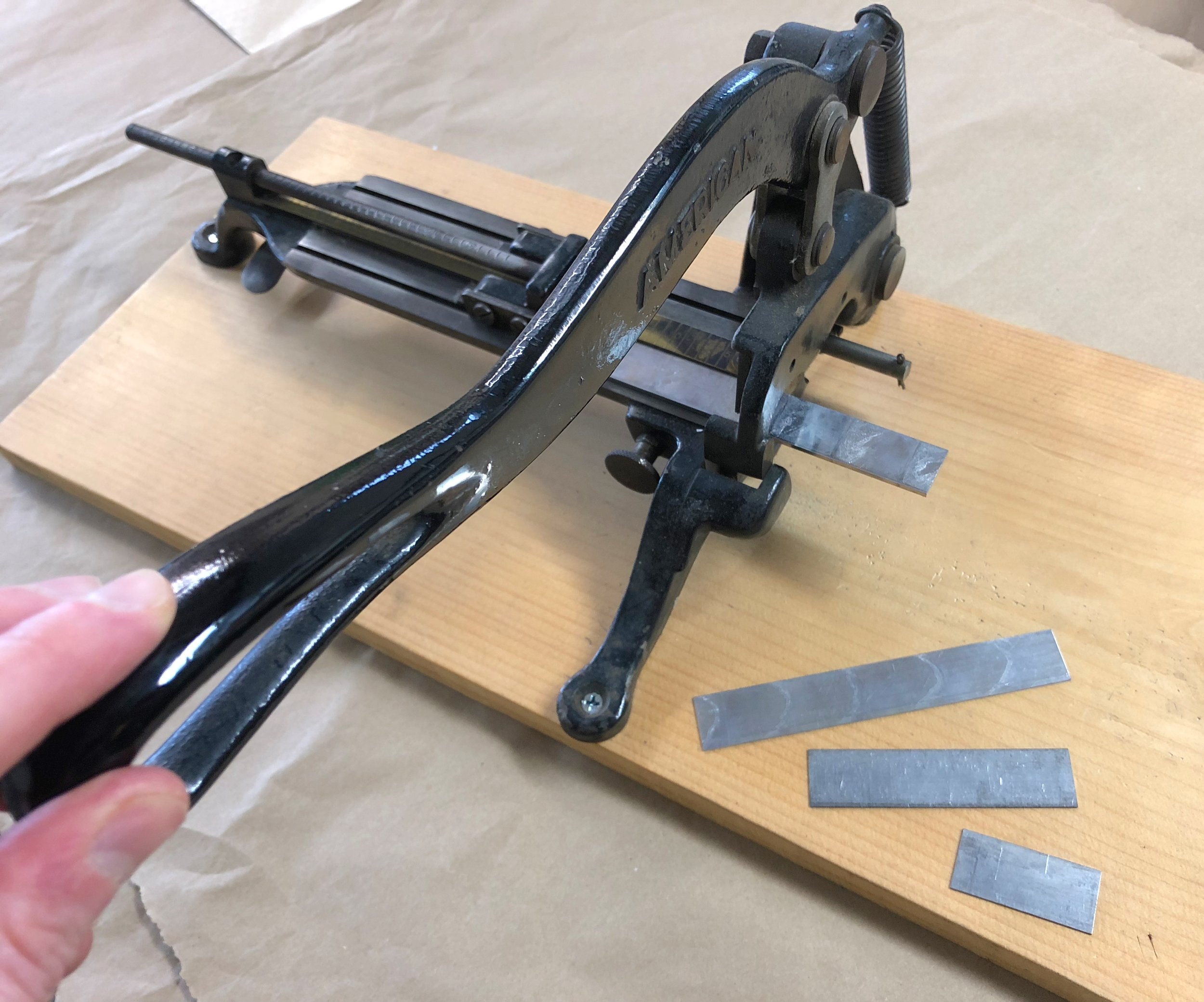
In addition to letter spacing, strips of metal also need to be correctly sized and set between lines of type ("leading" or "linespacing"). This strip material comes in various widths and can be cut to various lengths (also called "slugs") ~ all tailored to ordering the printed page.
The whole point of spacing is to surround the letters and lines as snug as possible. A loose letter can print unevenly, and even become damaged.
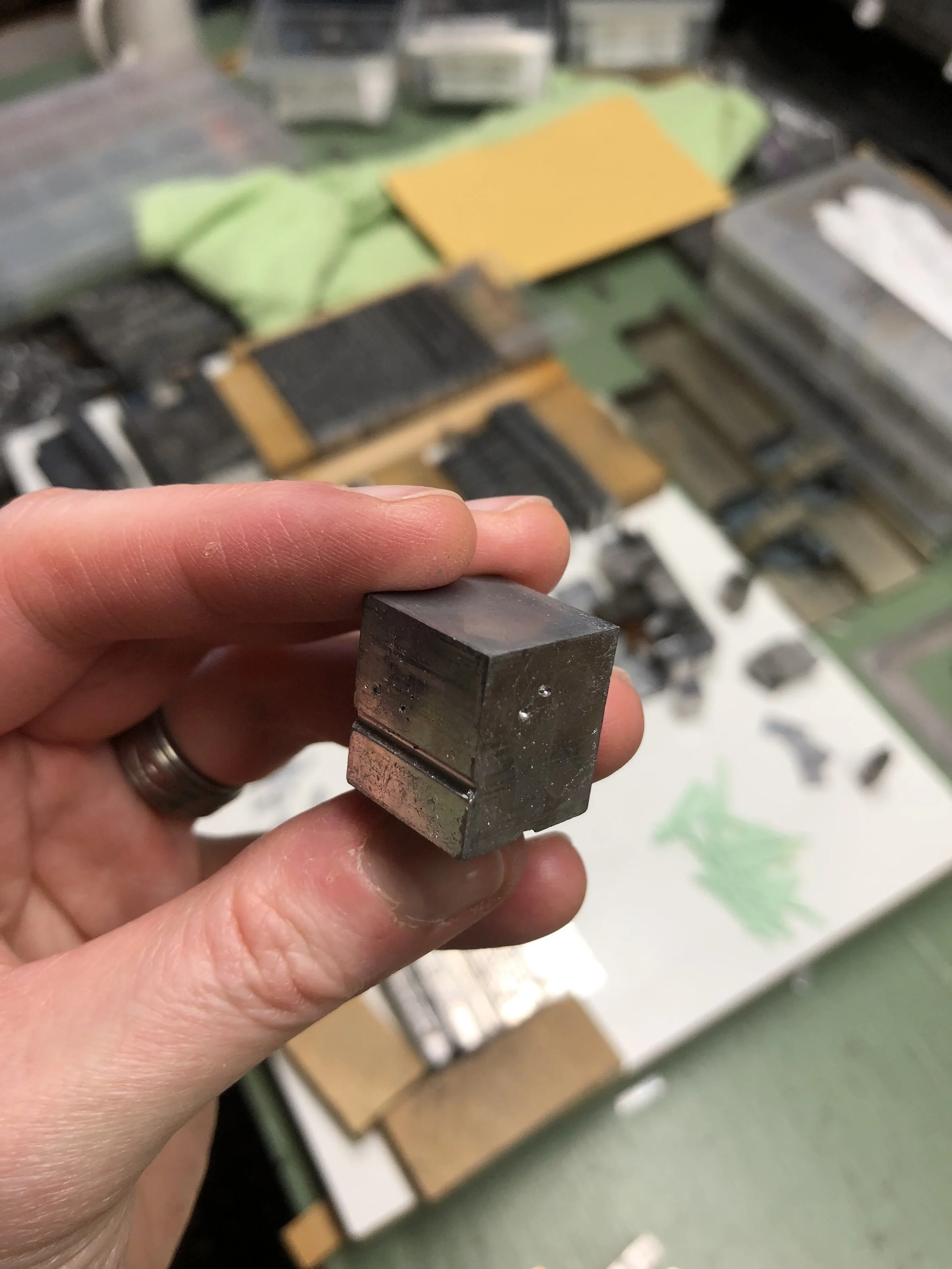
The final step before printing is to surround the whole forme (the letters and spaces) with "furniture" ~ blocks of wood (sometimes metal) in various standard sizes that fill out the chase. Two quoins (a kind of lock) are placed in as well, and when turned with a key the quoins tighten everything together.
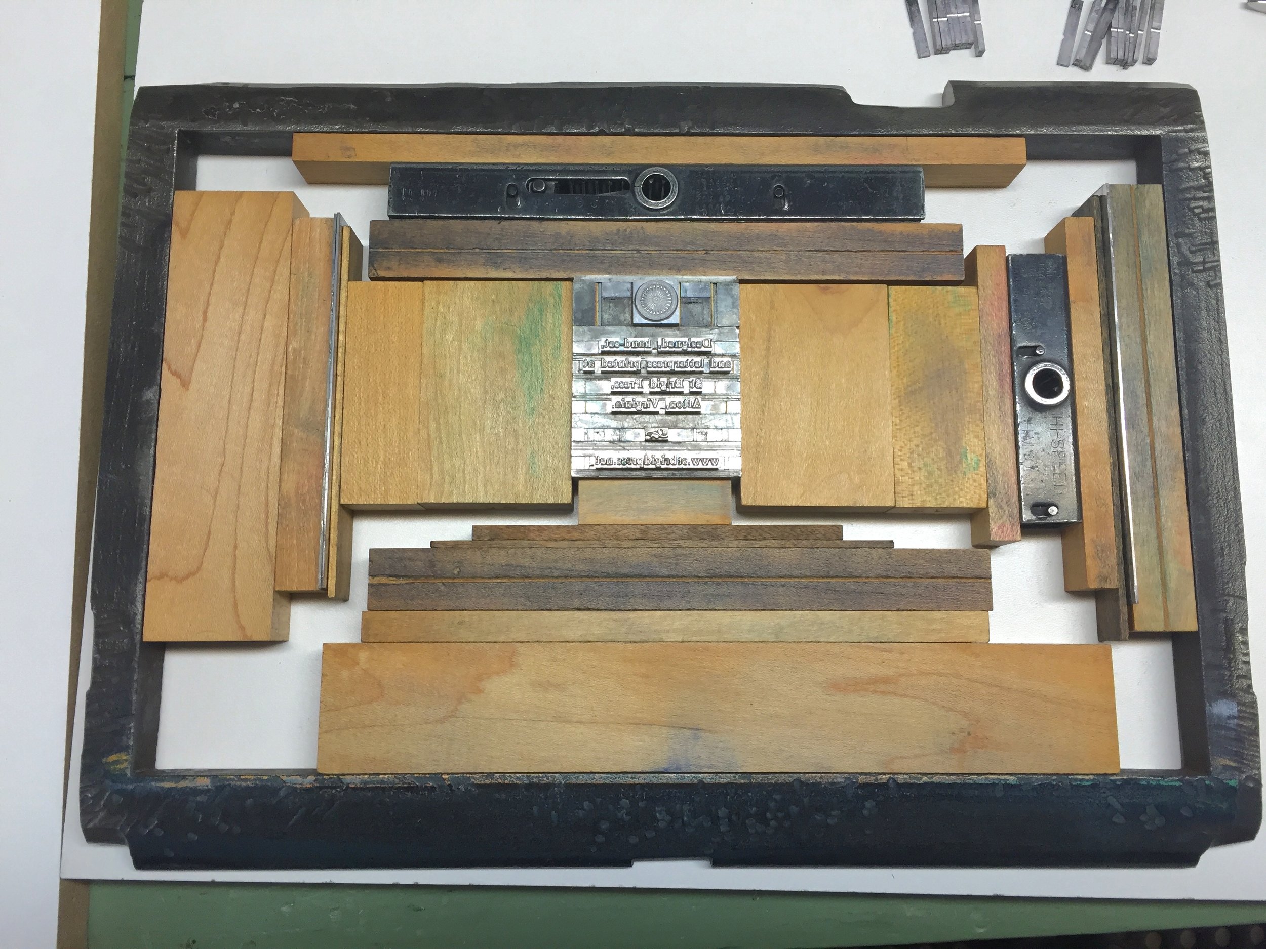
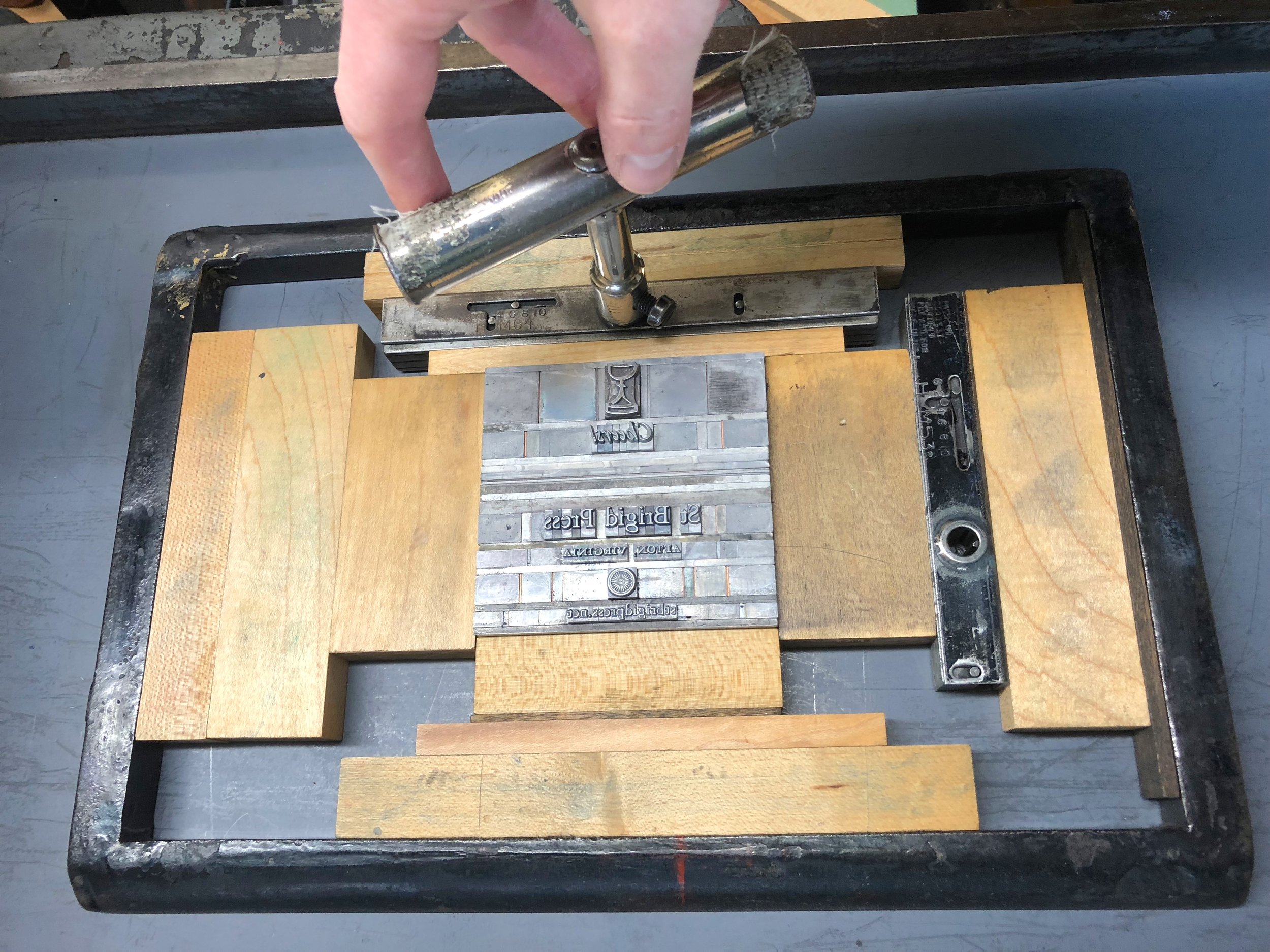
When the forme to be printed is locked up tight, I can lift it off the table and into the press without fear of everything collapsing onto the floor.

The printer:
Emily, holding a tightly locked forme in mid-air. If the spacing material has been set correctly, the whole thing can be transferred easily to the printing press. If it has NOT been set correctly... well.. catastrophe can ensue.
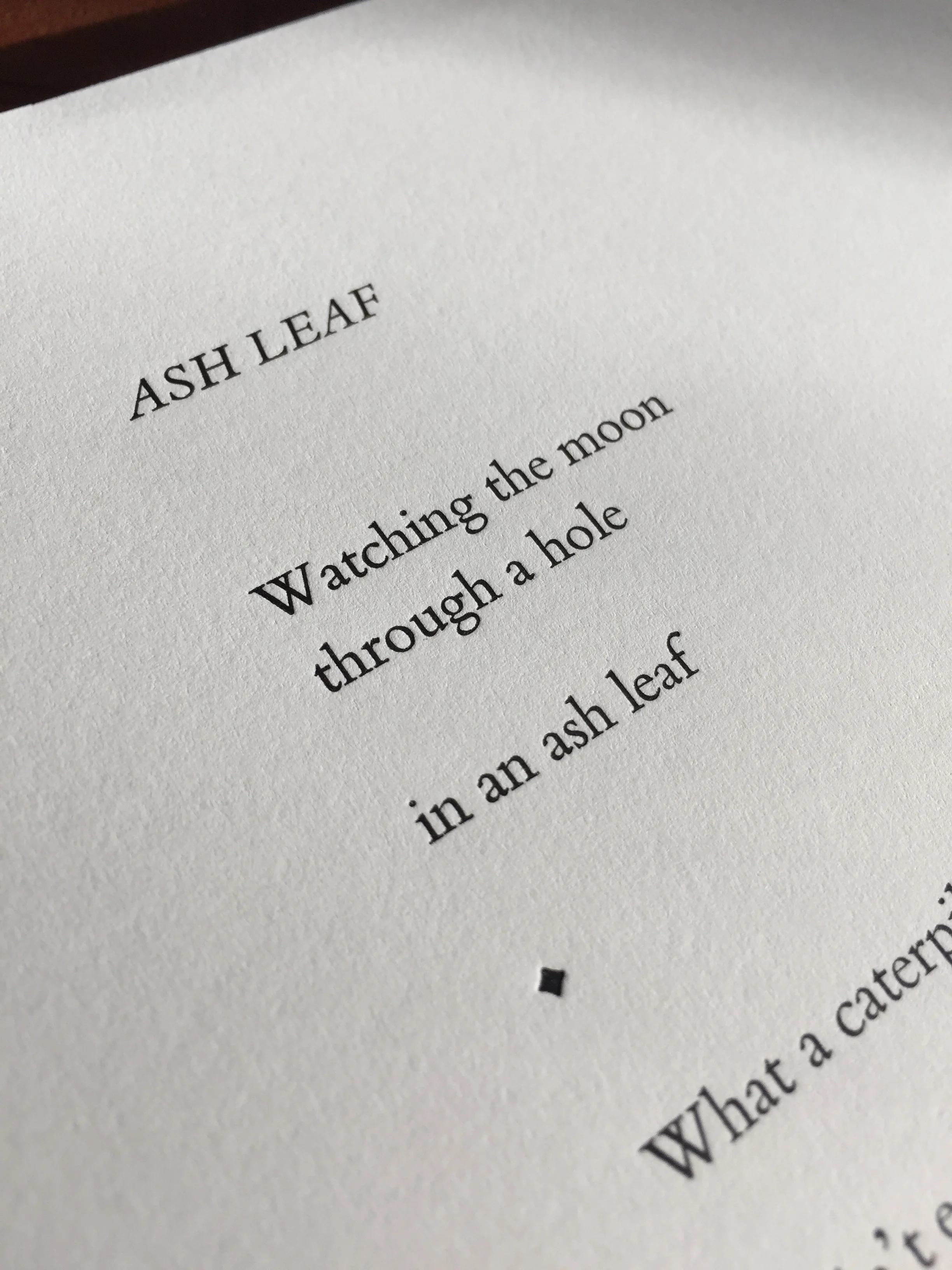
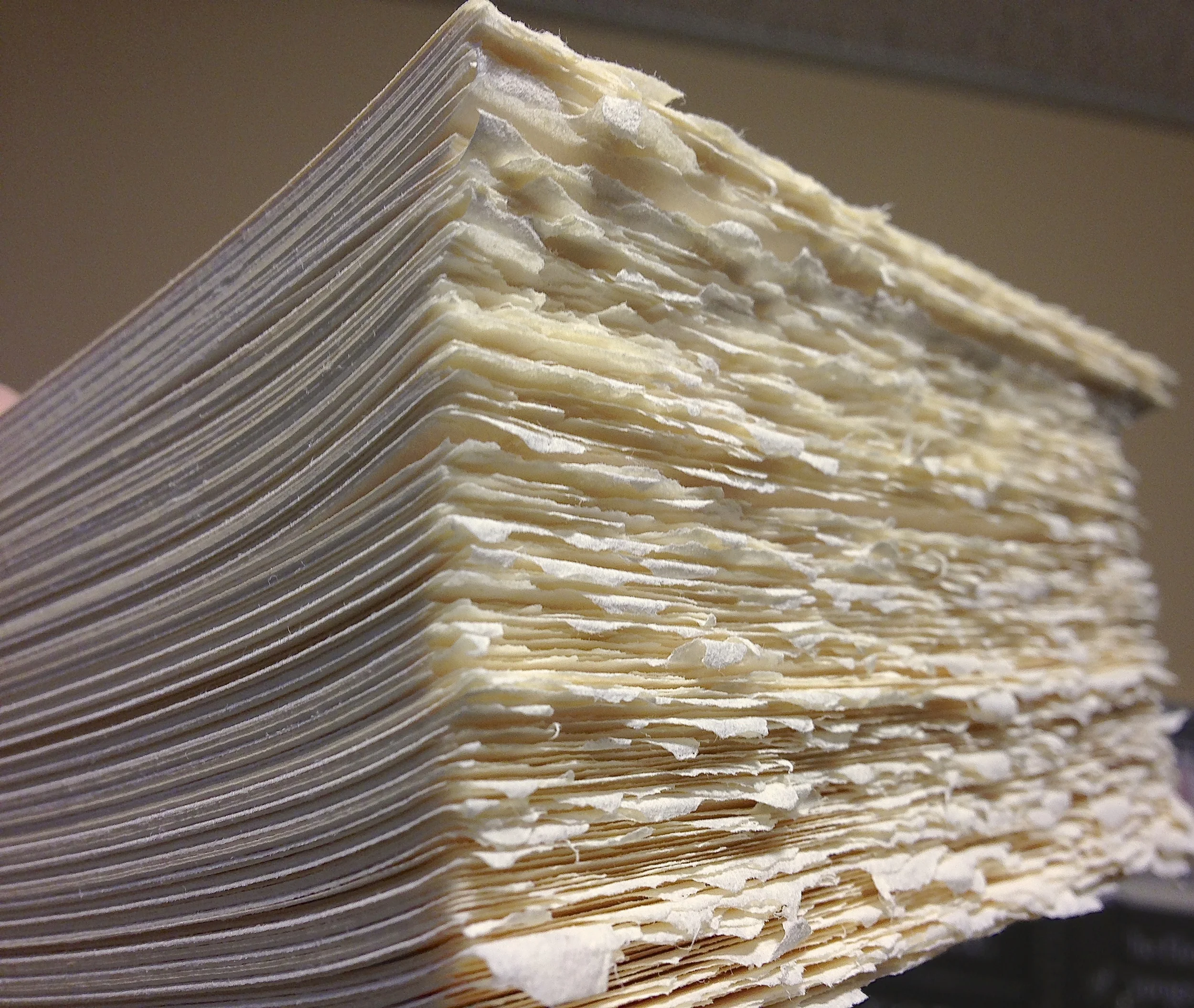
The printed page:
Now, when you see a printed page, you'll think of the actual mass and work of all that "white space"! Shown here, a leaf from Jeff Schwaner's Wind Intervals.
So, that's the story of SPACE at St Brigid Press!
Thanks for spacing out with us for a few minutes ;-)