Viewing entries in
The Craft of Letterpress

Printing, Circa 1776

4 Comments

Printing, Circa 1776

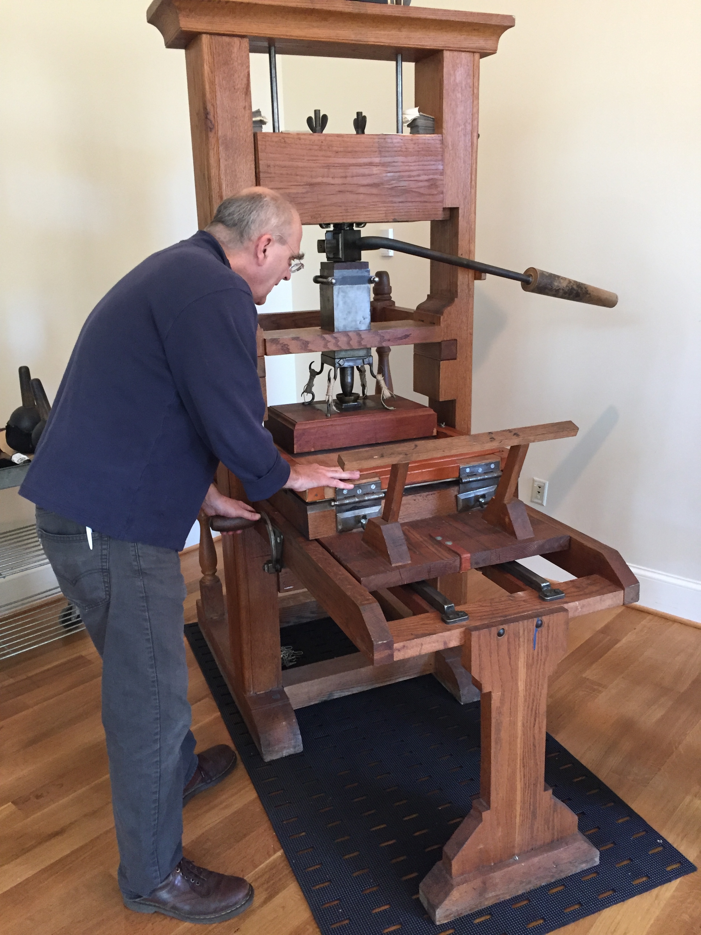
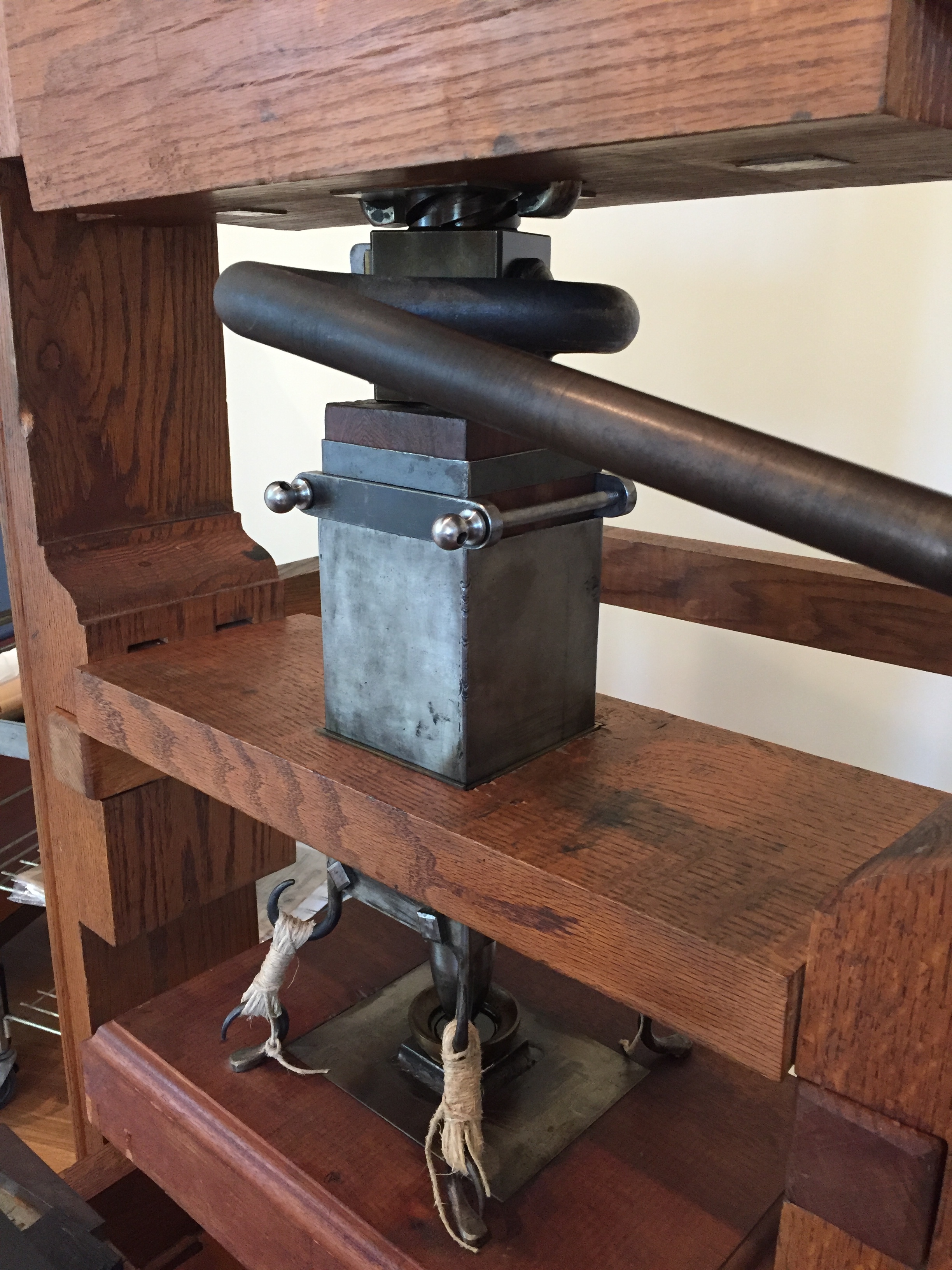
Last week I had the pleasure of attending a demonstration of the University of Virginia’s replica wooden common press:

The common press at the University of Virginia.

The earliest printing presses in Europe, from the time of Johannes Gutenberg and his associates Peter Schöffer and Johann Fust, were constructed primarily out of wood. Using similar technologies as contemporary agricultural presses (for winemaking, papermaking, olive oil extraction, and linen pressing), these 15th century printing presses used a wooden screw to lower a heavy wooden plate onto a bed holding cast metal type. The screw was turned by pulling a lever, or "bar" (also called the Devil's Tail ;-). Wooden common presses remained in use until the early 1800s, when iron handpresses and new types of cylinder and platen presses were developed.

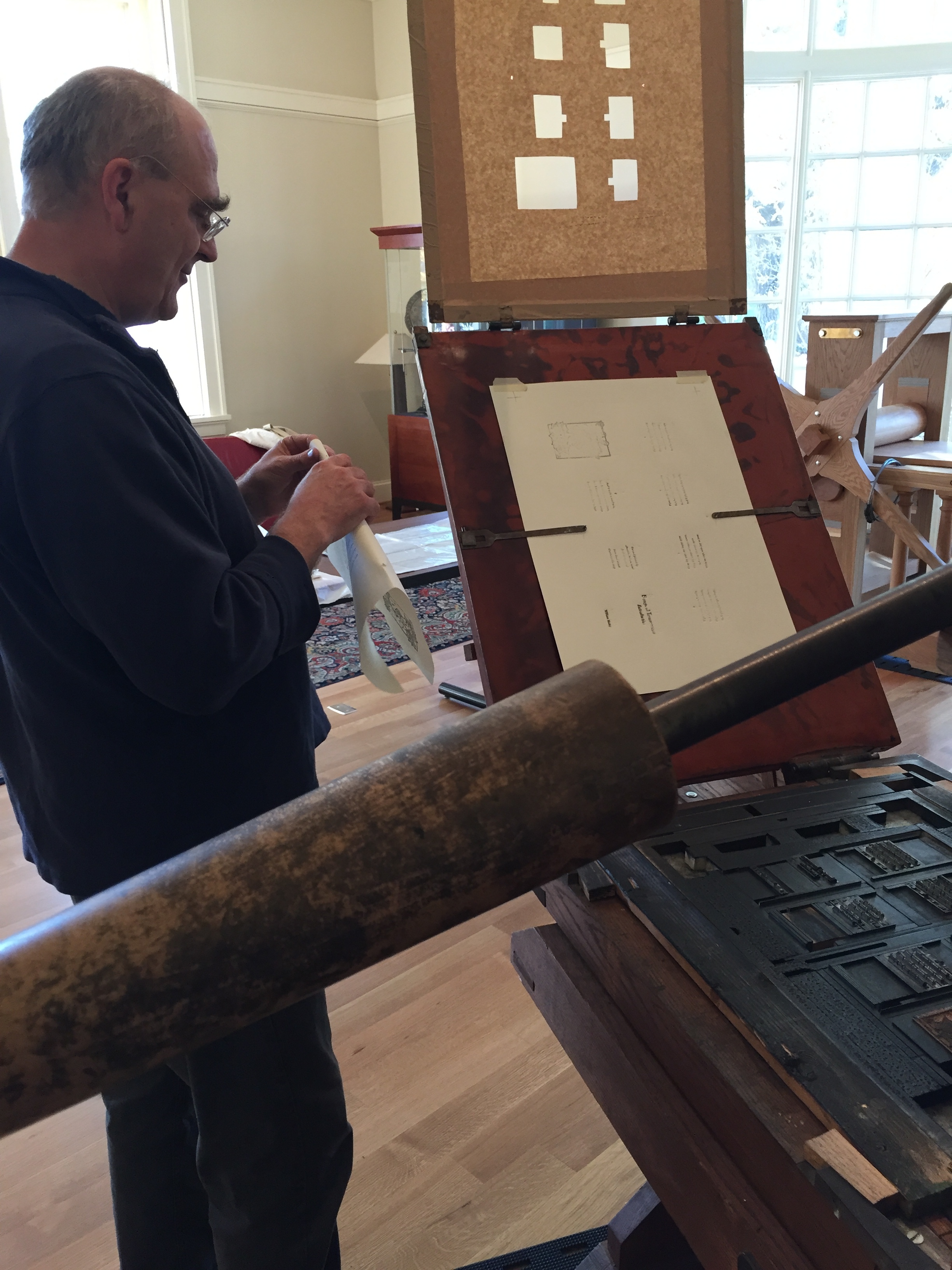
Josef Beery demonstrating UVA's wooden common press.

UVA’s common press was constructed in the 1970s, as a result of research at the Smithsonian Institution on the "Franklin" common press. It is on display in the Harrison Small Building’s South Gallery. Though the bar is kept locked for safety most of the time, you can still walk right up to the press and examine much of its design and function. Occasionally, folks associated with UVA’s Rare Book School offer working demonstrations.

The session I attended last week was lead by Josef Beery ~ book designer, letterpress printer, woodcut artist, papermaker, educator, and cofounder of the Virginia Arts of the Book Center in Charlottesville. A practitioner of the printing arts for many decades, Beery is a perfect guide to the history and use of this fascinating press.
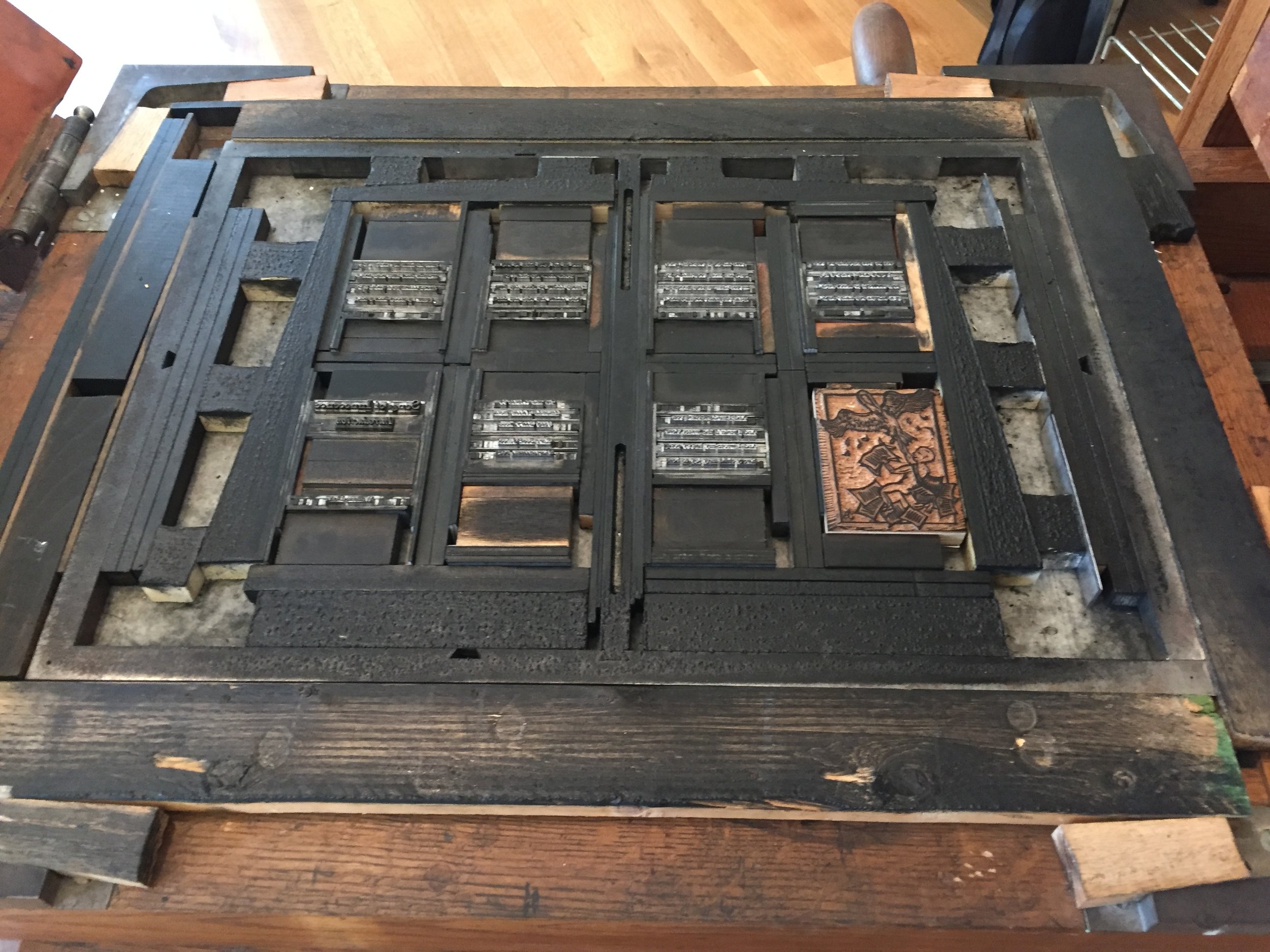
When you finish marveling at the wooden common press, head downstairs to the Albert & Shirley Small Special Collections Library. A highlight of the Library’s wonderful collection of rare books and manuscripts (including significant holdings in the history of books and printing) is a rare first-printing of the Declaration of Independence, printed the night of July 4th by John Dunlap. It’s on permanent display along with many other early printings of the document (the world’s most comprehensive collection of these) near the Library’s entrance.

If you're ever in the vicinity of Charlottesville, Virginia, don't miss this chance to see the common press, the Declaration of Independence, and many other artifacts of printing-circa-1776!

* For more information on early American printing history, visit the American Printing History Association (APHA) website.

* To follow the fascinating process of reconstructing a wooden common press, visit Seth Gottlieb's blog post series at APHA.

* Watch Josef Beery demonstrating the traditional method of using ink balls to apply ink to the type on a common press:
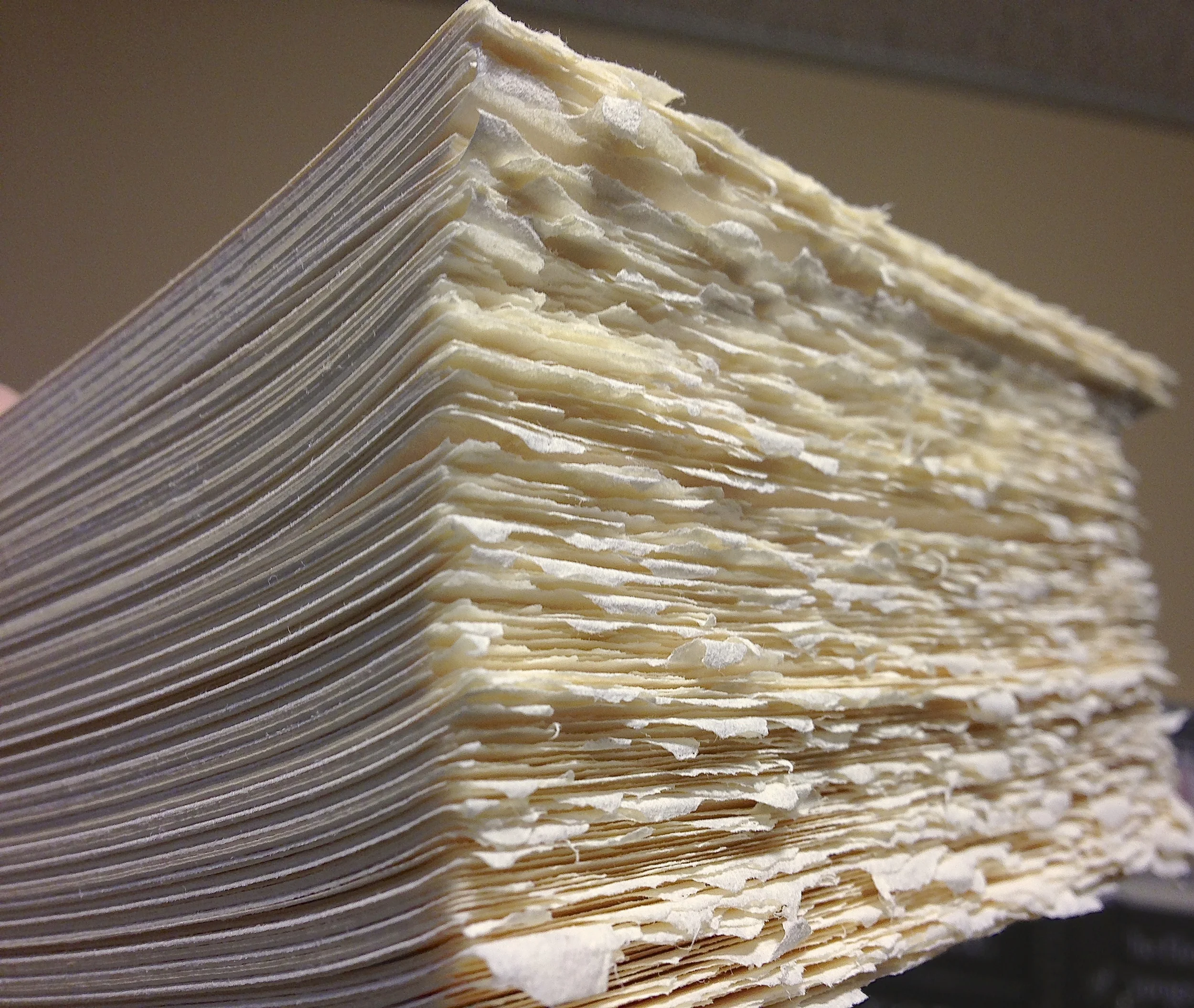
Josef Beery using traditional ink balls to apply ink to the type on the University of Virginia's replica wooden common press.

4 Comments

Simple Binding for Single-Section Booklets

2 Comments

Simple Binding for Single-Section Booklets

Sometimes a little bit of extra effort gives a lot of extra elegance to a project. Such is the case with this style of binding a single-signature booklet to a jacket-with-a-spine. 

I learned this from the fabulous Myrna Keliher of Expedition Press, and she learned it from the wonderful printers and binders at Stern and Faye

Below is a step-by-step outline of the binding style. But first, here's a two-minute video I took in my shop, showing the basics of affixing the pamphlet-sewn booklet to the scored-and-printed jacket:

THE BASICS: 

  • Sew your single-section booklet. In my video example, it's a five-hole pamphlet stitch pattern.
  • Prepare the jacket you wish to encase your booklet in, printing any text on the cover, and scoring the paper stock where you want the folds to be. In my video example, I determined how wide I wanted the spine to be (a quarter-inch) and how wide I wanted the flaps to be (about 3 inches), then made the scores and folds. (I use an inexpensive Martha Stewart brand "scoring board" to make accurate creases.)
  • With a narrow brush (quarter-inch or so), run a thin line of glue along the back of the last sheet (your booklet's endpaper), about a half-inch in from the sewn edge.
  • Position the booklet, back (glued) page down, on the inside back jacket cover, and press gently to adhere the page to the jacket.
  • Fold in any flaps, and close the jacket over the booklet.
  • Voila! A sweet, simple, smart-looking book!

All the best to you in your own creative adventures!

St Brigid Press

*** For more information about the book shown above, A Handbook for Creative Protest: Thoreau, Gandhi, & King in Conversation, please see our post HERE.

2 Comments

Printing with Nature

10 Comments

Printing with Nature

Hello Friends of the Press,

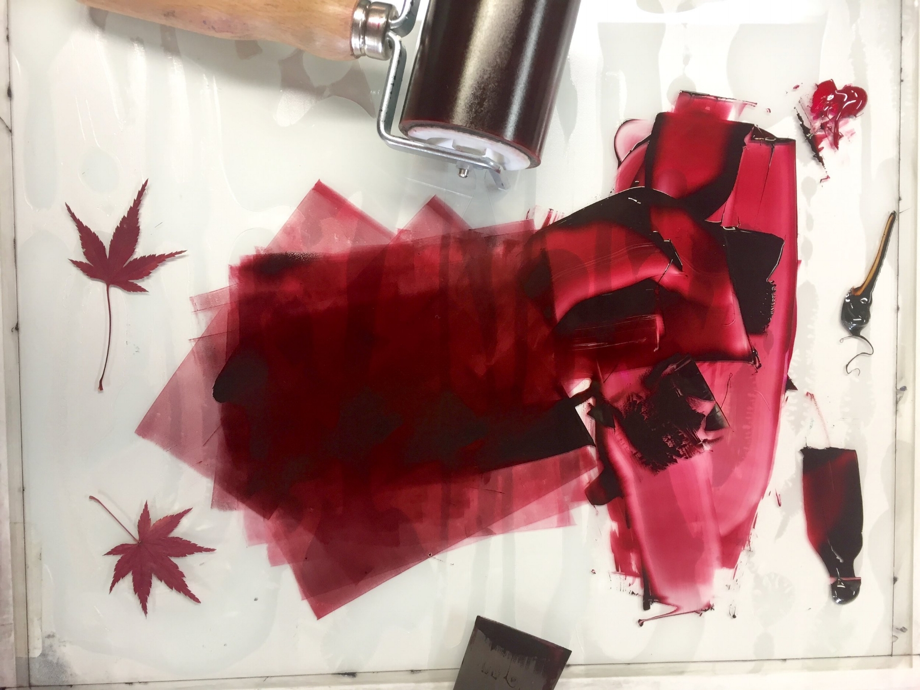
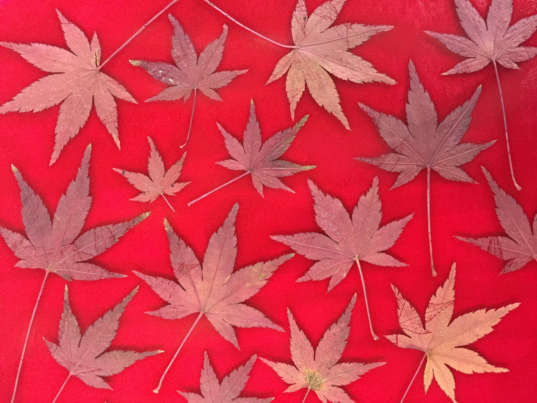
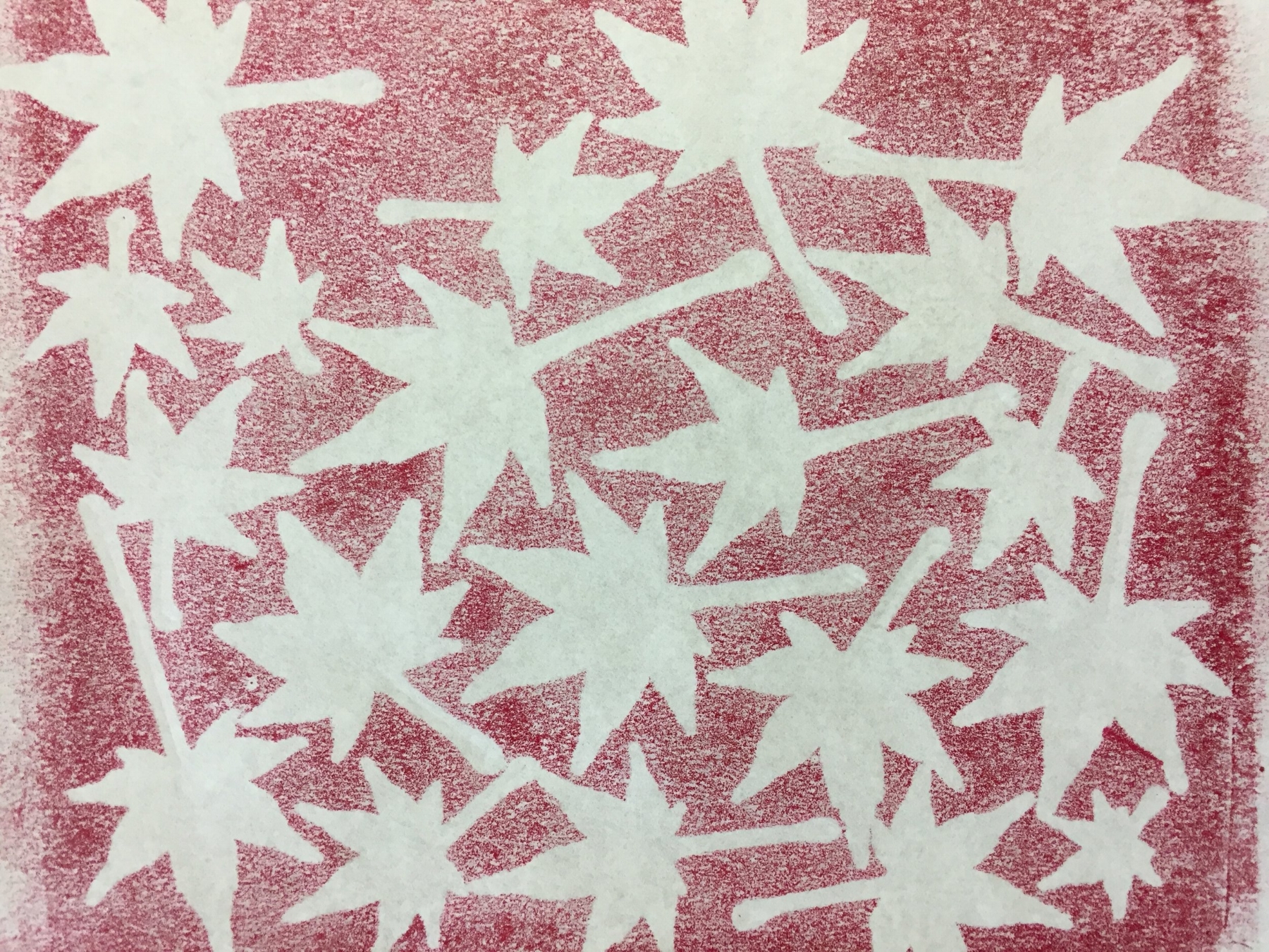
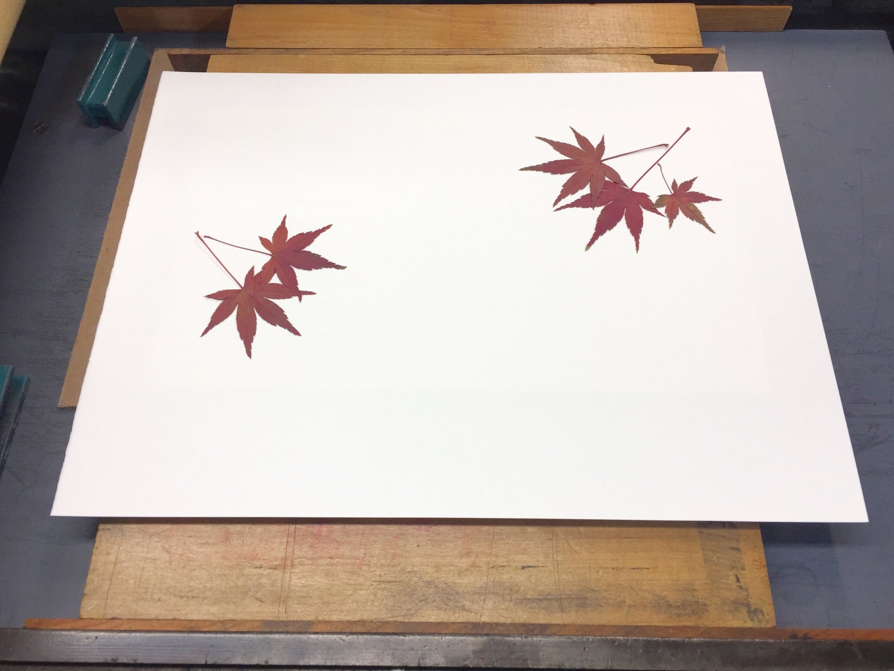
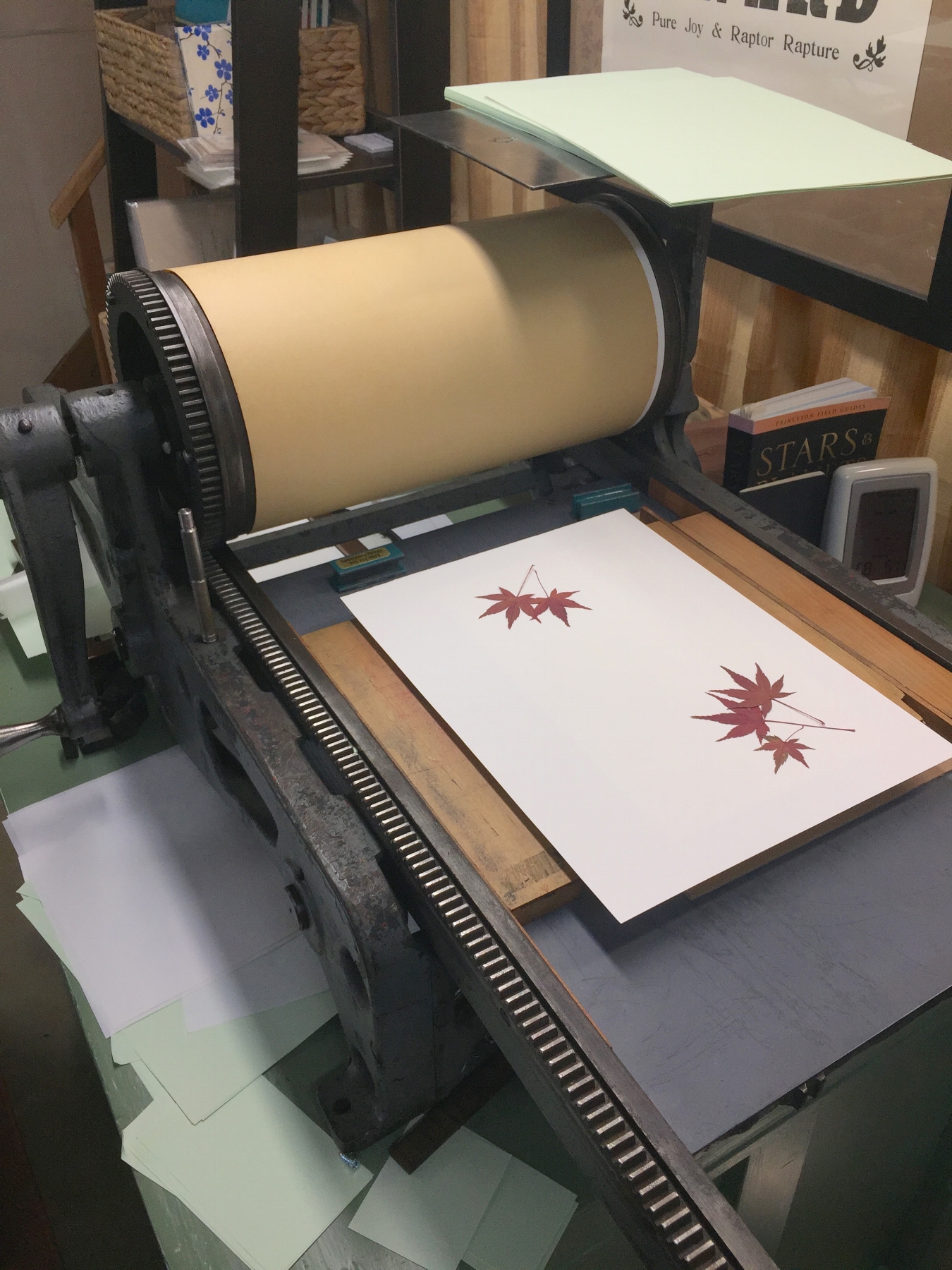
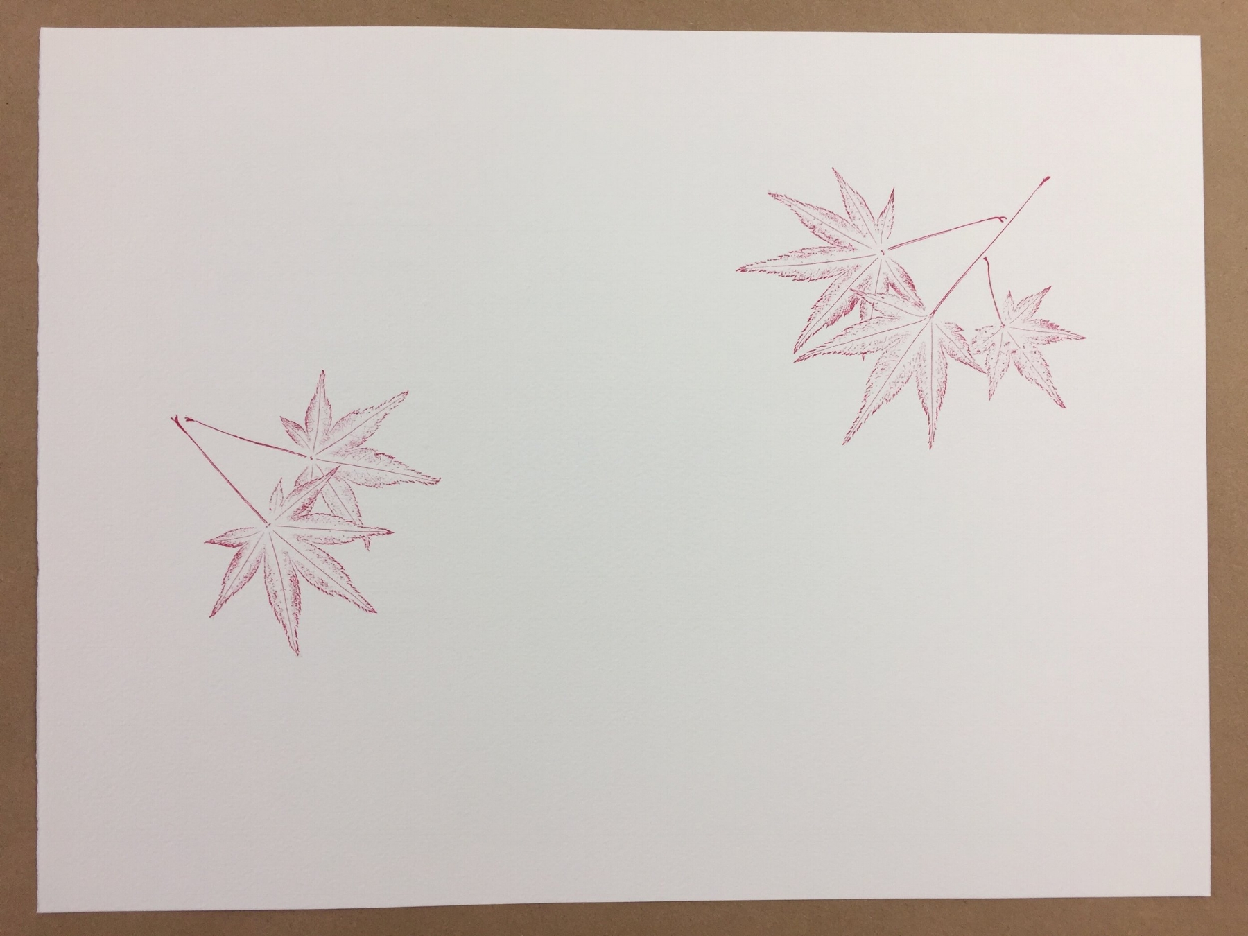
Last year we published Reverie, a little book poems that featured illustrations printed from grasses growing in our field. I loved the process and the look of these nature prints (which I first learned about from John Ryder's wonderful book Printing for Pleasure), and they came immediately to mind when I began to think about what illustrations might accompany our newest production ~ Wind Intervals, a chapbook of poems by Jeff Schwaner.

Collected and dried last autumn from the tree outside our print shop door, I had a stash of beautiful Japanese maple leaves under weights in a corner of the shop. Many of Jeff's poems include the presence and imagery of trees, including maples. It seemed like a perfect match.

So, this past week I began adding prints made directly from these dried leaves to the pages of Wind Intervals. Here's a little peek at the process ~ enjoy!

10 Comments

Diary of a Printed Page

16 Comments

Diary of a Printed Page

I must confess ~ each time a piece of paper goes into the printing press blank and emerges again filled with words, I am astonished. 

What still feels like the sudden epiphany of language out-of-nothing is not, in fact, miraculous. It is careful, collaborative craftsmanship by author and papermaker and metal-caster and printer, among others. It’s a strangely fluid movement of human and machine ~ an always-changing choreography of eye and iron, hand and fiber, thought and ink and breath. 

Joyous!

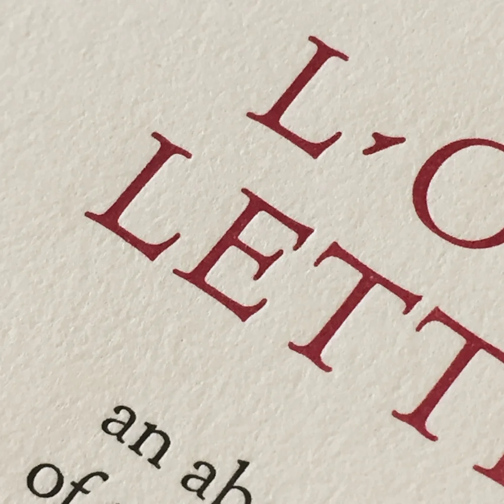
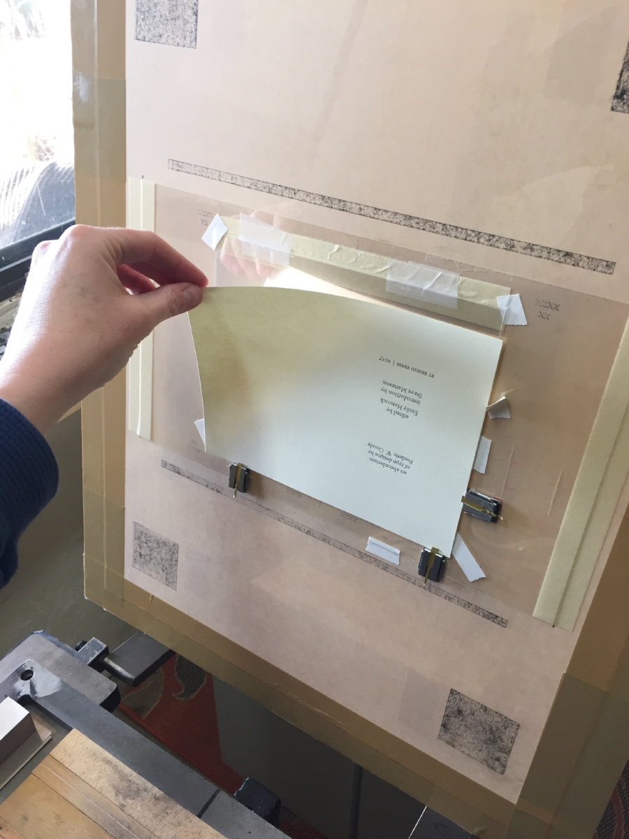
Here’s a little photo diary from today’s print run. I was printing the second color (in red) on the title page of St Brigid Press’s newest book, forthcoming in early February.

Thanks so much for joining us on this journey. All best to you all,

St Brigid Press

16 Comments

A Letterpress Lexicon, Part 3

7 Comments

A Letterpress Lexicon, Part 3

Hi, Friends of St Brigid Press!

Here is the third installment in our occasional blog series about the words and phrases that identify printing's particular tools and processes ~ A Letterpress Lexicon. Enjoy!

(If you missed Part 1, you can find it HERE. And Part 2 is HERE.)


Today's Words Are:

PIED  ~  Pronounced with a long “i”, as in "cherry pie." The term for metal type that has become all jumbled up, disarranged, mixed up.

HELL BOX  ~  The box or bucket into which is thrown metal type that is too worn or damaged to print well.

PRINTER'S DEVIL  ~  An old term for the young assistant in a printing shop who was given menial tasks or errands, such as sweeping floors or sorting type.


I had a completely different set of interesting words from the printing trade ready to share with you all. And then this happened:

Pied type on the floor at St Brigid Press.

I allowed myself to get in a hurry recently, while looking for a particular dash in the back of a typecase. I pulled the case out too far, without pulling the case below it out slightly (a safety measure, to prevent what happened from happening), and CRASH — a small tsunami of metal letters fell to the floor. The concrete floor. ARGH. There they stayed for a few days, until I could face the mess again and gently scoop up the pied type.

A 12pt letter "m" from the pile of pied type. It is, unfortunately, damaged and bound for the hell box.

Much of the type is salvageable, thank goodness. But there are still many letters, numbers, and punctuation pieces that were damaged. Type metal is soft enough to scratch or dent easily if dropped. Those pieces that are too damaged to print correctly will be weeded out and relegated to the hell box. When the box is full, a type foundry can melt down the metal and cast new letters with it.

The St Brigid Press hell box, into which we pitch metal letters that are broken, scratched, dented, or otherwise rendered unprintable. Grateful acknowledgement goes to the Shop Dog, Mira, for generously donating an empty biscuit tub for the task.

Obviously, sorting pied type is a time-consuming job. One that is at once drudgery and exacting — each letter must be inspected to see if its face is dented or scratched, or if it survived the ordeal unscathed. Since we are in the full swing of book production here at the Press, we decided to call upon our own printer’s devil, Julia Grammer, to help out. Julia is a student of typography and graphic design at an area college. Not only is she knowledgable about type, but she brings the kind of care, curiosity, and intelligent attention that are guiding principles at the Press. Here’s a case of type after Julia was let loose on it:

Ahhhh.... Order, wrought from chaos, thanks to the Press printer's devil, Julia Grammer.

Thanks, as always, for joining us on this journey, Friends! 

All best to all,

The Pied Typer of Afton

7 Comments

How Type is Made, Part 2

4 Comments

How Type is Made, Part 2

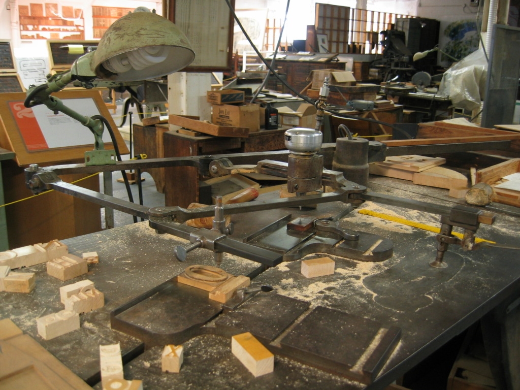
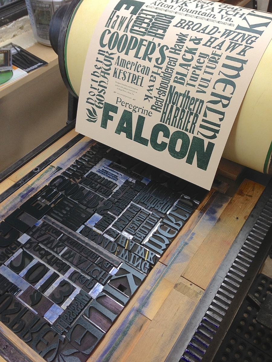
Traditional letterpress printing requires physical letters, cast from metal or carved from wood, which get inked and pressed into paper to make a print. In the last post, we took a look at the process of making type from metal (if you missed it, click here). In this installment, we’ll see how it’s created from wood.

Civil War recruitment poster.
From the International Printing Museum website.
http://www.printmuseum.org/museum/wood-type-2/

Wood came to be used as a material for making letters for printing primarily in the 1800s, when the printing and advertising industry became more widespread. Imagine trying to lift a big “Wanted”-poster-sized chase of metal type — pretty darn heavy! (See the photo of a Civil War recruitment poster.) Letters carved and routed from holly or maple were MUCH lighter, and could be made MUCH larger than their metal counterparts. 

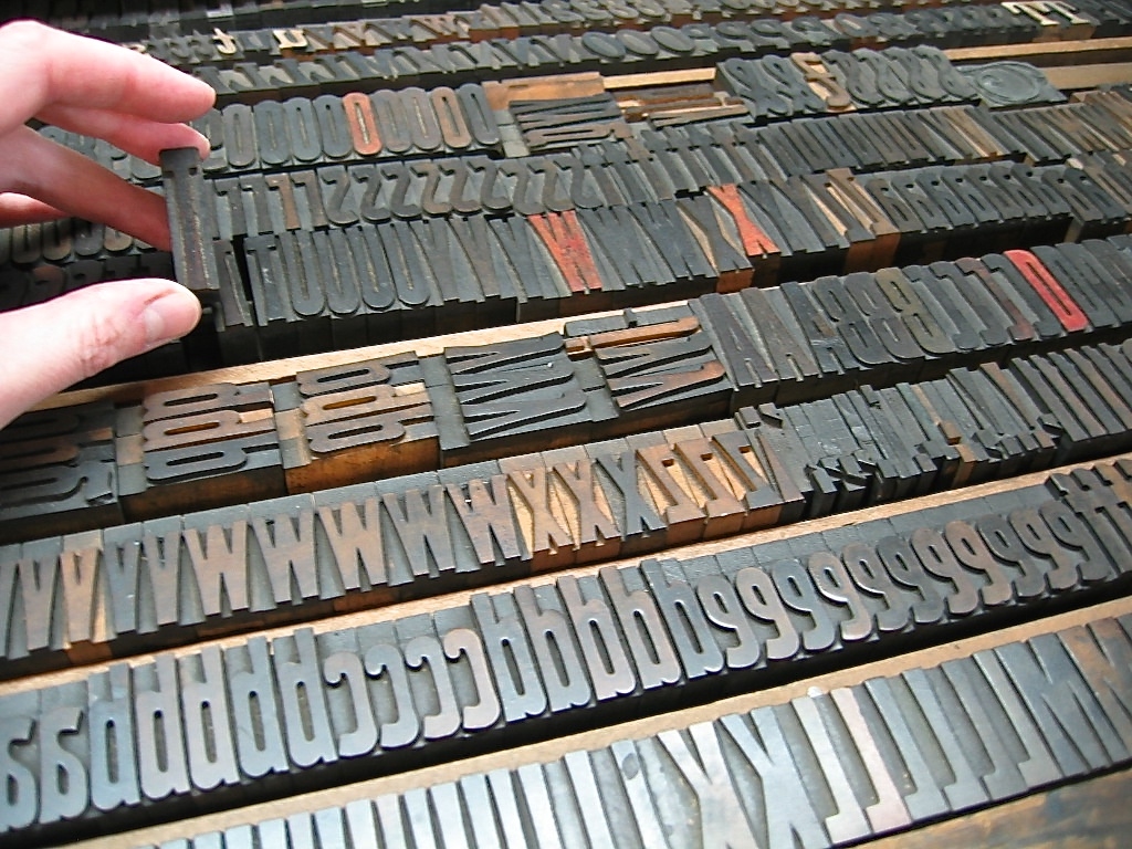
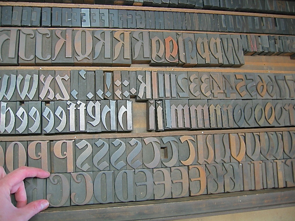
Here at the Press, we’re fortunate to care for and print with a nice selection of wood type, most of which was made between 1875 and 1910. If used with plenty of TLC, it’ll outlast us (just like our presses)!

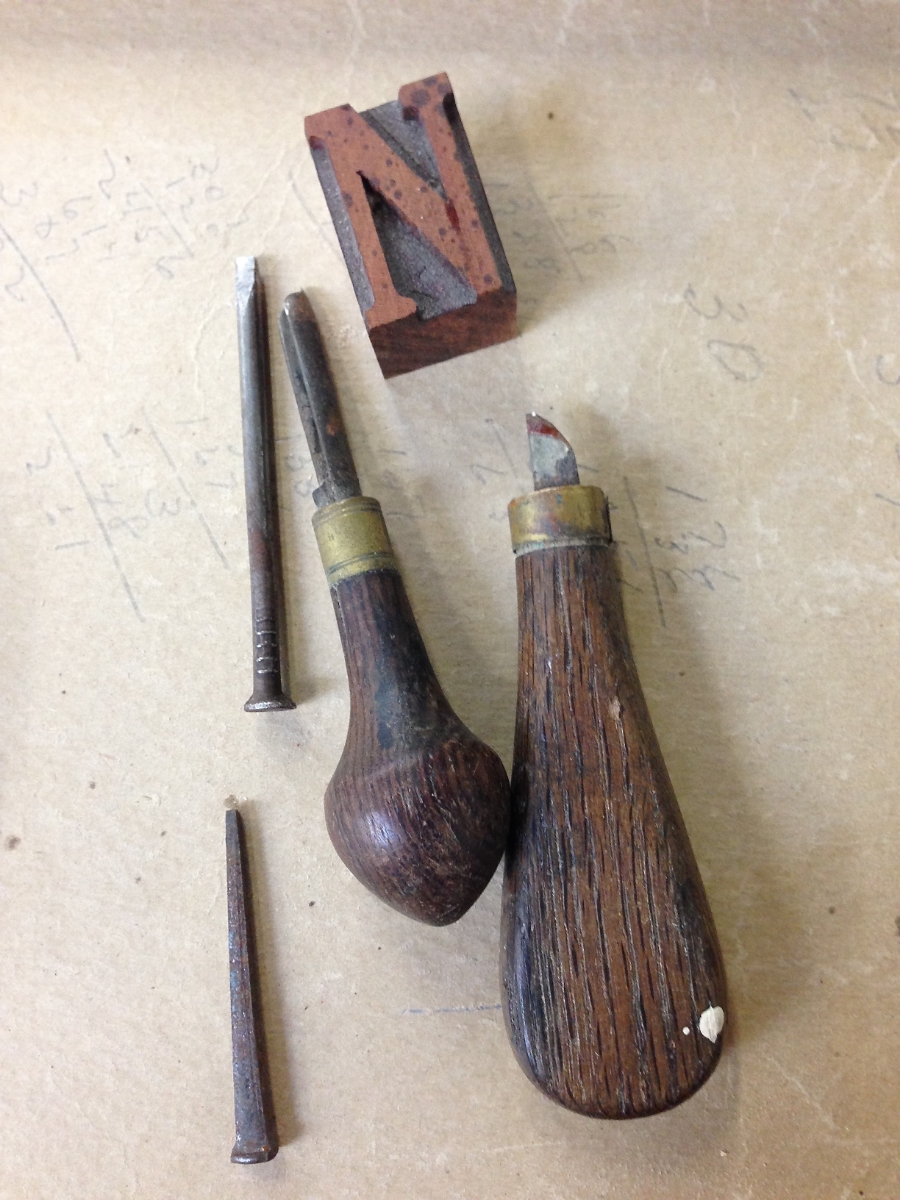
Here's a slide-show of some of the materials and tools used to create wood type, along with some of the type in our collection here at the Press:
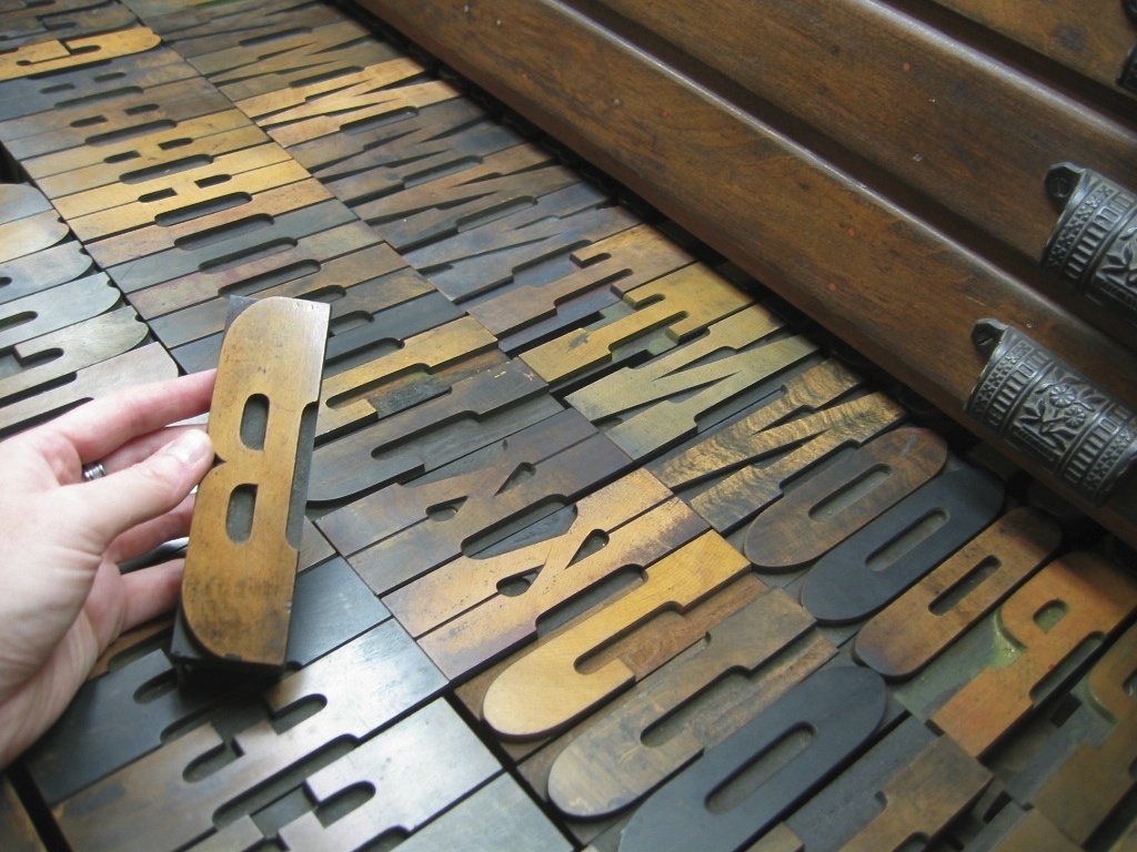
A lot of vintage type, however, either went to the scrap heap decades ago, is just too damaged to print well anymore, or is too scarce and expensive for most printers to purchase. Thankfully, there are a few excellent folks who are making brand new type from wood today!

Here is a great interview (4 mins) of Geri McCormick of Virgin Wood Type (Rochester, NY), by Frank Romano.

And another great short (1 min) video of Scott Moore, of Moore Wood Type (in Ohio), making new wood type:

Want to know more about the wonderful world of wood type?

Here are some great resources ~


Thanks for joining us on this journey into type! Please sign up below for more occasional dispatches from letterpress land!

St Brigid Press

4 Comments

How Type is Made, Part 1

Comment

How Type is Made, Part 1

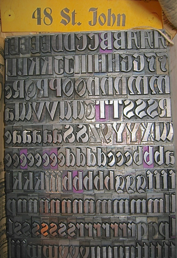
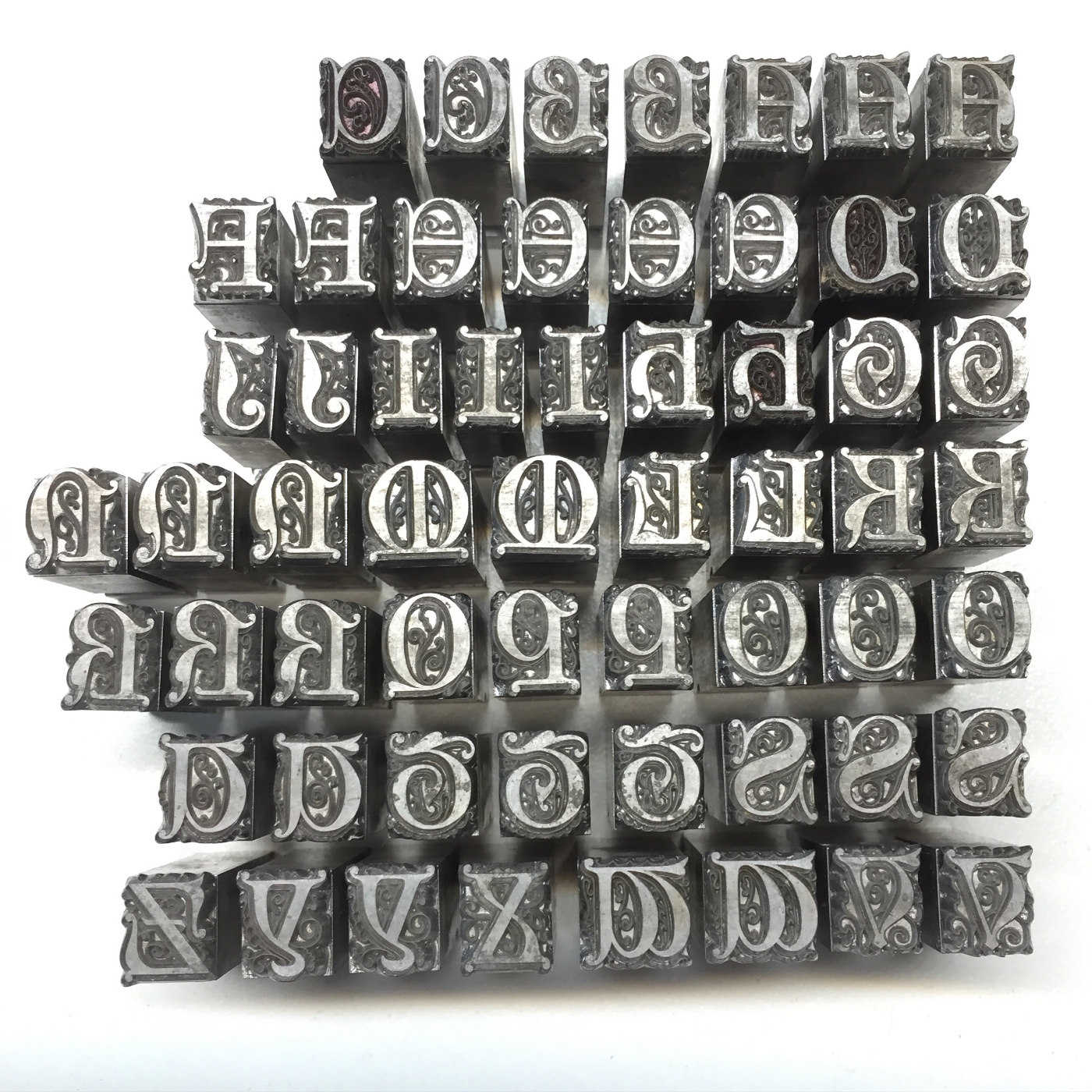
Traditional letterpress printing requires physical letters, cast from metal or carved from wood, which get inked and pressed into paper to make a print. In the next two blog posts, we’ll take an introductory look into how these letters get made.

First up, metal type!

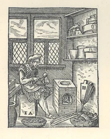
A typecaster of centuries past, pouring molten metal into a mould to cast new letters. (Courtesy of the The University of Manchester Library.)

A typecaster of centuries past, pouring molten metal into a mould to cast new letters. (Courtesy of the The University of Manchester Library.)

Johann Gutenberg’s big Ah-HA! moment in the 15th century was figuring out how to create multiple letters with which to print, and print again and again — a system of “movable type,” where each piece is cast in a mould from an alloy of metals (lead, tin, and antimony). These pieces, all the letters and numbers and punctuation, etc., of the alphabet, could be used and reused — a huge savings of time, effort, and expense compared to the work of scribes!

Metal type wears down over time, because it is relatively soft, and gets scratched or dinged easily. Thankfully for us 21st century printers, some hardy folks are still casting brand new metal type!

Here's a short (1:58), awesome little video by Dave Keyes of Michael Curry casting 48pt Garamond ampersands on his caster in New Zealand:

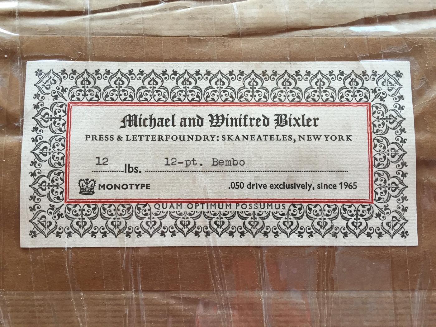
And here’s another little window into the world of typecasting, courtesy of Michael and Winifred Bixler, who operate their Bixler Letterfoundry in upstate New York, and who have cast much of the new type we have here at St Brigid Press. This beautiful 2-minute video was done by Mary M Jones:
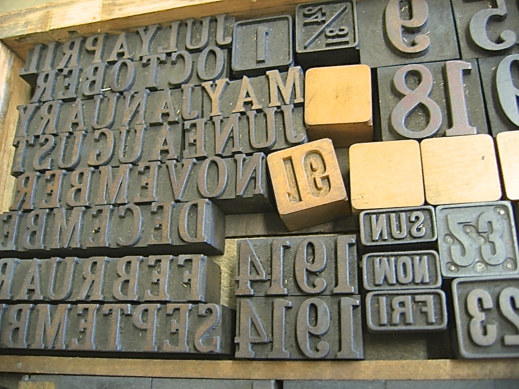
Some of our type comes from a wonderful foundry in Germany, run by the renowned Herr Rainer Gerstenberg. Click the photo below to see an excellent photo-tour of Gerstenberg's foundry, taken by letterpress printer and teacher Thomas Gravemaker.

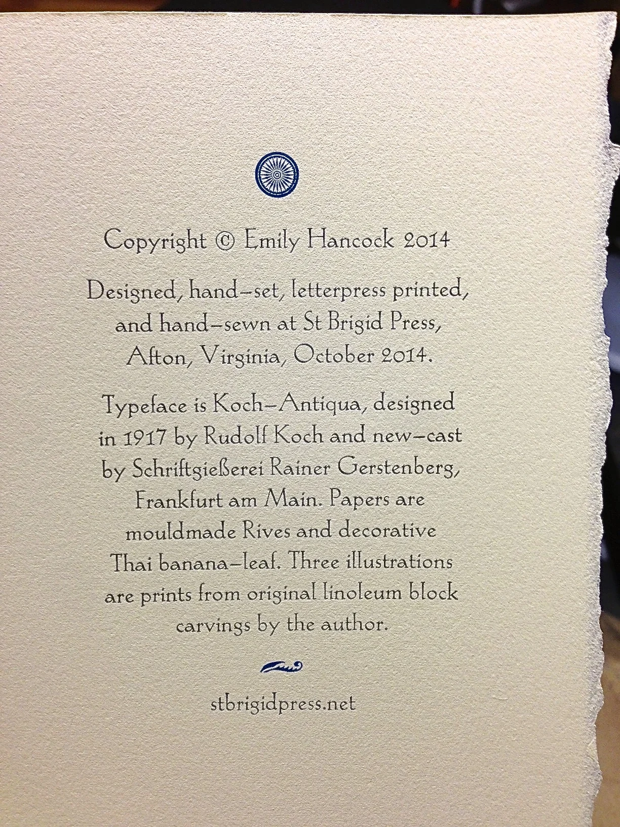
The beautiful Koch-Antiqua typeface, cast for us by Rainer Gerstenberg in Germany, here printed for the colophon of our limited edition book of poems, Soundings. Click the photo for more about Gerstenberg's foundry.

The beautiful Koch-Antiqua typeface, cast for us by Rainer Gerstenberg in Germany, here printed for the colophon of our limited edition book of poems, Soundings. Click the photo for more about Gerstenberg's foundry.

So, would YOU like to order some shiny new type?? Here's a list of foundries ready to take your order!

List of Type Foundries in the US and Abroad

Thanks for joining us, friends! We'll see you again soon,

St Brigid Press

Comment

Printing With Plants

3 Comments

Printing With Plants

Hi Friends of St Brigid Press!

We're rolling along in our production of our new chapbook, Reverie, which launches next Sunday the 20th at Black Swan Books (3pm to 5pm, if you're in the neighborhood!). At the moment, we are enjoying illustrating the pages with original nature prints from the grasses that grow in the meadow at the Press.

Here's a sneak peek at today's print process, working with the lovely little meadow flower, Pennsylvania Bittercress.

Just last week, our field began to bloom with the tiny white petals of Cardamine pensylvanica, Pennsylvania Bittercress. 

We decided the Bittercress would make a delightful accompaniment to the first poem in the book.

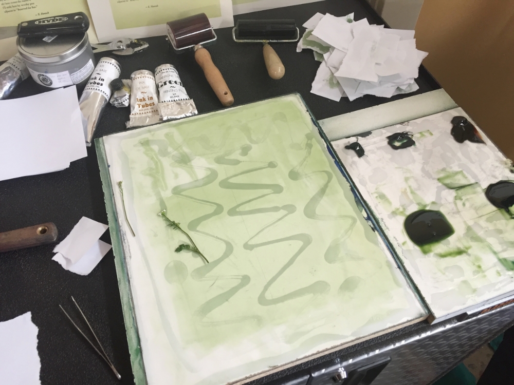
Next we hand-mixed a sweet spring green color, gently pressed the Bittercress into the ink, and carefully transferred the inked cutting to the page of poetry.

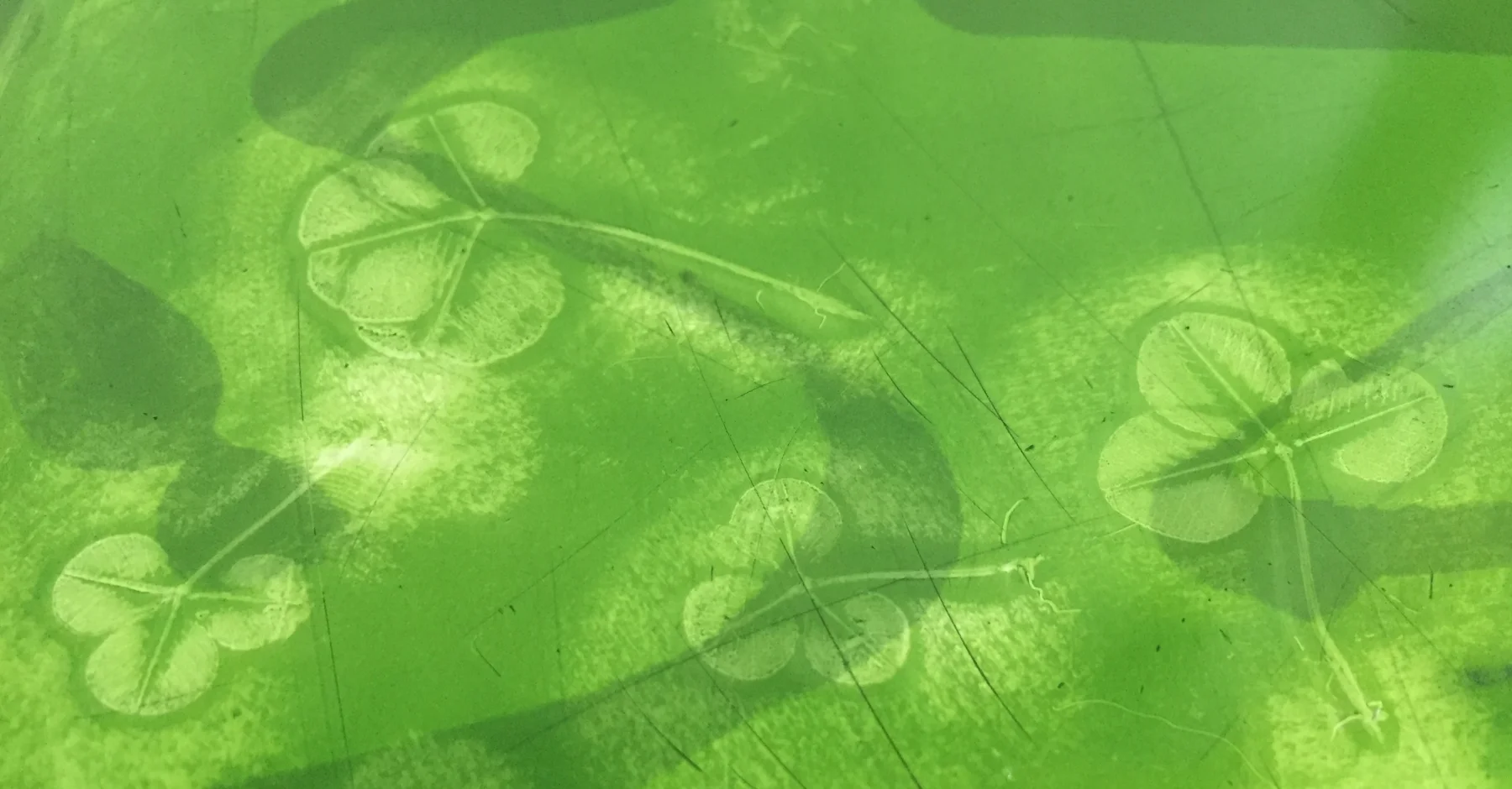
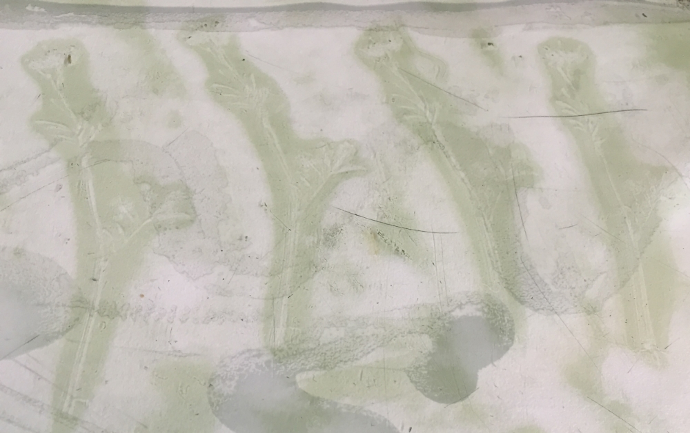
Lifting off the Bittercress, reveals its subtle image. Next up: clover and wild onion!

Thanks for joining us!

If you can't make it to the look launch on March 20th, but are interested in purchasing this limited edition book, please see HERE.

3 Comments

Printing a Poem on the Handpress

1 Comment

Printing a Poem on the Handpress

One of our chief passions here at the Press is traditional letterpress printing — using some of the techniques, equipment, and materials that have been used since Johannes Gutenberg and his team first developed moveable type and printing presses in Europe around 1450. 

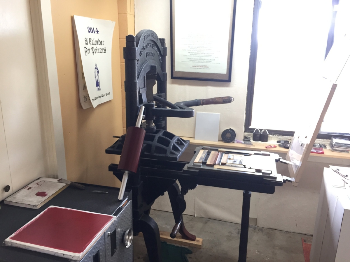
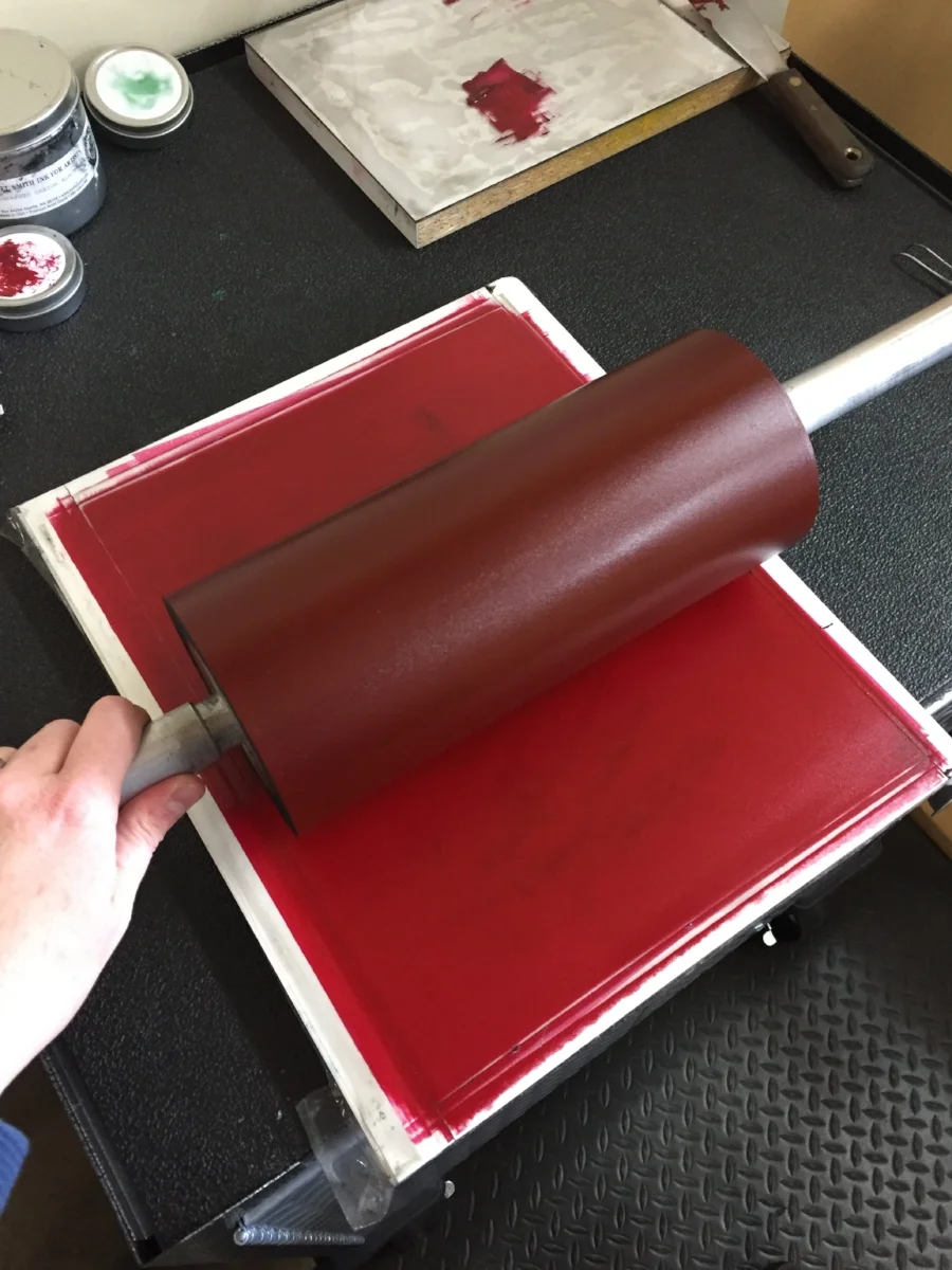
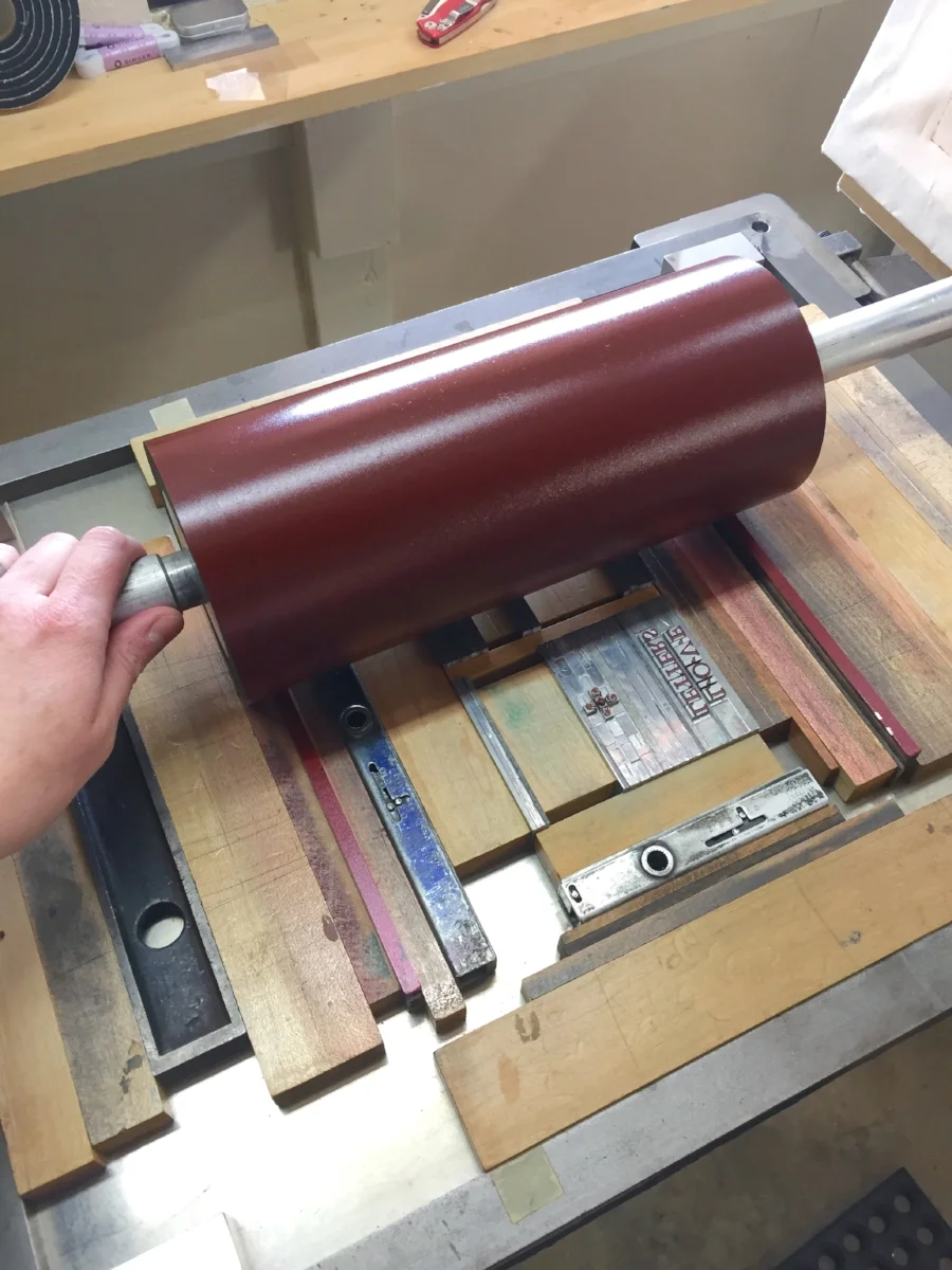
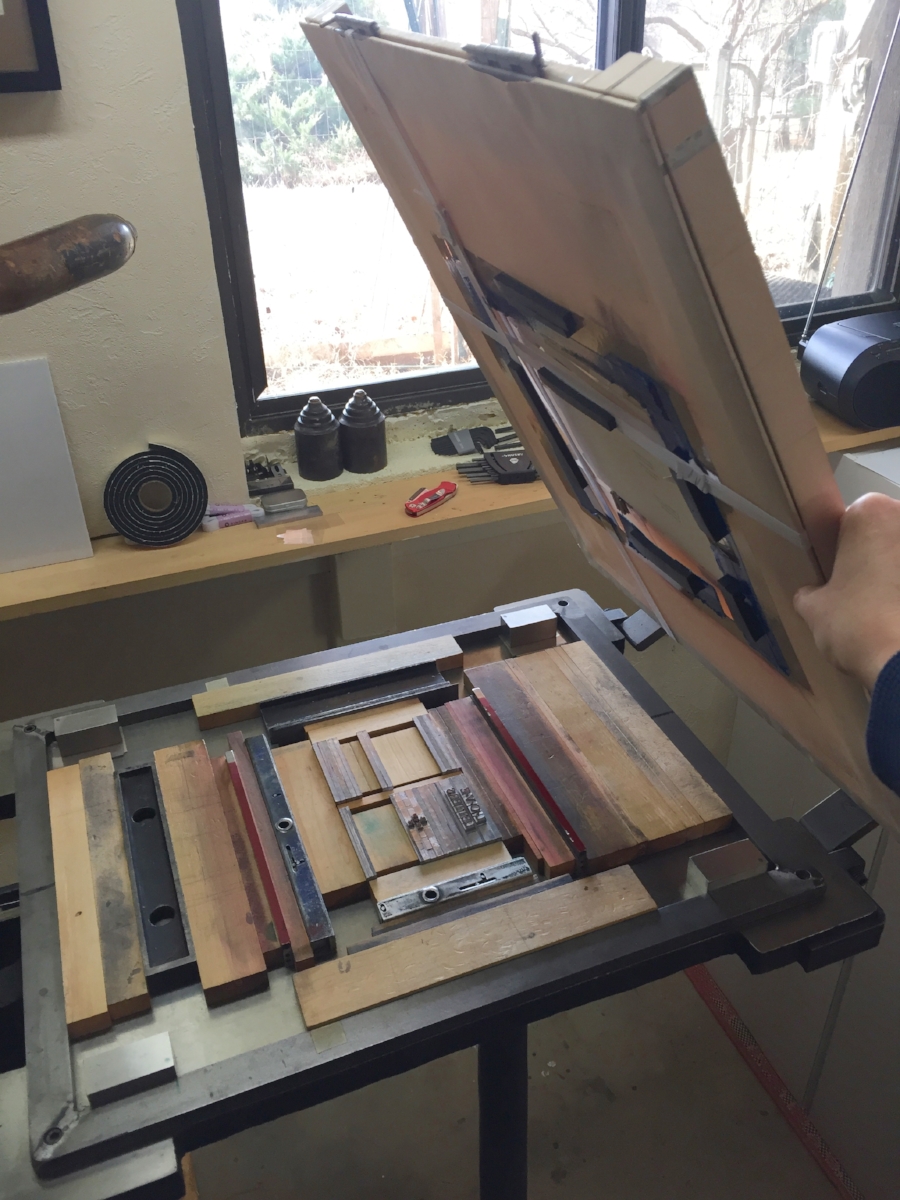
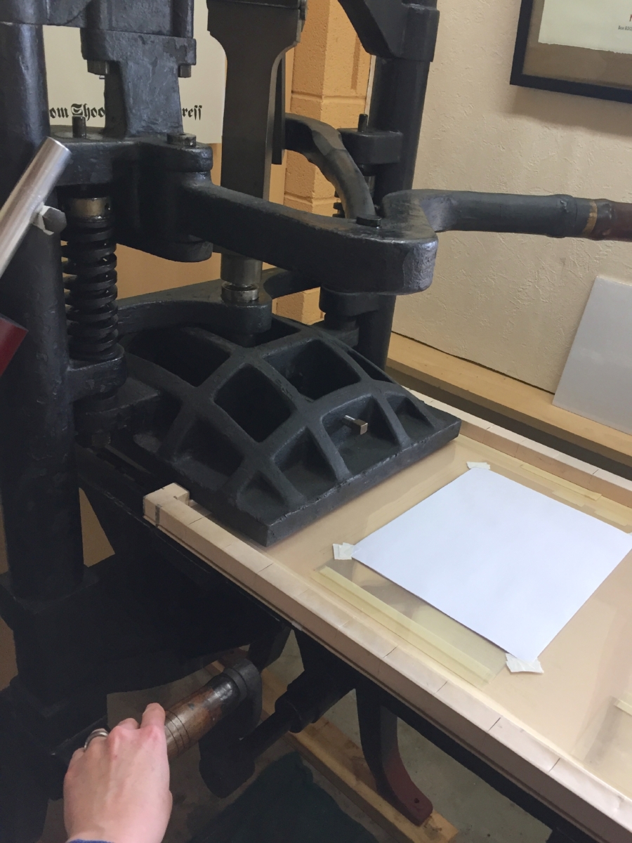
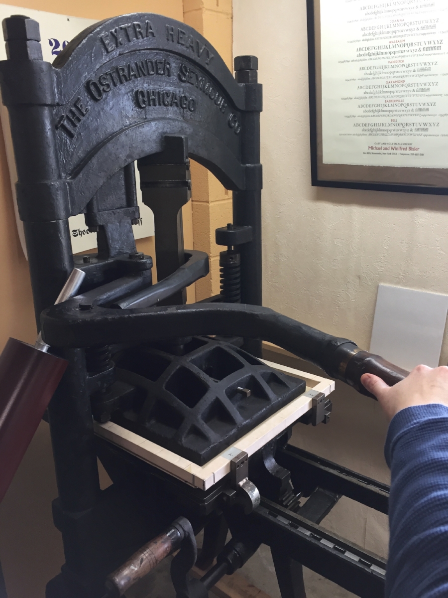
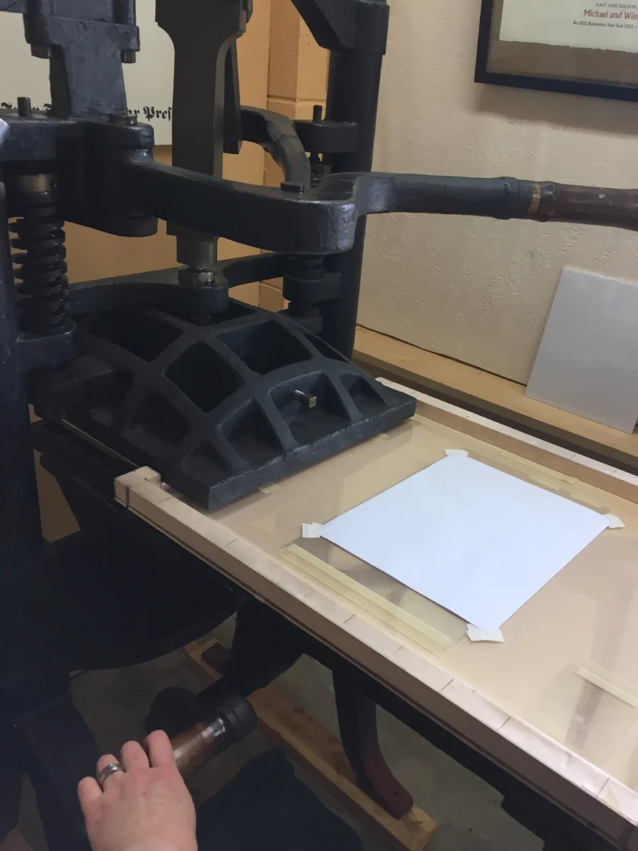
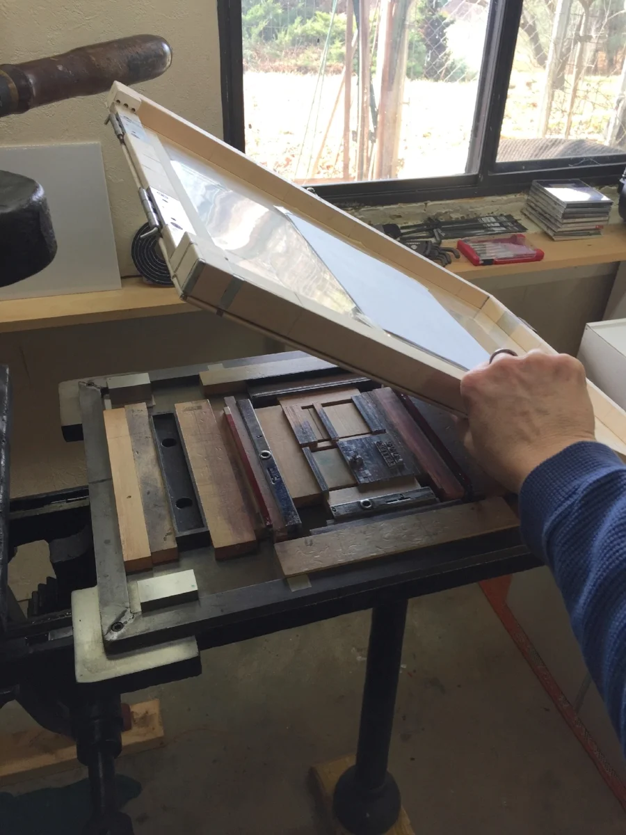
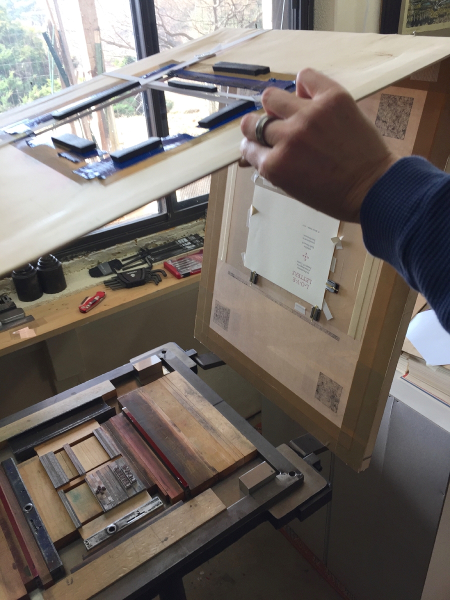
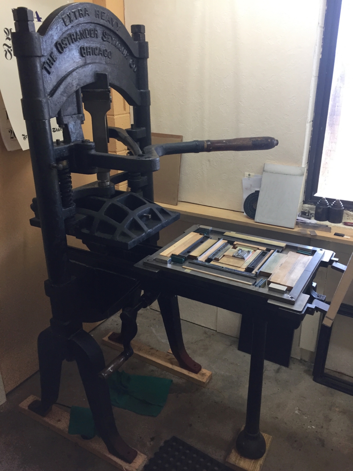
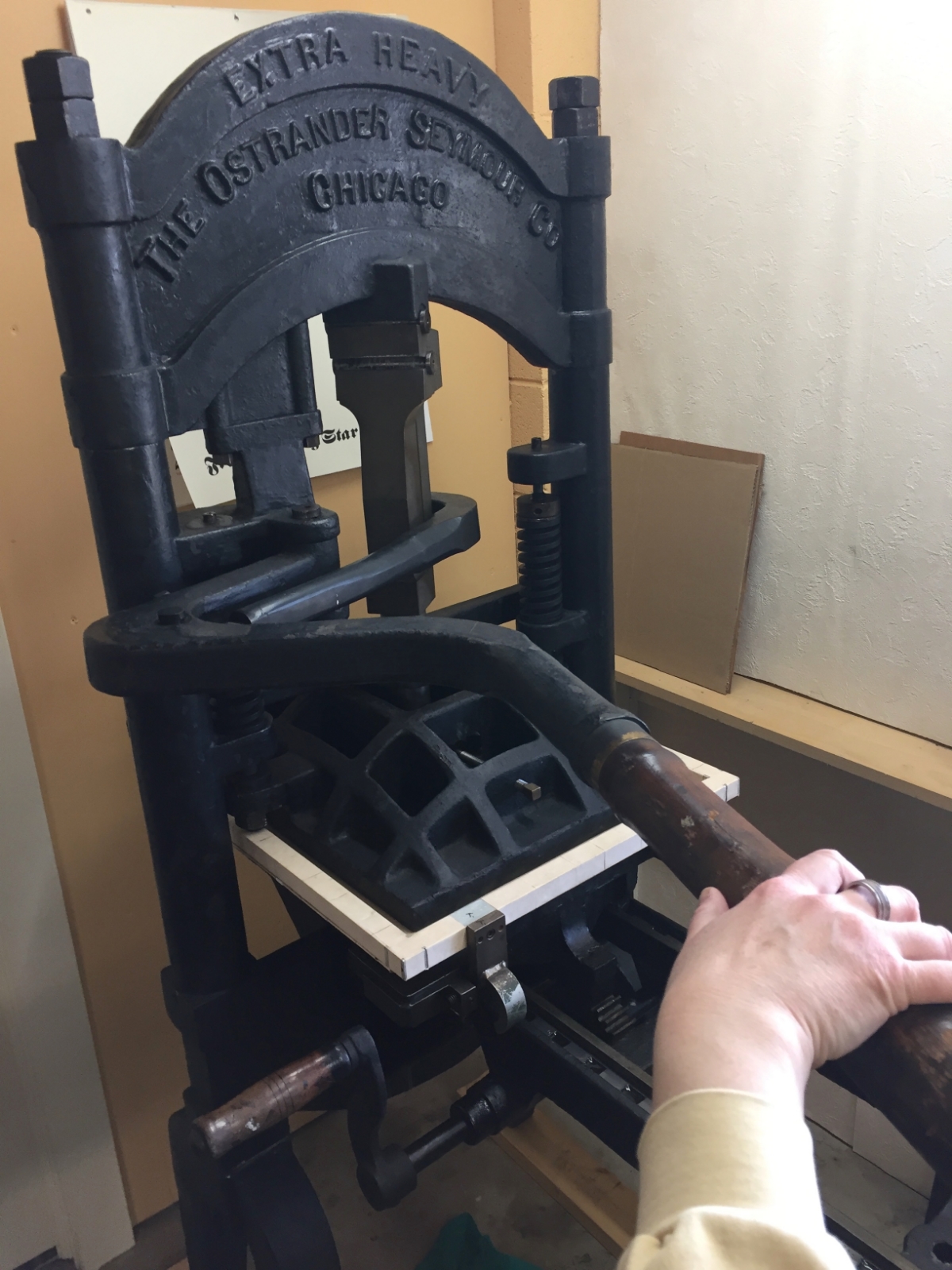
We enjoy being a part of that long historical lineage, learning the skills and passing along the wonder of the printed word. Our latest project, a little chapbook of poems called “Reverie,” has given us the opportunity to produce a book entirely on the circa-1915 iron handpress, affectionally named “Ben” (for Ben Franklin, of course). 

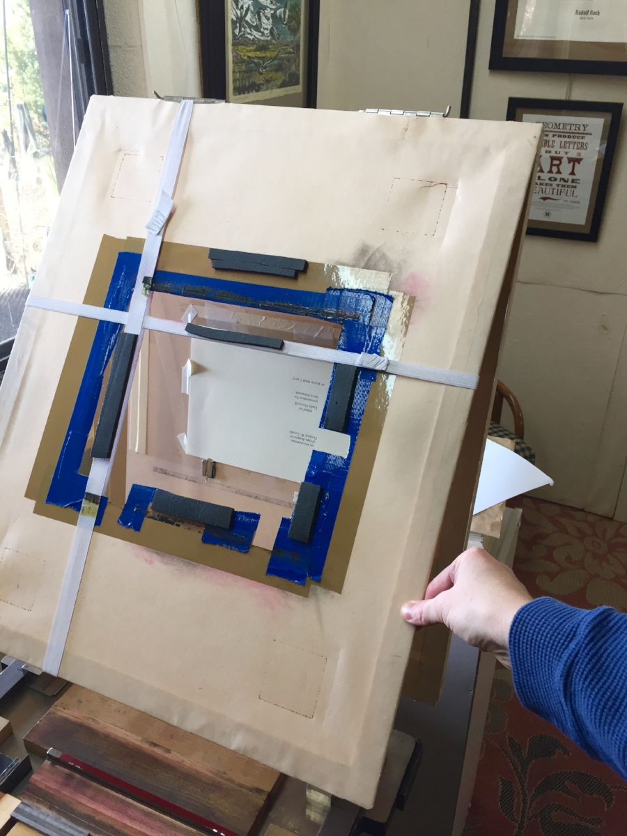
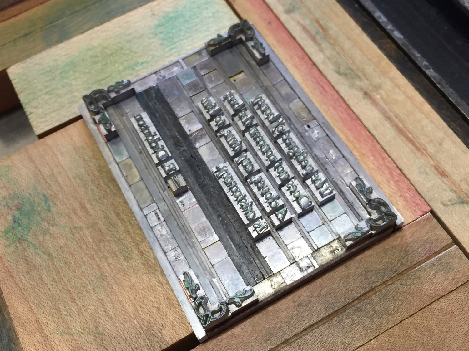
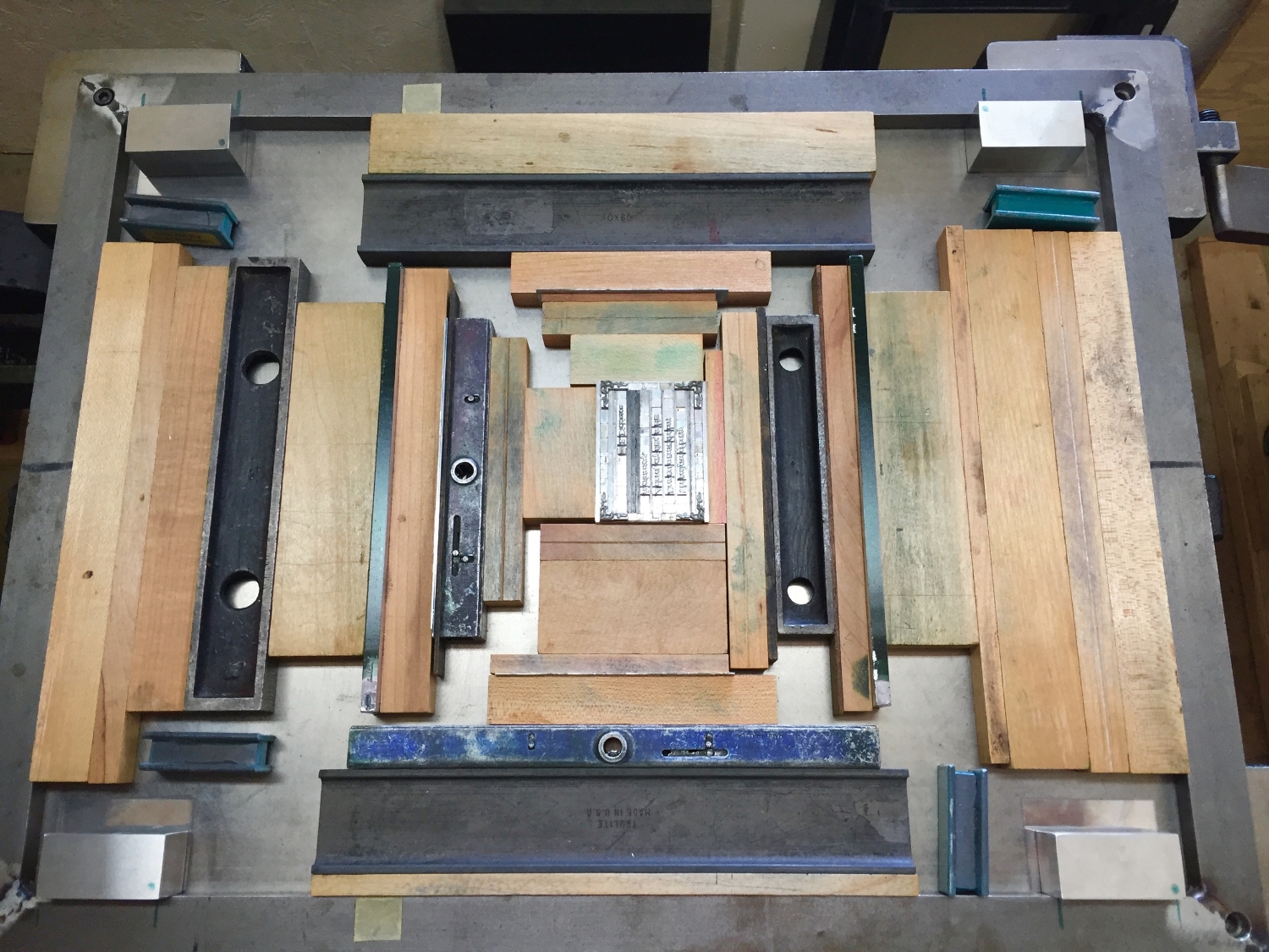
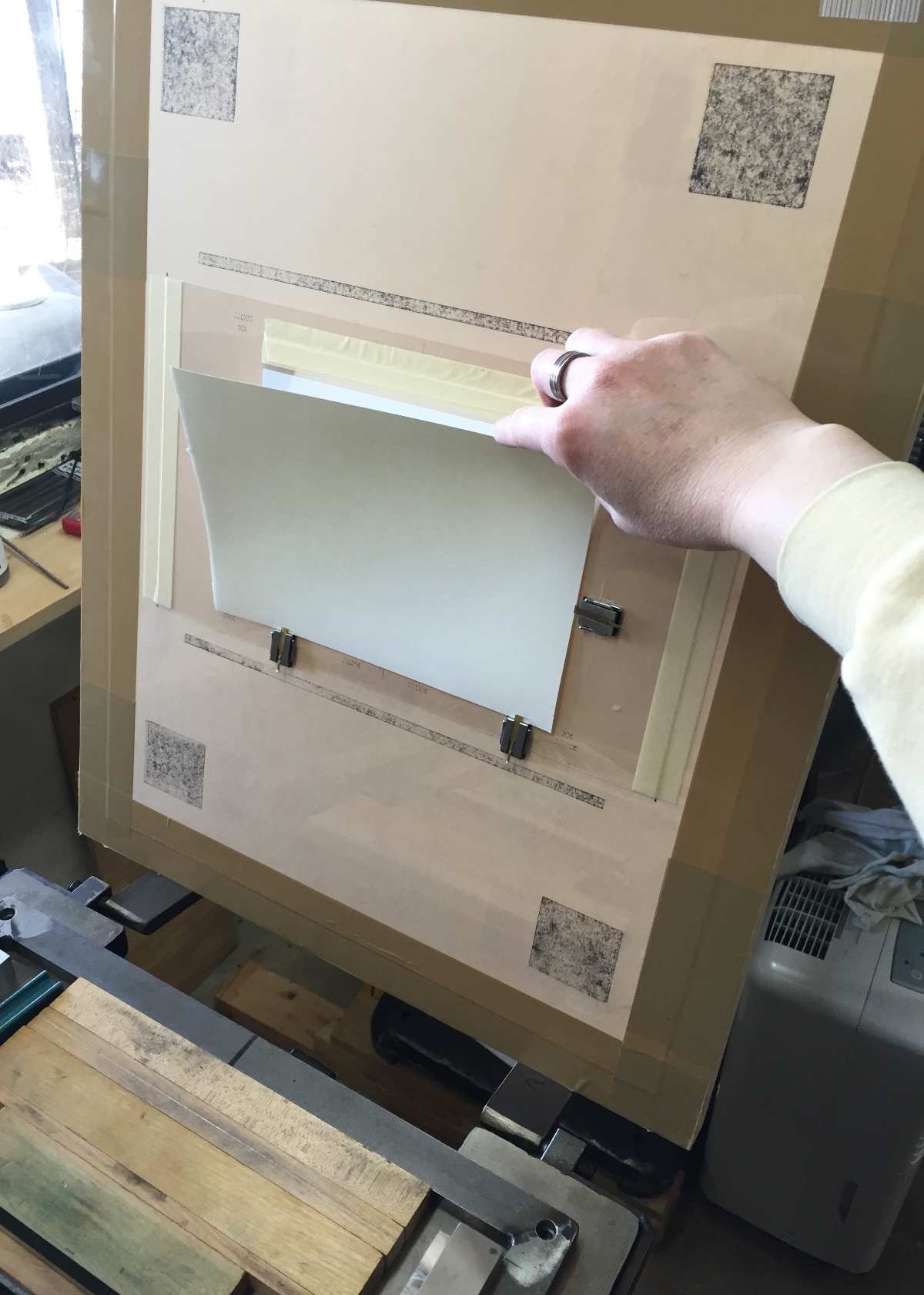
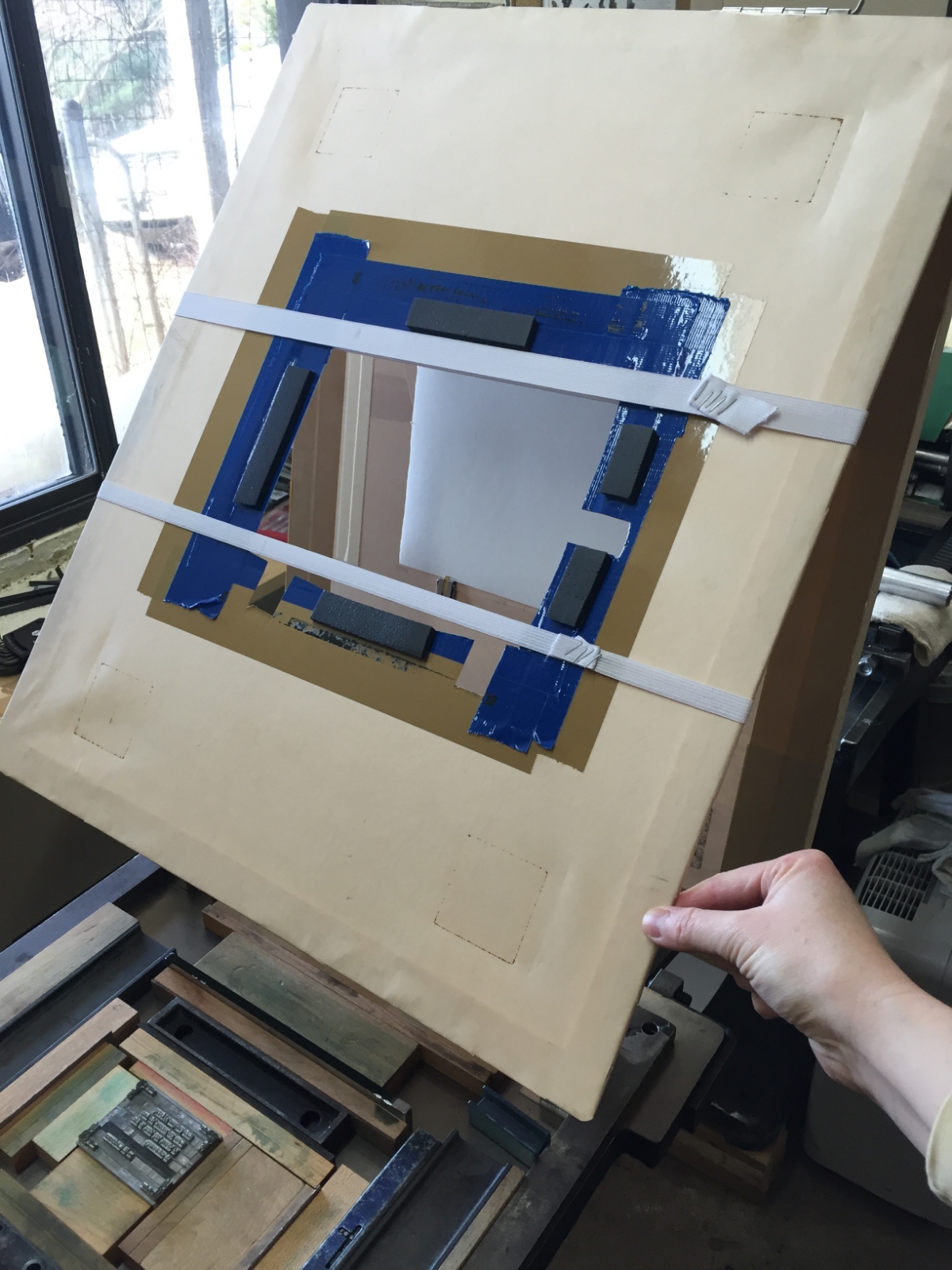
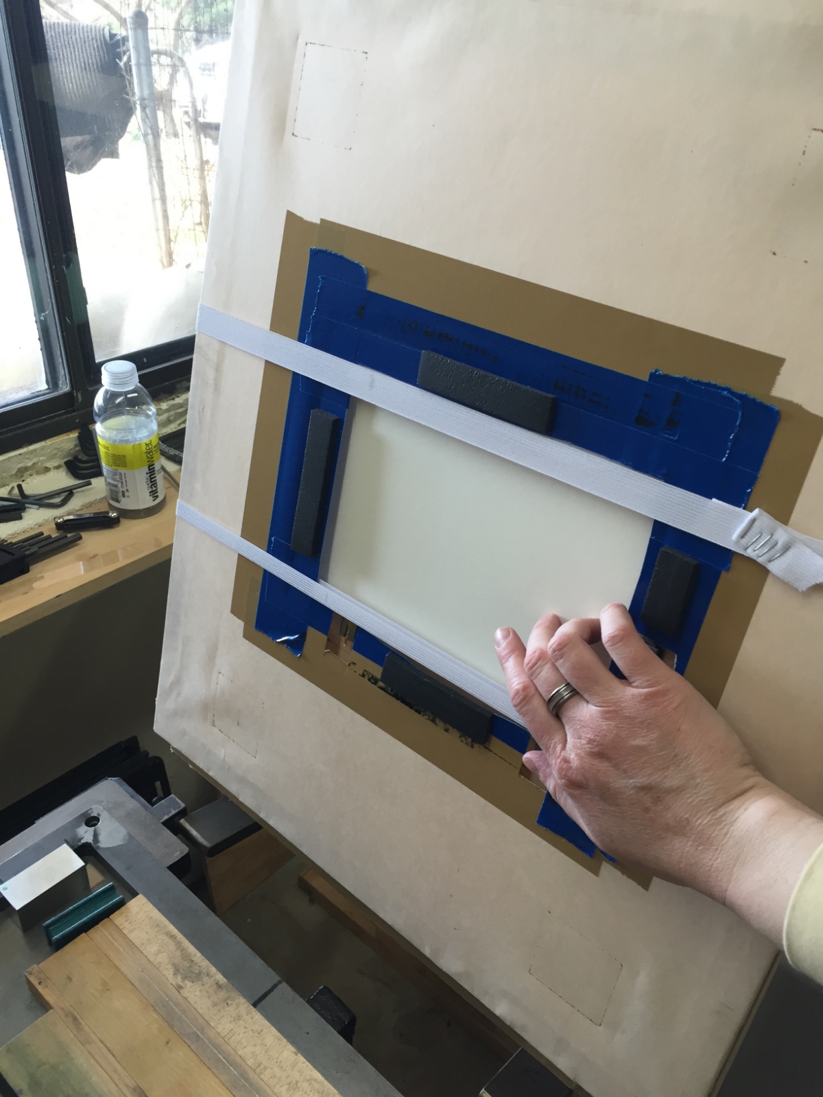
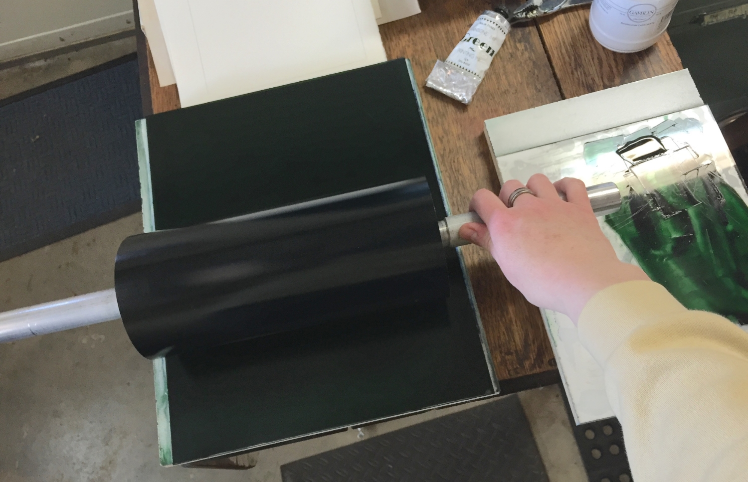
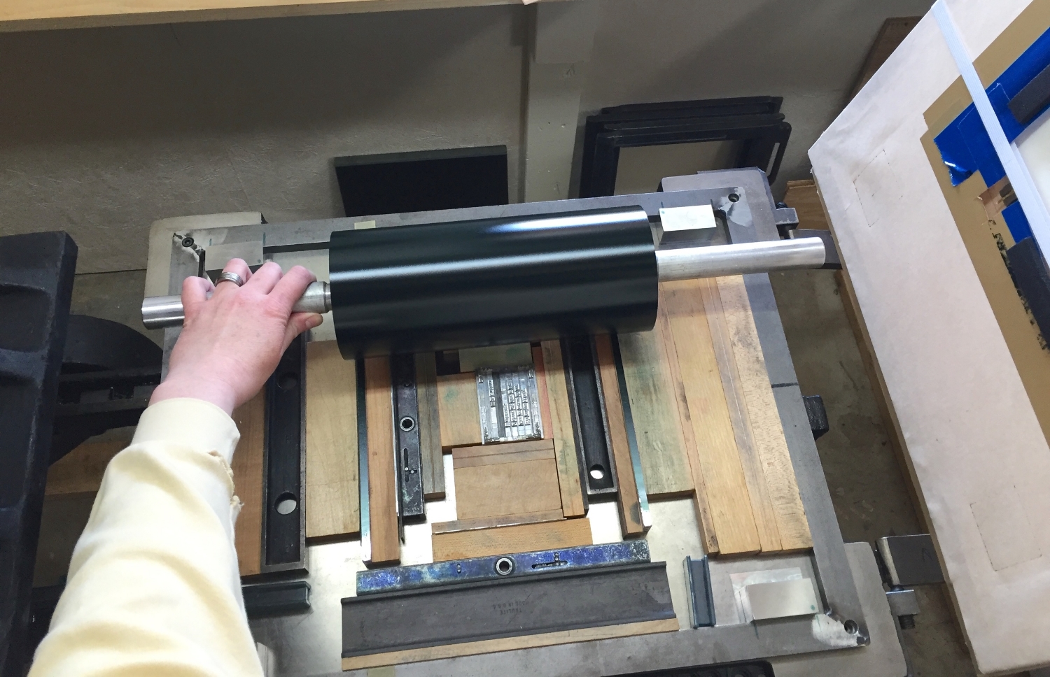
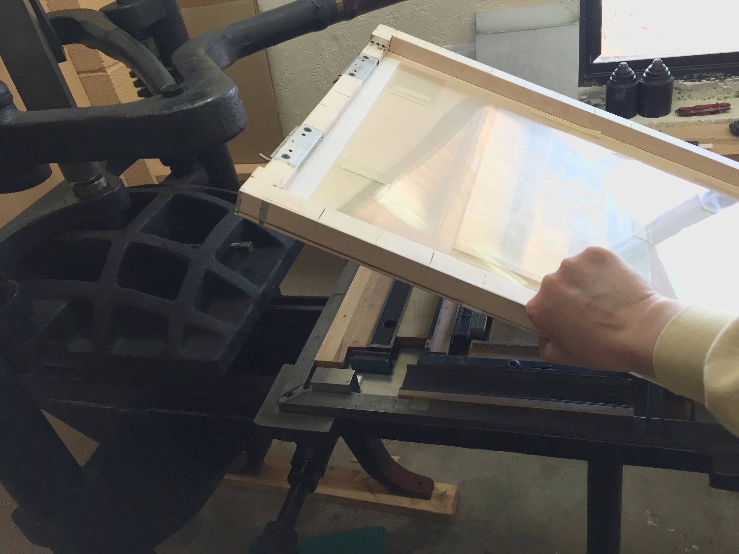
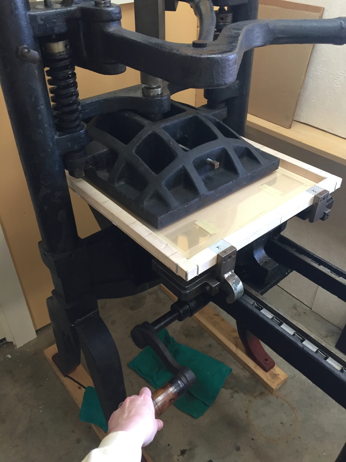
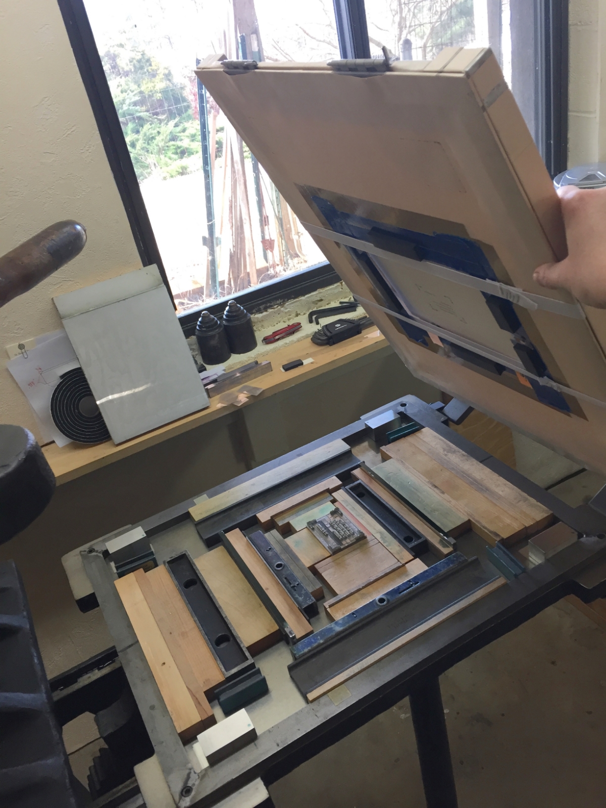
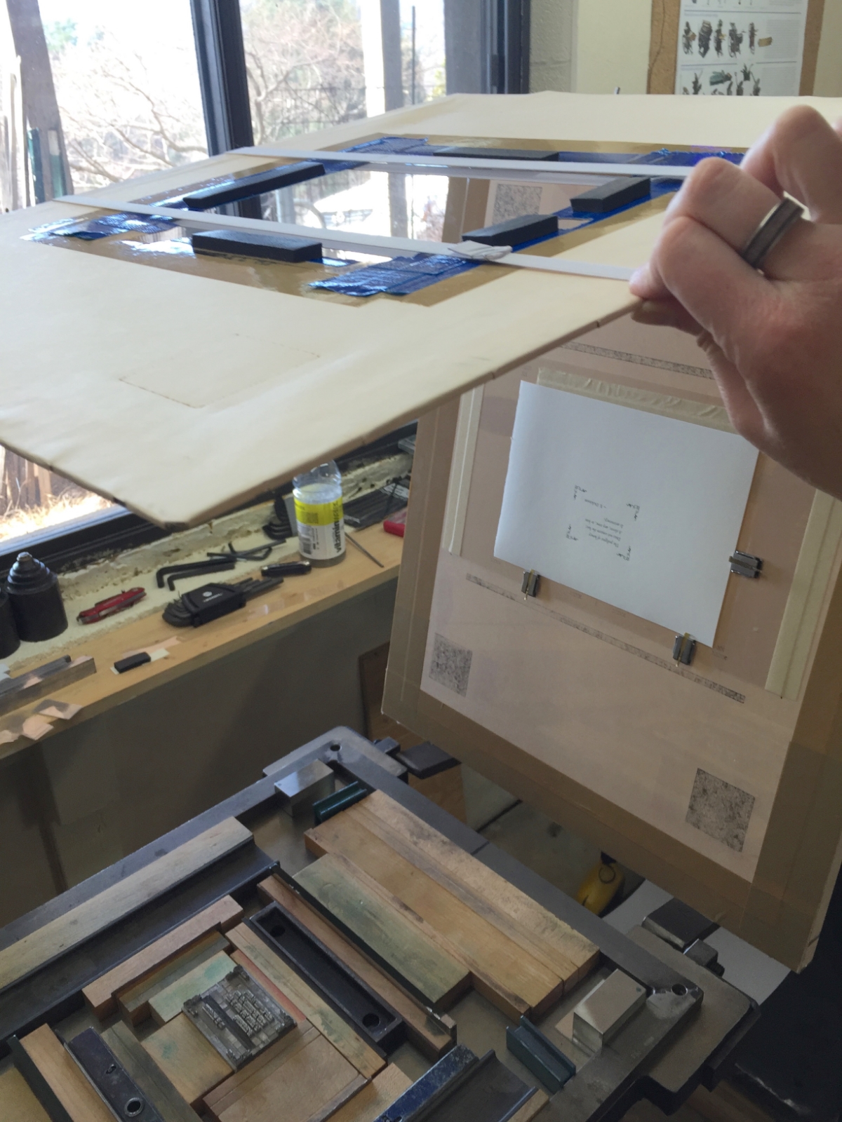
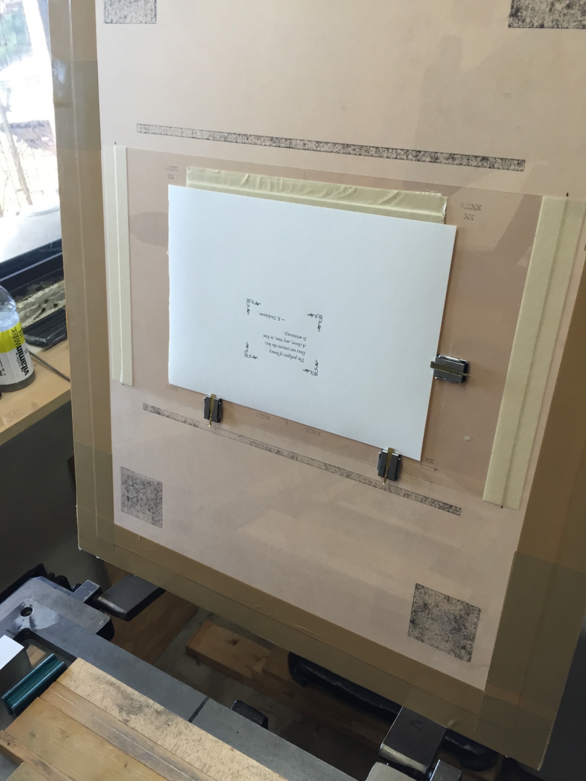
Here is a series of photos that will walk you through the printing of one sheet of one poem for this one book. By the time we finish the edition, we will have enacted this same process about 1,260 times. Good thing we love what we do!

All best to all, 

St Brigid Press

1 Comment

A Letterpress Lexicon, Part 2

1 Comment

A Letterpress Lexicon, Part 2

Hi, Friends of St Brigid Press!

Here is the second installment in our occasional blog series about the words and phrases that identify printing's particular tools and processes ~ A Letterpress Lexicon. Enjoy!

(If you missed Part 1, you can find it HERE.)


Today's 3 words are

TYPECASE, TYPESETTING, and COMPOSING STICK


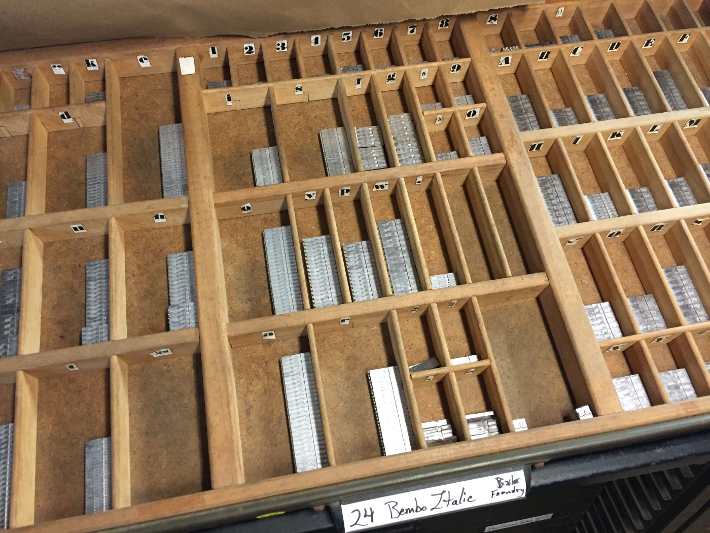
TYPECASE:  A typecase is a wooden tray, divided up into numerous small compartments, in which the letters, numbers, and punctuation of a font of type are organized and stored. 

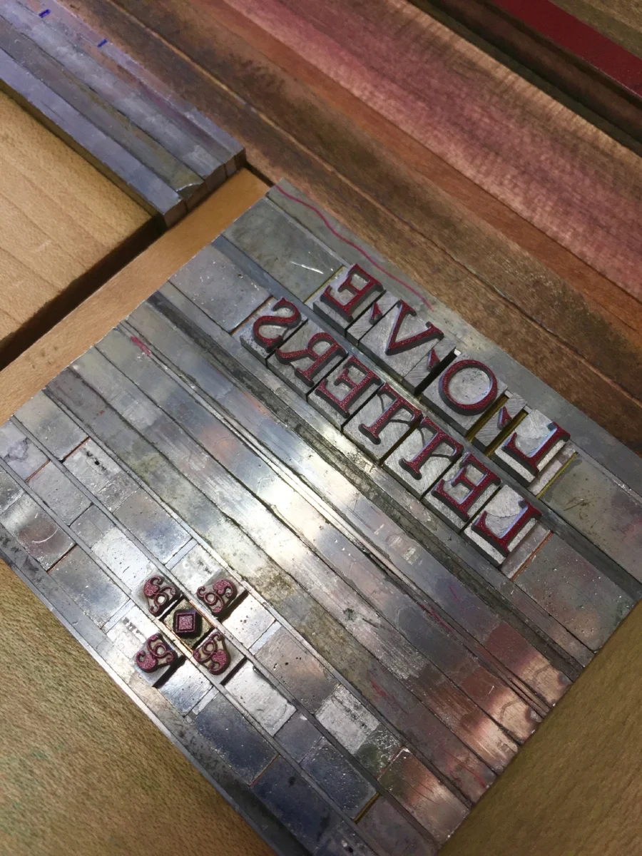
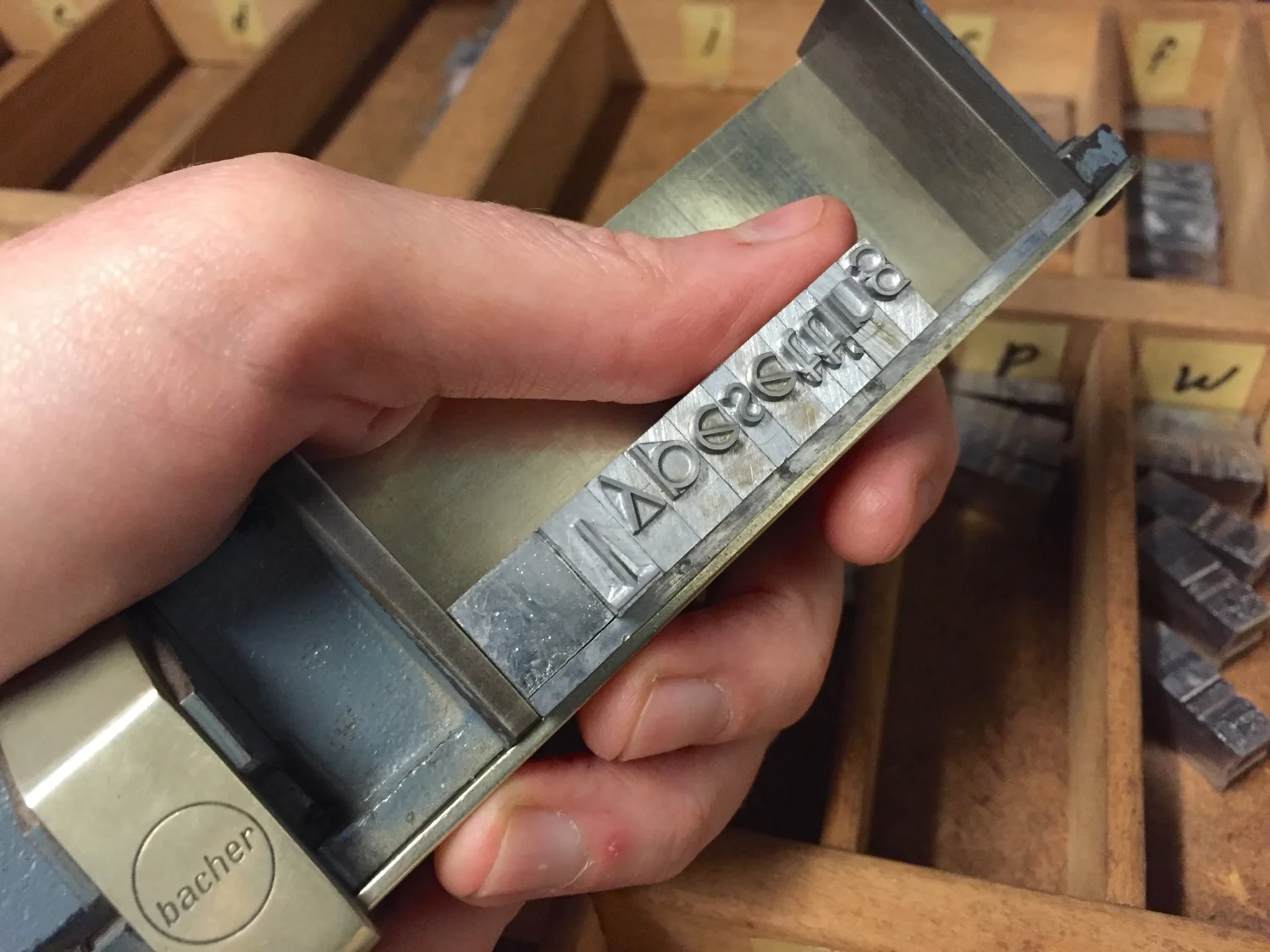
TYPESETTING:  This refers to the action of composing words from the individual pieces of type. A printer reaches into their typecase, picks up the desired letter, and literally "sets" it in place beside the last letter placed. 

COMPOSING STICK:  This is the tool that holds the pieces of type that are being set (or, "composed"). Usually made of brass or steel, the composing stick is held in the non-dominant hand while the typesetter lines up each desired letter. The stick is adjustable, according to how long the line of type needs to be. 

And here's a little video to put these three words together!

Thanks so much for joining us on this journey into the World of Letterpress!

If you haven't already, take a second to sign up below for our occasional newsletter, which features posts like this one, as well as updates on our printing projects here at St Brigid Press.


1 Comment