6 Comments

Handmade Bulfinch Journals

Bulfinch Header Greetings All!

We have the First Fire of the season burning brightly in the wood stove today. Autumn's damp chill at bay, we're excited to unveil the newest member of the St Brigid Press family of blank books: the Bulfinch Journal.

Bulfinch Array

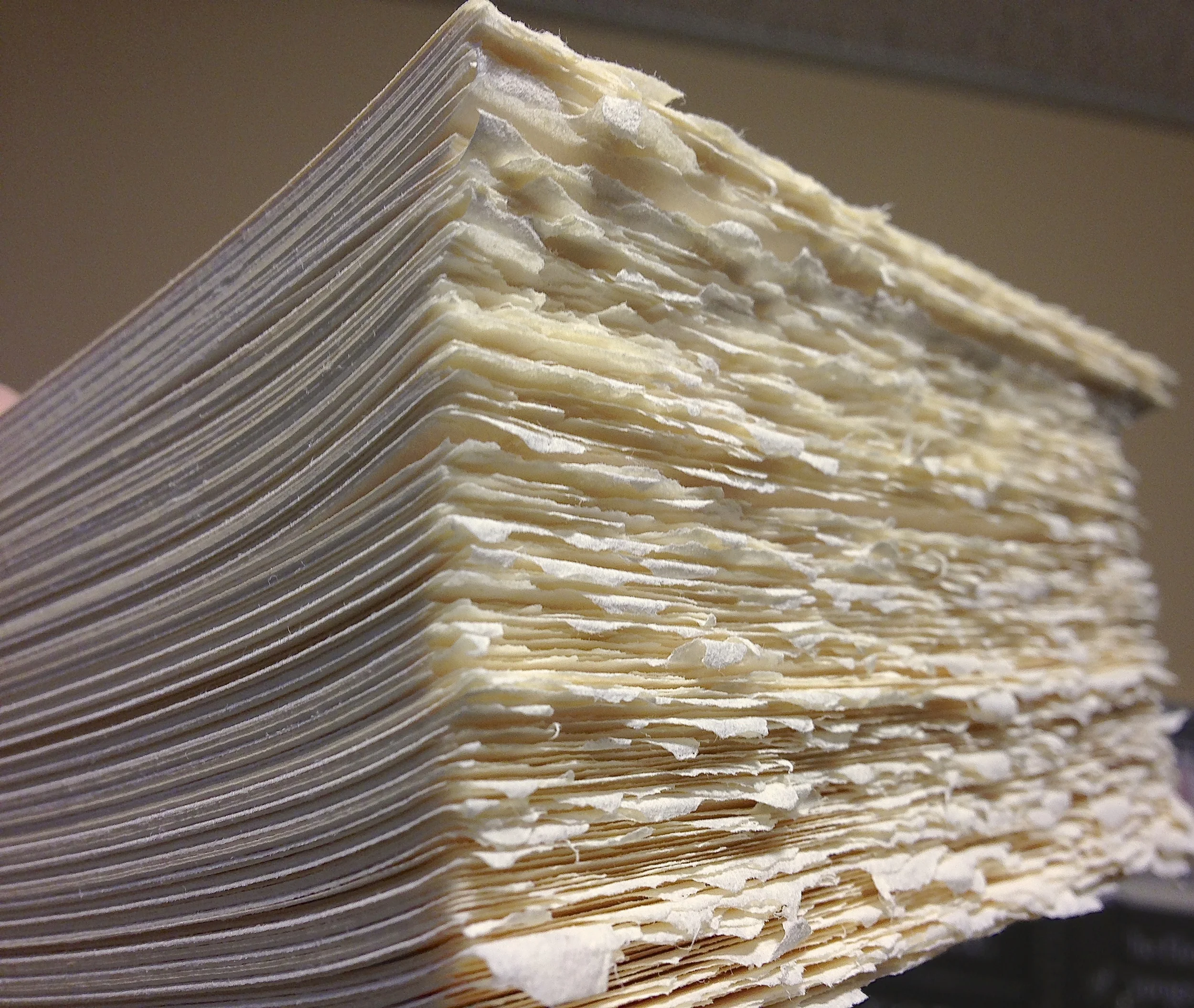
Midway in size between the larger Commonplace Books and the smaller PocketNotes, these 5" X 3.5" journals fit comfortably in the hand and in the handbag. About 90 interior pages are Mohawk Superfine text-weight paper, in warm cream and acid-free. The sturdy covers are Fabriano's wonderful Murillo paper (also acid-free), with a tactile wove surface and rich color (available in mustard and in deep green). The journals are hand sewn with linen thread of various earth-tones, in a lovely stitch pattern that decorates the spine.

Sewing the blank books with linen thread.

Bulfinch Stitch

Each cover is blind-stamped with a beautiful "open-book" ornament called Bulfinch. This ornament was originally part of a typeface of the same name designed in 1903 by William Johnson for the Ladies Home Journal. The back cover features our Press signature, letterpress printed in forest-green ink.

The Bulfinch Ornament, designed in 1903 by William Johnson.

Back cover, letterpress printed with our Press signature.

To order, please see our online Store, here. For more information, contact us at stbrigidpress@gmail.com. Those of you in the Waynesboro, Virginia, area can purchase these from Stone Soup Books. The journals are $12.95 each.

Thanks so much, and all best to all,

St Brigid Press

Letterpress printing the covers on the 1909 Golding Pearl treadle press.

The Bulfinch Journals, in mustard or deep green.

6 Comments

8 Comments

So, what IS "letterpress printing" anyway??

An American-made handpress from the late 1800s, a descendant of the style used by Gutenberg.

~

Before eBooks and all-things-digital, before laser printers, before photocopiers or typewriters, how in the world did the written word get into print? Well, slowly and carefully, letter by hand-selected letter.

Printing office, circa 1560.

In the Western world, we usually associate Johannes Gutenberg with the development of the printing press in about 1450. Other cultures, notably in Korea and China, had also developed printing techniques by this time. The brilliant idea that Gutenberg also employed was moveable type. By casting, in relatively hard metal, multiples of each letter of the alphabet, the printer could set the text for a given project, print it, redistribute the metal letters  and spaces in their cases, and set another text. This was, like the invention of paper itself, REVOLUTIONARY.

Setting the type for the Introduction in

In the centuries since Gutenberg, letterpress printing has continued to evolve and innovate, but its hallmark has remained the same -- the tactile, lush kiss of type upon paper, the physical sculpture of language that becomes manifest before our eyes. At St Brigid Press, we are committed to practicing and to passing on this craft tradition, working with hand-set type and elegant old presses to bring words into being.

If you'd like to know more about the history of printing and about the letterpress process, there are a host of great websites to learn from. Here are a few to get you started:

Thanks, and all the best,

St Brigid Press

The gentle impression of inked metal type upon paper.
Yours truly printing with an iron handpress at Penland School of Crafts. (photo by Lari Gibbons)
Rolling the ink carefully over the type forme.

8 Comments

2 Comments

15th Century Meets 21st Century -- from Gutenberg to the Digital Age

Hello Friends! Though we spend most of our days in the Shop hand-setting type, letter-by-letter and space-by-space, and sewing books with needle and linen thread, there ARE times when we emerge -- blinking -- into the light of the Year 2013 ;-)

St Brigid Press is now on Facebook. Yes, that's right. Check us out at www.facebook.com/StBrigidPress. Here we will be posting short updates, pictures, and videos several times a week, to give you a taste of what's happening at the Press in almost-real time. If you're already on Facebook yourself, "Like" us and invite your friends to "Like" us. We are grateful to make new connections!

Enjoy the Beauty of these Autumn days, and keep in touch,

St Brigid Press

Part of a suite of photos and a video we posted on Facebook yesterday, showing the process of printing the covers for our new "Bulfinch Journal" (coming soon!).

2 Comments

5 Comments

Shop News: Online Updates and Expansions

Pears in Blue Bowl Happy almost-Autumn from St Brigid Press!

Sometimes a day at work is NOT a day spent in the Shop here at the Press. To help you and new visitors better navigate our website, we've spent some time this week updating and expanding the online offerings.

Here are a few of the additions to check out:

  • A brand new Home Page, with photos and introductory text, sharing a bit about what St Brigid Press is all about.
  • A revised About St Brigid Press page, telling a little more of our story.
  • A completely updated online Store, which will allow you to navigate more easily among the various items we have on offer.

We hope you enjoy some of the updates, and we welcome your feedback. You can leave a reply below, or send us an email at  stbrigidpress@gmail.com

Thank you all, and enjoy the Beauty of the days,

St Brigid Press

5 Comments

5 Comments

Raptors and Wood Type Fun

Hawk Poster on press

~

Warm Greetings from St Brigid Press!

Well, it's that time of year again -- the cooling days of late summer and early fall that provide the impetus for some of the most spectacular mass-movements of species on the planet:  the annual migration of hawks and other raptors from North America to Central and South America. Those of us in the beautiful Blue Ridge Mountains are fortunate to live along a major flyway -- the updrafts along the spine of the mountains support a bird highway from Canada and New England south toward the Gulf of Mexico. And Rockfish Gap, near our home in Afton, Virginia, is one of the best locations in the East to watch this magnificent flow of raptors.

To commemorate the birds and the hundreds of people who gather to witness them, I spent the last week joyfully rummaging through the 20+ cases of wood type here at the Press. Most of the type was made in the US between 1875 and 1910, and still in very good condition. The idea for the design this year came from the list of raptors that the official Hawk Watch Counters tally -- there are fourteen species for which they scan the skies, from Broad-winged Hawks (the most numerous) to the rare Mississippi Kite. Other species include Ospreys, Falcons, Eagles, and many different kinds of Hawks. I set the names of all fourteen raptor species in various typefaces of wood type, creating a fun collage of avians.

Each poster is hand-inked and printed on the Potter Proofing Press (circa 1915, Chicago). Paper is Stonehenge Rising Fawn, with oil-based ink in either deep blue or deep green, in 12"x18" size. The posters were printed in a limited edition of 35, all signed and numbered. Each is backed by stiff board and sleeved in protective archival plastic. Price: $30 each, with 20% of the proceeds being donated by St Brigid Press to The Raptor Conservancy of Virginia. To purchase, go to the St Brigid Press Online Store.

With thanks, and enjoy the beautiful days!

St Brigid Press

[ For more information about hawk migration, go to www.hawkcount.org ]

Beginning to assemble the names of 14 raptor species, in various typefaces and sizes of vintage wood type. Quite the challenging puzzle!

St Brigid Press is honored to have collected over 20 cases of wood type, most made in the United States between 1875 and 1910.

Checking and rechecking the fit of the type forme, making sure each letter and space are snugly in their place.

Getting the ink well-distributed on the roller.

Rolling the ink carefully over the type forme.

Checking and rechecking the final proof.

Signing, numbering, and packaging the 2013 Hawk Watch Poster.

5 Comments

2 Comments

"Hope is the thing with feathers..." Poetry Broadside

HOPE Broadside

Warm Summer Greetings from St Brigid Press!

We are inaugurating our SBP Poetry Broadside Series with a limited-edition print of this beloved poem by Emily Dickinson, decorated with an original block carving by SBP printer Emily Hancock. When Dickinson first penned this verse around 1861, America was in the initial throes of civil war, and through the century-and-a-half since, its themes of courage and ever-available hope have remained relevant, revelatory, and inspiring. (Read the full text of the poem at the end of this post.)

The text-body of "Hope is the thing with feathers..." has been hand-set in Victor Hammer's wonderful American Uncial typeface, with hand-set Lombardic Capitals illuminating the opening word "Hope," in forest-green oil-based ink. The broadside is letterpress-printed with the 1914 Chandler and Price treadled press, on lush Rives 100% cotton mouldmade paper. Decorative Thai kozo-and-banana-bark paper frames the title and the carving. The decorative feather was hand-carved here at the Press, and printed on the Rives paper with warm brown ink. Ready for framing, the broadside is matted with forest-green acid-free board, and backed with sturdy acid-free foamboard (mat is lightly affixed to the backing board with archival artists' tape).

Produced in a limited edition of 40, with 30 available for purchase. $35 each. Finished size: 12"x16". To order, please go to the SBP Online Store. For more information, Contact Us.

With thanks, and good Summer wishes to all!

St Brigid Press

Hand-setting "Hope" with the lovely and historic Lombardic capitals typeface.

Letterpress printed with forest-greet ink onto Rives paper, mouldmade in France.

Hand-carving the feather (shown here highlighted with the warm-brown ink).

Close-up of printed carving, with colophon.

~

FULL TEXT of the poem by Emily Dickinson:

Hope is the thing with feathers That perches in the soul, And sings the tune without the words, And never stops at all,

And sweetest in the gale is heard; And sore must be the storm That could abash the little bird That kept so many warm.

I've heard it in the chillest land, And on the strangest sea; Yet, never, in extremity, It asked a crumb of me.

~

2 Comments

6 Comments

"Tasting the Wild Strawberry: Blue Ridge Haiku"

TWS -- Cover Warm Greetings from St Brigid Press!

We are delighted to announce the publication of artist and author Nancy Maxson's second collection of poetry ~ Tasting the Wild Strawberry: Blue Ridge Haiku.

Nearly sixty new haiku evoke the beauty and surprises of a life lived in these Virginia mountains. With humor and deep insight, Maxson gives us a poem's-eye-view of her journey through the seasons of a year; in the Introduction, she elaborates upon the artful and spirited aesthetic which inspired this work.

The book's design and hand-crafted execution seek to reflect the nature of the poetic form, as well as Maxson's mindful sensibility. Each edition is 6-inches square, with black covers of Nepalese Lokta paper, decorative interior papers of red Thai Unryu, and a warm-white text block of bamboo paper. Binding is in the traditional Japanese style of 4-hole stab binding, with red linen thread. Cover and interior art is from Maxson's original watercolor, "The Strawberry Seeker." Produced in a limited edition of 100 numbered books.

Available now in the St Brigid Press Store, and, for those of you near Waynesboro, Va, at Stone Soup Books and Cafe. For more information, contact us at stbrigidpress[AT]gmail.com.

Best wishes to all for a lovely summer!

St Brigid Press

Gluing the decorative papers that illuminate the seasonal title pages.

Punching the holes for the Japanese 4-hole binding with a bookbinder's awl.

Sewing the book with red linen thread.

10 finished editions of the book, "resting" overnight in the nipping press.

Title page, with beautiful red Thai Unryu endpapers.

"Spring" title page, with decorative Thai Unryu papers.

Close-up of "Summer" title page.

Colophon, on the final page of "Tasting the Wild Strawberry: Blue Ridge Haiku"

Author and artist Nancy Maxson, holding her new book, with printer and bookbinder Emily Hancock of St Brigid Press, at Maxson's reception at Stone Soup Books and Cafe, Waynesboro, Va, on Saturday, June 29th, 2013.

6 Comments

2 Comments

The First Day of Summer at St Brigid Press

Come, shamanic bee,

turning light into sweetness:

pollinate this dawn

~

Warm Greetings, Friends,

The above haiku is the opening poem of Summer in a new book by Nancy Maxson, Tasting the Wild Strawberry: Blue Ridge Haiku, forthcoming from St Brigid Press. In this, her second collection of poetry, Maxson explores the seasons of the year and of the heart in fifty-six wonderfully distilled, 3-line gems. Known throughout the region for her fine watercolor paintings, we are thrilled to collaborate with Maxson to produce this limited-edition, letterpress printed, hand-bound collection of her written work.

Below are a handful of photos from some of the stages of creating Tasting the Wild Strawberry. If you are in the Waynesboro, Virginia, area, please drop by Stone Soup Books next Saturday, June 29th, for Maxson's art opening and book launch reception. Books will be available for purchase at Stone Soup and through our website here, as of the 29th.

Very best summer wishes to all,

St Brigid Press

Cutting large sheets of fine paper from their from-the-mill size of 27"x40" down to a size that will eventually become our 6"x6" book.

Forming the bodies of the poems, letter-by-letter and space-by-space...

The letters and spaces are gathered into words, which are gathered into poems, which are gathered into a forme for printing each page.

TWS and CandP

The last stop: the Bindery, where the book's covers and pages will be sewn together with linen thread.

2 Comments

Comment

Letterpress PocketNotes

PocketNotes 1

Now available from St Brigid Press -- Letterpress PocketNotes!

We are glad to introduce a sweet little line of letterpress printed journals, in five dandy designs and one handy size. At about 4.5" tall and 3.25" wide (closed; 6.5" wide open), these blank booklets are perfect to slip into a pocket or satchel and go wherever you do. Printed on our 1909 Golding Pearl treadle-powered press, the sturdy cream-colored covers brightly display five themes: "Fly Fishing," "Piper Airplane," Golden Sun," "Sailing Ship," and "Notes." Inside, 40 pages of warm-white paper await your thoughts, lists, ideas, and art. All are hand-bound with linen thread.

Offered only through our website, please see our SBP Online Store for ordering information.

Thanks, friends, and all the best from St Brigid Press.

PocketNotes binding

Golden Sun journal whole

PocketNotes interior

~

Five PocketNotes Designs

Comment

6 Comments

Printing Presses at St Brigid Press

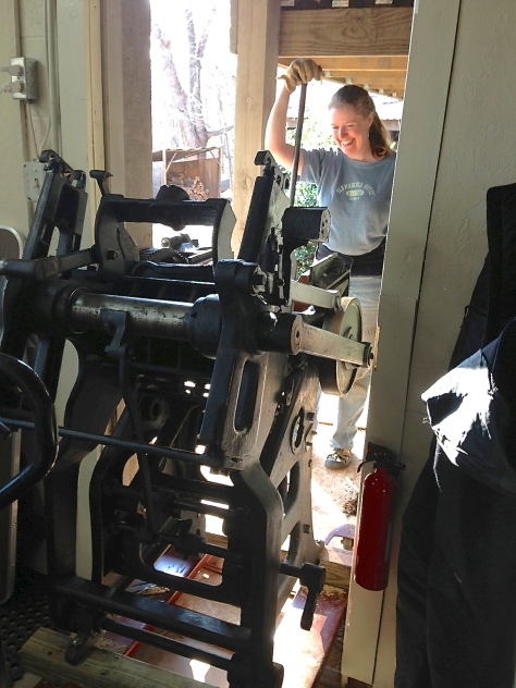
Greetings Friends! With the pressroom here at SBP now rounded out with four vintage presses, we thought you might like a closer look at the marvelous machines that do the heavy work of printing everything from coasters to books. I've created a new page on this site that gives a brief description and a couple of photos of each press.

To learn a little more about the 3000+ pounds of cast iron and steel, click here: Printing Presses at SBP.

With thanks, and all best to all,

St Brigid Press

How DO you get three-quarters-of-a-ton of cast iron through the shop door?!

6 Comments